InetSoft on DM Radio: Self-Service Approach to Data Exploration
This is the continuation of the transcript of DM Radio’s program titled “The Eyes Have It: Ten Reasons Why Data Visualization Rocks.”
Eric Kavanagh: Okay folks, back here at DM Radio. The topic is Data Visualization. And now, for a word from Tableau Software, Suzanne Hoffman, welcome to DM Radio.
Suzanne Hoffman: Well thank you Eric. I appreciate your allowing me to be here.
Eric Kavanagh: Well, absolutely. So you have heard us talk all about these different reasons why data visualization rocks. What have we missed, or what have you particularly liked?
Suzanne Hoffman: I am coming more from the business side of the house. My background is very sales and marketing oriented. So, a lot of times, it's less about someone handing me the reports and allowing me to be able to decipher what it is I need to get out of it as maybe more guided approach and having best practices involved in the delivery of the information itself so that I make the right decision in context with my business.
So, I think a lot of what’s missing is the idea of self-service — the idea that I can actually achieve the goal of pervasive BI which has sort of been a straw man out there we have all been trying to achieve in the business intelligence industry for 30 years now. We have maybe penetrated 14% of the market, and how do we drive the adoption of decision-making further into the organization.
Self-Service BI: Empowering Business Users
And John Chambers from CISCO succinctly put it: if he could have his lower-level managers make decisions in an organization such as his, he could make millions more decisions on an annual basis than the few hundred or thousand that his top line managers make.
That concept of self-service delivery or pervasive BI is really important in helping people drive their own business and understand how their goals and objectives roll up to Corporate America. Business people aren’t data geeks for the most part. Handing them a spreadsheet just means they are going to screen scrape, go offline and break all the rules by printing it to go review it. Here is a way to be green in your organization, right.
Eric Kavanagh: I do agree with you. It's a very interesting point. In terms of self-service, I think that can be wonderful stuff, but you do, as you just suggested, need to find a way to embed some guardrails, some governance guardrails.
Establishing Governance in Self-Service BI
Suzanne Hoffman: Exactly. The key element here is what's the guided principle? How do we incorporate best practices? How do we enable an end user almost in a protected environment? This is sort of a parameterized environment for a grown up so that they don’t make false decisions based on their perceptions of the data.
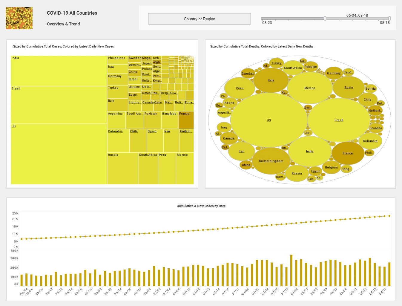
And I think handing them numbers almost puts them in a likelihood of making that wrong decision if they are not data geeks. But the visualization pops out at you — even the outliers are immediately apparent: here is something I need to react to, here is something that needs my attention, and then you take it from there.
Because you could, for example, use five or six or seven different tactics of different ways of mixing and matching datasets and really not see anything and in the 8th and 9th one, all of a sudden you see three or four outliers, and that’s usually where you need to look to find something interesting.
Suzanne Hoffman: I wholeheartedly agree, and that’s the whole concept of real-time access to the information and being as close to the data as you possibly can get without being impactful or an irritant to the IT organization who you are constantly needing to go back to and say, I need this data, I need this dataset.
Create Your Own Semantic View
If you are sitting right at the data level, and you are creating your own semantic view of the data just through drag and drop, you can look at as much or as little contextual data to be able to make those real-time decisions, and I think that’s key as well.
Eric Kavanagh: That’s a great point. The ability for business users to interact directly with data, without relying on IT for every request, really accelerates the decision-making process. When the tools are intuitive and designed with the end user in mind, adoption rates go up and organizations see more value from their BI investments.
Suzanne Hoffman: Absolutely. The challenge is making sure that the self-service capabilities are robust enough to handle complex questions, but simple enough that users aren’t overwhelmed. Training and support play a big role here, but so does the design of the platform itself. If users feel confident exploring data on their own, they’re much more likely to uncover insights that drive business growth.
Eric Kavanagh: And as more organizations embrace self-service BI, we’re seeing a shift in culture. Data-driven decision making becomes part of everyday operations, not just something reserved for analysts. Ultimately, empowering users at every level to explore and visualize data leads to better outcomes and a more agile business.


