InetSoft on DM Radio: In-Memory's Beneficial Effects on Visualization
This is the continuation of the transcript of DM Radio’s program titled “The Eyes Have It: Ten Reasons Why Data Visualization Rocks.”
Eric Kavanagh: Well, that’s actually a really, really good point. I think that’s a great comment. You know, why didn’t we see this data before? Well, it was there, you just hadn’t noticed it before. And I think maybe one of the things to keep in mind here is that, especially if you are a larger organization, you really need to have people who specialize in what a friend of mine, Howard Spielman, calls graphicacy, meaning somebody who specializes in finding compelling ways to visually display data, right?
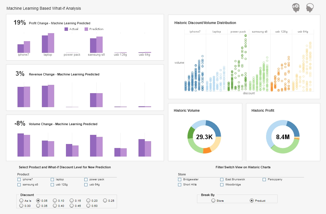
Doug Cogswell: Right. And then that relates to, Eric, my sort of second point about exploring the thought thread. So you see something that seems a bit odd, or it jumps, or it’s colored a certain way. In an interactive visual dashboard, you can then just click on it, and it's tagging data that’s in memory and the whole thing, as I think Tibby was indicating, updates.
And then something else might jump when you go after that subset so you can click on that. So you are effectively also exploring this sort of visual thought thread, and you are effectively querying a whole bunch of tables even though all you are doing is clicking on the charts you see on the screen. So the interactive part of it means that the charts don’t just do display. They connect to the data, and you then basically cross-query it across a whole bunch of tables. And that’s something that without this, you are forced back to, okay I see this, let’s re-cut the data a different way.
In-Memory Visualization Benefits
Let’s update the report. It could be a week or two later the report comes back. You look at it, and you say, well that’s not what I expected. Let’s redo it again. We call that the cycle of pain, and it's visibility to see the story and explore the threads makes this really speed of thought quick interaction to do that in a whole new way.
Eric Kavanagh: Yeah, that’s very interesting. It really points to the fact that you do want to have an iterative process though, right, but the key is that you don’t want the steps in that process to be too time consuming or too painful, right?
Doug Cogswell: Right. And masking it and putting this visual interface, I mean business people, we have frontline business people who can literally click on what they see on the screen, and that’s form of a query that’s just so much easier, so much more intuitive and so much faster because you instantly see the result.
And that’s a huge value of the way I think when Mark was talking at the beginning and then Rich, they were talking about the visualization integrating with the in memory data. Those two together are what create this ability to see the stories and explore the threads, and it's really real-time, fast, easy way. And that’s something that’s new. Five, ten years ago you couldn’t do this.
Eric Kavanagh: Yeah. So there we are to the hardware advances, right. I mean in-memory obviously is powerful because it's so much faster than having to go back to a spinning disk, right?
Doug Cogswell: Yeah. And the memory footprints have continued to expand. I mean I think typically we were loading from Oracle warehouses, were loading source tables, marts, whatever. And today in a reasonable memory footprint, you can fit hundreds of millions of rows, 10, 20, 100, 150 tables and link them all together. And that’s profoundly different than what you could do 5 or 10 years ago, and it's really been enabling.
Eric Kavanagh: Yeah. And I guess maybe Rich, we will bring you back in. That use of in-memory capability seems to be significantly on the rise and for a couple of reasons: One, more vendors are supporting it; two, memory is a lot cheaper than it was five years ago, right?
Rich Penkowski: Absolutely. And you have to remember what organizations are trying to untangle and what they are dealing with data really centers around the velocity, the variety and the volume of their data. And really in-memory computing is sort of the first platform and first solution set that we have had that actually deals with all three of those dimensions.
You can actually -- as you know, we heard, you can combine a whole variety of data. The volumes are unprecedented, and the variety of sources you can integrate on those platforms is virtually unlimited. And so this is really the first time that we have been able to settle for all three of those variables simultaneously, and I think we are all looking forward to seeing what the next generation of technology might hold.
Wastewater Epidemiology Data Visualiztion
Wastewater epidemiology has emerged as a critical tool for public health agencies seeking early warning signs of disease outbreaks within communities. By monitoring the viral load in sewage, officials can detect pathogens shed by infected individuals even before clinical testing data is available. This approach offers a non-invasive and cost-effective method for tracking the spread of infectious diseases like cholera and polio at a population level. Since nearly all individuals excrete viral or bacterial markers, wastewater analysis can provide a broader and more representative sample of community health trends compared to traditional testing alone.
The process begins with regular sampling of wastewater from treatment plants or specific sewer catchments that correspond to particular neighborhoods. Laboratory analysis then quantifies the presence and concentration of cholera bacteria or other biomarkers, which serve as indicators of infection prevalence. These findings are mapped to geographic locations, allowing public health officials to pinpoint where infections may be increasing. Because pathogen loads in wastewater often rise before spikes in hospitalizations or clinical cases, this method gives valuable lead time for interventions such as targeted testing, vaccination drives, or public advisories.
Dashboards play an essential role in transforming raw wastewater data into actionable insights. By visualizing pathogen load metrics by neighborhood, public health teams can identify hotspots and monitor trends over time. Interactive dashboards can display heat maps, historical trend lines, and threshold alerts, allowing decision-makers to respond quickly when levels rise above predetermined benchmarks. Integrating additional datasets such as hospital admissions or vaccination rates further enhances the contextual understanding, enabling more precise targeting of resources and public health messaging.
The impact of wastewater epidemiology is profound in improving disease surveillance and outbreak response. It helps authorities detect infections in populations with limited access to healthcare or testing, providing a more equitable and comprehensive public health strategy. For diseases like cholera and polio, where early containment is crucial, wastewater monitoring and dashboard visualization offer an early-warning system that can save lives and reduce healthcare burdens. As technology and analytics capabilities advance, wastewater epidemiology is likely to become a permanent fixture in modern public health infrastructure, enabling communities to stay ahead of emerging health threats.


