Mobile Visualization Tools
An effective mobile visualization tool is one that combines the full capability of a desktop visualization software with the convenience of using a hand-held device. InetSoft's award winning data visualization software can be accessed on any mobile device that has a web browser.
Using HTML5 for client rendering, all devices are supported by the 100% cloud-based platform.
The expansion of global business requires executives to have their organization's data on hand wherever they go, and InetSoft's StyleBI meets that need perfectly. Convenient features of mobile devices such as screen sharing and a touch screen interface help executives to explain and share their organization's information with other employees.
Evaluate InetSoft's Solution

InetSoft's Mobile Visualization Tools
InetSoft's solution is known for combining state-of-the-art visualization with more traditional reporting capabilities. Even InetSoft's free visualization tool, Visualize Free, has been ranked among the top 10 visualization tools in the industry. With an approach to BI that's focused on self-service, end-users can now perform the same data analyses and intuitive visualizations outside of the office.
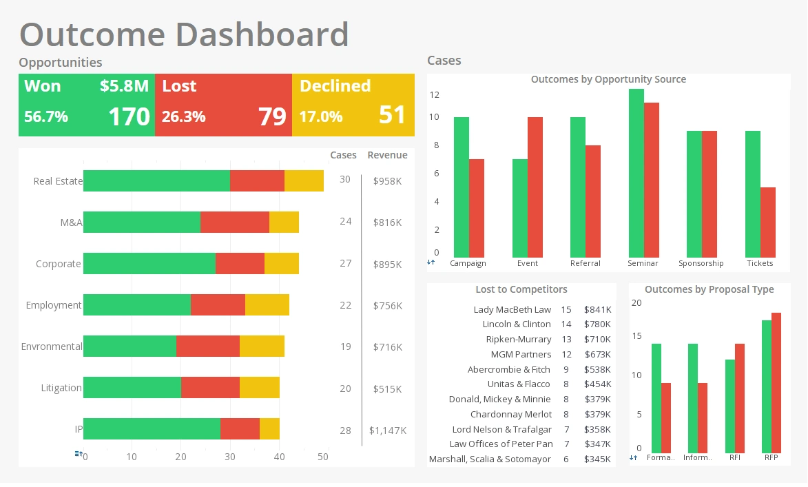
Mobile friendly BI tools such as InetSoft's StyleBI have given a new meaning to data visualization away from your desktop. Style's web-based platform also makes information-sharing and collaborative BI effortless among peers. Dashboards and visualizations that can be created quickly through a drag-and-drop interface will enable your organization to become more time efficient, allowing goals to be met at a much faster rate.
StyleBI Mobile Visualization Tool — Use Case: Urban Heatwave Response
Imagine a midsize city in the summer: heatwave warnings are issued, shelters open, and field teams are dispatched to check on vulnerable neighborhoods. The StyleBI Mobile Visualization Tool becomes the glue that holds decision-making together — a single, mobile-first dashboard app that stitches live IoT sensor streams, public health records, EMS dispatch queues, and citizen reports into an actionable, pocket-sized command center.
Why mobile-first matters for this problem
During an extreme weather event, the people who matter most aren’t sitting behind desks — they’re on the street. They need fast, contextual, offline-capable views that fit a thumb and a thumb-sized attention span. StyleBI’s mobile visualization approach prioritizes condensed layouts, touch interactions, and data-synthesis strategies that make complex, multi-source information immediately useful for a person walking a block or coordinating a van-sized response team.
What the mobile dashboard shows
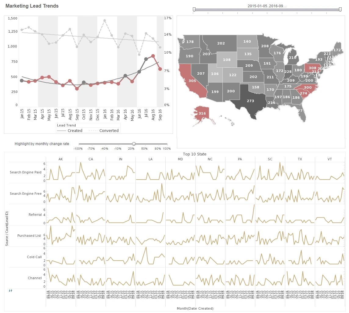
The primary mobile dashboard is a single scrollable screen with four compact panels: a live-heat map of the city color-coded by surface and ambient temperature, a prioritized "At-Risk" list of addresses with recent alerts, a miniature time-series sparkline for city-average temperature and ER admittances, and a small actionable tile for "Open shelters / capacity" with one-tap directions. Each panel is designed for glanceability — big numbers, high-contrast thresholds, and tappable drill-downs that load details only when needed.
Data mashup and prioritization
StyleBI’s mobile tool combines data from heterogeneous sources: rooftop and street-level IoT sensors, public health feeds (anonymized heat-related admissions), utility grid stress signals, shelter occupancy APIs, and citizen reports submitted via a civic app. The magic happens in the visualization layer: the dashboard doesn’t try to show everything at once. It applies a simple ruleset — recent spike + high population density + vulnerable population indicator — to create a ranked "triage" list. Field workers see a compact scoring badge beside each address so their choices are defensible and fast.
Offline-first, low-bandwidth resilience
A practical feature: a lot of fieldwork happens where cellular coverage is sketchy. StyleBI’s mobile visualization supports cached tiles and lightweight data snapshots that synchronize opportunistically. When a crew member taps a location in low connectivity, the app can show the last-known sensor values, the last recorded welfare check, and offline check-in controls that queue updates for later sync. This capability transforms the dashboard from a "nice-to-have" to something crews can rely on in every neighborhood.
Interaction patterns optimized for speed
The interface intentionally favors rapid gestures: swipe to acknowledge an alert, long-press to flag a location for follow-up, and double-tap a map cluster to expand nearby sensor details. Drill-downs load micro-visualizations — a tiny multi-line chart showing the last 48 hours of temperature, a bar that shows EMS call volume in the area, and a quick photo gallery of citizen-submitted images. These micro-interactions reduce cognitive overhead and let responders move from 0→action in two taps.
Alerts, automation and human judgment
Alerts are tuned for mobile: push notifications are reserved for the highest-priority triage changes (e.g., a shelter hit capacity, a sensor shows dangerous heat rise at a senior housing complex). Lesser alerts appear as a subtle red badge on the triage tile so responders aren’t overwhelmed. Crucially, StyleBI’s rule engine is transparent on mobile — each alert includes the rule that triggered it and the raw values, so humans can overrule automated suggestions when nuance matters.
Outcomes and metrics
Cities that treat mobile dashboards as operational tools (not post-hoc reporting) see measurable improvements: faster check-in times, better shelter utilization, and fewer preventable heat-related ER visits. StyleBI’s compact visualizations reduce the time-to-decision because responders spend less time correlating spreadsheets and more time acting on prioritized, trustworthy signals.
Design and governance lessons
- Design for the thumb: make primary actions reachable and primary data scannable under bright sunlight conditions.
- Trust, then automate: show the logic behind alerts on mobile so field staff retain agency and confidence.
- Cache aggressively: offline behavior wins; users must be able to capture observations when connectivity drops.
- Keep visuals minimal: sparklines, single-value indicators, and micro-maps beat dense charts on phones.


