Police Dashboard
Police officers have always played a vital role in enforcing laws and reducing crime and disorder, while improving the overall quality of life for the community.
Sadly, it is found that the occupational fatality rate for law enforcement is three to five times greater than the national average for the working population, which has brought to the national consciousness concerns among many researchers, law enforcement agencies, and policymakers:


What are the major causes of police death? When and where do these tragedies happen the most frequently? Which states need the most attention and care? How should we allocate resources and build policies to protect the officers from death, so they can safely protect our communities?
To help answer these questions, InetSoft built an interactive Police Force Deaths Analysis Dashboard that displays police fatality data since 1791, across 17,985 police departments in the United States. The visualization's charts and tables let users comprehend these vast amounts of data at a glance in a more efficient way.
InetSoft's Law Enforcement Analytics
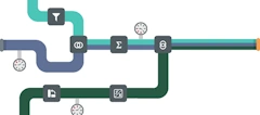
InetSoft StyleBI has rich built-in visual components and multiple functionalities which allow users to visualize data in diverse styles of charts, aggregates KPIs, and filters. InetSoft's Law Enforcement Analytics are a great example of this.
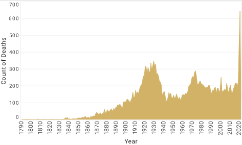
The dashboard utilizes area charts to show the death trends over time, allowing users to explore how police deaths have evolved over the years. It includes a map chart showing each state's death count, allowing the users to compare across states with a quick scan of the visualization.

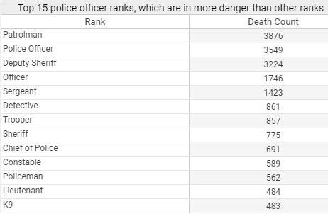
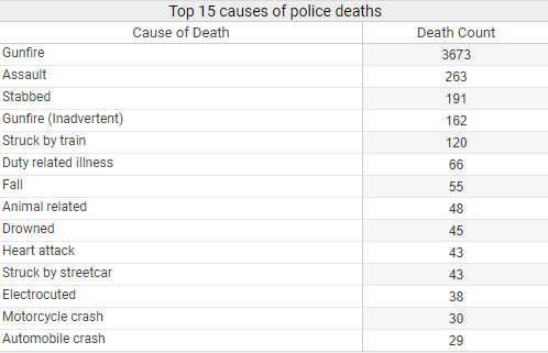
The dashboard also incorporates several tables to allow users to dive deep into more details. The tables list the top 15 death causes, the top 15 types of police officers in the most danger, and the top 15 departments with the most police deaths, providing details of police deaths that are the most relevant to analyze from an abundant amount of data.
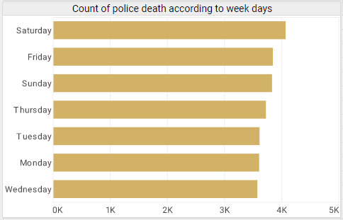
The dashboard also contains bar charts that sort months and weekdays by death counts, providing users another dimension to slice and dice data for deeper investigation. All the tables and charts can be used as filters that allow agile drilldowns and filtering of data, which further saves users time by reducing the number of clicks and the amount of time taken to search and change filters.
USA Police Force Deaths Analytics and Applications
InetSoft's application is designed to maximize user self-service. With InetSoft's Police Force Deaths Analytics Dashboard, government users can easily cater the completed dashboard to specific needs and conduct advanced and detailed analysis in no time.
For example, by utilizing the cause of death checklist, they can use the dashboard to investigate how specific events like 9/11 and COVID-19 affected police death rates and compare the severity across states. This way, they can provide support and allocate limited resources in the most efficient way possible. By clicking on different months/weekdays, they can uncover the potential seasonal patterns and understand how different levels of attention should be paid over time.
To make the most use of the maps, they can click and drag to select multiple states across the map, immediately filtering the whole dashboard not only by a single state but by multiple states at once. For example, they might be interested in analyzing the police force death rates across the whole Northeast region.

Achieving More with InetSoft StyleBI
The Police Force Deaths Analytics Dashboard is an example visualization created by InetSoft's Style Intelligence, a web-based application for mashup-driven dashboards and reports. It aims to improve efficiency and transparency across all levels of government by allowing agencies and municipalities to analyze and share volumes of information with the public and other agencies in a clear and concise manner.
With InetSoft StyleBI, a data source only needs to be linked once, and dashboard views can be scheduled for automatic updates to incorporate incoming information. This means that government users can always refresh the dashboard with the newest information to spot trends and aberrations across time and location, monitor the effects of local policies, estimate the causal effects of the interventions through comparisons of relevant outcomes across regions over time, and gather instant insights for building up new policies and making the best possible budget decisions.
Key Performance Indicators Tracked on Police Department Dashboards
Police department dashboards are designed to provide law enforcement agencies with real-time insights into operations, public safety, and resource allocation. They aggregate data from incident reports, patrol logs, community interactions, and administrative systems to help departments monitor effectiveness and make data-driven decisions. Some of the most commonly tracked KPIs include:
1. Crime Rates by Type
This KPI measures the number of reported incidents for different categories of crime, such as violent crimes (homicide, assault), property crimes (burglary, theft), and drug offenses. Monitoring crime rates helps departments identify trends, allocate resources strategically, and evaluate the effectiveness of prevention strategies. Dashboards often visualize these trends with charts or heat maps to show changes over time or geographic concentrations of incidents.
2. Response Times
Response time tracks the average duration between receiving a call for service and the arrival of officers on the scene. Shorter response times are critical for preventing escalation, improving public trust, and enhancing officer safety. Dashboards can break this KPI down by type of incident, shift, or district, helping supervisors identify areas that require additional staffing or faster deployment.
3. Clearance Rates
Clearance rate is the percentage of cases that are “cleared” by arrest, charge, or exceptional means. It reflects the department’s effectiveness in solving crimes and bringing offenders to justice. Dashboards often provide these statistics by crime category, allowing leadership to assess investigative efficiency and identify trends where clearance rates may be lagging.
4. Officer Activity and Workload
This KPI monitors individual officer activities, including patrol hours, case assignments, and calls handled. Tracking workload helps ensure equitable distribution of responsibilities and prevents burnout. It also allows management to assess whether staffing levels are adequate for the demands of different shifts or neighborhoods.
5. Use of Force Incidents
Monitoring incidents involving the use of force is crucial for accountability, compliance, and public transparency. Dashboards display trends, frequencies, and contextual details, helping departments review policies, identify training needs, and ensure compliance with internal and external regulations.
6. Traffic and Accident Data
This KPI includes traffic violations, accident reports, and related enforcement actions. Tracking patterns in traffic incidents enables police departments to identify high-risk areas, plan traffic enforcement campaigns, and implement safety improvements. Visualizations often highlight accident hotspots or repeat violation zones.
7. Community Engagement Metrics
Community engagement KPIs measure interactions such as citizen complaints, public meetings, outreach programs, and social media feedback. Monitoring these metrics helps departments understand public sentiment, assess trust levels, and prioritize initiatives that strengthen police-community relations.
8. Arrest and Citation Statistics
These metrics track the number and type of arrests and citations issued over a given period. Dashboards can break this down by location, crime type, and demographics to evaluate enforcement focus, ensure equitable treatment, and inform crime reduction strategies. They also help in identifying patterns that require proactive policing.
9. Asset and Resource Utilization
This KPI tracks the deployment and usage of vehicles, equipment, and personnel across districts. It ensures that resources are used efficiently and that areas with higher crime rates or call volumes receive sufficient coverage. Dashboards allow real-time monitoring, helping to optimize patrol assignments and emergency response capacity.
10. Training and Certification Status
Dashboards often track officer completion of required training and certifications, including firearms qualifications, defensive tactics, and specialized skills. Ensuring compliance supports operational readiness, legal compliance, and overall departmental effectiveness. This KPI helps leadership plan training schedules and monitor workforce competency.