Reporting Performance Measures with InetSoft
The outcome of effective performance management is the meeting of organizational goals. The right performance management tool will present key metrics in a way that is easy to comprehend by all departments.
With InetSoft's StyleBI, users can combine and collate disparate sources of data, allowing performance management reports to comprehensively include all desired metrics.
By providing self-service integration, InetSoft's BI tools give end-users the flexibility to modify their performance management system, as corporate strategy changes. With a web-based platform, employees can easily collaborate on generating new reports, and can access vital information wherever they are.


Meeting Corporate Goals
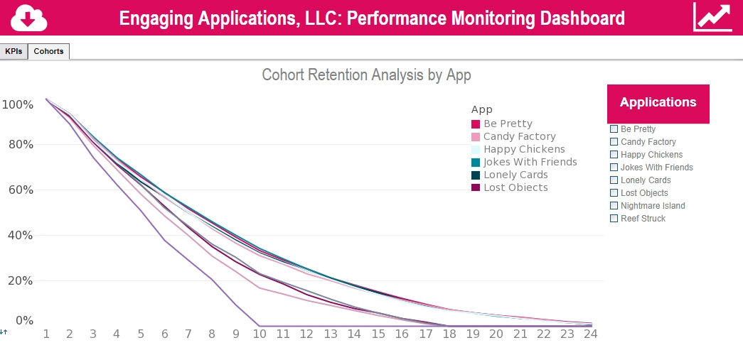
InetSoft's solution also includes a tool for producing sophisticated dashboards and visualizations. When given the power to visually see patterns in performance data, further insights are gained and new strategies are inspired. Take the visualization image above.
When you click the image to bring up a sample interactive dashboard, you will see how by clicking different categories, you can breakdown the data by category such as state sales activity, regional breakdown, and year to year sales. By isolating different product categories and adjusting date ranges, users can explore performance data for patterns that a basic performance report would not provide.
For regular non-exploratory monitoring, InetSoft's reporting engine enables the easy creation of balanced scorecards. Scorecards not only measure progress, they can also be configured to automatically provide recommended actions to take if the specified goals are not met. With InetSoft's StyleBI, it's now even easier to compare current performance metrics with strategic goals and manage proactively.
What Are the Metrics Tracked on a Dashboard for an Edible Insect Farming Company?
Below is a practical, operator-focused catalogue of the key metrics (KPIs) you’d put on a dashboard for an edible insect farm — what each metric means, why it matters, and concrete levers you can pull to influence it. I’ve prioritized metrics that directly impact production efficiency, product quality, cost-per-kilo, and regulatory/market success.
1. Feed Conversion Ratio (FCR)
What it means: FCR is the mass of feed required to produce a unit mass of insect biomass (e.g., kg feed per kg insect dry weight). Lower is better — it means you get more protein out of less input. Why it matters: Feed is usually the largest variable cost. A better FCR reduces cost per kg and improves sustainability metrics versus conventional livestock.
How to affect it: optimize feed formulation for the target species (protein/fiber balance), implement precision feeding schedules (avoid over- or under-feeding), monitor and control environmental conditions that affect digestion and appetite, and segregate cohorts by size to reduce competition. Trials of alternative feedstocks (e.g., food waste streams) can alter FCR; always run controlled A/B feed trials and log results on the dashboard.
2. Mortality Rate (by life stage)
What it means: Percentage of animals lost during a defined stage or cycle (eggs, larvae/nymphs, juveniles, adults). Track by cohort and time window.
Why it matters: Mortality directly reduces yield and increases unit costs — and high mortality often signals environmental stress, disease, or feed problems. It’s also a compliance and welfare indicator for buyers and regulators.
How to affect it: set alarm thresholds on the dashboard for sudden mortality spikes, run root-cause checks tied to recent changes (new feed batch, temperature/humidity excursion, handling events), maintain strict biosecurity and sanitation protocols, and implement staggered harvesting to limit spread of pathogens between cohorts.
3. Yield per Batch / Cycle Yield
What it means: Total harvested biomass (weight or count) produced by a production cycle or tray. Can be shown as absolute and as % vs target.
Why it matters: This is your revenue driver — it’s what you sell. Tracking yield helps plan sales, packaging, and processing capacity and flags deteriorating performance early.
How to affect it: ensure consistent environmental setpoints, optimize stocking density (too high → stress, too low → wasted space), tighten feed schedules and recipe quality, and use selective breeding or supplier genetics that deliver consistent growth. Display historical yields alongside environmental variables to spot correlations.
4. Growth Rate / Specific Growth Rate (SGR)
What it means: Rate of weight gain (e.g., grams/day or % bodyweight/day). SGR normalizes growth across cohorts of different sizes.
Why it matters: Faster, steady growth shortens cycle times and increases throughput — essential when margins are tight. It’s also a sensitive indicator of feed quality and environmental match to species needs.
How to affect it: adjust temperature/humidity lighting to species-specific optima, refine feed digestibility and micronutrient content, and reduce stressors (handling, overcrowding). Use cohort-tagging and frequent weight sampling so the dashboard can predict harvest windows.
5. Cycle Time (Days to Harvest)
What it means: Average elapsed time from stocking (egg or larval introduction) to harvest-ready size. Shorter cycle time increases annual throughput.
Why it matters: Helps with capacity planning — whether you need more trays, more grow rooms, or to shift production to different species to meet seasonality or orders.
How to affect it: improve growth rates (see SGR), maintain precise environment control, and eliminate bottlenecks in post-harvest processing. Use dashboard alerts when cycle time drifts outside expected variance.

6. Feed Usage and Cost per Kg Produced
What it means: Total feed consumption and raw feed cost allocated per kilogram of harvested insect biomass. Combine with FCR for full visibility.
How to affect it: negotiate bulk feed contracts, substitute cheaper but safe feed streams where possible (validated in trials), reduce feed wastage with better feeders, and automate feed dispense to avoid over-feeding.
7. Energy & Water Use per Kg
What it means: Utilities consumed (kWh, liters) divided by produced biomass. Useful for cost allocation and sustainability reporting.
How to affect it: improve insulation, upgrade to variable-speed ventilation fans, recover heat from processing areas, and test more energy-efficient lighting or dark-period strategies for species that don’t need continuous light.
8. Waste Conversion / Circular Inputs
What it means: Percentage or mass of feedstock (e.g., food waste, by-product) converted into useful product versus disposed. Particularly relevant for black soldier fly operations.
How to affect it: pre-process feedstocks for palatability, monitor moisture and contaminant levels that reduce conversion, and log supplier batch quality to avoid low-conversion inputs.
9. Biosecurity / Disease Incident Count
What it means: Count of confirmed or suspected disease events, contamination incidents, or regulatory non-compliances over a rolling window.
Why it matters: One outbreak can wipe out multiple cohorts and destroy customer trust. This metric is essential for insurance, audits, and buyer confidence.
How to affect it: enforce visitor controls, quarantine new stock, maintain cleaning logs (integrated into the dashboard), and run routine microbiological checks on products and surfaces.
10. Labor Productivity & OEE (Overall Equipment Effectiveness)
What it means: Labor hours per kg produced and an OEE-like view for automated systems (uptime × performance × quality). Useful for scaling decisions.
How to affect it: invest in automation for sorting/harvesting, cross-train staff to reduce downtime, schedule preventive maintenance and track time-on-task in the dashboard so you can spot efficiency drains.
11. Product Quality & Customer Metrics
What it means: Post-processing quality checks (moisture content, protein %), % of lots that pass QA, customer return rate, and Net Promoter or Customer Satisfaction scores. These are downstream but determine price and market access.
How to affect it: integrate QA lab results into the dashboard, run shelf-life trials, and feed customer feedback into production decisions (e.g., different drying specs or particle size for powder).
Putting it together: dashboard design tips
- Top line: show yield, FCR, and mortality trends for the last 30/90/365 days.
- Alerting: automated alerts for environmental excursions, mortality spikes, or FCR drift beyond acceptable variance.
- Drilldowns: ability to click a cohort and see time-series: temp, humidity, feed batches, weight samples, and handling events.
- Financial overlay: link production KPIs to cost-per-kg and margin so operators know which production changes actually move the bottom line.
- Benchmarking: store historical bests and expected ranges by species so deviations are obvious.