InetSoft's Safety Dashboard Examples
Safety Dashboard Definition
A safety dashboard is a centralized, visual workspace that consolidates key safety metrics, incidents, and alerts into an easy-to-read format. It helps EHS managers, plant supervisors, and executives monitor safety performance in real time, identify emerging risks, and prioritize corrective actions.
By combining incident data, near-miss reports, training records, and compliance indicators, a safety dashboard provides a single source of truth for safety performance across sites, departments, and teams. This improves transparency, accountability, and the speed of response when issues arise.
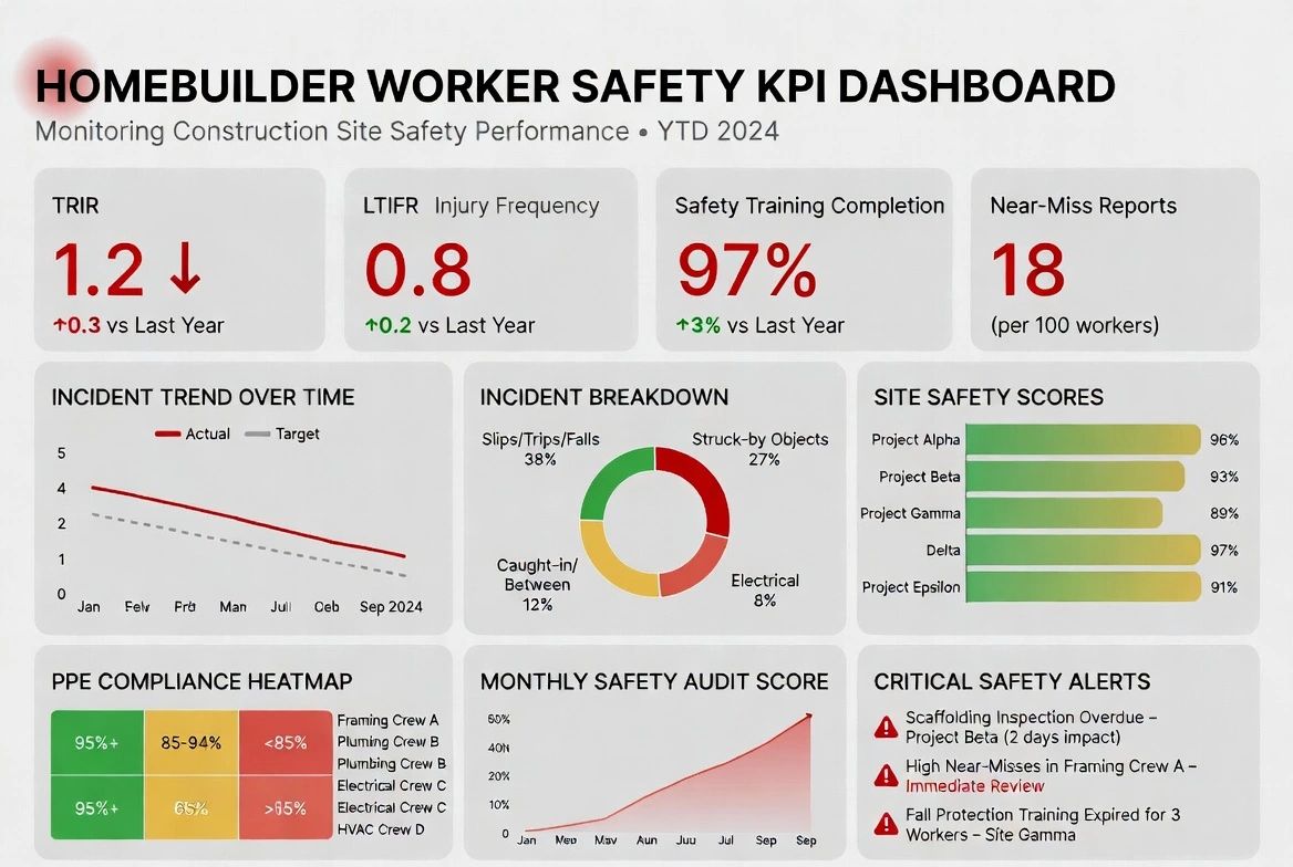


Key Features of a Safety Dashboard
-
Incident Tracking – Displays real-time and historical data on workplace accidents, near-misses, injuries, and fatalities.
-
Safety Compliance – Monitors adherence to industry regulations (e.g., OSHA, ISO 45001) and tracks inspections, audits, and certifications.
-
Leading & Lagging Indicators – Uses key safety performance indicators (KPIs) such as Total Recordable Incident Rate (TRIR), Lost Time Injury Rate (LTIR), and proactive safety measures (e.g., training hours, hazard reports).
- Risk Assessment – Identifies high-risk areas, job roles, or locations by analyzing trends and patterns.
- Employee Training & Certification – Tracks employee safety training completion, certifications, and expirations.
- Corrective Actions & Safety Improvements – Highlights corrective actions taken after incidents and monitors their effectiveness.
- Real-Time Alerts & Notifications – Sends alerts for safety violations, overdue compliance checks, or new incidents.
- Customizable Dashboards – Users can tailor views based on roles (e.g., Safety Officers, HR, Operations Managers) to focus on relevant data.
Safety Dashboard KPIs
Safety dashboards rely on clear, actionable KPIs that help teams monitor performance, identify risks, and drive corrective actions. These metrics provide visibility into both leading and lagging indicators across sites, departments, and shifts.
- Total Recordable Incident Rate (TRIR): Measures the number of OSHA‑recordable incidents per 200,000 hours worked. A core lagging indicator for overall safety performance.
- Lost Time Incident Rate (LTIR): Tracks incidents that result in missed workdays. Helps assess the severity and operational impact of workplace injuries.
- Near‑Miss Reporting Volume: A leading indicator showing proactive identification of hazards. Higher reporting often correlates with stronger safety culture.
- Corrective Action Closure Rate: Measures how quickly corrective actions are completed after incidents, audits, or hazard observations. Indicates responsiveness and accountability.
- Safety Training Completion: Tracks required training, certifications, and overdue courses. Ensures employees are prepared and compliant with safety standards.
- PPE Compliance Rate: Monitors adherence to personal protective equipment requirements across teams and locations.
- Hazard Observations: Counts identified hazards logged by employees. A leading indicator that highlights risk exposure before incidents occur.
- Inspection & Audit Findings: Summarizes issues discovered during safety inspections or audits. Helps track recurring problems and compliance gaps.
- Emergency Response Time: Measures how quickly teams respond to incidents or alarms. Critical for high‑risk environments.
- Environmental Monitoring Metrics: Includes air quality, noise levels, temperature, vibration, or chemical exposure readings from sensors and IoT devices.
These KPIs form the foundation of an effective safety dashboard, enabling real‑time visibility, proactive risk management, and continuous improvement across the organization.
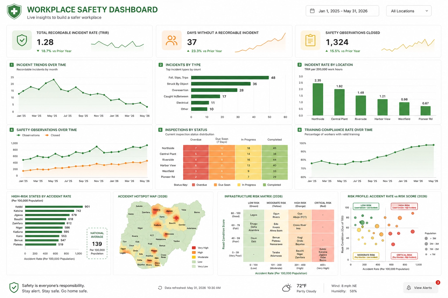
Benefits of a Safety Dashboard
-
Improves Safety Awareness – Provides clear visibility into safety trends and risks.
-
Enhances Decision-Making – Data-driven insights help organizations take proactive steps to prevent accidents.
-
Ensures Compliance – Helps businesses avoid legal and financial penalties by ensuring regulatory adherence.
-
Reduces Workplace Injuries – Identifies risk factors and promotes proactive safety measures.
-
Saves Time & Resources – Automates safety data collection and reporting, reducing manual effort.
Real-Time Monitoring & Alerts
Modern safety dashboards are built around real-time monitoring. They continuously ingest data from incident management systems, IoT sensors, and operational applications to surface live conditions and potential hazards.
- Live incident alerts: Immediate notifications when a new incident or near miss is logged.
- Sensor integration: Data from temperature, vibration, air quality, and other sensors to detect unsafe conditions.
- Threshold-based warnings: Configurable limits that trigger alerts when KPIs or readings exceed safe ranges.
- Escalation workflows: Automated routing of critical alerts to supervisors, EHS managers, or executives.
Real-time visibility enables faster intervention, reduces the severity of incidents, and supports a proactive safety culture.
Role-Based Views
A high-performing safety dashboard adapts to the needs of different roles, ensuring each stakeholder sees the information most relevant to their responsibilities.
- EHS Manager View: Focused on incident trends, near-miss reporting, corrective action closure, training completion, and compliance status across sites.
- Plant Supervisor View: Highlights shift-level incidents, hazards, PPE compliance, and open corrective actions for their specific area.
- Executive View: Summarizes overall risk exposure, safety scorecards, cost impact of incidents, and progress against safety objectives.
Role-based views improve adoption and ensure that each user can quickly act on the insights presented by the dashboard.
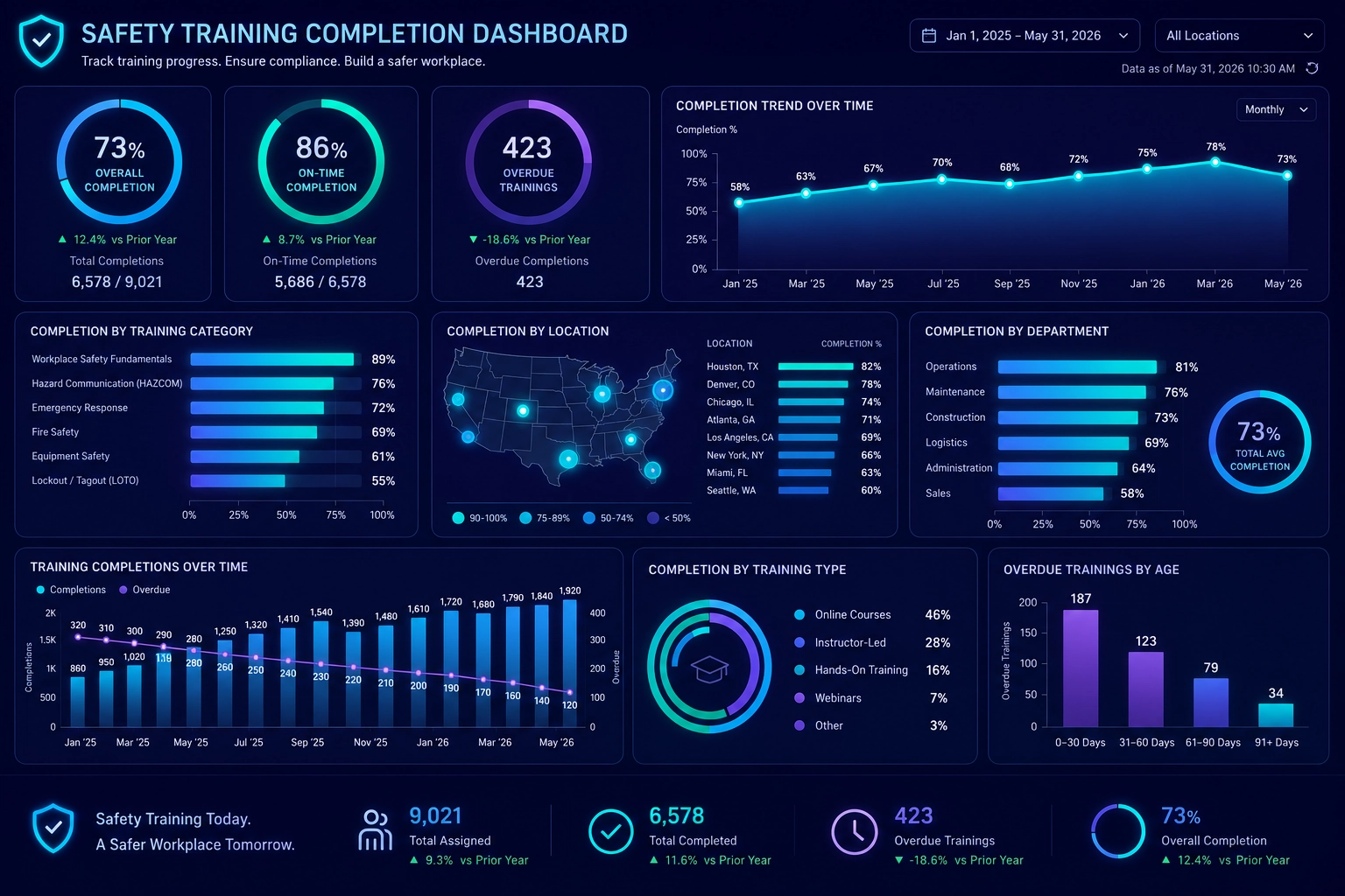
Safety Dashboard Use Cases
Safety dashboards can be tailored to a wide range of environments and industries. Common use cases include:
- Manufacturing Safety: Monitor machine-related incidents, lockout/tagout compliance, and near-miss trends on the production floor.
- Warehouse & Logistics Safety: Track material handling incidents, forklift safety, and loading dock hazards.
- Construction Site Safety: Visualize fall protection compliance, equipment incidents, and site-specific hazards.
- Fleet & Driver Safety: Monitor driver behavior, vehicle incidents, and route-specific risks.
- Chemical & Environmental Safety: Track spills, exposure incidents, and environmental compliance metrics.
Each use case can be supported by tailored KPIs, visualizations, and alerting rules that reflect the unique risks of the environment.
Data Sources & Integration
Effective safety dashboards rely on data from multiple systems to provide a complete picture of safety performance. Typical data sources include:
- Incident Management Systems: Records of incidents, near misses, and corrective actions.
- Training and LMS Platforms: Safety training completion, certification status, and overdue courses.
- IoT and Sensor Networks: Real-time readings for environmental and equipment conditions.
- HR Systems: Employee roles, departments, and shift assignments for context and accountability.
- Compliance Databases: Regulatory requirements, audit findings, and inspection results.
Integrating these sources into a single dashboard reduces manual reporting, improves data quality, and enables more accurate analysis of safety trends.
Popular Tools for Safety Dashboards
Organizations use various software platforms, including:
-
InetSoft – Known for its flexible data mashup and visualization capabilities.
-
Power BI – A widely used business intelligence tool for safety analytics.
-
Tableau – Offers interactive safety data visualization.
-
EHS (Environmental Health & Safety) Software – Includes platforms like Intelex, Cority, and VelocityEHS, which are tailored for safety reporting.
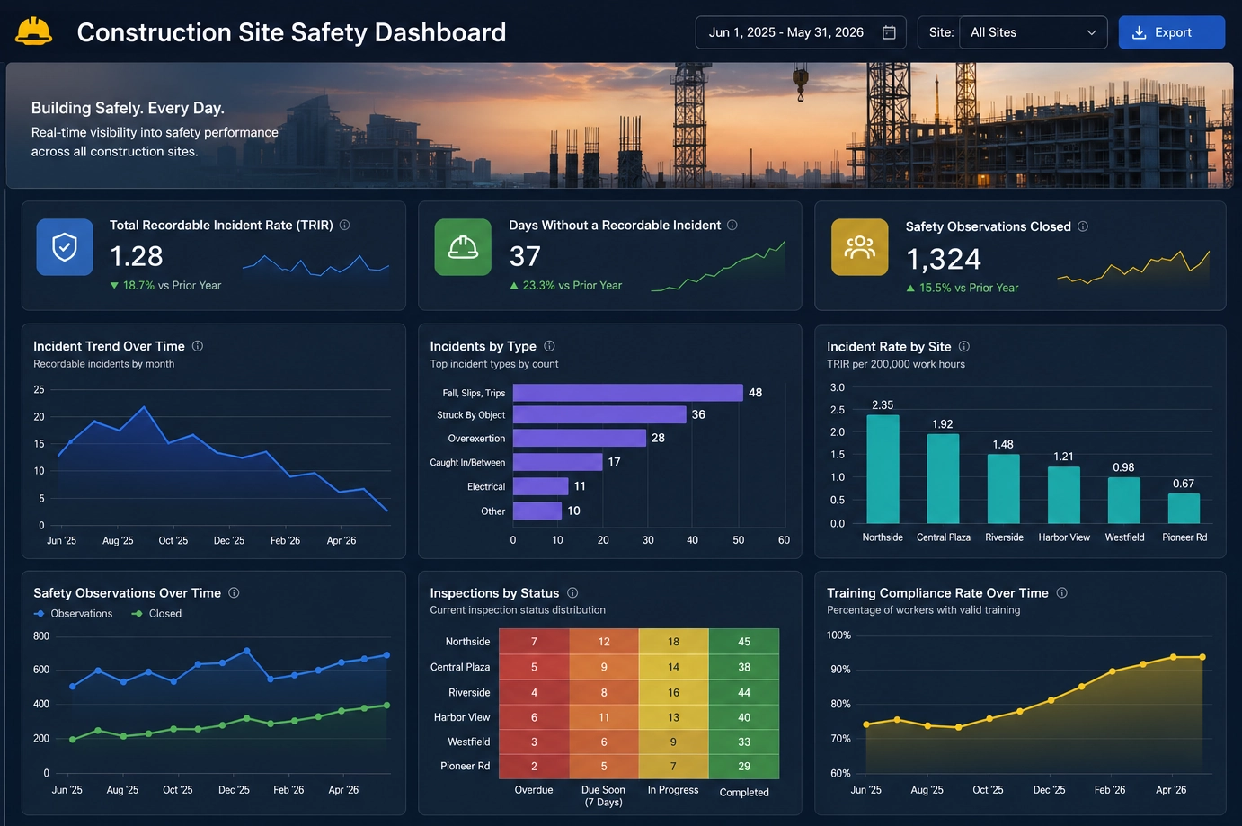
Case Study: Enhancing Construction Site Safety with InetSoft's Microservice-Based Safety Dashboard
SafeBuild Homes, a mid-sized home construction company with multiple ongoing projects across different states, faced increasing safety concerns on its construction sites. With a workforce spread across various locations, tracking safety incidents, compliance measures, and risk assessments became overwhelming. The company relied on spreadsheets and manual reporting, which led to delays in hazard identification and incident response. Additionally, regulatory compliance with OSHA standards was difficult to maintain consistently.
To address these issues, SafeBuild Homes implemented InetSoft's microservice-based safety dashboard. The solution provided a centralized, real-time view of safety performance across all construction sites. By leveraging InetSoft's data mashup capabilities, the dashboard integrated data from various sources, including:
-
IoT-enabled wearables and sensors
-
Incident reporting mobile apps
-
Compliance tracking systems
-
Employee training records
-
On-site safety inspections
Key Features of the Safety Dashboard:
-
Real-Time Incident Tracking – Immediate logging and analysis of accidents, near-misses, and hazards.
-
Regulatory Compliance Monitoring – Automated tracking of OSHA standards, safety audits, and corrective actions.
-
Risk Assessment & Predictive Analytics – Identification of high-risk zones and proactive hazard mitigation.
-
Employee Safety Training Management – Monitoring certification status and training completion rates.
-
Mobile Accessibility – Field supervisors and workers could access reports and submit incident data via mobile devices.
-
Automated Alerts & Notifications – Instant alerts for safety violations or overdue compliance tasks.
Implementation Process:
-
Data Integration – InetSoft's data mashup tool connected multiple data streams into a single dashboard.
-
Customization & Role-Based Access – The dashboard was tailored to different user roles, including site managers, safety officers, and executives.
-
Training & Deployment – Employees were trained on using the dashboard for real-time reporting and analysis.
-
Continuous Monitoring & Improvements – The dashboard evolved with user feedback, enhancing usability and efficiency.
Results & Impact:
-
30% Reduction in Workplace Incidents – Faster reporting and analysis led to proactive safety measures.
-
Improved Compliance – Automated tracking ensured timely audits and adherence to OSHA regulations.
-
Enhanced Decision-Making – Data-driven insights allowed management to allocate resources effectively.
-
Increased Worker Engagement – Employees actively participated in safety reporting via the mobile-friendly platform.
-
Time Savings – Automated processes replaced manual reporting, freeing up valuable time for safety managers.
Safety Dashboard FAQs
What should a safety dashboard include?
A safety dashboard should include core KPIs such as incident rate, near-miss volume, corrective action closure rate, training completion, and PPE compliance. It should also provide visualizations, trend analysis, and alerts that help users quickly identify and address risks.
How do safety dashboards reduce incidents?
Safety dashboards reduce incidents by making risks visible in real time, highlighting recurring issues, and tracking the effectiveness of corrective actions. This enables faster intervention and supports continuous improvement in safety practices.
Which KPIs are most important on a safety dashboard?
Important KPIs include total recordable incident rate, lost time incident rate, near-miss reporting volume, corrective action closure rate, safety training completion, and PPE compliance. The exact mix depends on the industry and risk profile.
How do real-time alerts work in a safety dashboard?
Real-time alerts are triggered when data from incidents, sensors, or KPIs crosses predefined thresholds. The dashboard sends notifications to the appropriate stakeholders and can initiate escalation workflows for critical events.
Can a safety dashboard help with regulatory compliance?
Yes. A safety dashboard can track compliance-related metrics, training status, inspection results, and audit findings. This makes it easier to demonstrate compliance, prepare for inspections, and identify gaps before they become violations.

More Articles About Industry KPIs
-
Visualize And Report
InetSoft’s retail dashboard article explains how retailers consolidate sales, inventory, and store performance KPIs into a single interactive view so managers can spot trends and act quickly. It emphasizes the ability to blend time-series sales with inventory and departmental breakdowns to prioritize promotions and restocking. The page highlights how StyleBI’s features turn raw metrics into actionable retail decisions.
-
Booking And Revenue Metrics
This industry KPI resources hub collects KPI guides across many verticals, from marketplace booking metrics to utilities uptime and inventory days. It provides practical KPI definitions and examples so BI teams can pick relevant measures for their sector and role. The resource is designed to help analysts rapidly locate KPI templates and apply them within InetSoft dashboards.
-
Manufacturing Dashboard KPIs
The KPI dashboard examples page surveys dozens of industry-specific KPI dashboards, including manufacturing, finance, and supply chain templates that show common KPIs like OEE, yield, and defect rates. It demonstrates how visual templates accelerate insight and provide starting points for custom dashboards. The article is presented as a practical gallery for teams building operational scorecards.
-
Visually Digestible KPIs
This healthcare-focused article explains how dynamic KPIs and visualizations improve clinical decision-making and operational efficiency, covering metrics such as patient wait times, safety rates, and treatment costs. It stresses the importance of combining clinical, financial, and operational data to reduce redundant spending and improve outcomes. The piece shows use cases for dashboards that support bedside-to-boardroom analytics.
-
Manufacturing Metrics KPI Dashboard
The manufacturing metrics page outlines the KPIs production managers need—like throughput, downtime, and error counts—and how interactive dashboards surface root causes faster. It highlights real-world examples where joining MES, ERP, and quality data reveals process issues that static reports miss. InetSoft’s mashup capabilities are positioned as the layer that turns transactional data into operational action.
-
Customer Acquisition Cost
The e-commerce KPI article lists nine core online retail KPIs—conversion rate, CAC, AOV, CLV, and more—explaining how each metric exposes strengths and weaknesses in the funnel. It offers practical measurement formulas and optimization suggestions such as A/B testing and bundling to raise AOV and lower CAC. The guidance is aimed at teams who want to tie marketing and UX changes directly to revenue metrics.
-
Patient Satisfaction Metrics
The hospital operations KPI article focuses on patient-centric and operational measures like patient satisfaction, average length of stay, and bed occupancy. It explains how these KPIs inform capacity planning, clinical quality initiatives, and financial management. The page also connects workforce and flow metrics to patient outcomes and operational resilience.
-
Drag And Drop Dashboard
This examples page showcases key performance indicator templates you can build with InetSoft’s drag-and-drop dashboard tool—covering customer service, marketing campaigns, worker safety, and university enrollment. Each template illustrates live KPI refresh behavior and interactive features such as sliders and drilldowns. The collection demonstrates how prebuilt visuals accelerate adoption and reduce time-to-insight.
-
Lead Conversion Rates
The list-of-dashboard-kpis article aggregates KPI guidance across roles—sales, service, safety, and specialized functions—calling out metrics like lead conversion, sales velocity, and opportunity win rate. It’s structured to help teams choose metrics that align to process improvements and forecasting accuracy. The content is useful for organizations building cross-functional scorecards.
-
Patient Lifetime Value
The patient acquisition KPI article covers acquisition metrics for healthcare providers—conversion rate, CPA/CPA, ROI, and patient lifetime value—and explains how these measures drive marketing and operational decisions. It advises on segmentation and channel analysis to improve acquisition efficiency while maximizing long-term value per patient. The article includes practical examples for measuring and optimizing each KPI.