List of Dashboard KPIs
Are you looking for list of dashboard KPIs? InetSoft has compiled hundreds of articles on different industries, departments, and software categories.
What Are the Metrics Tracked on LLM Performance Dashboards? - Large Language Model (LLM) performance dashboards exist to answer a few core questions: How fast is the model? How good are its answers? How much does it cost? and Is it behaving safely and reliably? To do that, they track a set of recurring metrics that fall into four broad categories: latency and throughput, token and cost metrics, quality and safety metrics, and system reliability and user experience metrics. Below is a breakdown of the most common metrics you will see on an LLM performance dashboard, what they mean, and the levers you can pull to affect them in practice. Time to First Token (TTFT) What it is: TTFT is the time from when a request is sent to the model until the first token of the response is received. It captures the “initial wait” before the model starts streaming anything back...

What Key Performance Indicators Are in a Dashboard for 360 Degree Feedback Software? - A Key Performance Indicator (KPI) Dashboard for 360 Degree Feedback Software plays a crucial role in providing a comprehensive view of the performance and effectiveness of the feedback process. This type of dashboard typically includes a range of metrics and indicators that offer insights into various aspects of the 360-degree feedback program. Here's a detailed breakdown of what you might find in such a dashboard: Overall Participation Rates: Metric: Percentage of employees participating in the 360-degree feedback process. Importance: Indicates the level of engagement and the extent to which the organization values and utilizes the feedback process. Feedback Completion Rates: Metric: Percentage of feedback surveys completed by participants. Importance: Reflects the thoroughness of the feedback process and the commitment of participants to providing comprehensive input. Feedback Timeliness: Metric: Average time taken by participants to complete feedback surveys. Importance: Highlights the efficiency of the feedback process and the promptness of participants in submitting their evaluations...
What KPIs and Analytics Are Used on an Air Quality Dashboard? - Air quality management and monitoring have become critical. Air quality dashboards, which provide data and insights on the condition of our atmosphere in real time, have become very useful tools with the emergence of smart technology. This article explores the complex world of analytics and Key Performance Indicators (KPIs) used on air quality dashboards, providing insight into the measures and metrics that inspire decisions for a healthier, cleaner atmosphere. The monitoring of particulate matter concentrations is the central component of any air quality dashboard. Particulate matter, or PM for short, is the term used to describe minute particles or droplets in the air that may enter the lungs by inhalation. The concentrations of these different sized particles are important markers of the quality of the air. PM1, PM2.5, and PM10 KPIs are often used to measure PM concentrations. These three categories correspond to particles with dimensions of 1, 2.5, and 10 micrometers, respectively. Monitoring these levels directs regulatory efforts to reduce pollution and assists in evaluating the possible health concerns linked to breathing in particle matter...
What KPIs and Analytics Are Used on Alumni Engagement Dashboards? - A vital component of the success of higher education institutions is alumni involvement. Active alumni may help their alma mater tremendously by offering financial assistance as well as their knowledge. Institutions use analytics and Key Performance Indicators (KPIs) to assess and enhance alumni involvement. We will look at the key KPIs and data that are used to monitor and improve alumni involvement in this article. One of the key performance indicators (KPIs) for gauging alumni involvement is the participation rate. It displays the proportion of former students who actively support the university via contributions, attendance at events, and volunteer work. An alumni base with a high involvement rate is likely very loyal and connected to one another. Measuring alumni gifts is essential to determining their level of financial involvement. Examining patterns over an extended period is crucial in order to determine if graduates are contributing more or less. Analytics can reveal which appeals or campaigns are more successful in generating contributions...
What KPIs and Analytics Are Used on Building Power Management Dashboards? - Ensuring dependable and effective energy generation is crucial. To monitor and manage their operations, power production businesses and utility providers use a variety of key performance indicators (KPIs) and analytics. Power generating dashboards, which provide a thorough and up-to-date picture of the whole power production process, are essential to this effort. This article examines the statistics and KPIs that are often shown on dashboards for power generating and discusses their importance in the energy industry. One of the key performance indicators (KPIs) in power management is the overall energy usage. It shows the total energy used by a facility over a certain time frame and is often expressed in kWh. Organizations may establish baseline consumption levels and monitor advances in energy efficiency by keeping an eye on this KPI. The quantity of energy used per square footage or unit of output is measured by energy intensity. It's an essential KPI for evaluating energy efficiency across various facilities and benchmarking, allowing one to pinpoint failing or high-performing assets...
What KPIs and Analytics Are Used on Calibration Management Software Dashboards? - Quality control and compliance in numerous sectors depend on calibration management to ensure accurate measuring devices and equipment. Calibration Management Software (CMS) is essential for optimizing and simplifying the calibration process in today's high-tech environment. These software systems provide detailed dashboards that show calibration actions. The crucial analytics and Key Performance Indicators (KPIs) utilized in dashboards for Calibration Management Software will be covered in detail in this article. Monitoring and managing the calibration state of instruments and equipment is the main function of a Calibration Management Software. The current state of equipment calibration is one of the most visible KPIs on CMS dashboards. This KPI gives a brief summary of the number of instruments that need to be calibrated, the number that is in process, and the number that is past due. By analyzing this data, companies may lower the risk of erroneous measurements that might affect product quality and regulatory compliance and guarantee that all equipment are calibrated on time...
What KPIs and Analytics Are Used on Capital Program Management Dashboards? - Through effective resource allocation, risk management, and project success assurance, capital program management plays a critical role in guiding enterprises towards their strategic goals. Key Performance Indicators (KPIs) and analytics are becoming essential tools for decision-makers in this changing environment. Data-driven decision-making is made possible by capital program management dashboards, which are driven by pertinent KPIs and analytics and provide real-time insights. We will examine the importance and effect of the key KPIs and analytics used on capital program management dashboards in this article. The Budget Variance is a key performance indicator (KPI) used in capital program management. It calculates the gap between anticipated and actual expenses, assisting businesses in finding disparities and swiftly addressing them. This KPI is shown in real time on dashboards, which helps project managers keep tabs on expenses and avoid going over budget...
What KPIs and Analytics Are Used on Data Risk Dashboards? - Enterprises have never-before-seen difficulties in safeguarding and controlling their data against diverse threats. In this situation, a Data Risk Dashboard is essential because it gives businesses a thorough picture of the risks and weaknesses they face. These dashboards must include analytics and Key Performance Indicators (KPIs) in order to efficiently monitor and reduce data risks. We will examine the particular KPIs and analytics used on a Data Risk Dashboard in this article, as well as how they support an effective data risk management plan. Number and severity of data breach occurrences are the primary KPIs on a Data Risk Dashboard. This indicator gives a quick overview of how effectively a company protects its critical data. Usually, the dashboard shows trends over time, enabling stakeholders to see trends and evaluate the effectiveness of security precautions. A rise in data breach instances might be a sign of vulnerabilities that need quick fix...

What KPIs and Analytics Are Used on Digital Experience Platform Dashboards? - Success on your website or application depends on your ability to comprehend user behavior and engagement. Digital Experience Platforms, or DXPs, are now considered to be very effective tools for managing and improving an organization's online presence. DXPs deliver significant insights via dashboards that show KPIs and statistics. This article discusses KPIs and analytics on digital experience platform dashboards and the metrics and data points used to assess and enhance digital experiences. Any digital experience revolves on user engagement, and DXPs assist businesses in measuring it successfully. Typically, DXP dashboards incorporate the following KPIs to evaluate user engagement: Page Views: The number of times a certain page has been seen on a website or application is indicated by page views. Tracking page views makes it easier to determine which material is well-liked and which can need some enhancement. Session Duration: The length of a session offers information on how long visitors spend on a website or application in one session. Extended session times are often linked to increased user involvement...
What KPIs and Analytics Are Used on Earthwork Estimating Software Dashboards? - An essential stage of building projects is earthwork estimates, which calls for accuracy and productivity. Earthwork estimate software has become essential to the upheaval in the construction sector brought about by the integration of technology in the digital era. The dashboard, which displays KPIs and statistics, is a significant aspect of many software systems. This article discusses earthwork estimating software dashboard KPIs and analytics, showing how they help construction professionals make educated choices and maximize project results. Because earthwork projects must be completed on time, it is essential to track project progress in order to fulfill deadlines and maintain a seamless construction process. The statistics and KPIs listed below are essential for monitoring the progress of a project. This statistic contrasts the volume of excavation that actually occurred with the aim that was set. A departure from the anticipated volume may indicate impending delays or inefficiencies, necessitating immediate remedial action...

What KPIs and Analytics Are Used on Emergency Medical Services Dashboards? - Emergency Medical Services (EMS) are essential in saving lives in life-threatening circumstances. The efficacy and efficiency of these services are guaranteed by EMS organizations via data-driven decision-making. Dashboards for emergency medical services provide as a single location for tracking, assessing, and enhancing operations. This article discusses EMS dashboard KPIs and analytics to improve emergency response, patient care, and system performance. Some of the most important KPIs for emergency medical services are response time measures. These measurements provide light on how soon emergency medical services may arrive at a location. A few important reaction time measurements are: Response Time (RT): The response time (RT) is the amount of time that passes between receiving a call and an EMS unit arriving on the site. In cases when life is at risk, a quicker reaction time (RT) is indicative of a more prompt and efficient response. Scene Time (ST): ST is the amount of time emergency medical workers spend on the site. It covers patient loading, therapy, and evaluation. Monitoring ST promotes effective patient care and resource allocation. Transport Time (TT): The time it takes to get a patient from the scene to the hospital is measured by TT. Better patient results may result from shorter TTs, particularly in situations when time is of the essence...
What KPIs and Analytics Are Used on Emergency Management Dashboards? - Effective emergency management systems are essential in a world of natural catastrophes, pandemics, and unexpected events. Dashboards for emergency management are essential tools for keeping an eye on and efficiently handling a variety of disasters. These dashboards use KPIs and analytics to give a real-time snapshot of the situation for quick decision-making. We explore the KPIs and data found on emergency management dashboards in this article. Incident severity is one of the most important KPIs in emergency management. This KPI is essential for evaluating the seriousness of the problem and figuring out how much action is needed. There are certain measures for determining the intensity of different sorts of emergencies: Natural Disasters: Severity measures often take into account variables like wind speed, fire intensity, or Richter scale magnitude for natural catastrophes like hurricanes, earthquakes, or wildfires. These indicators aid in the proper allocation of resources and provide a clear picture of the possible effect. Pandemics: Key indices of severity for pandemics such as COVID-19 include the number of cases, hospitalization rates, and fatality rates. The trend of these figures aids in forecasting the burden on the healthcare system and the success of containment strategies. Humanitarian Crises: Measures such as food security indicators, violence indices, or displacement statistics may be used to determine the severity of humanitarian catastrophes, such as refugee crises or wars. Humanitarian groups might use this data to guide their plans for intervention and resource allocation...

What KPIs and Analytics Are Used on Emergency Room Dashboards? - Dashboards in emergency rooms are vital instruments for keeping an eye on and controlling many facets of patient care and operations. Analytics and Key Performance Indicators (KPIs) are essential to achieving this. We will dive into the realm of emergency room dashboards in this post, examining the important KPIs and statistics used as well as their importance in improving efficiency and patient outcomes. Emergency room dashboards are all-inclusive visual displays that provide up-to-date information on a variety of operational factors. For the purpose of observing, evaluating, and improving patient care and operations, they are essential resources for healthcare administrators, physicians, and employees. In order to accomplish these goals, these dashboards' utilization of KPIs and analytics is essential. 1. Patient Throughput Metrics: Effective patient flow is a vital component of emergency room operations. Various KPIs and analytics are used by ER dashboards to monitor and improve patient flow. These consist of: Door-to-Provider Time The amount of time it takes for a patient to see a doctor after arriving at the emergency room is called the "door-to-provider time." This KPI aids in evaluating how well early evaluations and triage are done...
What KPIs and Analytics Are Used on Energy Management Dashboards? - Dashboards for energy management have become essential instruments for tracking and optimizing energy use. Energy use dashboards use KPIs and analytics to help organizations make educated choices and save energy. We will examine the important KPIs and metrics found on energy management dashboards in this post, as well as how they improve energy management. The foundation of energy management dashboards is energy consumption patterns. Stakeholders may recognize patterns and variations in energy use thanks to these trends, which provide a thorough picture of an organization's energy usage. Energy management dashboards help in forecasting and decision-making by displaying current and historical data. Organizations may identify abnormalities and take proactive measures to prevent energy waste by monitoring patterns in energy use. One of the most important KPIs for energy management dashboards is real-time energy usage. Because it offers a real-time feed of energy use, businesses can keep an eye on energy-intensive operations as they take place. Companies can react quickly to surges in energy use and put energy-saving measures into place in real time thanks to this real-time data. Additionally, it assists in locating equipment issues so that timely repairs may be made to avoid wasting energy...
What KPIs and Analytics Are Used on a Forex Trader's Dashboard? - A Forex trader's dashboard typically incorporates key performance indicators (KPIs) and analytics to provide a comprehensive view of market conditions, trading performance, and risk management. Here are some common KPIs and analytics used on a Forex trader's dashboard: Account Balance and Equity: Current Balance: The total amount of funds in the trading account. Equity: The account balance plus or minus any floating profits or losses. Profit and Loss (P&L) Metrics: Net Profit/Loss: The total profit or loss from all closed trades. Daily/Weekly/Monthly P&L: Breakdown of profits or losses over specific timeframes. Trade Metrics: Number of Trades: The total number of trades executed. Winning Percentage: The percentage of trades that resulted in a profit. Average Win/Loss Size: The average size of winning and losing trades...

What KPIs and Analytics Are Used on a Global Trade Management Dashboard? - With global firms and complex supply chains, global trade management (GTM) has gotten more complicated. Businesses use Global Trade Management Dashboards with KPIs and analytics to manage international trade operations. These technologies help firms make educated choices and improve their international operations by providing insights on global commerce. This article discusses Global Trade Management Dashboards' key KPIs and analytics. Ensuring adherence to international trade rules is crucial for every company involved in international commerce. To efficiently monitor and manage compliance, GTM dashboards include a number of KPIs and analytics pertaining to compliance. These measurements usually include: Customs Compliance Rate: The proportion of shipments that adhere to customs laws is tracked by this KPI. A high percentage of customs compliance lowers the possibility of delays or penalties and indicates effective customs paperwork. Denied Party Screening: Trading partners and clients are screened using analytics techniques against forbidden party lists, such the Entity List maintained by the U.S. Bureau of Industry and Security. In order to stay out of trouble with the law, you must make sure that you do not interact with forbidden parties. Import/Export License Management: These KPIs monitor import and export license status and expiry dates to make sure all required permissions are in place for cross-border transactions...
What KPIs and Analytics Are Used on Heat Management Solution Dashboards? - Businesses are depending more and more on cutting edge technology to streamline their operations across a range of sectors. Heat management is a serious issue, particularly in sectors of the economy where temperature control is crucial. Solutions for managing heat have grown to be essential instruments for monitoring and managing temperature-related operations. These systems include advanced dashboards that provide analytics and insights in real time. The analytics and key performance indicators (KPIs) that are shown on dashboards for heat management solutions will be discussed in this article. It is essential to comprehend heat management solutions and their importance before diving into the KPIs and analytics. A variety of technologies and instruments are included in heat management systems, which are intended to monitor and control temperature in diverse processes and settings. They are used in fields where accurate temperature control is crucial, including as industry, energy, healthcare, and even data centers. These solutions are made up of sensors, controls, and often automated systems that cooperate to keep temperatures at ideal levels. Operators and engineers are then able to make educated choices by using dashboards to view the data produced by these components...

What KPIs and Analytics Are Used on Heavy Construction Software Dashboards? - The use of technology has become essential in the field of heavy construction, where projects are large and complex. A key feature of this technology revolution is the use of specialist software dashboards designed for large-scale building projects. These dashboards simplify operations and show project performance using KPIs and analytics. This article discusses heavy construction software dashboard KPIs and analytics and how they improve project management and decision-making. Types of Heavy Construction Projects Highway and Road Construction: Description: This involves the construction, expansion, or maintenance of highways, expressways, and local roads. Significance: Improved road networks enhance transportation, reduce congestion, and stimulate economic development. Bridge Construction: Description: Building, repairing, or upgrading bridges that span bodies of water, highways, or other obstacles. Significance: Bridges facilitate transportation and connect regions, contributing to economic integration. Tunnel Construction: Description: Excavating and constructing tunnels for transportation (such as subways) or utility purposes. Significance: Tunnels provide efficient transportation options and enable infrastructure development in densely populated areas. Airport Construction: Description: Building or expanding airports, including runways, terminals, and associated infrastructure. Significance: Modern airports are essential for global connectivity and economic development...
What KPIs and Analytics Are Used on Heavy Construction Software Dashboards? - The use of technology has become essential in the field of heavy construction, where projects are large and complex. A key feature of this technology revolution is the use of specialist software dashboards designed for large-scale building projects. These dashboards simplify operations and show project performance using KPIs and analytics. This article discusses heavy construction software dashboard KPIs and analytics and how they improve project management and decision-making. Types of Heavy Construction Projects Highway and Road Construction: Description: This involves the construction, expansion, or maintenance of highways, expressways, and local roads. Significance: Improved road networks enhance transportation, reduce congestion, and stimulate economic development. Bridge Construction: Description: Building, repairing, or upgrading bridges that span bodies of water, highways, or other obstacles. Significance: Bridges facilitate transportation and connect regions, contributing to economic integration. Tunnel Construction: Description: Excavating and constructing tunnels for transportation (such as subways) or utility purposes. Significance: Tunnels provide efficient transportation options and enable infrastructure development in densely populated areas. Airport Construction: Description: Building or expanding airports, including runways, terminals, and associated infrastructure. Significance: Modern airports are essential for global connectivity and economic development...
What KPIs and Analytics Are Used on Home Builder CRM Software Dashboards? - CRM software for home builders is essential for managing connections, streamlining operations, and growing the construction sector. Integrating analytics and Key Performance Indicators (KPIs) into these CRMs' dashboards is one of the key components that drives their efficacy. This article explores the particular KPIs and statistics that are essential for improving performance and decision-making in the house construction industry. Any CRM system for house builders must be centered on the need to monitor and enhance sales performance. A range of key performance indicators and analytics are used in the evaluation and improvement of sales force efficacy. Among them are: Lead Conversion Rates: Measuring the proportion of leads that turn into clients gives valuable information about how well the sales funnel is working. Sales Velocity: This KPI calculates how long it takes a lead to pass through the sales funnel in order to pinpoint areas that need work and identify bottlenecks. Opportunity Win Rates: Better forecasting and resource allocation are made possible by having an understanding of the success rates of converting possibilities into completed transactions...

What KPIs and Analytics Are Utilized by Industrial Hygienists? - Industrial hygienists are essential to maintaining the health and safety of employees across a range of sectors. They are in charge of locating and eliminating dangers at work, which may seriously affect the well-being and output of employees. Industrial hygienists use KPIs and analytics to evaluate, analyze, and improve occupational health and safety. The key KPIs and data that industrial hygienists use to try to make workplaces safer will be discussed in this article. An essential component of industrial hygiene is exposure monitoring, which entails calculating the concentrations of potentially harmful materials or agents in the working environment. When evaluating worker exposure to different chemicals, gases, particles, and other potentially hazardous contaminants, this KPI is crucial. To gather information on exposure levels, industrial hygienists use a variety of tools, including dust monitors, gas detectors, and air samplers. When examining this data over time to find patterns, hotspots, and other risk factors, analytics are useful...
What KPIs and Analytics Are Used on Industrial Waste Dashboards? - Managing industrial waste is essential for maintaining environmental sustainability and adhering to regulations. Keeping an eye on and controlling industrial trash may be difficult because of the variety of waste that is produced and the requirement to adhere to strict environmental regulations. Industries use analytics and Key Performance Indicators (KPIs) on industrial waste dashboards to expedite this process. With the help of these instruments, waste management procedures may be enhanced, the environmental effect can be reduced, and compliance can be guaranteed. The many KPIs and metrics found on industrial waste dashboards, as well as their importance, will be discussed in this article. The trash production rate is a crucial key performance indicator that measures the quantity of garbage generated in a certain period of time. It facilitates resource allocation and trash reduction initiatives by assisting companies in understanding the scope of their waste output. Businesses may spot patterns, anomalies, and inefficiencies in their waste generating operations by monitoring this KPI...
What KPIs and Analytics Are Used on an Integrated Receivables Dashboard? - Effective receivables management is essential to preserving stable finances and a steady cash flow. This procedure may be streamlined with the help of an integrated receivables dashboard, which offers real-time insights and facilitates data-driven decision-making. To assist organizations, enhance their accounts receivable processes, we will examine the key performance indicators (KPIs) and analytics that are often utilized on an integrated receivables dashboard in this article. Integrated receivables dashboards are all-inclusive software programs that compile and provide vital data pertaining to the administration of accounts receivable. Financial professionals may monitor, evaluate, and take action on many components of the receivables process from a common hub provided by these dashboards. Now let's explore the particular KPIs and metrics that are essential to these dashboards. To put it another way, DSO counts the typical number of days it takes a business to be paid for a transaction. Faster payment collection is indicated by a reduced DSO, which is usually good news for a business. Organizations are able to evaluate the effectiveness of their credit and collections procedures by monitoring DSO on the integrated receivables dashboard...
What KPIs and Analytics Are Used on a Magazine Publisher's Dashboard? - For success, data-driven insights are now essential. Key Performance Indicators (KPIs) are used by magazine publishers, both conventional and digital, to track, evaluate, and improve their business operations. These KPIs provide useful information on numerous business factors, assisting publishers in making choices and adjusting to changing consumer tastes and market trends. The success of a magazine publisher depends critically on their ability to comprehend how consumers engage with the material. Metrics for measuring audience engagement include a variety of variables that reflect reader interest. Pageviews, time spent on page, bounce rate, and scroll depth are metrics that may be used to measure how engaging the content is and if the target audience finds it interesting. Citation counts are particularly valuable. Tracking metrics connected to subscriptions is crucial for publishers that provide subscription-based business models. Metrics like average revenue per user (ARPU), customer lifetime value (CLTV), and subscriber growth rate provide information on the health of the subscriber base and the total amount of income earned. These data aid in making tactical choices that will increase subscriber retention and draw in new ones...
What KPIs and Analytics Are Used on Mobile Carrier Messaging Network Dashboards? - Our connected world relies on mobile carrier messaging networks for text, multimedia, and other communications. Mobile carriers use KPIs and analytics to monitor, manage, and improve their messaging services as these networks grow more complicated and vital. The KPIs and analytics on mobile carrier messaging network dashboards help maintain the quality and efficiency of these critical communication networks. One of the most basic KPIs for mobile carrier messaging networks is the message delivery success rate. It calculates the proportion of communications that reach their intended recipients successfully. This KPI is crucial for evaluating the messaging service's overall dependability. A network's efficiency may be determined by its success rate; on the other hand, a low success rate might point to problems with message delivery or routing. The time it takes for a message to get from the sender to the receiver is measured by message latency. Because it directly affects user experience, it is a crucial KPI. Users may find it annoying when communications are delayed due to high latency. To make sure that messages are delivered on time, mobile carriers keep a careful eye on message latency...
What KPIs and Analytics Are Used on an MTTR and MTTA Dashboard? - It is essential for organizations to track and evaluate their IT performance given the complexity and interconnection of the world today. Two crucial metrics that aid firms in assessing the effectiveness of their incident management procedures are mean time to resolve (MTTR) and mean time to acknowledge (MTTA). Businesses may learn a lot about their incident response and resolution capabilities by monitoring and analyzing key performance indicators (KPIs) and using analytics on an MTTR and MTTA dashboard. The different KPIs and metrics that are often utilized on an MTTR and MTTA dashboard will be discussed in this post. Average Time to Acknowledge: This KPI monitors the typical amount of time it takes for the support staff to acknowledge an event once it has been reported or identified. It demonstrates the organization's response to occurrences by demonstrating how promptly a problem is acknowledged...
What KPIs and Analytics Are Used on Ocean Freight Booking Platform Dashboards? - The transportation of commodities and products depends heavily on the maritime sector. In particular, maritime freight transportation is a vital link in the supply chain. Dashboards from ocean booking platforms are used by industry experts to improve and expedite the procedures involved in booking maritime freight. These dashboards provide well-informed decision-making by offering real-time insights on a variety of ocean freight logistics-related topics. These dashboards rely on KPIs and analytics to let stakeholders evaluate performance, analyze trends, and make data-driven decisions. This article explores the metrics and KPIs used on dashboards of ocean booking platforms and their importance in the shipping sector. Booking efficiency is one of the core KPIs of an ocean booking platform. This measure evaluates how efficiently and fast cargo can be scheduled on a ship. The time it takes to book cargo, the proportion of successful bookings, and the average time it takes to finish a booking are all revealed by the analytics in this field. By keeping an eye on these indicators, booking process bottlenecks may be found and corrected, increasing both customer happiness and efficiency...
What KPIs and Analytics Are Used in Patient Acquisition Dashboards? - One of the most important components of a successful healthcare company is patient acquisition and retention. Reaching and interacting with prospective patients is just as important as delivering high-quality medical treatment. Healthcare companies and providers monitor their patient acquisition efforts using a range of analytics and key performance indicators (KPIs) to do this. This article will discuss patient acquisition KPIs and analytics and how they may help healthcare firms compete. The proportion of prospective patients who complete a desired activity, such making an appointment, subscribing to a newsletter, or getting in touch with the healthcare provider, is measured by the conversion rate, a core key performance indicator. This KPI is essential since it shows how well a healthcare organization's patient acquisition tactics work. A high conversion rate shows that the website, marketing campaigns, and other channels used by the healthcare organization are effective in persuading prospective patients to proceed with their engagement with the provider. On the other hand, a poor conversion rate might indicate that the organization's message, the accessibility of its website, or its call-to-action buttons need to be improved. Healthcare companies often do A/B tests, examine user behavior on their websites, and fine-tune their marketing strategies in order to increase conversion rates...
What KPIs and Analytics Are Used in Patient Engagement Dashboards? - Modern healthcare places a high value on patient engagement, and physicians work hard to increase patients' participation in their treatment process. Analytics and key performance indicators (KPIs) are essential to reaching this objective. Healthcare practices may optimize their strategy, improve patient outcomes, and improve the entire healthcare experience by monitoring and evaluating different elements of patient involvement. We'll look at the key KPIs and statistics used in patient engagement in the following article. The proportion of prospective patients who complete a desired activity, such making an appointment, subscribing to a newsletter, or getting in touch with the healthcare provider, is measured by the conversion rate, a core key performance indicator. This KPI is essential since it shows how well a healthcare organization's patient acquisition tactics work. A high conversion rate shows that the website, marketing campaigns, and other channels used by the healthcare organization are effective in persuading prospective patients to proceed with their engagement with the provider...
What KPIs and Analytics Are Used on PEO Service Dashboards? - Professional Employer Organizations (PEOs) must use KPIs and analytics to provide efficient and effective services in a changing environment. PEO service dashboards act as the hub, offering data-driven decision-making and real-time insights. The article dissects the layers of data that propel success in this sector by examining the key KPIs and analytics used on PEO service dashboards. PEO operations revolve on the primary duty of accurately handling payroll and guaranteeing adherence to constantly changing rules. This category's key performance indicators include payroll processing timeliness, tax compliance, and mistake rates. By exposing trends via analytics, PEOs may improve overall accuracy and deal with inconsistencies proactively, which paves the way for customer satisfaction and regulatory compliance...
What KPIs and Analytics Are Used on Power Generation Dashboards? - Ensuring dependable and effective energy generation is crucial. To monitor and manage their operations, power production businesses and utility providers use a variety of key performance indicators (KPIs) and analytics. Power generating dashboards, which provide a thorough and up-to-date picture of the whole power production process, are essential to this effort. This article examines the statistics and KPIs that are often shown on dashboards for power generating and discusses their importance in the energy industry. One essential KPI in the production of electricity is capacity utilization. It gauges how well a power plant uses its available production capacity. Real-time capacity utilization percentages are often shown on a power generating dashboard, which helps operators determine if the plant is running as efficiently as possible. For the purpose of maximizing resource allocation, minimizing downtime, and guaranteeing cost-effective operations, capacity utilization monitoring is essential...
What KPIs and Analytics Are Used on Practice Management Dashboards? - The healthcare, legal, financial, and other service industries rely on practice management dashboards. By using analytics and key performance indicators (KPIs), these dashboards are intended to provide a thorough picture of a dental, mental health, or family practice performance. This article will discuss practice management dashboards and the KPIs and statistics that improve patient satisfaction, billing efficiency, profits, decision-making, and success. Prioritizing patient or customer pleasure is crucial in the legal, healthcare, and other service sectors. KPIs and data pertaining to customer happiness, such as Net Promoter Score (NPS) and Customer happiness Score (CSAT), are often included in practice management dashboards. NPS assesses patients' or customers' propensity to refer the service to others, while CSAT evaluates their level of satisfaction with the whole encounter. By examining these data, one may get insight into areas that need improvement and raise the standard of service. In the healthcare industry, like in other service industries, effective scheduling and appointment management are essential. KPIs including provider utilization, appointment no-show rates, and scheduling accuracy are often tracked using dashboards. By preventing any slots from being underutilized and cutting down on patient wait times, these measures aid in the optimization of appointment scheduling...

What KPIs and Analytics Are Used on Real Estate Development Software Dashboards? - Real estate development software allows professionals to make data-driven choices thanks to technology. A crucial component of these software programs is the dashboard, which is a graphic depiction of important metrics and analytics that offers a thorough picture of the state of a project. We will examine the crucial analytics and Key Performance Indicators (KPIs) used in real estate development software dashboards in this article. Large sums of money are often needed for real estate development initiatives. For developers, monitoring the effectiveness of capital deployment is essential. This KPI evaluates how well money is used to advance the project, making sure that resources are distributed as efficiently as possible. A key financial indicator of a real estate project's success is return on investment, or ROI. Dashboard analytics in real estate development software determine return on investment (ROI) by weighing the project's profits against its expenses. Developers may assess the return on their investments with the help of this KPI...
What KPIs and Analytics Are Used on Rental Property Management Dashboards? - In order to optimize profits and simplify operations, property managers are depending more and more on advanced tools and technology. These solutions, including rental property management dashboards, provide a single hub for property performance monitoring. This article discusses how rental property management dashboard KPIs and analytics help property managers make educated choices and improve efficiency. The occupancy rate is one of the core KPIs shown on rental property management dashboards. This measure gives an overview of the proportion of leased apartments to all available units. In order to assess the performance of their real estate assets, property managers keep a careful eye on occupancy rates. A low occupancy rate may suggest poor marketing or property management, whereas a high rate shows significant demand. To maximize occupancy and income, property managers may monitor this KPI and alter price, marketing, and tenant retention...
What KPIs and Analytics Are Used on Reputation Management Dashboards? - The success or failure of a company may be influenced by public perception thanks to the influence of social media and internet platforms. In order to track and improve how a company is seen, reputation management has become an essential activity. Key Performance Indicators (KPIs), measures that provide light on the state of a company's reputation, are essential to successful reputation management. This article discusses reputation management dashboard KPIs and how firms assess, track, and react to their online image. An important KPI in reputation management is online sentiment analysis. It entails keeping an eye on internet reviews, news stories, and social media to gauge if a brand is being linked with good, negative, or neutral opinion. Businesses may react quickly to negative sentiment and magnify positive feedback by using this KPI to identify the general tone of talks about their goods or services...
What KPIs and Analytics Are Used on Requirements Management Dashboards? - Good requirements management is essential to making sure a project or product is delivered successfully. Managing requirements entails acquiring, documenting, and verifying requirements, monitoring changes, and ensuring they meet project goals. This is where requirements management dashboards may assist teams obtain insights, make educated choices, and enhance software or project quality. This article discusses requirements management dashboard KPIs and analytics and their role in the software development lifecycle. A good requirements management method is predicated on effective requirement traceability. It is keeping track of and recording the connections between different needs in order to make sure that every demand can be linked to its original sourceâ€"a business need or stakeholder request, for example. Key KPIs and Analytics: Traceability Matrix Completion Rate: The proportion of needs that have been successfully tracked down to their original sources is measured by this KPI. A greater percentage of completion signifies a stronger traceability, lowering the possibility of criteria being overlooked. Cross-Requirement Impact Analysis: analytics that highlight the effects and interdependencies among requirements. Comprehending these associations facilitates the evaluation of possible impacts of modifications on other prerequisites, hence enhancing change management...
What KPIs and Analytics Are Used on Revenue Cycle Management Dashboards? A critical component of maintaining the financial stability of healthcare businesses is revenue cycle management, or RCM. Organizations use complicated dashboards with analytics and Key Performance Indicators (KPIs) to effectively manage the intricacies of revenue cycles. These resources provide priceless insights into the organization's financial health and support decision-making by stakeholders. This article examines Revenue Cycle Management dashboard KPIs and analytics and their use in financial process optimization. Days in Accounts Receivable (DAR) is one of the cores KPIs in dashboards for revenue cycle management. The average number of days it takes a healthcare company to be paid after rendering services is measured by this KPI. A lower DAR suggests that the company is collecting payments on time and has a more effective revenue cycle. If DAR is high, billing and collections concerns may be present, requiring firms to explore and fix inefficiencies to improve cash flow...
What KPIs and Analytics Are Used on Sales Coverage Analysis Dashboards? - Sustainable development requires that your sales coverage be understood and optimized. Insights into the productivityy and efficiency of your sales activities are provided by sales coverage analysis dashboards, which are necessary tools to lead a high-performance sales team.. These dashboards provide you a thorough overview of your sales coverage via the use of analytics and key performance indicators (KPIs). This article discusses sales coverage analysis dashboards' key KPIs and analytics, revealing how they help companies increase sales and revenue. Tracking the sales pipeline is one of the core elements of a dashboard for sales coverage analysis. This KPI offers a quick overview of the several phases a lead or prospect experiences prior to becoming a client. Among the metrics used in this category are: Conversion Rates: The proportion of leads that advance from one step of the sales funnel to the next is tracked by conversion rates. A well-optimized sales process is indicated by a better conversion rate. Sales Velocity: The pace at which leads pass through the pipeline is measured by sales velocity. It takes transaction closing time into account, which improves revenue forecasting for businesses. Deal Size: Knowledge of deal sizes at various stages of the pipeline can lead to new sources of income. It aids in giving high-value opportunities priority...

What KPIs and Analytics Are Used on a Service Level Monitoring Dashboard? - In order to guarantee ideal service levels and client happiness, it is essential to monitor the functioning of these services. An efficient way for organizations to manage and assess service performance is via the use of a service level monitoring dashboard, which offers a thorough overview of key performance indicators (KPIs) and analytics. The key KPIs and analytics used on a service level monitoring dashboard are examined in this article. Service Uptime: The proportion of time a service is operational is measured by this KPI. It offers information on the service's dependability and accessibility. Downtime Duration: The length of service outages is measured by this statistic. Analysis of downtime patterns reveals recurrent problems and areas for development. Mean Time Between Failures (MTBF): The average interval between servicing failures is calculated using MTBF. It helps in the identification of patterns and possible regions for improving service stability...
What KPIs and Analytics Are Used on Shared Rider System Dashboards? - Data-driven insights play a critical role in the effective administration of shared rider systems. These systems' dashboards act as command centers, providing a thorough view of analytics and key performance indicators (KPIs). This article explores the key performance indicators that make up these dashboards, illuminating how they improve user experience and operational efficiency. The percentage of rides completed is one of the main KPIs tracked on dashboards for shared rider systems. The proportion of started rides that are successfully finished is assessed by this measure. Reliability of the transportation network, smooth user experiences, and operational efficiency are all indicated by a high completion rate. On the other hand, a falling completion rate might indicate problems with the app, driver availability, or route optimization, which would need quick fixes...
What KPIs and Analytics Are Used on a Solar Power Generation Dashboard? - Solar energy has become a leader in renewable energy, offering a sustainable and environmentally beneficial way to meet our energy demands. As the solar business grows, it becomes more critical to monitor and optimize solar power production. An invaluable resource for this is a Solar Power Generation Dashboard, which provides information via an abundance of Key Performance Indicators (KPIs) and analytics. We explore the key performance and efficiency indicators of solar power systems in this article. The solar panels are the essential component of any solar power producing system. One important KPI that has a direct bearing on the system's overall performance is the efficiency of these panels. The ratio of the panels' energy output to their energy intake from sunlight is known as solar panel efficiency. Real-time data on each panel's efficiency are provided via a solar power generation dashboard, which helps operators quickly detect failing panels. Ensuring a good return on investment and maximizing energy output are made possible by this KPI...
What KPIs and Analytics Are Used on Subcontractor Software Dashboards? - Successful cooperation with subcontractors is essential for construction and project management. With its ability to streamline communication, project tracking, and general efficiency, subcontractor software has become a potent tool. Subcontractor software dashboards benefit from KPIs and analytics, which provide stakeholders meaningful information. In order to improve decision-making and project results, we explore the particular KPIs and analytics used on subcontractor software dashboards in this article. Timeline compliance is one of the main issues in building projects. KPIs pertaining to project progress and schedules are often included in subcontractor software dashboards. Metrics that provide project managers a thorough picture of how well the project is doing include task completion rates, milestone accomplishments, and deadline adherence. With real-time monitoring, any delays may be quickly identified and prompt interventions can be made to maintain the project on schedule...
What KPIs and Analytics Are Used on Sustainability Software Dashboards? - Businesses navigating the complicated world of environmental, social, and governance (ESG) depend on sustainability software dashboards. These dashboards provide a thorough picture of a business's sustainability initiatives by using sophisticated analytics and Key Performance Indicators (KPIs). The main KPIs and metrics shown on these dashboards are examined in this article, which also clarifies their role in promoting a more sustainable future. A key performance indicator (KPI) for sustainability software dashboards is the carbon footprint of a business. The overall greenhouse gas emissions that are both directly and indirectly related to an organization's operations are measured by this KPI. Businesses may establish emission reduction objectives and find areas for improvement by using advanced analytics to help break down emissions by source...
What KPIs and Analytics Are Used on Subscription Billing Dashboards? - SaaS, streaming, and e-commerce enterprises have all adopted subscription-based business models in recent years. Managing subscription models successfully demands a comprehensive grasp of KPIs and analytics to assess company health. Dashboards for subscription billing are an excellent resource for tracking and evaluating these important variables. This article discusses subscription billing dashboard KPIs and analytics and their importance in enhancing subscription-based company operations. For organizations that rely on subscriptions, Monthly Recurring Revenue (MRR) is perhaps the primary key performance indicator. It stands for the consistent and reliable monthly income that subscriptions bring in. Add together all of your clients' monthly membership costs to determine MRR. MRR aids companies in comprehending the growth trajectory and stability of their revenue stream. MRR may be further divided into three categories: Churn MRR (from customers canceling their subscriptions), Expansion MRR (from current customers upgrading or adding services), and New MRR (from new customers). Businesses may identify areas in need of attention by tracking these components...
What KPIs and Analytics Are Used on Waste Collection Software Dashboards? - Businesses are using technology to improve productivity and simplify processes. This change has also been welcomed by waste management, an essential component of urban infrastructure, via the use of advanced waste collection software (WCS). These systems not only help with improved administration, but they also provide insightful data via analytics and Key Performance Indicators (KPIs). We explore the key KPIs and statistics found on waste collection software dashboards in this article, providing insight into how these measurements support efficient trash management. Optimizing collection routes to decrease fuel consumption, vehicle wear and tear, and ultimately reduce costs is one of the main difficulties in garbage management. Dashboards for waste collection software use a range of KPIs and data to optimize routes: garbage management teams may locate hotspots with the use of collection density heatmaps, which show the concentration of garbage in certain places. Managers may make route optimizations to guarantee effective garbage collection in high-density areas by examining these heatmaps...
What KPIs and Analytics Are Used on a Water Treatment Plant Dashboard? - In order to guarantee that populations get clean, safe water, water treatment facilities are essential. These facilities use analytics and key performance indicators (KPIs) on their dashboards to monitor, optimize, and enhance their operations as technology develops. This article discusses water treatment plant dashboard KPIs and analytics, highlighting efficiency and reliability tools. A collection of KPIs for tracking water quality are the fundamental components of any dashboard in a water treatment facility. To make sure the water satisfies regulatory requirements, parameters including turbidity, pH levels, dissolved oxygen, and chemical concentrations are essential. Plant operators can quickly spot abnormalities and take remedial action to ensure water quality when these parameters are monitored in real-time. KPIs pertaining to treatment efficiency provide valuable information about the efficacy of the plant's water purification process. Measures including organic matter, virus, and bacterium clearance rates are used to assess how well the treatment methods are working. Analyzing treatment efficiency KPIs helps to make water treatment operations more economical and sustainable by maximizing resource use and reducing waste...
What KPIs and Analytics Are Used on a Worker Safety Dashboard? - Organizations are depending more and more on cutting-edge instruments and technology in the field of occupational health and safety in order to track and enhance worker safety. The Worker Safety Dashboard, a centralized center that offers real-time insights into numerous areas of workplace safety, is one such product that is becoming more and more popular. Analytics and Key Performance Indicators (KPIs) are essential to the effectiveness of these dashboards. Let's examine the particular KPIs and statistics that these dashboards utilize to promote workplace safety. Total Incident Rate (TIR): This KPI determines the overall number of occurrences per 100 workers over a certain period of time. It is a basic indicator that gives an overview of a workplace's overall performance in terms of safety. Severity Rate: It's critical to evaluate the occurrences' seriousness. The number of days missed as a result of work-related events per 100 full-time workers is measured by the severity rate KPI. This aids businesses in comprehending how occurrences affect the wellbeing and productivity of their personnel...
What KPIs Are Monitored on an Incident Management Dashboard? - Effective incident management is a difficulty for businesses in many sectors. An essential tool for enterprises is an incident management dashboard, which offers real-time visibility and insights into event-related data so they can react quickly and with knowledge. Organizations use key performance indicators (KPIs) and analytics to assess the efficacy of incident management procedures. In order to assist firms, enhance their incident management procedures and boost overall operational efficiency, this article examines the important KPIs and analytics utilized on an incident management dashboard. Incident resolution time is one of the main KPIs used on an incident management dashboard. It counts the number of hours from the time an event is reported and when it is finally resolved. This KPI aids companies in identifying bottlenecks or potential development areas and offers insights into the effectiveness of the incident management process. It is possible to further segment incident resolution time into subcategories like time to identify, time to escalate, and time to resolve...
What KPIs Are Used on Crisis Management Dashboards? - Including anything from severe weather events to public health crises to cyberattacks and economic downturns. For an organization to minimize harm, ensure the safety of its stakeholders, and maintain its reputation, crisis management must be done effectively. Dashboards for crisis management have become effective tools for tracking, evaluating, and reacting to crises in real time. These dashboards' Key Performance Indicators (KPIs) are essential for helping firms gauge the severity of a crisis, monitor response activities, and make defensible judgments. This article examines the critical KPIs used on crisis management dashboards to effectively traverse challenging situations. KPIs that assess the situation's severity are at the center of any crisis management dashboard. These indicators aid companies in comprehending the crisis' possible effects on their activities, reputation, and stakeholders. Measures like "Magnitude of Impact" place a number on how big the issue is, whether it's a natural catastrophe or a hit to one's image. For emergencies that have the potential to grow quickly, like infectious disease outbreaks or cyberattacks, "Rate of Spread" KPIs are essential. Organizations may spend resources efficiently and put responsive plans into place by monitoring these KPIs...
What KPIs Are Used on a Fund Management Company's Dashboard? - Monitoring and assessing performance is crucial for a fund manager. Fund management organizations (hedge funds, pension funds, trust funds, mutual funds, and corporate funds) significantly depend on Key Performance Indicators (KPIs) to gauge performance, spot trends, and make defensible judgments about the assets they are tasked with managing on behalf of customers. The key performance indicators (KPIs) that make up a fund management company's dashboard are examined in this article, giving light on how these measurements guide investment strategies and promote financial success. Asset Under Management (AUM), a key performance indicator (KPI), measures the total amount of money that a firm manages. Monitoring AUM growth gives the business information about how well it can draw in new customers and keep existing ones, as well as how well-liked its investment options are...
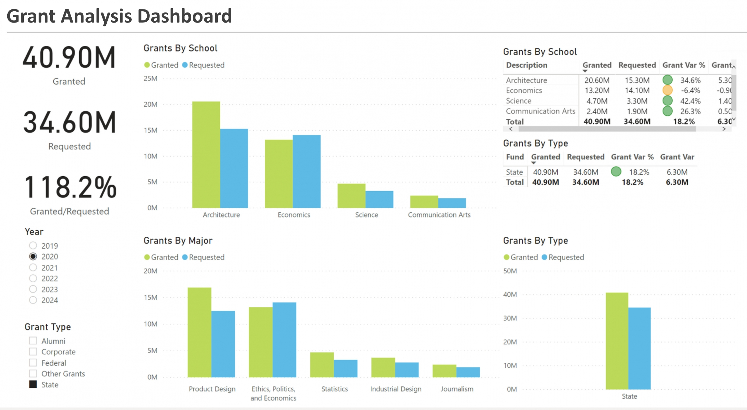
What KPIs Are Used in Grant Management Dashboards? - Receiving a grant is an exciting accomplishment for an organization, but it carries some hefty responsibilities. Grantors typically require proof of appropriate and effective use of their funds, so you must keep thorough records, which requires in-depth insight into your operations. Business intelligence can offer that insight through grant management dashboards. Grant management dashboards can ensure you use your funds wisely and streamline regulatory compliance. However, like any technology, you must use them effectively to experience their full potential. That starts with tracking the right key performance indicators (KPIs). Before doing anything else, you must understand what a grant management dashboard is. These tools offer a single place to view, analyze and share your grant's key metrics. A visualization dashboard provides the most intuitive way to understand information, which is crucial for something as highly regulated as grants. Having all the data you need in one place makes it easier to spot and address errors or alarming trends before they cause larger problems. It also makes it easier to give other parties, like your grantor, a complete picture of your operations, which is important for transparency. Real-time reporting features take these advantages further...
What KPIs Are Used on Investor Relations Dashboards? - A company's connection with its shareholders, future investors, and the financial community is crucially influenced by investor relations (IR). Investor relations dashboards are now crucial tools for giving stakeholders a succinct but thorough picture of a company's performance in the digital era. These dashboards' key performance indicators (KPIs), which provide helpful insights into many business elements, are their basis. This article explores the key KPIs used on investor relations dashboards and how they aid in making well-informed decisions. Perhaps the most important KPIs on investor relations dashboards are financial metrics. Investors can clearly see a company's profitability and financial stability via metrics like sales growth, earnings per share (EPS), and net profit margin. These indicators are often shown graphically to illustrate patterns over certain time periods and to assist in the evaluation of a company's financial health...
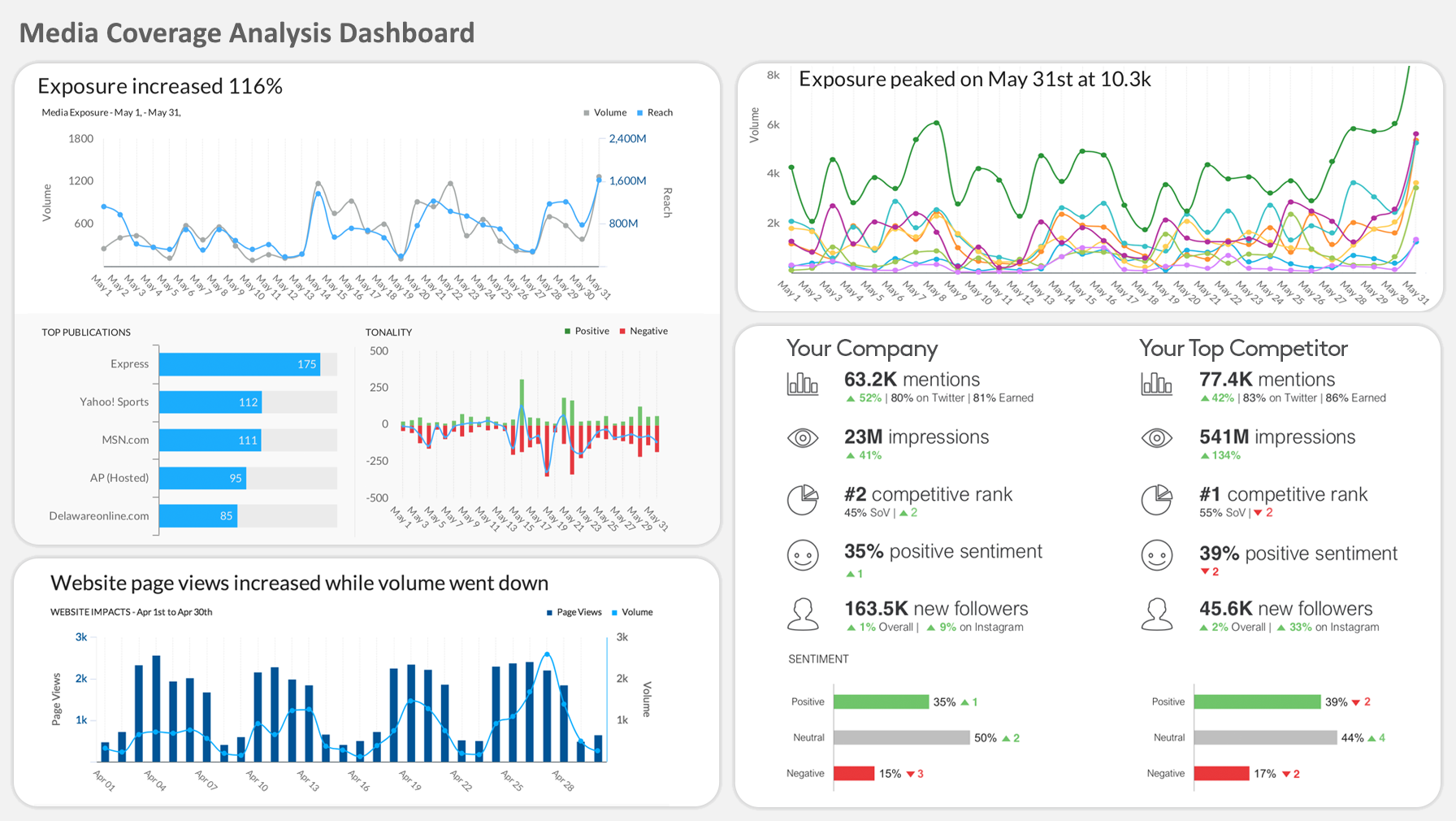
What KPIs Are Used on Media Coverage Analysis Dashboards? - Dashboards for coverage analysis are essential for determining how well a company's tactics are connecting with the target market. They provide a thorough review of key performance indicators (KPIs) that assess the success of advertising campaigns, marketing initiatives, and communication plans. In this article, we'll examine the crucial KPIs used on dashboards for coverage analysis and examine how they help with strategic planning and informed decision-making. Fundamental metrics for evaluating a campaign's early exposure include reach and impressions. While impressions represent the overall number of times the material has been shown, reach describes the specific number of people who have seen it. These indicators provide light on the campaign's general exposure and possible influence. The monetary value of the media attention a firm has gotten is measured by its media value. It figures out what the business would have paid if it had bought the same quantity of advertising space. For calculating the ROI of earned media and comprehending the financial effects of media coverage, this KPI is essential...
What KPIs Are Used on Media Monitoring Dashboards? - It's essential to stay up to date on the public view of your business and its internet presence. Media monitoring has become a crucial discipline that aids businesses in extracting information from massive volumes of web data. Dashboards for media monitoring work as command centers by providing key performance indicators (KPIs) that provide useful information. This article examines the important KPIs found on media monitoring dashboards and their importance in determining the effect, sentiment, and visibility of a business. An important KPI is monitoring brand mentions across multiple media outlets. It illustrates how widely your brand is being spoken about online. This statistic takes into account the reach and quality of those mentions in addition to their number. Analyzing where and by whom your brand is being discussed may help you determine its general exposure...
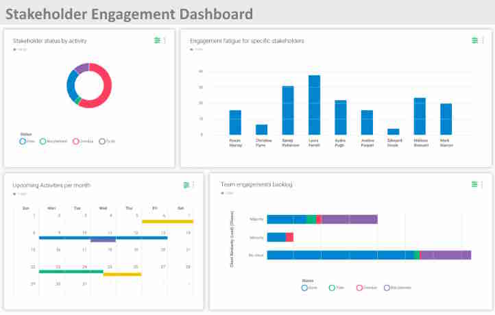
What KPIs Are Used on Stakeholder Engagement Dashboards? - Across sectors, stakeholder involvement has become a strategic requirement for firms. Key performance indicators (KPIs) must be monitored and evaluated as part of a successful stakeholder engagement plan in order to determine how well communication, relationship-building, and overall engagement initiatives are working. Stakeholder engagement dashboards are essential for visualizing these KPIs and provide useful information that helps with decision-making. In this post, we examine the crucial KPIs that are often shown on stakeholder engagement dashboards and explain how they impact organizational performance. The first step in stakeholder involvement is reach. A baseline for evaluating the initial effect is established by counting the people who have been exposed to the organization's messaging, information, or events. Impressions provide a more precise estimate of the audience's potential size that has seen or engaged with the organization's activity. These metrics provide information on how well the company can engage its stakeholders and how well the communication channels work...
What KPIs, Metrics, and Charts Would a Developer of Corrective and Preventive Action Software Include When Embedding a BI Application? - Corrective and Preventive Action (CAPA) software is designed to help organizations manage and track the resolution of issues and incidents, as well as to implement measures to prevent their recurrence. The key performance indicators (KPIs), metrics, and charts displayed in CAPA software typically focus on various aspects of the corrective and preventive action process. Here are some examples: Number of CAPA Requests: This metric tracks the total number of CAPA requests initiated within a specific period. It provides an overview of the volume of issues and incidents being addressed by the organization. CAPA Cycle Time: Measures the time taken from the initiation of a CAPA request to its closure. It helps assess the efficiency of the corrective and preventive action process and identify bottlenecks that may prolong resolution times. Root Cause Analysis Effectiveness: Evaluates the effectiveness of identifying root causes of issues or incidents. It may include metrics such as the percentage of CAPAs with clearly defined root causes or the percentage of CAPAs where root causes were accurately addressed...
What KPIs for a Loan Management Dashboard - Consumer lending is a growing industry as more people borrow money to buy homes, finance their studies and meet other financial obligations. Lenders and financial institutions offer a wide range of loans, but these companies must have a good understanding of their performance to remain competitive. As a lender, tracking your company's performance may be challenging. So many numbers are floating around, so a dashboard is an easy way to track your performance and measure your KPIs. Using a dashboard also helps you to arrange and organize your data in a way that is easy to read and works for your business. You can pull automatically generated reports and view your vital information in easy-to-read tables and graphs. Using a dashboard saves time by eliminating the need to manually arrange data and put together information in a meaningful way. Your dashboard is typically a visual representation of your KPIs so that you can pick up on trends, track progress and decide more effectively. If you're a loan company, consider including the following KPIs and analytics on your dashboard...
What KPIs and Metrics Are Tracked on an Optimizely Dashboard? - Optimizely is an experimentation and optimization platform that helps businesses improve their digital experiences through A/B testing, multivariate testing, and personalization. The platform provides various key performance indicators (KPIs) and metrics to track the effectiveness of experiments and optimizations. Here are some common KPIs and metrics that are typically tracked on an Optimizely dashboard: Conversion Rate: The percentage of users who complete a desired action, such as making a purchase, signing up for a newsletter, or filling out a form, out of the total number of visitors to a webpage or app variant. Click-Through Rate (CTR): The percentage of users who click on a specific element, link, or call-to-action (CTA) within a webpage or app variant, typically used to measure the effectiveness of different designs or messaging. Engagement Metrics: Metrics related to user engagement, such as time spent on page, pages per session, bounce rate, scroll depth, and interactions with specific elements (e.g., buttons, videos, sliders)...
What KPIs and Metrics Are Used on Dashboards for Lawyers? - Dashboard metrics for lawyers often focus on various aspects of caseload management, client satisfaction, financial performance, and operational efficiency. Here are some key performance indicators (KPIs) and metrics commonly used on dashboards for lawyers: Case Status and Progress: Tracking the status and progress of individual cases is essential for managing workload and meeting deadlines. Metrics may include the number of open cases, cases closed, cases pending, and the average time to resolve cases. Client Satisfaction: Client satisfaction surveys or feedback mechanisms can provide valuable insights into the quality of legal services provided. Metrics may include client satisfaction scores, Net Promoter Score (NPS), or the percentage of clients who would recommend the firm to others. Billable Hours and Utilization Rate: Billable hours are a critical metric for measuring the productivity and revenue-generating capacity of lawyers. Metrics may include total billable hours recorded, billable hours per lawyer, and the utilization rate (percentage of billable hours vs. total available hours)...
What KPIs to Put on a Field Service Dashboard? - The most crucial KPIs that have to be on a field service dashboard are: First-Time Fix Rate (FTFR) The proportion of works that are finished during the first visit to the customer's site is known as the first-time fix rate (FTFR). A high FTFR shows that the field technician has the necessary knowledge, equipment, and supplies to address the problem at the first visit. Also, it indicates that the client is content with the service and does not need a follow-up appointment. Less customer satisfaction, higher expenses, and a negative effect on the company's image may all result from poor FTFR. Service Level Agreement (SLA) Compliance The proportion of tasks that are finished within the specified period is known as service level agreement (SLA) compliance. The SLA outlines the level of service that the company has committed to provide to its clients. For client retention and happiness, SLA compliance is essential. Low SLA compliance may result in fines, lost income, and a bad image for the company...
What KPIs to Put on an FMCG Dashboard? - It can be a pain to manage all the moving pieces of your supply chain, especially when the goods at stake fall under the fast-moving commodities category. An FMCG dashboard is a real-time analytical tool that assists in meeting financial objectives by taking into consideration the unique requirements of popular fast-moving consumer items like food and beverages. It helps to satisfy high demand, improve purchasing and selling tactics, and cover shortages.Well over half of all consumer expenditure goes into fast-moving consumer goods (FMCGs), which include snacks, soft drinks, cleaning supplies, and cosmetics. As a result, FMCG companies must keep track of a vast array of KPIs, including those specific to each product, market, and even store location. FMCG businesses also look at the supply chain that moves their products from the raw ingredients to the retailer to spot inefficiencies, expenses, and other problems. Metrics including stock levels for each store, typical time to sell, product margins, shelf exposure and availability, delivery costs, fulfillment statistics, brand preference versus competitors, as well as sustainability data are frequently included in FMCG KPIs...
What KPIs Should Be on a Construction Project Management Dashboard? - 1. Downtime hours Downtime is one of the worst drivers of cost overruns. Downtime can result from outside factors, such as weather, waiting for shipments, equipment breaking, or internal ones such as work stoppages, sick employees, or accidents. Two main groupings of these metrics are equipment downtime and labor downtime. 2. Installation defect % Workers skill-levels, training, and supervision influence a construction team's workmanship. The percentage of improperly completed projects tells you how carefully they follow instructions and complete their duties. The installation defect rate can be measured through random audits or by having managers and team-leaders verify the quality of their direct reports' work. 3. Supplier defect % Conducting inspections of vendor shipments let's you count the defect rate among raw materials, equipment, tools and other supplies. Tracking this information tells you about the reliability and consistency of your construction suppliers. Having consistent materials is important for producing buildings that are structurally sound. This metric can help you make choices about where to purchase materials...
What Makes a Dashboard Easy to Use? - Creating an easy-to-use dashboard involves a thoughtful combination of design, functionality, and user experience considerations. Here are several key factors that contribute to making a dashboard user-friendly: Clarity of Purpose: Clearly define the purpose of the dashboard. Users should instantly understand what information it provides and how it adds value to their tasks or decision-making processes. Intuitive Design: Design the dashboard with an intuitive layout. Place important elements prominently, and use logical grouping for related information. Users should be able to navigate effortlessly without feeling overwhelmed. Customization Options: Allow users to customize the dashboard based on their preferences and needs. This may include the ability to rearrange widgets, choose specific metrics, or adjust the layout to suit individual workflows. Consistent Visual Language: Maintain a consistent visual language with a cohesive color scheme, font style, and iconography. This helps users easily associate different elements and understand their significance...
What Makes InetSoft's Dashboard Software Simple to Use? - InetSoft's dashboard software is designed with a focus on simplicity and user-friendly features, making it accessible to a broad range of users, including those without extensive technical expertise. Here are key factors that contribute to the simplicity of use in InetSoft's dashboard software: Intuitive Drag-and-Drop Interface: The software features an intuitive drag-and-drop interface that allows users to easily add, arrange, and customize dashboard components without the need for coding or complex configurations. User-Friendly Design Tools: InetSoft provides design tools with a user-friendly layout, making it straightforward for users to create and modify dashboards. Design elements are logically organized, enabling users to navigate and customize with ease. Pre-built Templates and Widgets: The software offers pre-built templates and widgets that users can leverage as starting points for their dashboards. These templates simplify the process of creating common dashboard layouts and visualizations...
What Makes a Good Internet of Things Dashboard? - The user interface of an IoT platform known as an IoT dashboard allows users to monitor and communicate with connected devices using graphs, charts, and other UI components. By visualizing the data from your connected devices, dashboards let you take control of every element of your connected devices and get perspective on your surroundings. Users may easily personalize their dashboards without impairing the processing of device data since IoT dashboards lie on top of the essential functionality offered by an IoT platform. They may transfer IoT data to their own tools for graphical data visualization, reporting, analytics, CRM, etc. in addition to employing dashboards. Companies are now understanding that the ability to use IoT Dashboards to remotely monitor equipment will increase their resource efficiency and their capacity to provide more value to their consumers. The next question is, "How does an organization gain this capability?...
What Makes for a Good Turnkey Dashboard Vendor? - Choosing a turnkey dashboard vendor is a crucial decision for organizations seeking to implement data visualization solutions quickly and efficiently. A good turnkey dashboard vendor should offer a range of features, services, and support to meet the unique needs and requirements of their clients. Here are some key factors that make for a good turnkey dashboard vendor: Ease of Use: The dashboard platform should be intuitive and user-friendly, allowing non-technical users to easily create, customize, and interact with dashboards without extensive training or coding skills. A drag-and-drop interface, pre-built templates, and customizable widgets contribute to ease of use. Customization Options: While offering pre-built templates and widgets for rapid deployment, a good turnkey dashboard vendor should also provide extensive customization options to tailor dashboards to the specific needs and branding of each organization. Customizable themes, colors, logos, and layouts enable organizations to create visually appealing and branded dashboards. Data Integration Capabilities: The dashboard platform should support seamless integration with a wide range of data sources, including databases, APIs, cloud services, and third-party applications. It should provide connectors or APIs for accessing and aggregating data from disparate sources, enabling comprehensive data analysis and visualization...

What Metrics Are Tracked on ERP Dashboards? - Enterprise Resource Planning (ERP) solutions are used by businesses to improve efficiency and simplify operations. ERP dashboards act as a central repository of data, giving instantaneous insights into numerous facets of company performance. Organizations use Key Performance Indicators (KPIs) and analytics to efficiently monitor and evaluate the performance of an ERP system. In order to promote informed decision-making and improve business operations, this article examines a complete list of KPIs and analytics often used on ERP dashboards. Revenue Growth: This KPI gauges the rate of revenue growth over a certain time period, giving information about the company's financial stability and potential for expansion. Profit Margins: Monitoring profit margins ensures profitability and identifies opportunities for development by assessing the effectiveness of operations and pricing strategies. Cash Flow: Monitoring working capital, managing liquidity, and spotting possible surpluses or gaps in cash flow are all made easier for firms by tracking cash flow...
What Metrics Are Tracked on a Retrieval-Augmented Generation (RAG) System Dashboard? - A Retrieval-Augmented Generation (RAG) system dashboard exists to answer one core question: “Is the system reliably finding the right information and using it to generate trustworthy answers at an acceptable cost and speed?” To do that, it tracks metrics across three layers: retrieval, generation, and system/business performance. By monitoring retrieval metrics, you ensure the system pulls relevant information from your knowledge base. Through generation metrics, you validate that answers are accurate and faithful to the retrieved content...
What Metrics Are Used on Field Service Dashboards? - In order to ensure efficient operations, effective customer service, and efficient resource allocation, field service management is essential. Organizations depend on field service dashboards with key performance indicators (KPIs) and analytics to accomplish these goals. These dashboards provide in-the-moment insights into numerous fields operating areas, allowing firms to make fact-based choices. We will examine a full list of KPIs and analytics often used on field service dashboards in this post. First-Time Fix Rate: The proportion of service calls that are resolved during the first visit is tracked by this KPI. High first-time repair rates are a sign of productive field personnel and well-planned schedule, which translate into lower costs and more customer satisfaction. Response Time: This indicator measures how quickly field technicians react to a service call. Organizations may identify bottlenecks and streamline their dispatching procedures by monitoring response time, which leads to speedier customer service. Mean Time to Repair (MTTR): The mean time to repair or remedy a problem, or MTTR, is measured. Businesses may identify areas for development and put downtime-reduction plans into action by studying this KPI...
What Metrics Do Managers of Sporting Events Track on Dashboards? - Managers of sporting events track a variety of metrics on dashboards to monitor and optimize various aspects of event planning, operations, and fan engagement. These metrics help managers make informed decisions, improve the overall experience for participants and spectators, and maximize revenue opportunities. Here are some key metrics that managers of sporting events commonly track on dashboards: Ticket Sales and Attendance Metrics: Ticket Sales: Monitoring ticket sales volume, revenue generated, and ticket distribution across different seating sections or ticket categories. Attendance: Tracking attendance figures, including total attendance, attendance by ticket type, and attendance trends over time. Fan Engagement Metrics: Social Media Engagement: Monitoring social media mentions, interactions, and sentiment related to the event on platforms such as Twitter, Facebook, and Instagram. Fan Interactions: Tracking fan interactions and feedback received through online channels, fan forums, and customer support channels...
What Types of Business Dashboards Should You Consider? - The decision of what features their dashboards should include consumes a lot of time for firms thinking about implementing business intelligence dashboards. However, figuring out what kind of dashboard would suit your demands is an even better method to decide what functions to include. Different BI Dashboards Three major categories may be used to classify BI dashboards. They are often employed by the organization's top leaders. They provide a summary of the overall company performance. They provide information on key performance indicators (KPIs) that are crucial for gauging the success of the company. These dashboards provide executives a clear picture of the state of the business. They are more qualified to decide on the direction of the business and choose the most effective strategy for its development...
What Would the Developer of Deviation Management Software Put on a Dashboard? - The dashboard for Deviation Management Software serves as a central hub for users to monitor, analyze, and manage deviations from established processes, standards, or requirements within an organization. It provides real-time visibility into deviations, their status, impact, and resolution progress. Here are several key components and metrics that the developer might include on the dashboard: Deviation Overview: A summary of total deviations logged within a specified time period. Breakdown of deviations by category (e.g., quality, safety, regulatory) or department. Trend analysis showing the number of deviations over time. Deviation Status: Distribution of deviations by status (e.g., open, in progress, closed). Aging analysis displaying the duration of open deviations to identify overdue items. Severity and Impact: Categorization of deviations by severity level (e.g., minor, moderate, major). Analysis of deviations by potential impact on operations, compliance, or customer satisfaction...
What Would the Developer of Out of Specification Software Put on an HTML5 Dashboard? - The dashboard for Out of Specification (OOS) Software serves as a central interface for users to monitor, analyze, and manage instances where products or processes deviate from predefined specifications or quality standards. It provides real-time visibility into OOS incidents, their status, root causes, and resolution progress. Here are several key components and metrics that the developer might include on the dashboard: OOS Incident Overview: A summary of total OOS incidents logged within a specified time period. Breakdown of incidents by product, process, or testing method. Incident Severity and Impact: Categorization of OOS incidents by severity level (e.g., critical, major, minor). Analysis of the potential impact of OOS incidents on product quality, compliance, and customer satisfaction. Root Cause Analysis: Breakdown of OOS incidents by root cause (e.g., equipment malfunction, human error, raw material variability). Trends in root causes to identify recurring issues and areas for improvement. Investigation and Resolution Progress: Status of investigations and corrective actions associated with OOS incidents. Timeline or Gantt chart showing the progress of investigation, analysis, and resolution activities...
What Would a Home Improvement Store Display on a KPI Dashboard? - Sales Performance: Total Sales Sales by Department (e.g., lumber, tools, paint) Sales by Product Category Average Transaction Value Sales Growth Percentage Inventory Management: Inventory Turnover Rate Stockouts and Backorders Inventory Levels by Category Slow-Moving or Obsolete Inventory Reorder Point Attainment Customer Engagement: Customer Foot Traffic Conversion Rate (Percentage of visitors making a purchase) Customer Satisfaction Scores Return Customer Rate Average Customer Wait Time...
What You Should Know About Executive Dashboards? - Data may be seen in real time in a wide variety of ways. Executives find it simpler to conduct analyses and come to choices when data is accessible in a single location. In this post, we'll define an executive dashboard and discuss the advantages of using it for reporting. We'll also provide advice on how to create your own executive dashboard while maximizing its benefits. How do executive dashboards work? Executive dashboards are personalized user interfaces that provide your company's data graphically and in an orderly fashion. You may gather data using executive dashboards to monitor team objectives, make adjustments, spot patterns, forecast outcomes, and more. Your executive dashboards promote strategic decision-making by showing the most important facts for your business in real time, eliminating the need for further, pointless research...