Easy Dashboards: Transforming Raw Data into Visual Information
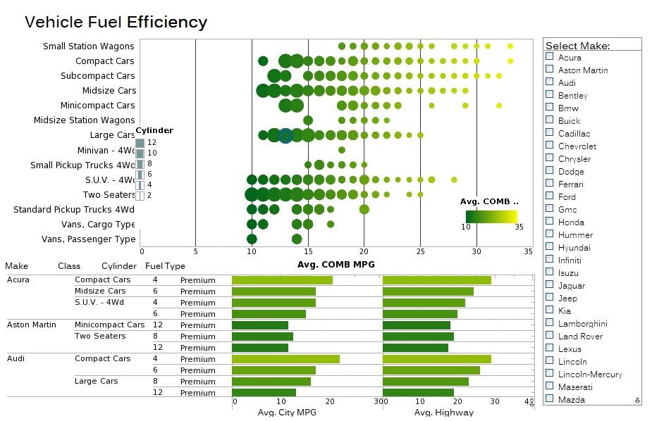
Dashboards are an essential data visualization tool that allow users to explore and analyze their data visually in order to find business solutions. Dashboards benefit enterprises by enabling the easy recognition of strengths and weaknesses, and the easy measuring of KPI's and metrics.
An effective dashboard can intuitively convey the same information that could only be gleaned by paging through many different reports.
Users of InetSoft's StyleBI can configure original dashboard designs or utilize ready-to-use templates. InetSoft's dashboards can be structured to be monitoring-oriented or analysis-oriented.
Easy Drag-and-Drop Interface
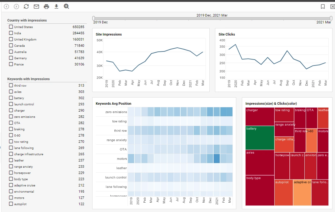
Creating informative and sophisticated dashboards is a simple task with StyleBI. Dashboards are created with a simple, intuitive drag-and-drop interface that is easy to use, even for those with no IT training.
A drag-and-drop interface is also used to create unique data mashups. With the click of a mouse, the robust data mashup engine will automatically write queries that integrate and manipulate massive amounts of data.
The powerful data mashup engine is flexible enough to handle many data elements, enabling experimental changes that users can save for future use in their dashboards. StyleBI's BI dashboarding tools can make data that would otherwise be overwhelming yield useful insights for your enterprise.
Accessibility, Whenever and Wherever
StyleBI is a zero-client program that requires low maintenance, can be deployed rapidly, and has extremely customizable security measures. The web-based software enables users to quickly access and modify dashboards from any web browser, exploring their data and answering questions in real time.
This convenience is extended to mobile devices such as smartphones and tablets, so live engaging dashboards can be shared and utilized beyond a desktop computer.
InetSoft's StyleBI makes it effortless to generate elaborate and interactive dashboards that can extract and combine data from virtually any source.
What Makes a Dashboard Easy to Use?
Creating an easy-to-use dashboard involves a thoughtful combination of design, functionality, and user experience considerations. Here are several key factors that contribute to making a dashboard user-friendly:
- Clarity of Purpose:
- Clearly define the purpose of the dashboard. Users should instantly understand what information it provides and how it adds value to their tasks or decision-making processes.
- Intuitive Design:
- Design the dashboard with an intuitive layout. Place important elements prominently, and use logical grouping for related information. Users should be able to navigate effortlessly without feeling overwhelmed.
- Customization Options:
- Allow users to customize the dashboard based on their preferences and needs. This may include the ability to rearrange widgets, choose specific metrics, or adjust the layout to suit individual workflows.
- Consistent Visual Language:
- Maintain a consistent visual language with a cohesive color scheme, font style, and iconography. This helps users easily associate different elements and understand their significance.
- Responsive Design:
- Ensure that the dashboard is responsive and adaptable to different screen sizes and devices. This is crucial for users who may access the dashboard on desktops, laptops, tablets, or smartphones.
- Clear Data Presentation:
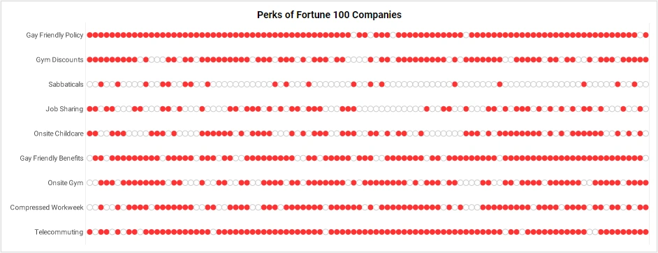
- Display data in a clear and understandable format. Use charts, graphs, and other visualization techniques to convey information quickly. Avoid clutter and unnecessary details that could distract users.
- Real-time Updates:
- If applicable, provide real-time or near-real-time updates. This feature is especially important for dashboards focused on monitoring key metrics or dynamic data.
- Interactive Elements:
- Include interactive elements such as clickable buttons, dropdown menus, or drill-down capabilities. This enhances user engagement and allows for a more detailed exploration of data when needed.
- Performance Optimization:
- Ensure that the dashboard loads quickly and operates smoothly. Slow-loading dashboards can frustrate users and hinder their ability to access timely information.
- User Feedback Mechanism:
- Implement a feedback mechanism to gather input from users. This can be in the form of surveys, user testing, or direct feedback channels. Use this information to continuously improve the dashboard based on user preferences and needs.
- Security and Privacy:
- Prioritize security and privacy features, especially if the dashboard involves sensitive or confidential information. Implement access controls and encryption measures to protect user data.
- Documentation and Help Resources:
- Provide clear documentation and help resources to assist users in understanding the features and functionalities of the dashboard. This can include tooltips, tutorials, or a knowledge base.
More Articles About Easy Dashboards
About Configuring the Report Repository - InetSoft's reporting software gives users the ability to configure the report repository in order to meet specific organizational needs. View the information below to learn more about the StyleBI solution. The definitions of all Viewsheets are stored in the registry file named asset.dat...
Combine Data From Multiple Queries - You can combine data from multiple queries and different data sources into a Data Table, producing a single dataset that contains meaningful and useful information. Tables have many different roles. Many Data Table operations create and maintain links between the component Data Tables, conditions...
Creating Multidimensional Dashboards - Looking for tools for creating 3D dashboards? InetSoft offers Web-based dashboard software that has been deployed at several thousand enterprises worldwide spanning several industries. For a commercial version, visit the Style Scope product page, and see examples, view a demo, and read customer reviews. A free option can be found at and https://www.visualizefree.com/. View information about InetSoft's agile dashboard creation software...
Drilling Down into the Medical Dashboard - In this medical dashboard example we have opened up a table of specific and relevant data. We are looking at the mortality stats for 35-44 year old Men of Asian or Pacific Islander ethnicity. The columns have been sorted to count down from the cause of the most deaths to the least. This is the "View Details" tool. It can be extremely helpful when trying to take a...
Examples of Contour Charts - This contour chart, taken from a modified version of InetSoft's Census Dashboard, uses a Contour Scatter Plot to explore the relationship between states population and their median income, with state population plotted on the x axis and state median income on the y axis. In the original version of the chart, each of the fifty states was plotted with a circle data point, causing quite a jumble...
How To Design Efficient Dashboard Charts - An efficient dashboard chart allows users to access the most amount of detail in a given chart while still keeping the chart easy to look at. The Chart component's 'Properties' dialog box provides the following tabs: General, Advanced, and Pre-Aggregate. The next sections discuss the chart-specific properties available under these tabs...
Information About Adding Tooltips to a Table or Chart - A tooltip is a graphical user interface element that provides additional contextual information when a user hovers over or clicks on a specific element, such as a button or icon, within a digital interface. Typically appearing as a small pop-up box, tooltips offer concise and relevant details about the associated...
Library of Database Reporting Software Articles - Looking for database reporting software? Since 1996, InetSoft has been offering flexible, powerful and easy to use reporting software for enterprises and OEMs. The cache tag caches the content of the report page. This tag must be the first report tag in the page. The cache tag is required. The create tag generates the report and serves any resources required to display the report...
Making a Map With Path - To display data on a map by latitude and longitude, follow the steps in the walk-through below: Walkthrough: The 'Map Points' Data Worksheet can be found in the 'Examples' folder. In this example, you will label a map with a list of landmarks along Historic Route 66. The locations of the landmarks are provided by the 'Map Points' Data Worksheet data block, which contains raw latitude and...
Nine Department Dashboard Templates - This dashboard template breaks revenue down by month and state, with several filters to help drill down into the data. While in this particular use case the charts on the right display a breakdown by customer plan, they could be modified to display the proportions of any type of customer offering or product line...
Reading About Reporting Elements - This is a table of contents of useful product information about reporting elements within InetSoft's Style Report Enterprise and Style Report Professional. Features from both are included in InetSoft's flagship business intelligence software for dashboards, reporting, and analytics...
Resources About Reports and Reporting - Looking for tools to write reports? Reporting software has been InetSoft's specialty since 1996. Now its award winning reporting tools include pricing options comparable to open source vendors. Download a free eval. InetSoft's reporting-only product is Style Report Enterprise. If you also want interactive dashboarding and data mashup then look at InetSoft's flagship business intelligence software - StyleBI...
Tool to Make Circular Heat Map Charts Online for Free - To easily and quickly create Circular Heat Map Charts online for free, create a Free Individual Account on the InetSoft website. You will then be able to upload a text data set, as shown below: Once you have done that, you will be able to proceed to the Visualization Recommender, which will get...
Visual Query Builder - InetSoft's Visual Query Builder typically offers the following features: Drag-and-Drop Interface: The tool provides an intuitive, user-friendly interface where users can drag and drop database tables and fields to visually construct their queries. This eliminates the need for users to have in-depth knowledge of SQL syntax...
