Medical Dashboard Examples
Are you looking for medical dashboard examples? Try out this interactive mortality analysis dashboard from the InetSoft live dashboard gallery. This dashboard was made with InetSoft's commercial dashboard builder StyleBI.
The ease of use and high level of interactivity in this example are proof of InetSoft's core concept of deploying advanced visualization without sacrificing computing power.
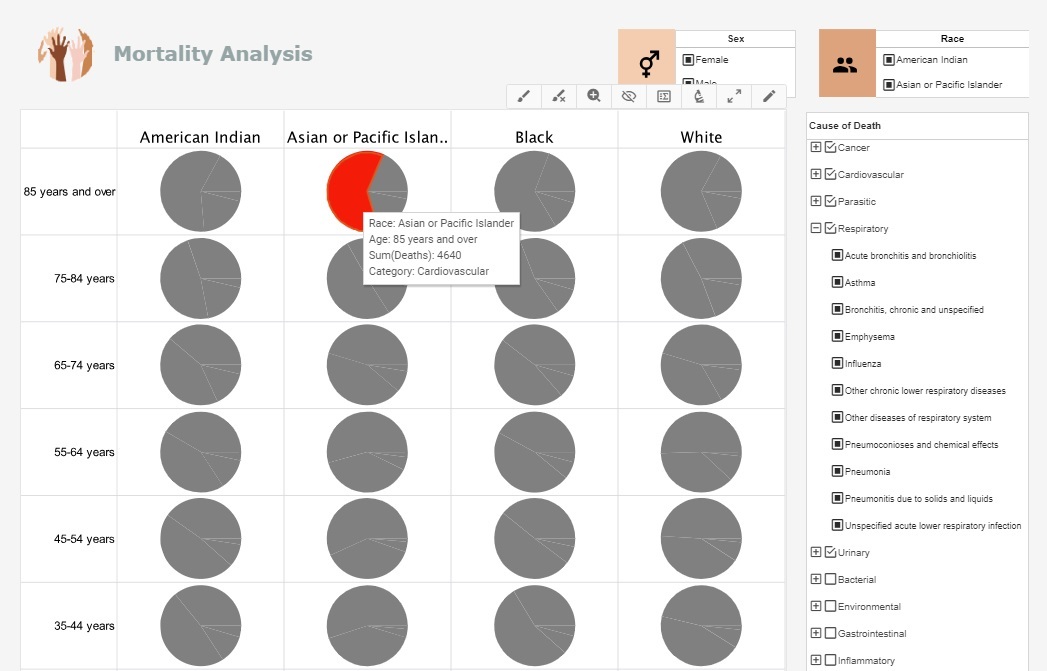
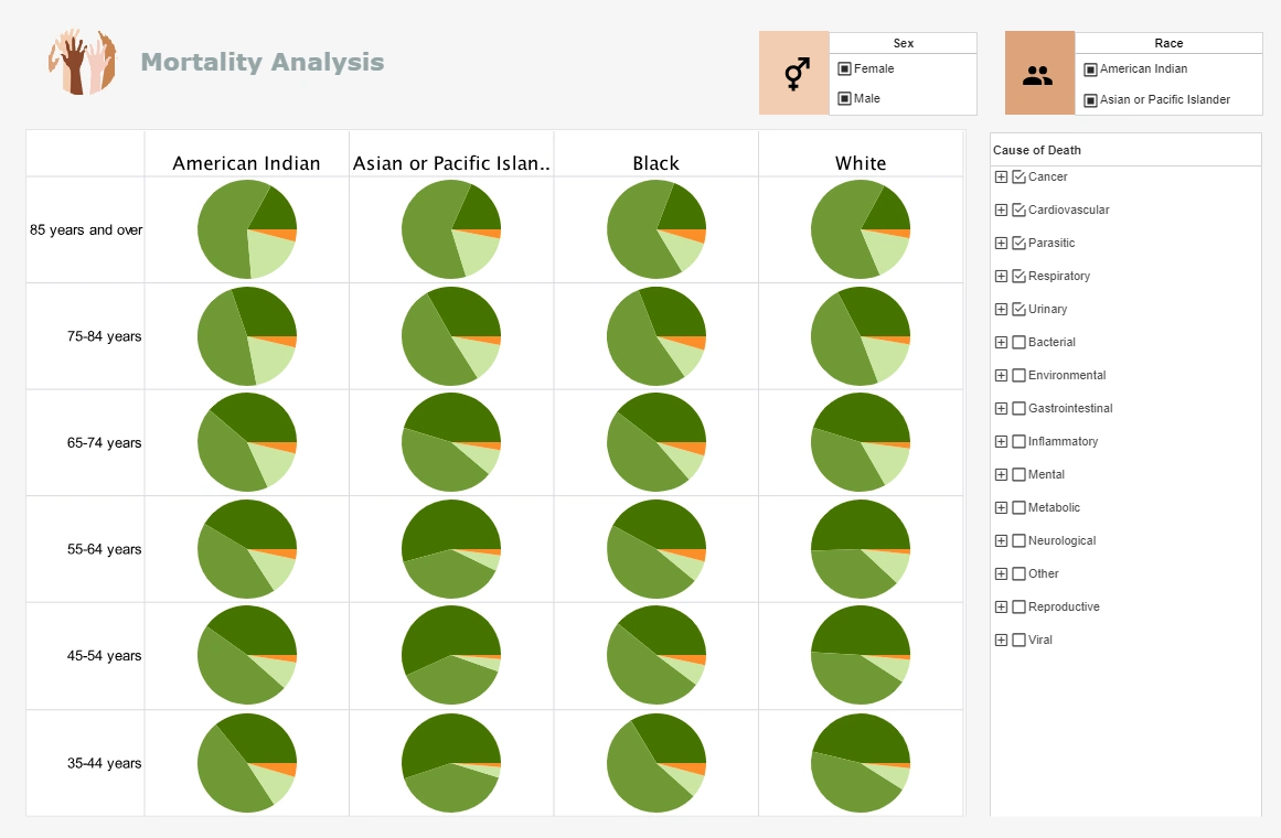
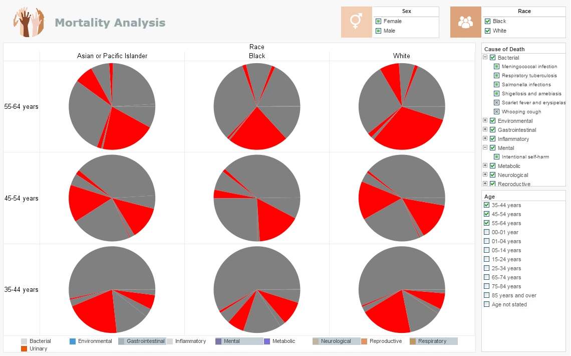
In this medical report example you can easily wring out a huge variety of statistics surrounding national mortality. The visuals can be displayed by age, race, gender or cause. You can filter out specific diseases within each Cause or zoom in for an intimate analysis within certain communities.
Easily spot the major causes or drill down to find the way certain causes affect demographics differently.


StyleBI Dashboard Software
In this example we can see that drill down has been used in a few ways to resolve the table to this view. Chart such as this example are made in StyleBI by dragging and dropping columns and rows of data into X and Y axis, dimensional breakdowns, shape or size coding, then the graphs and charts materialize themselves.
This kind of dashboard is great for research, as with a few more clicks and a couple different selections we can materialize a brand new visualization that tells a brand new story with the same information.
A hospital could use dashboard styles similar to this to develop better patient charts that display data from the various storage solutions hospitals need to use. Which allergies, treatments, medical history, ICD-10 data, insurance coverage, can all be put into a single interactive space. Instead of asking a patient and nurse to fill out redundant forms, the dashboard can call up the necessary information on the path to proper treatment.
Rather than using paper charts that need to be updated by hand, where even something as fundamental as handwriting becomes an issue, a medical dashboard is instantly recallable and is less vulnerable to paper mistakes.
Drilling Down into the Medical Dashboard
In this medical dashboard example we have opened up a table of specific and relevant data. We are looking at the mortality stats for 35-44 year old Men of Asian or Pacific Islander ethnicity. The columns have been sorted to count down from the cause of the most deaths to the least. This is the "View Details" tool. It can be extremely helpful when trying to take a granular approach to data-understanding, allowing broad to specific data questions to be asked and answered by customized tables containing only relevant data. In a few seconds of scanning this table we should notice that different malignant neoplasms constitute the majority of cancer deaths, an insight much more difficult to render from looking at whole data sets.
From an administrative standpoint having this enormous and homogenized access to patient information is a boon in creating better patient care and saving hospital operation costs. When an individual's habits, disease symptoms, patterns of progression, and treatments are organized by relationship, effective treatment can be standardized at the same time as developing tailored patient treatment programs. The a medical dashboard visualization can act as a data hub that monitors heart rate, oxygen levels, treatment response, and more. With powerful BI tools, caretakers can develop early warning systems to alert necessary staff to subtle patterns that indicate health degradation before serious symptoms and crises occur.
In this image we see brushing being used. A brushing highlights in red the object a user wants to dial into and focus on. The irrelevant information is washed out into gray and only the brushed information is visualized and can be interacted with. Brushing is not limited to a single measure or dimension, four in this arrangement have been put on display. We can visually aggregate their import and variety of import across age limits.
When treating complex diseases that require multiple phases, different medications, and particular patient responses, brushing could be an invaluable tool for predictive analysis. By brushing a dashboard with multiple charts and KPI's the dashboard will be able to communicate how one change in treatment affects the rest of vital stats.
If a caregiver brushes a medicine on a dashboard built to display broad patterns of diseases treatment and responses, they will be highlighting how the treatment side effects would modify the overall condition of their particular patient. Seeing how a medicine might affect a patient is much preferable to administering it and reacting to negative side affects.
Intelligence With Style
More than just a research tool or a report maker, StyleBI is a powerful BI dashboard builder that will grant an administration the dynamic freedoms to develop ever more intelligent and advanced data oriented, cost-saving and patient care solutions. To view more dashboard examples make your way over to the eclectic collection of fully interactive dashboards from the free InetSoft dashboard gallery. You will find an impressive library of aesthetic capability coupled with the powerful yet effortless data processing that gives StyleBI its advantage. View dashboard examples for US Census data, sales analysis reports, and more to see the wide range of dynamic reporting abilities that the StyleBI environment supports.