Circular Heat Map Charts - Definition, Example, and How to Make for Free
This page explains how you can create a Circular/Radial Heat Map chart in InetSoft. This page also provides access to a free online tool for creating charts and complete functioning business intelligence dashboards.
Contents
Definition of a Circular Heat Map Chart
How to Make a Circular Heat Map Chart
Tool to Make Circular Heat Map Charts Online for Free

Definition of a Circular Heat Map Chart
A circular heat map is a data visualization technique that presents tabular data in a circular layout. It is a variation of a heat map, which is a graphical representation of data that uses color to represent values in a two-dimensional matrix. In a circular heat map, the values are arranged radially around a circle, with each row or column of the matrix represented as a colored arc segment. The colors in the heat map are used to represent the values, with darker colors indicating higher values and lighter colors indicating lower values.
Circular heat maps are often used in genomics and bioinformatics to represent complex data sets such as gene expression levels, DNA methylation, or protein-protein interactions. They can also be used to visualize other types of data, such as financial data or survey results. In our example, the heat map is used to visualize earthquake magnitudes over different time scales.
How to Make a Circular Heat Map Chart in InetSoft
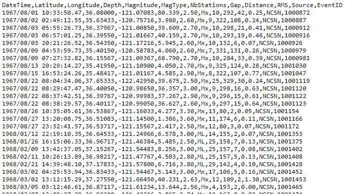
There is no built-in chart type for a circular heat map; however, since a circular heat map is essentially a stacked bar chart bent into a circle, it is possible to obtain this display by applying a small script to an existing stacked bar chart. Begin by importing the data set into a Data Worksheet. The sample data is based on data from Northern California Earthquake Data Center (NCEDC) and processed by Giuseppe Macrì to produce the CSV file available on Github, which has the following form:
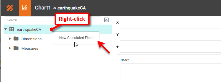
Import this data directly into a Data Worksheet and create a new Dashboard based on the Data Worksheet. Add a new Chart. In the Chart Editor, set the Chart Style to Bar with Stack option enabled. To obtain the desired plot, we need to create a 'Year' field that we can use as a measure rather than as a dimension. To do this, right-click the data block in the left panel, and select New Calculated Field.
Name the Field 'Year', set the Return Data Type to Integer, and enter the formula CALC.year(field['DateTime']). This returns the year as a number that we can use as a measure on the Chart.
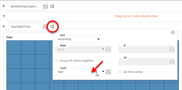
Place the 'DateTime' field in the X region, press the Edit Dimension button, and set the Level to Month of Year. Place the 'DateTime' field (again) in the Break By region, and set the Level to Year.
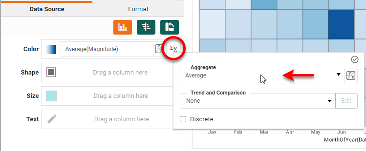
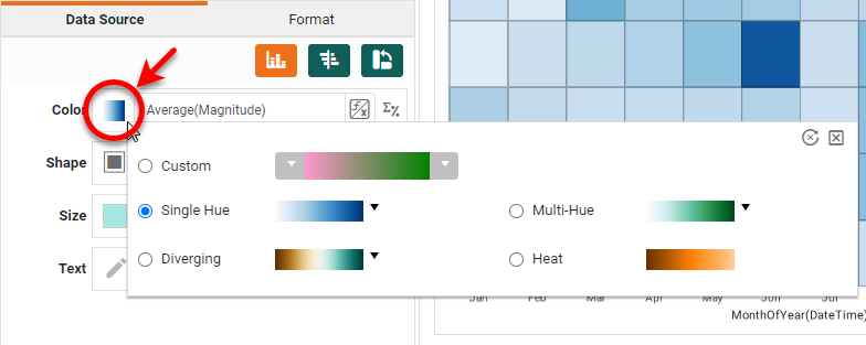
Place the 'Magnitude' field in the Color region, press the Edit Measure button, and set the Aggregate to Average.
Press the Edit Color button to the left of the Color region, and select a desired color representation.
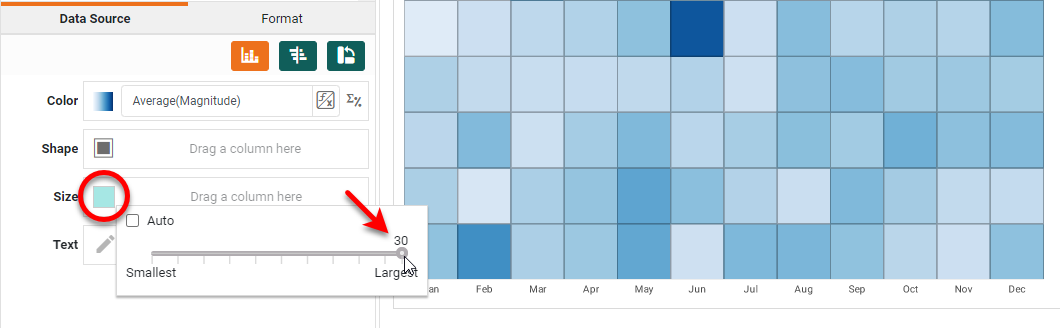
Drag the 'Year' calculated field to the Y region, press Edit Measure, and set the Aggregate to Distinct Count. This means that for each year group in the data, the measure returns "1" so that the segments of each bar are all the same size. NOTE: This does not contribute anything to the Chart design visually, but it is necessary for the Month labels to be placed correctly when the coordinates are changed to polar.
Right-click each of the axis titles and select Hide Title. Right-click any Y axis label and select Hide Axis. Press the Edit Size button and select the maximum possible size. Then press Finish to exit the Editor.
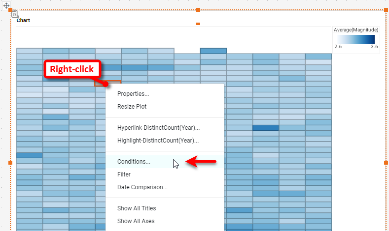
Since the data set contains earthquake data back to the 1960's, plotting the full data set would produce a fairly dense chart. Place a filter on the Chart to limit the data to just the 2000's. Right-click the Chart, and select Conditions.
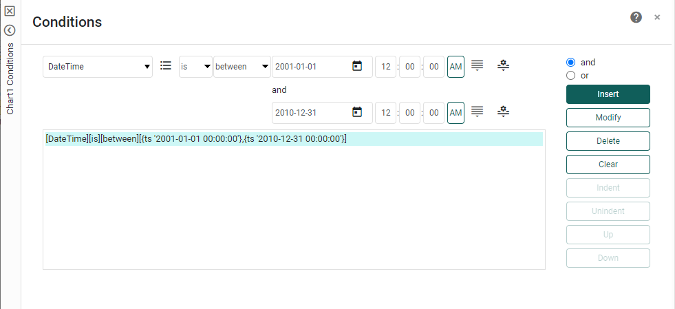
Add the following condition and press OK.
Right-click the Chart and select Properties. Select the Script tab in the 'Properties' dialog box. Enter the following script, and press OK.
// Convert to Polar Coordinates
var coord = graph.getCoordinate();
var polar = new PolarCoord(coord);
graph.setCoordinate(polar);
// Add year labels
for(var i=0;i<10;i++) {
  var form = new LabelForm();
  form.setLabel(i+2001);
  form.setTuple([0, i/2+.1]);
  var spec = new TextSpec();
  spec.setFont(java.awt.Font('Verdana',java.awt.Font.BOLD, 10));
  form.setTextSpec(spec);
  graph.addForm(form);
}
The first part of the script converts the rectangular coordinates into polar coordinates, creating the desired circular heat map. The second part of the script simply adds the year labels to the chart. (This is not strictly necessary because the built-in tooltip provides this information, but it makes the chart easier to read.)
Add a chart title to complete the chart.
Tool to Make Circular Heat Map Charts Online for Free
To easily and quickly create Circular Heat Map Charts online for free, create a Free Individual Account on the InetSoft website. You will then be able to upload a text data set, as shown below:

Once you have done that, you will be able to proceed to the Visualization Recommender, which will get you started creating a dashboard. To start with a circular heat map plot, though, you can skip the Recommender by pressing the Finish button at the top bar of the Recommender.
Then press Continue to go to Visual Composer. Proceed to add a Chart component using Visual Composer, and follow the steps shown earlier to create the desired heat map.
Can You Make a Circular Heat Map Chart Using Google Apps?
No, you cannot use Google applications to make a circular heat map chart. Advanced interactive data visualizations require an advanced analytics solution.