Data Visualization Chart Types
The following is a listing of the various chart types enabled by InetSoft's StyleBI data visualization software.
Gantt Chart

A Gantt chart is a visual representation of a project schedule, showing the start and end dates, duration, and dependencies of each task. It is commonly used in project management to track progress and help coordinate the efforts of team members. The chart is named after Henry Gantt, who developed the concept in the 1910s.
Stock Chart

A stock chart is a graphical representation of the price and volume movement of a stock over a specific period of time. It provides a visual representation of the stock's performance, and can be used to analyze trends, make investment decisions, and track the performance of a stock over time.
Stock charts typically display information such as the stock's price, volume, moving averages, and technical indicators, and can be displayed in various time frames, such as daily, weekly, or monthly.
Pareto Chart
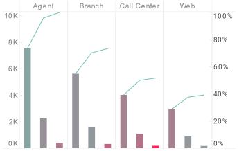
A Pareto chart is a type of graph that is used to represent the distribution of data in which the majority of the observations are concentrated in a few categories. It is named after Italian economist Vilfredo Pareto, who first described the concept of the 80/20 rule, which states that 80% of the effects come from 20% of the causes.
In a Pareto chart, the categories are arranged in descending order of frequency or magnitude, with a bar graph showing the relative frequency or size of each category, and a line graph showing the cumulative total. The chart is used to identify and prioritize the most important factors in a given situation, and can be applied in a wide range of fields, including quality control, business analysis, and process improvement.
Percent Change Chart

A percent change chart is a graph that displays the percentage change in a data set over time. It is used to visualize how a value has changed relative to its initial value, allowing you to see the trend of the data and compare different periods. The percent change is calculated by subtracting the original value from the current value and dividing the result by the original value, then multiplying by 100 to express the result as a percentage.
The resulting values are plotted on the y-axis, with time or other relevant factors plotted on the x-axis. The percent change chart can be used to analyze a variety of data, including financial data, sales data, or other quantitative data sets.
Waterfall Chart
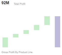
A waterfall chart is a graphical representation of how an initial value is affected by intermediate values, ultimately resulting in a final value. It is commonly used in finance and accounting to show the changes in a company's net income or balance sheet, as well as in other areas to display the cumulative effect of positive and negative changes to an initial value.
The chart consists of vertical bars that represent the positive and negative changes, with the bars extending either up or down from a baseline to show the cumulative effect of the changes. The starting and ending values are typically represented by the first and last bars, while intermediate bars represent the positive and negative changes. Waterfall charts can provide a clear visual representation of the sources of change in a given data set, making it easier to understand the overall trend and identify areas that require attention.
Radar Chart
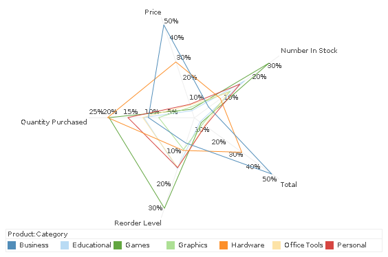
A radar chart, also known as a spider chart or web chart, is a type of graph used to compare the values of several variables for a single data point. The chart displays the data in the form of a two-dimensional polar plot, with each variable represented by a radial axis that extends from the center of the chart. The values for each variable are plotted along the radial axis, creating a series of points that form a polygon.
The resulting shape of the polygon provides a visual representation of the relative magnitude of the variables for the data point, allowing for quick and easy comparison of multiple data points. Radar charts are commonly used in fields such as market research, performance evaluation, and data analysis to compare and analyze the characteristics of multiple entities or factors.
Donut Chart
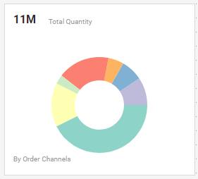
A donut chart is a type of circular chart that is divided into multiple segments to represent data. Each segment represents a category, with the size of the segment proportional to the value of that category. The chart is similar to a pie chart, but with a hole in the center, which gives it the shape of a donut.
This hole can be used to display additional data, such as a total value, or to provide more space for labeling the categories. Donut charts are commonly used to display parts of a whole, such as market share, product distribution, or population demographics, and can be used to compare the relative size of multiple categories. By dividing a circle into segments, a donut chart provides a clear and visually appealing representation of data that can help to highlight patterns and trends in the data.
Funnel Chart
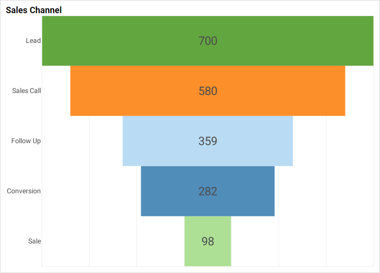
The width of each section of the chart represents the number of items or entities at each stage, with the sections getting progressively narrower as the items move through the process. Funnel charts are commonly used in business and marketing to track the progress of leads or customers through a sales or marketing pipeline, and to visualize the results of a marketing campaign. They can also be used to represent other types of processes, such as the stages in a manufacturing process, or the steps in a decision-making process.
Scatter Plot Chart
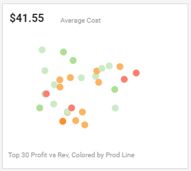
A scatter chart, also known as a scatter plot, is a type of chart used to display the relationship between two sets of numerical data. In a scatter chart, each data point is represented by a single marker, such as a dot, that is positioned on the chart according to its values on the X and Y axes. The X axis represents one set of numerical data, while the Y axis represents the other set of data.
The distribution of the data points on the chart provides a visual representation of the relationship between the two sets of data. Scatter charts are commonly used in statistical analysis, data visualization, and machine learning to identify patterns, relationships, and correlations in the data. They can also be used to detect outliers, or data points that are significantly different from the other data points, and to visualize the distribution of data in two dimensions.
Box Plot Chart
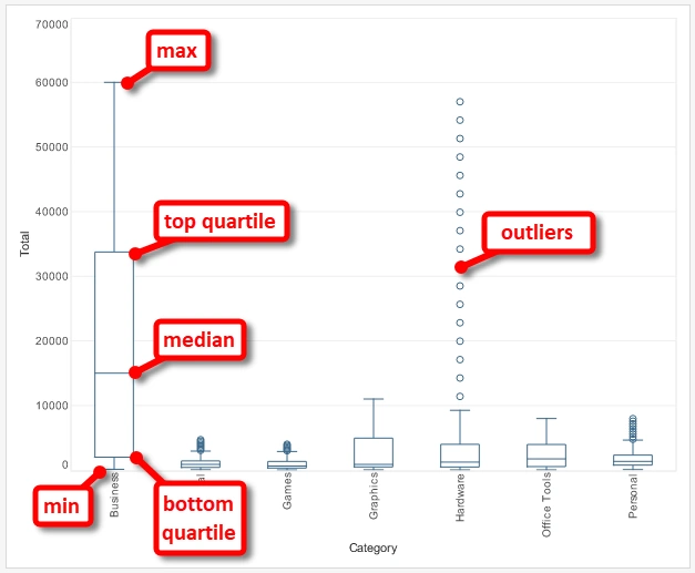
A box plot, also known as a box-and-whisker plot, is a type of chart that displays the distribution of a dataset, showing the median, quartiles, range, and outliers. The box in the plot represents the interquartile range (IQR), which contains the middle 50% of the data, and the line inside the box represents the median.
Whiskers extend from either side of the box to represent the range of the data, and any data points outside of the range are plotted as individual points and are considered outliers. Box plots are commonly used to visualize and compare distributions between groups.
Sunburst Chart

A sunburst chart, also known as a radial tree map or multi-level pie chart, is a visualization tool used to represent hierarchical data structures. It is created by dividing a circle into multiple nested segments, each of which represents a level in the hierarchy. The size of each segment is proportional to the numerical value it represents, and the color can also be used to encode additional information.
The center of the sunburst represents the root of the hierarchy, and as you move away from the center, you move down the levels of the hierarchy. Sunburst charts are useful for showing the relationships between different levels of a hierarchy and can help provide an overview of complex data structures.
Tree Chart
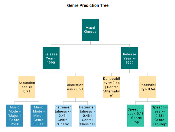
A tree chart, also known as a tree diagram or dendrogram, is a graphical representation of a hierarchical structure. It is used to visualize and understand complex relationships between elements in a hierarchy. The structure is represented by a series of connected nodes, where each node represents an element in the hierarchy and is connected to its parent and child nodes.
The root node is at the top of the hierarchy and branches extend downward to represent the different levels of the hierarchy. Tree charts can be used to represent a variety of hierarchical relationships, such as organizational structures, file systems, decision trees, and evolutionary trees.
Treemap Chart

A treemap chart is a type of information visualization used to represent hierarchical data structures, such as file systems or organization structures, as nested rectangles. Each branch of the hierarchy is represented by a colored rectangle, and the area of each rectangle is proportional to a specified dimension of the data.
For example, in a file system treemap, a folder might be represented by a rectangle, and its subdirectories represented by smaller rectangles nested within it. The size of each subdirectory rectangle would represent the sum of the sizes of all the files within that directory.
Treemaps can effectively display large amounts of data and can be useful for uncovering patterns and structure in the data that may not be immediately obvious. They are used in many different fields, including marketing, finance, and project management.
Candle Chart

A candlestick chart is a type of financial chart used to represent the price movement of an asset, such as a stock or currency, over a specified period of time. It consists of individual "candlesticks" that show the range of price movement for a given time period, as well as the opening and closing prices.
Each candlestick is composed of a "body" that represents the difference between the opening and closing prices, and "shadows" or "wicks" that represent the high and low prices for the period. If the closing price is higher than the opening price, the body is typically drawn as a hollow rectangle (often white or green) and is referred to as a "bullish" candlestick. If the opening price is higher, the body is filled (often black or red) and is referred to as "bearish".
Candlestick charts are widely used in technical analysis to identify potential buying or selling opportunities based on the price patterns that they represent. They are also used in other financial markets, such as commodities, bonds, and currencies.
Interval Chart

An interval chart, also known as a range chart, is a type of chart that is used to represent data that has a minimum and maximum value over a certain period of time. This type of data is commonly referred to as "interval data."
Interval charts typically display the minimum and maximum values as a range, represented by a bar or a vertical line segment. The height of the bar or line segment represents the difference between the minimum and maximum values. The position of the bar or line segment along the x-axis indicates the time period to which the data corresponds.
Interval charts are often used to represent data in fields such as quality control, manufacturing, and engineering, where it is important to monitor and visualize the variability of a process over time. They can help identify trends and patterns in the data, and can be used to detect and diagnose problems with a process.
Examples of interval charts include bar charts, box plots, and error bars.
Marimekko Chart

A Marimekko chart, also known as a Mekko chart, a Marimekko diagram, or a Mosaic plot, is a type of stacked column chart that is used to represent hierarchical and part-to-whole relationships in data. In a Marimekko chart, the width of each column is proportional to the total size of the data, while the height of the column represents the relative size of each category within the data.
The chart is useful for visualizing complex data structures and showing the hierarchical relationships between the different categories. For example, it can be used to represent market share data, where the width of each column represents the total market size, and the height of each stacked segment represents the relative market share of different companies.
Marimekko charts provide a unique and effective way of visualizing data and can help identify patterns and relationships that may not be immediately obvious in other types of charts. They are widely used in business and marketing applications, as well as in academic research and data analysis.
Dual Axis Chart

A dual axis chart, also known as a combination chart or a multi-axis chart, is a type of chart that combines two or more sets of data into a single visualization. It allows you to display different types of data, such as numerical data and categorical data, on two or more separate y-axes, with a shared x-axis.
In a dual axis chart, each axis is associated with a different type of data and is scaled independently to accommodate the range of values for that data. This allows for the comparison of different types of data in a single chart, making it a powerful tool for exploring complex relationships and trends.
For example, a dual axis chart can be used to combine a bar chart and a line chart, where the bar chart represents categorical data and the line chart represents numerical data. Another example could be a dual axis chart combining a column chart and an area chart, where the column chart represents sales data and the area chart represents profit data.
Dual axis charts can be especially useful when you need to compare two sets of data with different scales or units, or when you want to explore the relationship between two different types of data.
Heat Map Chart

A heat map chart is a type of data visualization that uses color to represent data values. It is used to represent data where individual values are associated with specific colors, often using a color scale to represent a range of values.
In a heat map chart, data is displayed in a grid, where each cell represents a value in the data set. The color of each cell is determined by its value and the color scale being used. Higher values are typically represented by darker or more intense colors, while lower values are represented by lighter or more subdued colors.
Heat map charts are commonly used to visualize large and complex data sets, and can be particularly useful for visualizing patterns and relationships in the data. They are often used in fields such as finance, medicine, and geographic information systems.
For example, a heat map chart could be used to represent the distribution of temperature across a geographic area, where each cell represents a temperature value and the color scale represents the range of temperatures. Another example could be a heat map chart that represents the frequency of visits to a website, where each cell represents the number of visits to a specific page and the color scale represents the range of visit frequency.
Point Chart

A point chart, also known as a scatter plot or scatter chart, is a type of data visualization that represents individual data points as separate points on a graph. In a point chart, the x-axis and y-axis represent two variables in the data set, and each point represents an individual data value.
Point charts are useful for visualizing the relationship between two variables and can help identify patterns and trends in the data. By plotting each data point as a separate point on the graph, it allows for the observation of the distribution and distribution patterns of the data.
Point charts can also be used to visualize categorical data by using different symbols, shapes, or colors to represent different categories. For example, a point chart could be used to represent the relationship between the height and weight of a group of people, where each point represents an individual person and the color of the point represents gender.
Point charts are widely used in a variety of fields, including statistics, data analysis, and research. They are a simple and effective way to visualize relationships between two variables in a dataset and can provide valuable insights into the data.
Network Chart

A network chart, also known as a network graph or network diagram, is a type of data visualization that is used to represent complex relationships and connections between entities. It is commonly used to visualize social networks, communication networks, and other types of interconnected data.
In a network chart, entities are represented by nodes, and the relationships or connections between the entities are represented by edges or lines connecting the nodes. The strength and direction of the connections can be represented by the thickness and direction of the lines, and the size and color of the nodes can represent additional information about the entities.
Network charts can help identify patterns and relationships within complex data sets and can provide valuable insights into the structure and organization of the data. They are widely used in fields such as social network analysis, data mining, and business intelligence.
For example, a network chart could be used to visualize the relationships between individuals in a social network, where each node represents a person and the edges represent the relationships between them. Another example could be a network chart that represents the flow of goods and services within a supply chain, where each node represents a company and the edges represent the relationships between them.
Trellis Chart

A trellis chart, also known as a small multiples chart or a lattice chart, is a type of data visualization that uses a series of small, similar charts to represent different subsets of the data. It is used to display multiple views of the same data, often to show how the data varies across different categories or dimensions.
In a trellis chart, each small chart represents a subset of the data, and the charts are arranged in a grid or lattice pattern. Each chart is typically a simple visualization, such as a bar chart or a line chart, and the charts are designed to be small enough to allow for a large number of charts to be displayed on the same page.
Trellis charts are useful for exploring and comparing patterns and trends in the data across different categories or dimensions. By displaying multiple views of the data, it allows for the comparison of how the data changes and evolves over time or across different groups.
Trellis charts are widely used in fields such as data analysis, business intelligence, and research. They are a powerful tool for exploring and visualizing complex data sets and can provide valuable insights into the data.
Dot Plot Chart

A dot plot chart, also known as a dot chart or a strip chart, is a type of data visualization that uses dots to represent individual data values. It is similar to a bar chart, but instead of bars, dots are used to represent the data.
In a dot plot chart, the x-axis represents the categories or groups in the data set, and the y-axis represents the values. Each data value is represented by a dot plotted at the corresponding position on the chart.
Dot plot charts are useful for visualizing the distribution and distribution patterns of the data, and for comparing the distribution of multiple sets of data. They can also be used to represent data with many categories or a large number of data points, as the dots can be stacked or jittered to avoid overlap.
Dot plot charts are widely used in fields such as statistics, data analysis, and research. They are a simple and effective way to visualize data distributions and can provide valuable insights into the data.
Word Cloud Chart

A word cloud, also known as a tag cloud or a wordle, is a type of data visualization that represents the frequency or importance of words in a given text or dataset. The words are displayed in a cloud-like shape, with the size and color of each word indicating its frequency or importance.
In a word cloud, the most frequently occurring or important words are displayed in a larger font size and often in a darker color, while less frequent or less important words are displayed in a smaller font size and lighter color. The layout of the words in the cloud is typically randomized, but can also be arranged in a specific pattern.
Word clouds are used to analyze text data, such as the contents of a book, a newspaper article, or a social media post, to identify the most frequently occurring or important topics and themes in the data. They can also be used to quickly identify trends and patterns in large amounts of text data, making them a useful tool for data analysis and text mining.
Word clouds are widely used in fields such as natural language processing, data analysis, and research. They are a simple and effective way to visualize the content of text data and can provide valuable insights into the data.
Icicle Chart

An icicle chart, also known as a sunburst chart or a nested donut chart, is a type of data visualization that is used to represent hierarchical data structures. It is used to show the hierarchical relationships between different levels of data, with each level represented by a concentric ring or segment in the chart.
In an icicle chart, the innermost ring represents the highest level in the hierarchy, and each subsequent ring represents a lower level in the hierarchy. The size and color of each segment in the chart can represent additional information, such as the quantity or proportion of the data.
Icicle charts are useful for visualizing hierarchical data structures, such as file systems, taxonomies, or organization charts. They can help to understand the relationships between different levels of data and can provide valuable insights into the structure and organization of the data.
Icicle charts are widely used in fields such as data analysis, business intelligence, and research. They are a powerful tool for exploring and visualizing hierarchical data structures and can provide valuable insights into the data.
Circle Packing Chart

A circle packing chart is a type of data visualization that represents numerical data using circles of different sizes, arranged in a way that they do not overlap. The size of each circle represents a data point or value, and the position of the circles can provide additional information or context.
In a circle packing chart, the circles are typically organized in a hierarchical or tree-like structure, with larger circles representing higher-level categories or groups, and smaller circles representing subcategories or individual data points. The circles can be colored or labeled to provide further information or to make the chart more easily readable.
Circle packing charts are often used in fields such as biology, economics, and computer science to visualize hierarchical data, but they can be used for any type of data that can be represented numerically. They are particularly useful when dealing with large datasets, as they can effectively convey a lot of information in a compact and visually appealing format.
Step Line Chart

A step line chart, also known as a step chart or a step plot, is a type of chart commonly used in data visualization to display changes over time or to compare different categories.
In a step line chart, the data points are connected by horizontal and vertical lines, forming a series of steps. The horizontal line represents the duration of the data point, while the vertical line represents the change in value between the previous and current data points. The line jumps from one data point to the next, creating a series of steps that make it easy to see how the data is changing over time or across categories.
Step line charts are often used to show changes in stock prices, weather patterns, or other time-series data, as well as to compare data across categories or to highlight changes in data over time. They are particularly useful for visualizing data with a large number of data points, as they can show changes over time in a way that is easy to understand and interpret.
Circular Network Chart

A circular network chart, also known as a circular diagram, is a type of data visualization that is used to display relationships or connections between different elements in a network.
In a circular network chart, the elements are represented as nodes, which are arranged in a circular pattern around the perimeter of the chart. The connections between the nodes are represented by lines, which are drawn between the nodes to show the relationships between them.
Circular network charts are often used to show complex relationships between multiple elements or to demonstrate the interconnections between different parts of a system. They are commonly used in fields such as social science, biology, and engineering to visualize the relationships between different components of a system, such as social networks, ecological systems, or electrical circuits.
Circular network charts are useful for displaying a large amount of information in a compact and visually appealing format, making it easy to see how the different elements in a network are connected and how they interact with each other.
Running Total Chart

A running total chart, also known as a cumulative chart or a cumulative line chart, is a type of data visualization that shows the accumulation of values over time or across categories.
In a running total chart, the values are displayed as a line graph, with the y-axis representing the total value and the x-axis representing time or categories. The line starts at zero and shows the incremental increase in the values over time or across categories. The line is connected by points to show the progression of the accumulation.
Running total charts are often used to show the growth or accumulation of data over time, such as cumulative sales or revenue, as well as the progression of a process or project. They are also commonly used in finance and accounting to show the cumulative effects of interest or inflation.
Running total charts are useful for visualizing the overall trend of the data, as well as the contributions of individual data points to the total. They can help to highlight trends, identify patterns and outliers, and provide insights into the underlying data.
Step Area Chart

A step area chart is a type of chart commonly used in data visualization to display changes in data over time or across categories. It is similar to a step line chart, but the area between the lines is filled with color to create a solid shape that emphasizes the changes in data.
In a step area chart, the data points are connected by horizontal and vertical lines, forming a series of steps. The area between the lines is then filled with color to create a solid shape that emphasizes the changes in data. The shape is often shaded with different colors to represent different categories or data sets.
Step area charts are often used to show the changes in a single data set over time, or to compare the changes in multiple data sets over time. They are particularly useful for visualizing data with a large number of data points, as they can show changes over time in a way that is easy to understand and interpret.
Step area charts are used in many fields, including finance, economics, and environmental science, to track changes in data over time and to make predictions about future trends. They are also commonly used in business and marketing to track sales or website traffic over time, and to make decisions about resource allocation and strategy.
Contour Map Chart

A contour map chart, also known as a contour plot or a contour graph, is a type of data visualization that is used to represent three-dimensional data on a two-dimensional surface.
In a contour map chart, the data is displayed as a series of contour lines, which connect points of equal value on the surface of the data. The lines are drawn at regular intervals, with each line representing a specific value or range of values. The areas between the lines are then filled with color to represent the values in that range.
Contour map charts are commonly used to display data that varies continuously over a surface, such as elevation data on a topographic map, temperature data on a weather map, or population density data on a map of a city or region. They can also be used to show the distribution of data in a scatter plot or a surface plot.
Contour map charts are useful for visualizing complex data sets and for identifying patterns or trends in the data. They can provide a detailed and accurate representation of the data, as well as insights into the relationships between different variables. They are commonly used in fields such as geography, geology, and environmental science, as well as in engineering and physics.
Hybrid Table Chart

A hybrid table chart is a type of visual representation that combines elements of both a table and a chart. It is often used to display complex data in a way that is easy to understand and analyze.
A hybrid table chart typically has a column or row of data that is presented in a tabular format, and one or more additional columns or rows that are presented in a graphical format, such as a bar chart or line graph. The table portion of the chart is used to display detailed information, while the graphical portion is used to highlight trends or patterns in the data.
Hybrid table charts can be useful in a variety of contexts, including business, finance, and research. They are particularly effective for presenting data that includes both quantitative and qualitative information, as they allow for both types of data to be presented in a clear and concise manner.
Jump Line Chart

A jump line chart, also known as a jump plot or a lollipop chart, is a type of data visualization that is used to display changes in data over time or across categories.
In a jump line chart, the data is represented as a series of dots or circles, connected by horizontal lines to show the change in the value of the data point over time or across categories. The dots or circles are then connected to a vertical line, creating a lollipop-like appearance. The length of the vertical line indicates the magnitude of the data value, while the horizontal line represents the time or category.
Jump line charts are commonly used to display changes in a single data set over time or to compare changes in multiple data sets over time. They can also be used to show the relationship between two variables or to highlight specific data points within a larger data set.
Jump line charts are particularly useful for visualizing data sets with a large number of data points or categories, as they can effectively highlight changes and trends over time. They are commonly used in fields such as finance, economics, and environmental science, as well as in business and marketing to track sales or website traffic over time and to make decisions about resource allocation and strategy.
Multiple Style Chart

A multiple style chart is a type of data visualization that uses multiple chart styles or types to represent different aspects of the same data set. This approach allows for the combination of different types of charts or graphs within a single display, in order to better illustrate and communicate complex data.
For example, a multiple style chart might combine a line graph with a bar chart, in order to represent both the trend over time and the relative size of different values. Alternatively, it might use a scatter plot to represent the relationship between two variables, and a pie chart to illustrate the distribution of a third variable within that relationship.
The key advantage of a multiple style chart is that it can provide a more comprehensive view of the data, allowing viewers to see multiple aspects of the same information in a single display. This can help to facilitate deeper insights and more accurate analysis, by providing a more nuanced and complete understanding of the data.
However, it is important to use multiple styles carefully and judiciously, in order to avoid creating confusion or obscuring the main message of the chart. Designers should always consider the audience and purpose of the chart, and choose chart styles that are appropriate, clear, and effective in communicating the intended message.
Scatter Contour Chart

A scatter contour chart, also known as a 2D density plot or a scatter density plot, is a type of data visualization that combines elements of a scatter plot and a contour plot. It is typically used to display the density of points in a scatter plot, by showing regions of higher and lower density as contour lines or shaded areas.
In a scatter contour chart, the data is plotted as a series of points in two-dimensional space, with one variable represented on the x-axis and the other variable represented on the y-axis. The density of points in the scatter plot is then visualized using contour lines or shading, which show regions of higher and lower density.
The contour lines are typically drawn using a color scale, with different colors indicating different levels of density. The areas between the contour lines are usually shaded to provide a more visually appealing and informative display.
The advantage of a scatter contour chart is that it provides a more detailed and nuanced view of the data than a standard scatter plot, by showing the density of points and the areas of highest concentration. This can help to reveal patterns and relationships in the data that might not be apparent from a standard scatter plot alone.
Scatter contour charts are often used in scientific research, environmental studies, and other fields where the analysis of spatial data is important. They can also be used in data exploration and visualization to help identify trends, outliers, and other features of the data.
Scatter Matrix Chart

A scatter matrix chart is a type of data visualization that displays multiple scatter plots in a matrix format. Each scatter plot in the matrix shows the relationship between two variables in the data set, and the entire matrix provides a visual overview of the pairwise relationships between all variables in the data set.
In a scatter matrix chart, each row and column in the matrix represents a different variable, and the scatter plots in the matrix show the relationship between each pair of variables. The diagonal of the matrix shows a histogram or density plot of each variable, which provides a visualization of the distribution of values for each variable.
The advantage of a scatter matrix chart is that it allows for a quick and comprehensive overview of the relationships between all variables in the data set, making it easier to identify patterns, trends, and correlations. It is particularly useful when working with a large number of variables, as it allows the viewer to quickly assess the relationships between all pairs of variables, rather than having to examine each pair individually.
Scatter matrix charts are commonly used in exploratory data analysis, and are often employed in fields such as statistics, machine learning, and data science. They can be used to identify trends, outliers, and other features of the data, and to guide the selection of variables for further analysis.
Sliding Window Chart

A sliding window chart is a type of data visualization that displays a moving average of a time series or other sequential data, using a fixed-size window that slides or shifts across the data. The sliding window chart provides a visual representation of the trend and variability in the data, and can help to smooth out short-term fluctuations or noise in the data.
In a sliding window chart, the data is divided into overlapping segments of a fixed size, or window, which moves or slides across the data with each time step. At each step, the average or other statistical measure is calculated for the data within the window, and plotted on the chart. This process results in a smoothed curve that represents the overall trend of the data.
The advantage of a sliding window chart is that it can provide a more stable and representative view of the data than a standard line chart, particularly for data that exhibits short-term fluctuations or noise. By using a moving average, the chart can smooth out these fluctuations and highlight the underlying trend, making it easier to identify patterns and make predictions.
Sliding window charts are commonly used in finance, economics, and other fields where time series data is important. They can also be used in data exploration and visualization to help identify trends, outliers, and other features of the data.
