Step Line Charts - Definition, When To Use, and How to Make Them
This page will discuss the uses of Step Line Charts, show you how to create them in InetSoft, and provide access to a free online tool for creating Step Line Charts as well as complete functioning business intelligence dashboards.
Contents
Definition of Step Line Chart
When to Use a Step Line Chart
An Example of a Step Line Chart
How to Make a Step Line Chart
Tool to Make Step Line Charts Online for Free

Definition of a Step Line Chart
A Step Line chart, also called a stair chart or a step chart, is a type of chart that is useful for visualizing changes in data over a period of time.
It is a variation of a line chart, but instead of connecting the data points with a continuous line, it connects them with horizontal and vertical lines, forming a series of steps.
The vertical lines display a change in value from one point to the next, while the horizontal lines display a period of time or category.
When to Use a Step Line Chart
Like line charts, Step Line Charts should be used to depict a time series, not categorical data. For categorical data, a bar chart is better. But how does one determine when a Step Line Chart is preferable to a Line Chart? For some types of data, such as temperature, it is appropriate to assume a fairly smooth transition from one data point to another. In these cases, a Line Chart is appropriate.
The reason why a Step Line Chart is sometimes preferable over a Line Chart is that a Line Chart implies a continuous rate of change from one data point to the next, which is not always true. While a Line Chart represents each data point accurately, the change it depicts in between data points is not always accurate.
Using straight lines between data points is what implies a constant rate of change between the data points, and they don't display how long the value at a specific data point lasts or how large the change is between the points. To get the actual story from the data, it may be necessary to underscore the significant changes between the data points, and display how long it's been since the last change.
For data that doesn't change at a continuous rate, a Step Line Chart is an effective way to display the durations of values and the magnitudes of changes between them. Step line charts are also effective at highlighting the length of time between changes .
For these reasons, Step Line charts are typically used to display data that changes over time, in situations where the changes occur at regular intervals. Some common examples might include:
- Stock prices: Step line charts can be used to visualize the movement of stock prices over time, displaying the highs and lows as well as any trends or patterns that emerge.
- Financial: Step line charts are useful for tracking financial data, such as revenue, profits, or expenses. They can help display changes in these values over time and help the user identify trends or patterns.
- Process data: For data that represents the progression of a process, such as the completion of a project or the progress of a product through a manufacturing process, a Step Line chart is effective for visualizing how the process has progressed over time.
- Time-series data: For data that is collected at regular intervals, such as daily, weekly, or monthly, a step line chart can be a good way to visualize the data and measure how it changes over time.
An Example of a Step Line Chart
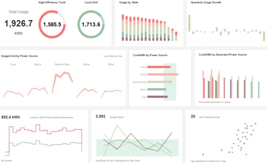
This dual axis chart from the Power Management Dashboard illustrates how a Step Line Chart is, in many cases, more "honest" than a regular Line Chart. This Step Line Chart contains two stepped lines, one representing solar panel installations and the other total output from solar panels. Both of these are non-continuous, in that they may change drastically from one quarter to another without going through an smooth transition from one amount to the other.

If this were a Line Chart, the lines between the data points would imply that there was a daily increase or decrease from one quarter's data point to the next, even though this might not be and often is not the case. Using the Step Line format presents the data points and only the data points, with no false implications in between them.
How to Make a Step Line Chart in InetSoft
The data source for the chart (data block, query, or data model) should represent dimensions and measures as independent columns or fields, as shown below. See Prepare Your Data for information on how to manipulate your data, if it is not currently in this form. (Note: A properly designed data model will already have the correct structure.)

In some cases (e.g., Pie Chart), you may want your data to provide just a single measure. In other cases (e.g., Line Chart), you may want the data to supply multiple measures. If the data does not provide the correct number of measures, you may be able to alter the number of measures to suit the needs of the chart by "pivoting" or "unpivoting" the data. See Convert Multiple Measures in Prepare Your Data for more information about this procedure.
If necessary, create a new Dashboard. For information on how to create a new Dashboard, see Create a New Dashboard.
From the Toolbox panel, drag a Chart component into the Dashboard.

Resize the Chart as desired by dragging the handles.
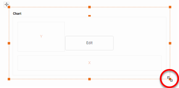
Press the 'Edit' button in the center of the Chart or press the 'Edit' button in the top-right corner.

This opens the Visualization Recommender. (To use the Recommender, see Create a New Dashboard.)
To bypass the Recommender, press the 'Full Editor' button at the top right to open the Chart Editor.

Then follow the steps below to add data to the chart:
Press the 'Select Chart Style' button . Choose the 'Step Line' style. Press the 'Apply' button.
From the 'Dimensions' folder of the Data Source panel, drag a desired dimension to the 'X' or 'Y' region.

To break-out the data set into groups using color, shape, size, or text labeling, drag a dimension from the Data Source panel to the 'Color', 'Shape', 'Size', or 'Text' region.

To break-out the data into groups without applying any visual formatting, drag a dimension to the 'Break By/Tooltip' region.
Optional For a date dimension, press the 'Edit Dimension' button next to the field name in the Chart Editor, and set the 'Level' to the desired date grouping. Then press the 'Apply' button.

Optional: You can add additional dimensions to the Chart if desired. See Trellis Chart (Grid) for information about adding multiple dimensions to a chart axis.
From the 'Measures' folder of the Data Source panel, drag a measure to the 'X' or 'Y' region. This places the selected field onto the chart as a measure.

NOTE: To convert a measure to a dimension, right-click the measure in the Data Source panel and select 'Convert to Dimension'.
Press the 'Edit Measure' button next to the measure, and select the desired aggregation method for the measure.

To represent a measure by using tooltip information, drag the measure to the 'Break By/Tooltip' region.
Optional: You can add additional measures to the Chart if desired. See Multiple-Measure Chart for more information about adding multiple measures to a chart axis. See Basic Charting Steps for information on how to add measures using color, shape, or size representation.
Optional: To specify an alternate order for drawing the lines between the data points, drag a measure to the 'Path' region. The magnitude of the aggregates for the 'Path' measure will determine the order in which the chart points are connected. (The point with largest 'Path' aggregate is connected to the point with second-largest aggregate, and so on.)
Press the 'Finish' button to close the Editor.
You can proceed to edit the titles, legend, etc. See Basic Charting Steps and Chart Properties for more information. See Format Data for information on how to format text on a Chart.
Tool to Make Step Line Charts Online for Free
To easily and quickly create Step Line Charts online for free, create a Free Individual Account on the InetSoft website. You will then be able to upload a spreadsheet data set, as shown below:

Once you have done that, you will be able to proceed past the Visualization Recommender, which can usually get you started creating a dashboard. Since the Recommender does not offer the Step Line Chart as a suggestion, press the Full Editor button.
Then proceed to build the Step Line Chart as described in the previous section.