Free Dashboard and Analytics Software
Table of Contents
1. Free Dashboard Software
Options
2. 31 Must Have Dashboard
Features
3. Reading Recommendations for Good
Dashboard Software
4. What is a Dashboard?
5. Benefits of Dashboards for
Businesses
6. Cost Savings of a Small Footprint
Dashboard Application
Best Free Dashboard Software Options
If you're looking for free dashboard software or free analytic dashboards, InetSoft offers several options:
Open Source - Most of the features of the commercial version. A great option for an IT staffer to set up for a small organization. Go to https://github.com/inetsoft-technology/stylebi
InetSoft's Free Cloud App - No download or setup. Upload a spreadsheet and build an interactive analysis in minutes. Click the orange Start Free button above.
Free Options to Try InetSoft's Commercial Dashboard Software
If you are looking for dashboard software to download and install on-premise in your organization, Or if your data goes beyond uploaded spreadsheet data, InetSoft's offers a commercial version. There are many capabilities included that are not found in the free version:
- Live connectivity to almost any enterprise or cloud-based data source
- Data preparation and mashup functions
- Integrated SSO and fine-grained user permission and security
There are two ways to try InetSoft's dashboard software for free:
- InetSoft provides you with a dedicated in-cloud instance customized with your data connections
- Download the software to install on-premise
31 Must-Have Features of Good Dashboard Software in 2025
Shareability
Dashboards and analyses have to be shareable over public or private networks with the ability to choose whether to share them publicly or privately. A good dashboard solution has to facilitate teamwork. Rarely is a dashboard useful to only one person, and the point of contributing to business performance improvement is sharing insights or calls-to-action. You should be able to share them via a URL which people can bookmark or simply by email as a snapshot. When security and confidentiality is important, then recipients should either have to have the same corporate domain or login with a username and password.
You may also share the live dashboard by providing a public URL that can be password protected for added security or use a secure viewer platform where you share the dashboard by allowing viewing rights only. You can control how interactive your dashboard will be by setting up different levels of interactivity for your readers or collaborators. Dashboards can be made available for viewing by others with a simple read-only feature that allows them to view the data on the dashboard without making any changes to the data.
Scheduling of automated delivery or notificaton of a dashboard update should be possible. Sometimes you may have to print them out, but not always. Automatically converting your dashboard to an export file format can help you fit your dashboard to a particular format. With this option, you can ensure that your dashboards export correctly in PPT, PDF or PNG file format without breaking any charts and graphs.

Drag and Drop Design
Non technical users should be able to build a dashboard with just a mouse. They should be able to hoose how they want to start building the ashboard, by using a Dashboard Wizard or a Visual Composer. A Dashboard Wizard helps you set up your Dashboard by suggesting appropriate ways to visualize your data. If you do not want to use the Wizard, you can proceed to a Visual Composer and build your Dashboard there.
Add components such as filters and calendars should be a simple drag and drop step. Just click and drag components from a toolbox panel onto the dashboard canvas. When you need to position a set of components together, it is helpful to combine the components into a group. Components within a group always retain their relative positions when the group is moved, and cannot be positioned independently.
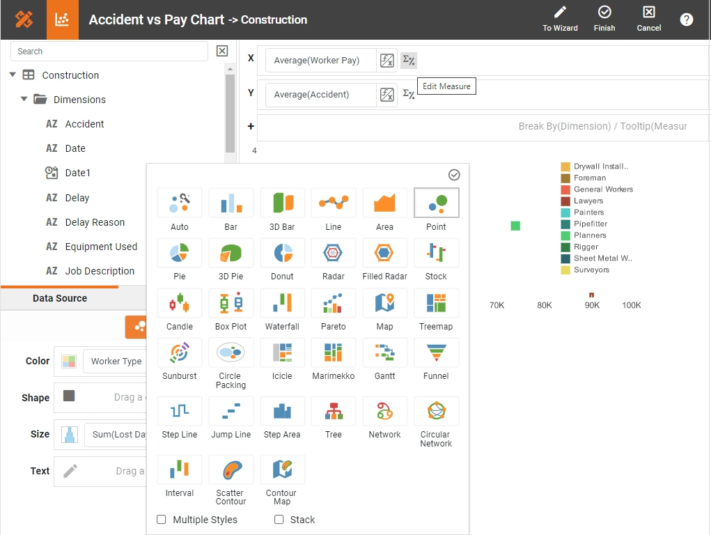
Large Library of Data Visualization Choices
An analyst should be able to take advantage of all the data visualization types that have been thought of by experts in the field. Multi-dimensional charting such as bubble charts, and trellis or multi-charts are essential. Advanced geographic mapping including the use of common country and state/provinces maps plus the ability to use custom-drawn maps should be possible.
Other specialized chart types that should be possible are tree, step line, step area, jump line, Gantt, funnel, network, circular, Marimekko, radar, candlestick, stock, box plot, waterfall, icicle, interval, scatter, scatter contour, sunburst, and circle packing. It almost goes without saying line, area, bar and pie charts will be included.
Brushing for Data Exploration
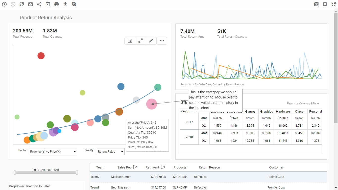
This is a somewhat hard to find feature among dashboard solutions. Brushing means highlighting related data across multiple charts. Brushing is a powerful tool that helps you to quickly detect and understand relationships your data. It is great for understanding the contribution of one item out of the total. This feature should be available both to designers and end-users. An administrator should be able to set CSS properties to change the brushing color.
Dual Purpose Input Selection Elements
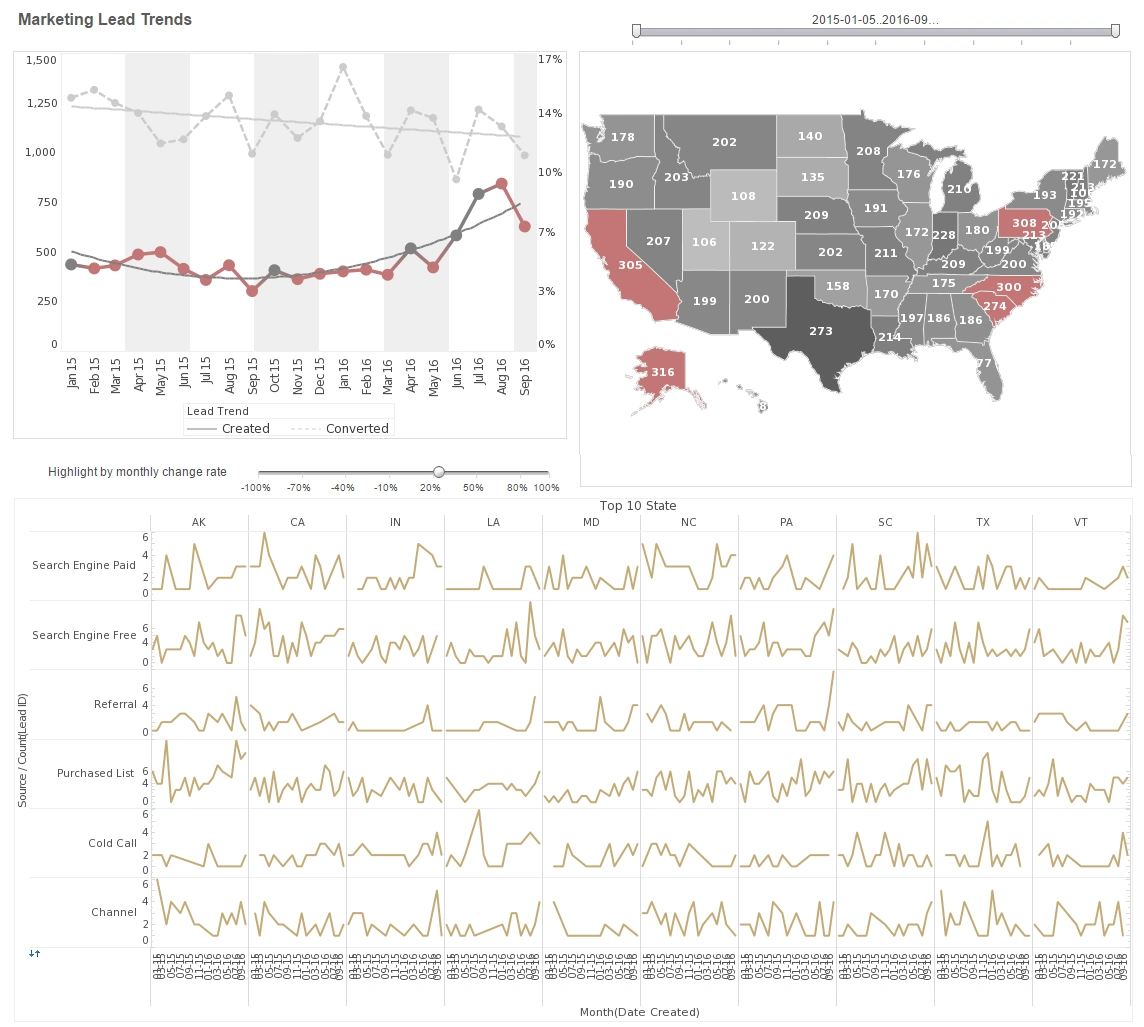
Among the input or filtering tools a dashboard user should have are selection lists, calendars, and range sliders. Simply by clicking or dragging, user should be able to narrow down the data view of interest to them. Being dual-purpose means that the input tool shows you the available choices before the user even begins to modify the view. In other words if the data range of available data in the dashboard is only 2 years, then the date calendar will only show that by coloring the possible choices. Another example would be in selection list. A selection list may only show two items (out of many) that are filled squares. This indicates that the result set includes only data from these two choices. The remaining choices are listed under 'Others'.
A selection list should rovide either single-selection or multiple-selection capability, and can be configured to submit selections immediately when you make the selection or on-demand when you press the 'Apply' button . To filter data using a selection list, select the desired item(s) in the list. If an 'Apply' button is visible in the title bar, press the 'Apply' button to submit your selections. If you want to make only a single selection (all selections being mutually exclusive), hold down the Alt key on the keyboard and make your selection. This changes the Selection List to "single-selection" mode. Alt -click again to return to multiple-selection mode.

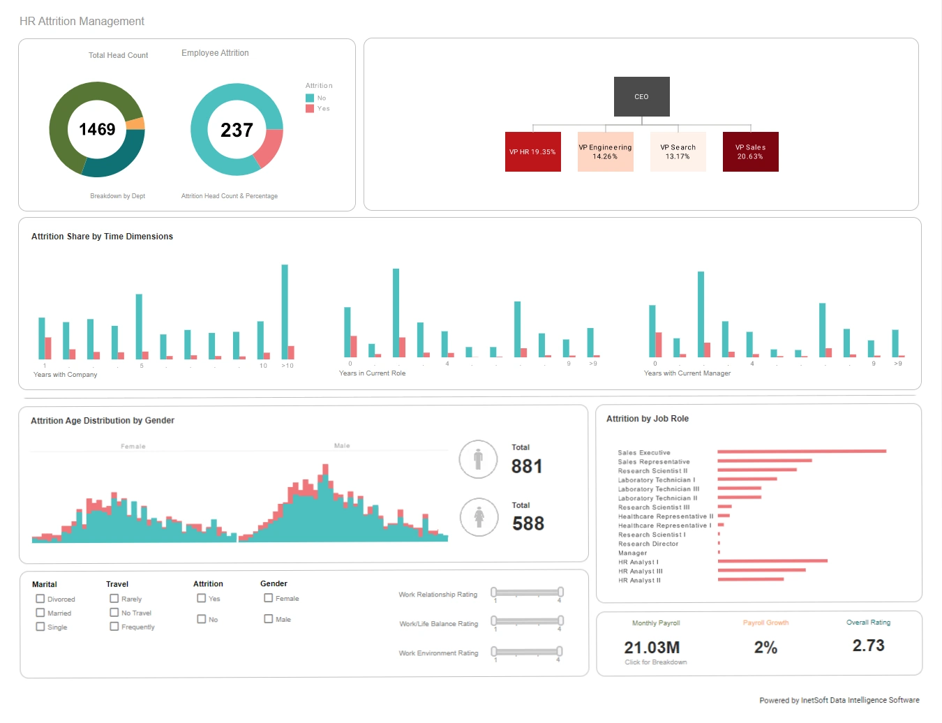
Multiple Output Gauge Types
The most common way to represent a key performance indicator (KPI) is by using a gauge component for graphical representation or a text component for digital representation. A gauge could be large numbers or arrows color-coded by condition such as green for good or up, andr red for bad or down. Other types are speedometers, donuts, thermometers, and bullet charts.
A gauge component allows you to display a single aggregated value (for example, a grand total) in a visually prominent manner. In addition to displaying static text, a text component allows you to display a single aggregated value (for example, a grand total).
The easiest way to use a Gauge or Text component to display a KPI is to bind the Gauge or Text to an existing data field as described in the previous sections. However, you can also compute a KPI using script. There are several ways to do this: create a calculated field, and bind the calculated field to the gauge or text in the usual way. Or enter an expression for the 'Text' property on the general tab of the 'Text Properties' panel to aggregate the desired data. Or enter an expression on the Script tab of the 'Gauge Properties' or 'Text Properties' panel to compute a desired value.
Sorting
With the click of a mouse, users should be able to sort data tables by column from largest to smallest or vice versa. Chart axes should be similarly sortable. To sort chart groups based on a measure, users should hover the mouse over the desired measure axis. This displays the 'Sort' button next to the axis. Press the button once to sort the groups in ascending order by measure value, press a second time to sort in descending order by measure value, and press a third time to restore the original order. Developers should also be able to set a dashboard to display and sort values for Top-N rankings.
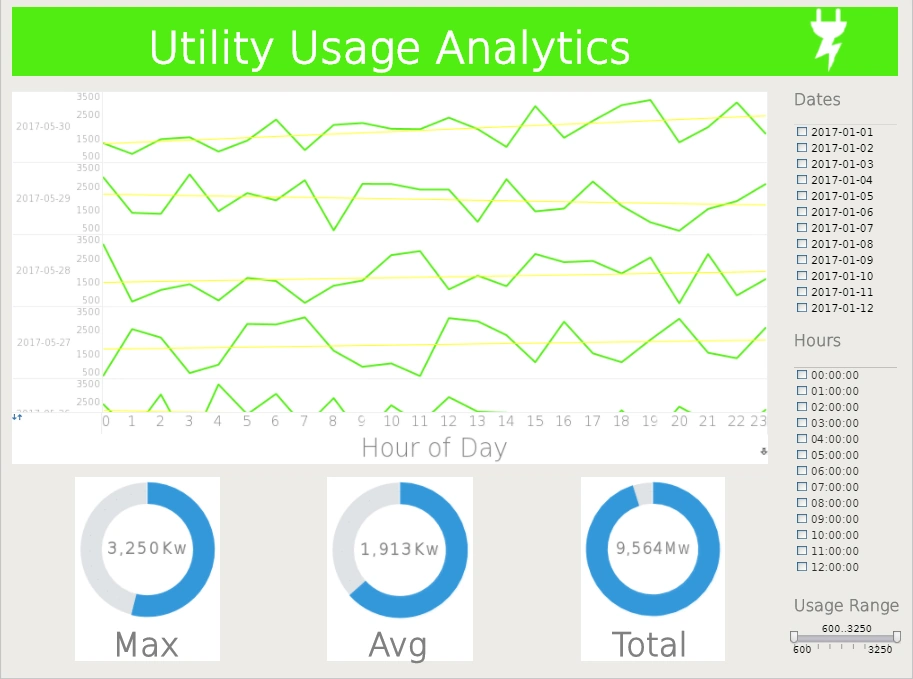
Target Lines and Trend Lines
A target line is a horizontal or vertical line drawn on the chart that denotes an ideal value (goal or threshold) or representative value (average, minimum, etc.). A target band is a horizontal or vertical band drawn on the chart that denotes either an ideal range (e.g., goal zone) or representative range (e.g., span of maximum to minimum). A statistical measure is a line or region drawn on the chart to represent one or more statistical quantities derived from the data (confidence intervals, percentiles, etc.). A trend line is curve that is fit to the data based on a selected model (linear, quadratic, etc.).
Visual Chart Tips or Mouseovers
When you hover the pointer over a data group on a chart, the tooltip provides useful information about the dimensions and measures represented by the group. You can also choose to replace the tooltip with a data tip. A data tip displays information about a data group using another Dashboard component, such as Chart, Text, or Gauge (or a collection of such components). The data tip is dynamically filtered to show only data corresponding to the particular chart group on which you hover. You can create a custom tooltip by using HTML markup to style the tooltip text. If you expect end-users to make changes to the chart using the Ad Hoc Editing feature, you should use field names rather than indices. Indices may not work correctly after a user makes ad hoc changes to the chart.
Annotations
End users should be able to add annotations to a dashboard, to an individual dashboard component, and even to an individual data point in order to share information among viewers or even just a reminder to themselves. The annotation could explain why there is an outlier, if there was an outage or a holiday, or it could impart some interesting finding or call-to-action. Adding an annotation should be as easy as right-clicking in an empty region of the dashboard, and selecting 'Add Annotation' from the context menu.

Bookmarking
A bookmark allows you save your current Dashboard settings (filter selections, menu choices, annotations, etc.) so that you can return to these settings at a later time. This makes it possble for novice users to customize their views of a pre-built dashboards. Bookmarks should also be shareable so an interesting data view can be shared without the recipient having to follow the same customization and filtering steps that the bookmark maker did. There should be a 'Read-only' option if you do not want other users to modify this bookmark. And there should be a default bookmark for a dashboard which specifies the settings (filter selections, menu choices, annotations) that will be in effect each time you re-open the dashboard in the portal, i.e., the "starting state" of the dashboard.
Social Network Support
With a simple click-to-share button users should be able to share a dashboard to Facebook, Google Hangouts/Chat, LinkedIn, Twitter, Slack, or just email or copy link. Sharing on Facebook should not require the application to be accessible from the internet.
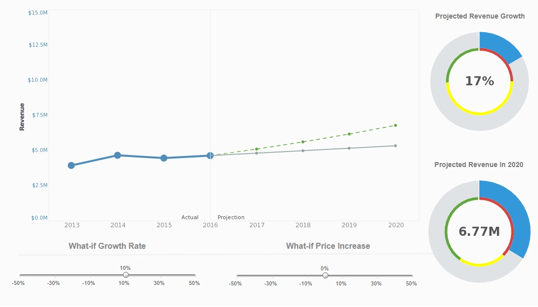
What-if Analysis
What-if analysis is the process of mathematically predicting how an organization will be affected given a predefined situation. This is typically done in spreadsheet programs, by modifying certain values in a dataset to see how those changes will influence outcome of the formulas in place. In a dashboard the input modification should be controlled by a range slider or input box. The what-if formula is programmed into the dashboard so that all charts automatically update when the input(s) is(are) changed.
Examples of what-if scenarios are "What if I sell only 97% of the product I wanted to sell this month? How will that affect my bottom line for the quarter?"; "What if our trucks get snowed in this winter? What will that do to our supply chain?"; "What if my sales people outperform their quotas? How do I have to modify my budget to pay their commission?"
Machine Learning Integration
The software productionalizes machine learning. It provides visual tools that directly tap into machine learning business applications. Business users can not only visually analyze machine learning results but also train machine learning models with sliced-and-diced data. When data grows beyond an experimental machine learning setup, the native Apache Spark based platform can easily scale on demand. It can utilize an external Spark Cluster or build its own with minimal Spark expertise. Learn more about the benefits of integrating ML and dashboards.
Ad Hoc Wizard
An Ad Hoc Wizard is a simple guided procedure that helps a user to create a basic report featuring a chart, table, or crosstab, depending on the Wizard that the user selects. The user can then proceed to make further modifications to the report using the Ad Hoc tools.

Wide Array of Data Access Options
The dashboard platform should be able to connect to any relational database as Microsoft Access, MySQL, or Oracle. It should be able to access many cloud-based sources such as Google Analytics, Ads, Facebook, salesforce.com, and AWS. It should permit the import of user or externally generated Microsoft Excel spreadsheets and comma-delimited text files. For a longer list of supported data sources, see https://www.inetsoft.com/solutions/all_data_sources/
Global Styling
Developers and administrators should be able to make format choices like colors and fonts uniform across dashboards to facilitate a corporate theme or especially when embedding dashboards into a cloud-based vertical product for a consistent brand image seen by clients. Developers should be able to deploy CSS files to set styles for all dashboard components. In the same way that global style options allow you to change the appearance of your dashboard without any effort, predefined dashboard themes provide an easy way to customize the look and feel of the dashboard.
Universal Device Support
A dashboard should display properly on all device types from desktops and laptops to tablets and mobile phones. No client app should be necessary. Only a browser. This maximizes reach and minimizes support overhead. HTML5 is the primary solution for how this is accomplished. The server application renders the dashboard in HTML5 which supports all the rich interactivity that would be expected.
At the same time the platform should provide the option to customize how a dashboard is displayed on an electronic device and on the printed pages to optimize the user experience or even load time. A Dashboard "layout" identifies a class of devices (e.g., phone, tablet) based on screen dimensions. The Dashboard layout allows you to tailor the display of the Dashboard to this class of devices.

Data Mashup
Data Mashup, at its basic definition, means combining disparate data sources that were not previously architected to be used together. The key benefit is to get a complete view of organizational performance or to be able to include all relevant data in an analysis.
In a data warehouse environment with rigid ETL process, data mashup yields other benefits, particularly in allowing prototyping of data manipulations before committing to new, official ETL definitions and transformations.
BI professionals should be able to easily mashup disparate data into analytic data blocks and also enable controlled self-service data mashup for users via data models. Data models map prepared data to business terms and completely shield end users from underlying technical details. Data blocks' built-in visual transformation and data cleansing functions make data preparation effortless with minimal technical skills.
Models' built-in governance enforces data consistency and safeguards data processing engine integrity. As part of data governance, the data security model can secure data down to the cell level where users will only access their personalized data.
Data Caching
For cases where data transfer is slow or costly, or operational data source impact needs to be minimized, or when many on-the-fly data transformations and calculations can slow the rendering of a dashboard, there should be an automated data caching option. The preferred approach is the materialized view. Materialized view is a caching strategy that pre-aggregates and stores the data required by a dashboard. When a dashboard has a materialized view, the dashboard will attempt to query the cached materialized view rather than the database.
This can significantly reduce the run time for certain queries, and greatly improve performance for the end-user. Dashboards that possess a materialized view will rely on this materialized view to supply their data. If no materialized view is found, dashboards will either query the database directly or automatically trigger the creation of a materialized view. To improve performance, you can distribute a materialized view across multiple machines.
You can schedule a materialized view to be regenerated on a predefined schedule by assigning a "cycle" to the view. (See Creating a Materialized View for more information.) This allows the materialized view to be updated with new data from the database. However, for a large data set, repeatedly regenerating the materialized view in its entirety may be inefficient. To improve performance, you can elect to update the materialized view incrementally based on a set of specified conditions. For example, you can selectively update the materialized view with data which has posted subsequent to the previous materialization. Likewise, you can delete selected records from the materialized view if they meet a specified condition, such as an expiration date. You can specify an incremental update condition both for mergeable queries (e.g., relational database queries) and for non-mergeable queries (e.g., non-relational database queries, un-parsable queries, etc.).

Clustering
To improve dashboard performance, you should be able distribute materialized views or data caches across multiple machines. This distributed configuration is called a Spark cluster. In a Spark cluster, the materialized dataset is saved on separate physical machines (nodes) in the grid. This allows the dashboard server to pull small blocks of data from each of the nodes, thereby distributing the processing load and minimizing the workload for any particular machine. This increases total throughput and improves Dashboard responsiveness.
A Spark cluster is completely transparent to the end-user. Users can access their dashboards in the same manner regardless of whether a Spark cluster has been configured or not. However, for large data sets dashboard performance is often improved with a Spark cluster in place. Distributed materialized views utilize the Hadoop distributed file system (HDFS) together with a Spark cluster. The Spark cluster provides ready scalability by adding additional machines and excellent fault tolerance.
Fine-grained Security
Security is an important part of any enterprise application. The security model provides security at both a component and functional level. The security model also provides security at a very granular object level, e.g., a user may not have access to all the data models or queries. The security model is highly adaptable and configurable, e.g., you can import your existing users/groups/roles from a database or an LDAP server without redefining them in the dashboard platform.
A security provider is a module which handles security operations for the report server. You can specify independent security providers to provide the following functions: You must specify a security provider in order to generate server audit records. Authentication: Retrieving users, roles, and groups; authenticating logins. Authorization: Storing and retrieving permissions for different components and functions. You can define a chain or authentication providers and a chain of authorization providers.
The LDAP security provider is useful when your users, groups, and roles are already defined in an LDAP environment such as Active Directory or any generic LDAP implementation. The LDAP server can only used for authentication (i.e., verifying user credentials), not for authorization (setting permissions). All user, group, and role information is then retrieved from the LDAP server and cannot be created or configured in dashboard server.
Server Logging
The dashboad server should provide the ability to log messages generated during server and scheduler execution. Administrators should have the option to use custom log configuration. Options should include specifying the 'Log File Directory' to store the log files and 'Log File Pattern' (regex) to identify the log files so that they can be displayed in admin console.
Multiple levels of detail levels are available: 'Debug' provides internal execution-tracing information for debugging purposes. This may be needed when diagnosing a problem in collaboration with Technical Support. 'Info' reports information about the state of the server, such as the security provider in use and the location of the sree.properties file. 'Warning' reports errors that do not prevent normal operation, but indicate a possible problem that should be investigated. 'Error' reports issues that prevent normal operation. It is recommended that you set the detail level to 'Warning' or 'Info' for regular use.
Docker/Kubernetes Deployment
Kubernetes is a container orchestration system that provides the following benefits: Automated (consistent, and repeatable) deployment of containers. Automatic scaling of containers. Automatic system and resource management, including storage, networking, and security. Support for DevOps for easy integration into CI/CD pipelines Support by many cloud infrastructures, including Amazon (EKS), Azure (AKS), and Google Cloud (GKE).
Multi-Tenancy
In certain deployment scenarios, particulary when dashboards are embedded into a cloud-based application serving many clients, you may need to provide different groups of users (i.e., "tenants") with access to different sets of data. This is called a multi-tenant environment. For example, if you are serving user groups from different departments or organizations, you may need to give each tenant access to data stored in a unique database or schema (different login permissions, etc.). To facilitate design of a multi-tenant environment, Style Intelligence allows you to define independent data connections for each tenant. Each tenant can access only the unique connections for which they have privileges. Additionally, you can define a common set of data that is accessible to all tenants.
You can set appropriate aliases for reports, folders, Data Worksheets, and Dashboards. You can use aliases to provide similar names to multiple tenants (e.g., a "Marketing" folder) while maintaining distinct names for administration (e.g., "Marketing-Company A", "Marketing-Company B", etc.). See the related links for details on setting aliases.

Archiving
When a report is generated, the dashboard engine retrieves fresh data from the database regardless of whether the same dashboard has been generated previously. In an environment with many large dashboards, you may choose to pre-generate and archive these large dashboards to avoid delays associated with repeated regeneration. Users can access archived dashboards through the Portal in the same way as regular dashboards, with access controlled by assigned permissions.
There are two ways to archive a dashboard: A user can save a live dashboard into the archive by selecting the 'Save as archive' option in the 'Save As' dialog box within the Portal. A scheduled task can create an archive dashboard. A new archive dashboard will overwrite any exiting archive dashboard with the same name. The archive can be backed up an archive into a Zip file.
Auditing
The audit feature tracks report and data access, as well as asset dependencies. When auditing is enabled, all report and database access is logged in the audit database. Note that auditing requires you to configure the audit database. Passwords for external services such as databases and LDAP servers are securely encrypted using a password-derived key.
Section 508 Accessibility Compliance
The User Portal is compliant with Section 508 of the federal Rehabilitation Act of 1973. This means that most features of the User Portal are accessible via keyboard commands and corresponding voice commands.

Single-sign On Flexibility
Single Sign-On (SSO) is the process of transparently passing user credentials from one application to another so that the user is only required to present login credentials a single time. This helps to create a seamless user experience. You can implement single sign-on (SSO) by injecting a principal object into the HTTP request object as part of the security filter chain. This allows the server to automatically sign in the user without attempting to authenticate credentials.
Language Support
You can use a simple text mapping to localize most text in a dashboard, as well as data source names, data model names (entity/attribute), and query (column) names. When users log into the User Portal or administrators log into Enterprise Manager they can specify a locale (language-country combination), based on which the server dynamically modifies the interface (Portal tabs, Enterprise Manager tabs, repository tree) as well as report and Dashboard elements (text elements, chart axis titles, table header columns, etc.).
Embeddability
A complete dashboard and reporting solution needs to provide the right mix of features and ease of use, but also must fit into the host application as seamlessly as possible. This means that the dashboards and reports must be transparent to the end-user and must look and feel like a normal part of the host application - whether it is used by either internal users or external customers.The dashboard software should be 100% open standards based and rely on these open standards such as AngularJS, REST, and Auth0 to ensure tight integration. Key features include: Single Sign On, Custom Theming, Wide Variety of Data Sources, and a Single Web UI for all Devices. If you are an application developer, be sure to read our top embedded BI features article.

Reading Recommendations for Good Dashboard Software
Two great resources for comparing solution options by feature and capability and for reading real customer opinions and stories of their exeriences with all the providers are the crowd source web sites: Software Advice and G2.
Software Advice's history is interesting. Years ago while on a hike in Montana, their founder had a revelation about software. At the time there weren't any websites that consolidated research on software in one place (especially when it came to industry-specific software). In 2006 they started with the name "RiverGuide," helping people "navigate the treacherous rapids of software selection." In 2009 they changed the name to "Software Advice" and made a new home in Austin, Texas. They went from a bootstrapped start-up to a thriving business, helping over 600,000 people find software. In 2014 they were acquired by Gartner, the world's leader in tech research.
To jump to the dashboard vendor section, go to https://www.softwareadvice.com/bi/dashboard-comparison/
G2's history is a little shorter. In 2012, five entrepreneurs asked themselves this question, Why is it easier to get authentic information about a $100 hotel room than a $100,000 piece of software? The next day, they founded G2 Crowd. Today, more than 60 million people each year including employees at all of the Fortune 500 companies visit G2.com to read and write authentic reviews about more than 100,000 software products and professional services. So far, they've published almost 1.7 million reviews and those numbers only keep growing, helping people around the world make better buying decisions and reach their potential.
To find to the dashboard provider area, go to https://www.g2.com/categories/analytics-platforms
What is a Dashboard?
A dashboard is a data visualization that automatically updates with new data and is used for monitoring performance or analyzing results. Dashboards are used by just about every department in an organization and in every organization in every industry that cares about maximizing performance.
For an in-depth article about examples of dashboards and how they are used in various departments, see https://www.inetsoft.com/company/what_is_a_dashboard/
Benefits of Dashboards for Businesses
Business and non-profit organizations use dashboards for many reasons. They include:
- stopping drowning in information
- gaining business insights
- having real-time information
- improved decision-making
- integrating data
- spotting trends
- boosting financial efficiency
For a 7-minute read of all the reasons for using dashboards and the benefits gotten from them, see https://www.inetsoft.com/business/bi/how-dashboard-software-will-benefit-your-business/
About InetSoft
Since 1996 InetSoft has been delivering easy, agile, and robust business intelligence software that makes it possible for organizations and solution providers of all sizes to deploy or embed full-featured business intelligence solutions. Application highlights include visually-compelling and interactive dashboards that ensure greater end-user adoption plus pixel-perfect report generation, scheduling, and bursting. InetSoft's patent pending Data Block™ technology enables productive reuse of queries and a unique capability for end-user defined data mashup.
This capability combined with efficient information access enabled by InetSoft's visual analysis technologies allows maximum self-service that benefits the average business user, the IT administrator, and the developer. InetSoft solutions have been deployed at over 5,000 organizations worldwide, including 25% of Fortune 500 companies, spanning all types of industries.
Highly Rated By Customers & Award Winning
"Using Style Scope from InetSoft gave us the ability to provide a graphical representation of the key data to top management right 'out-of-the-box' and move from static tables of numbers to charts and graphics that are much easier to understand. Now in a couple of days we can customize several graphic views, and even the users can build their own reports without IT intervention." - Sergio R.
"We chose InetSoft's Web-based dashboard solution because it could be deployed so easily across different geographies and computing platforms and because its feature set is so mature and robust. We were actually surprised by its ease-of-use for end-users when we started to see sales managers creating their own dashboards without special training or support from us in IT." - Erik S.
Cost Savings of a Small Footprint Dashboard Application
InetSoft's unique selling proposition lies in its small footprint, cloud first design philosophy. Compared to traditional dashboard solutions, InetSoft's small footprint platform is distinct in that it:
- Requires significantly less computing power and resources
- Minimizes skill training and administration with an all-in-one web app for dashboard design and
data preparation, for both professional designers and self-service business users
- Offers consistent high performance with an online mini warehouse that avoids IT heavy processes
InetSoft can be deployed to a cloud instance as small as two virtual cores (vCore) for basic use. Indeed one cannot even purchase a physical machine this small since two vCores is the same as one physical core. In contrast, traditional enterprise software usually needs machines or instances with at least 4 to 8 physical cores.
The benefit is directly realized in the software license cost and underlying computing resource cost savings. Add to that the fact that it allows a tremendous degree of flexibility to customize and scale as usage outgrows a deployment. Organizations can scale up with a more powerful instance or scale out with a Kubernetes cluster of small instances.
This flexibility is especially useful for embedding or rebranding scenarios. Imagine a simple case where each of your end-user customers requires a different branding. You no longer have to force them to share a monolithic, expensive deployment with complex branding and security management.
With traditional solutions, developers need expert tools, in the worst case, desktop tools. Many times, they also need to master more than one tool separately for data preparation, mashup, and dashboarding. Then business users are given a simplified web app that hampers their self-service.
InetSoft's single small footprint, modular web app drastically simplifies the environment for users of all skill levels. The foundation of the web app is a small footprint data mashup engine. Users with knowledge of the data can transform and mash up data from all sources without having to wait for IT to prepare the data.
With the single Web App, the tool capability divide between data scientists and self-service users is eliminated. Functional components and data components can be selectively permitted to users according to their skills and knowledge. Self-service users and professional analysts can seamlessly collaborate in the same Web App.