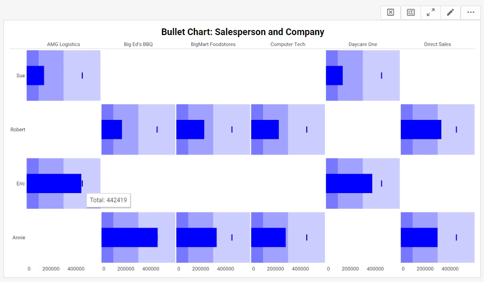
Adding Tooltips to a Table or Chart
A tooltip is a graphical user interface element that provides additional contextual information when a user hovers over or clicks on a specific element, such as a button or icon, within a digital interface.
Typically appearing as a small pop-up box, tooltips offer concise and relevant details about the associated element, aiding users in understanding its function or purpose without the need for navigating to another page or seeking external information.
They serve to enhance the user experience by providing on-the-spot guidance, clarifying ambiguous icons, and contributing to the overall intuitiveness of the interface.
With InetSoft's app, power users can add a tooltip to a chart with a simple GUI. Developers can control them via an API if they are embedding InetSoft's charting technology into their cloud-based vertical solution.
To specify tooltips for individual table cells or chart data, use the following syntax:
replet.addStatus("ElementID", item, "Tooltip");
The 'item' parameter specifies the particular table cell or chart data that should display the tooltip. The 'item' parameter is an EventPoint object, [column, row].
For example, consider the following element-level script for a chart with ID 'Chart1'. Note the index order in the 'item' parameter.
for(var i = 0;
 i < dataset.getRowCount(); i++) {
   replet.addStatus("Graph1", [1,i], dataset.getData(1,i));
 }
The loop iterates through every value in the first chart dataset (index '1'), given by “getData(1,i),” and assigns each value to the tooltip of the corresponding chart graphical element. Use “getData(0,i)” to obtain the X-labels.
To perform a similar assignment of tooltips to individual cells in a table (ID 'Table1'), you can use the following script. Again, note the index order.
for(var i = 1; i < table.length; i++) {
   for(var j = 0; j < table.size; j++) {
      replet.addStatus("Table1",[j,i],table[i][j]);
   }
}
To add a single tooltip to an entire table or chart element, leave the 'item' parameter as 'undefined' or 'null':
 replet.addStatus("Table1",null,"Example table");
 replet.addStatus("Chart1",null,"Example chart");
Specifying a Data Format for Tooltip Text
To specify a data format for the tooltip text, format the 'message' parameter input using the 'formatNumber()' function. In the example below, the tooltips on 'Chart1' are given a particular numeric format:
for(var i = 0; i < dataset.getRowCount(); i++) {
  var fdata = formatNumber(dataset.getData(1,i),"#,###");
  replet.addStatus("Graph1", [1,i], fdata);
}
Text and TextBox
The Text and TextBox elements are the most commonly used elements in a report. They can display static text such as titles, headers, footers, and descriptions, or data retrieved from a query (for example, in a Section element).
You can modify the properties of a Text and TextBox from within script, including font, color, and text contents.

Text Property
You can access the contents of a Text or TextBox element through the 'text' property. To change the contents, simply assign a new value.
Text1.text = CALC.today(); // display current date/time
A TextBox element has several properties in addition to those of the Text element. The 'alignment' property controls the alignment of the TextBox within the document flow. The 'textAlignment' property controls the alignment of the text within the TextBox boundaries.
// right align on the page
alignment = StyleReport.H_RIGHT;

// center align text inside textbox
textAlignment = StyleReport.H_CENTER;
Useful Text/String Functions
Two common string operations are changing case and searching for substrings.
Changing a String to Upper/Lower Case
To change a string to uppercase or lowercase, use the 'toUpperCase()' and 'toLowerCase()' functions, respectively. For example:
 var s = 'John Lennon';
 Text1.text = s.toLowerCase();
For example, to change the header cells of a table to uppercase, add the following lines to the table script:
for(var col = 0; col < table.size; col++) {
  table[0][col] =
    table[0][col].toUpperCase();
}
Searching Within a String
To find one string within another string, use the 'indexOf()' function. The 'indexOf' function returns the starting index of the substring within the parent string. If the substring is not found, the function returns a value of -1. For example:
var state = 'New Jersey';

if(state.indexOf('New') > -1) {
  Text1.text = 'With New';
}
else {
  Text1.text = 'Without New';
}
How Are Tooltips Helpful for Interactive Dashboard Charts?
Tooltips play a crucial role in enhancing the functionality and user experience of interactive dashboard charts. They provide context-sensitive information that helps users understand and interpret the data more effectively. Here's an in-depth exploration of how tooltips are helpful for interactive dashboard charts:
1. Providing Contextual Information
Explanation
Tooltips can display additional information about specific data points when users hover over them. This information may include data values, labels, percentages, or any other relevant details that enhance the understanding of the chart.
Benefits
- Detailed Insights: Users can gain deeper insights without cluttering the chart with too much text.
- Contextual Clarity: Helps in providing context to the data, making it easier to comprehend complex information.
2. Improving Data Interpretation
Explanation
Interactive charts can sometimes be overwhelming, especially when dealing with large datasets. Tooltips help break down the data into manageable pieces by showing details for individual data points.
Benefits
- Enhanced Readability: Users can focus on specific parts of the data without losing sight of the overall picture.
- Reduced Cognitive Load: By displaying information on-demand, tooltips make it easier for users to process and understand the data.
3. Enabling Interactive Exploration
Explanation
Tooltips make it possible for users to explore data interactively by hovering over different parts of the chart. This interactivity encourages users to engage more deeply with the data.
Benefits
- User Engagement: Interactive exploration keeps users engaged and makes the data analysis process more interesting.
- Discover Hidden Patterns: Users can uncover patterns and relationships within the data that may not be immediately apparent.
4. Minimizing Chart Clutter
Explanation
Including all relevant information directly on the chart can lead to clutter, making it difficult to read and interpret. Tooltips allow for a cleaner chart design by displaying detailed information only when needed.
Benefits
- Clean Design: Maintains a clean and uncluttered chart appearance.
- Focus on Key Data: Users can focus on the most critical data points without distractions.
5. Supporting Data Validation
Explanation
Tooltips can provide metadata about the data point, such as the source of the data, the date it was collected, and any calculations or transformations applied. This transparency supports data validation and trust.
Benefits
- Data Transparency: Users can understand the provenance and reliability of the data.
- Trust in Data: Enhances user trust by providing detailed information about the data's background.
6. Guiding User Actions
Explanation
Tooltips can offer guidance on how to interact with the chart or provide instructions on interpreting the data. This is particularly useful for complex dashboards where users might need additional context to navigate.
Benefits
- User Assistance: Helps users understand how to use the dashboard effectively.
- Improved User Experience: Enhances the overall user experience by reducing confusion and providing clear instructions.
7. Displaying Comparative Data
Explanation
Tooltips can show comparative data, such as changes over time or differences between categories. This is particularly useful in charts that track performance metrics or trends.
Benefits
- Contextual Comparison: Users can see comparisons directly within the tooltip, aiding in quick analysis.
- Trend Analysis: Helps in understanding trends and patterns by providing comparative context.
8. Enhancing Mobile Usability
Explanation
On mobile devices, screen space is limited, making it challenging to display detailed information. Tooltips can provide an effective way to offer additional details without occupying valuable screen real estate.
Benefits
- Optimized for Mobile: Improves usability on mobile devices by providing information in a space-efficient manner.
- Responsive Design: Ensures that the dashboard remains functional and user-friendly across different devices.
9. Enabling Customization
Explanation
Tooltips can be customized to display different types of information based on user roles or preferences. For instance, a tooltip might show detailed technical data for analysts and high-level summaries for executives.
Benefits
- Tailored Information: Provides relevant information based on the user's needs and preferences.
- Role-Based Access: Ensures that users see the information most pertinent to their role.
10. Enhancing Visual Appeal
Explanation
Well-designed tooltips can enhance the visual appeal of the dashboard by using colors, icons, and formatting to highlight key information. This makes the dashboard more attractive and engaging.
Benefits
- Aesthetic Enhancement: Adds to the visual appeal of the dashboard, making it more engaging.
- Highlight Key Data: Uses visual cues to draw attention to important information.


