Comparing Tools for Making Dashboard Graphs
Choosing the right tool for building dashboard graphs is about more than just pretty charts. It’s about how quickly you can connect to data, how deeply you can customize visuals, and how easily non-technical users can explore insights on their own. InetSoft, Dash Solutions, Polymer, Plecto, and Explo all promise to simplify analytics, but they approach the problem from different angles.
Some focus on operational performance, others on embedded analytics or self-service exploration. This comparison grid walks through their strengths and trade-offs so you can match the right platform to your organization’s needs, whether you’re running a data-heavy media site, a fast-moving SaaS business, or a sales-driven organization that lives and dies by real-time KPIs.


InetSoft
InetSoft is a full-featured business intelligence and dashboarding platform designed for organizations that need robust, enterprise-grade analytics. It emphasizes executive summaries, interactive dashboards, and scalable reporting that can serve both technical and non-technical stakeholders.
InetSoft supports rich data integration, including databases, cloud applications, files, and real-time feeds. It is well-suited for scenarios where you need to combine website analytics, operational data, and engagement metrics into a single, coherent view that updates continuously.
The platform offers advanced visualization options, pixel-level layout control, and highly customizable dashboards. Users can build executive summary views, drill-down paths, and interactive filters, while power users can leverage more advanced analytics such as predictive modeling and data mining.
InetSoft supports scheduled reporting, role-based access, and shared dashboards across teams. It works well in environments where editorial, operations, and leadership teams all need tailored views of the same underlying data, with governance and consistency.
Best for organizations that need a scalable, enterprise-ready analytics layer—such as media companies, SaaS providers, and data-driven enterprises that want a long-term BI foundation rather than a point solution.
Dash Solutions
Dash Solutions focuses on providing straightforward dashboards and reporting, often appealing to teams that want a simpler starting point. It tends to emphasize ease of setup and basic KPI tracking over deep, enterprise-level customization.
Data integration is typically adequate for common sources, but can feel limited when you need complex joins, real-time streams, or highly heterogeneous data. As data needs grow, organizations may find themselves constrained by the available connectors and transformation options.
Dash Solutions offers standard chart types and dashboard layouts, but customization and interactivity can be more restricted compared to enterprise BI platforms. It works well for simple scorecards and operational overviews, but may struggle with highly tailored executive summaries or advanced analytics.
Collaboration is generally focused on sharing dashboards and reports with internal users. It can support basic stakeholder visibility, but may not provide the same depth of role-based control, embedded options, or large-scale distribution that more advanced platforms offer.
Best for smaller teams or organizations that need quick, straightforward dashboards without heavy integration or customization requirements, and that are comfortable with a more limited feature set as they grow.
Polymer
Polymer positions itself as a no-code or low-code analytics tool that turns spreadsheets and simple data sources into interactive dashboards. Its core focus is speed to insight for business users who don’t want to write SQL or manage complex data models.
Data integration is strongest with files, spreadsheets, and common SaaS tools. It is ideal when your data lives in Google Sheets, CSVs, or a handful of cloud apps, but may be less suitable for highly normalized databases or intricate data warehouses that require sophisticated modeling.
Polymer offers attractive, interactive charts and dashboards with a focus on simplicity. Customization is oriented around drag-and-drop configuration rather than deep, developer-level control. This makes it accessible but can limit very specific layout or branding requirements.
Sharing dashboards with teammates and stakeholders is straightforward, often via links or embedded views. It works well for small to mid-sized teams that want to democratize data exploration without standing up a full BI stack or managing complex permissions.
Best for business users and small organizations that live in spreadsheets and want to quickly transform them into interactive dashboards without involving a dedicated data engineering or BI team.
Plecto
Plecto is built around real-time performance dashboards, especially for sales, support, and customer success teams. Its core focus is on motivating teams with live KPIs, leaderboards, and gamification elements that keep performance visible and engaging.
It integrates well with CRM, call center, and support tools, pulling in metrics that matter for frontline teams. While it can connect to other sources, its sweet spot is operational performance data that needs to be updated frequently and displayed on wallboards or team screens.
Visualization is optimized for at-a-glance clarity: big numbers, trend lines, and leaderboards. Customization is focused on arranging KPIs and widgets rather than building complex analytical journeys. It’s less about deep exploration and more about instant visibility and motivation.
Plecto shines in collaboration and team engagement. Features like achievements, contests, and real-time dashboards help align teams around goals. However, it is not a full BI replacement; it complements, rather than replaces, more comprehensive analytics platforms.
Best for sales, support, and customer success teams that want live performance dashboards and gamified KPIs to drive behavior and keep everyone focused on targets.
Explo
Explo focuses on embedded analytics, helping product teams add dashboards and reports directly into their own SaaS applications. Its core value is giving end customers self-service analytics without requiring you to build a full analytics layer from scratch.
Data integration is oriented around connecting to your application database or warehouse, then exposing curated views to end users. It works well when you already have a central data store and want to securely slice it for different customers or tenants.
Explo offers configurable dashboards and charts that can be embedded and styled to match your product. While it may not offer the same breadth of enterprise BI features as a platform like InetSoft, it excels at making embedded dashboards feel native and responsive inside your own UI.
Collaboration is indirect: instead of internal teams sharing dashboards, your customers interact with analytics inside your product. This makes it powerful for SaaS vendors that want analytics as a feature, not just an internal tool.
Best for SaaS companies that need multi-tenant, embedded dashboards and want to offer self-service analytics to their customers without building a custom analytics stack.
Summary
InetSoft, Dash Solutions, Polymer, Plecto, and Explo all help you create dashboard graphs, but they serve very different purposes. InetSoft stands out as a comprehensive, enterprise-ready BI platform that can unify complex data sources and deliver highly customized executive dashboards at scale. Dash Solutions offers a simpler, lighter-weight approach that works for basic KPI tracking but may feel limiting as data complexity grows. Polymer prioritizes no-code accessibility for spreadsheet-centric teams, while Plecto specializes in real-time, motivational dashboards for sales and support. Explo, meanwhile, is tailored for embedded analytics, turning dashboards into a native part of your SaaS product. The right choice depends on whether you’re optimizing for enterprise governance, speed to insight, team motivation, or customer-facing analytics—but understanding these differences makes it much easier to pick the tool that truly fits your strategy.

More Articles About Tools for Making Dashboard Graphs
Below you will find articles and documentation related to InetSoft offerings:
Embedding dashboards integrates interactive charts into other applications. It lets users see and
interact with dashboards without leaving the host application. This improves workflow and user
experience. Vendor of Turnkey
Dashboards - Looking for a good turnkey dashboard vendor? InetSoft, a pioneer in self-service
oriented
dashboard software, can manage your dashboards. Highly rated customer service holds your hand during the
entire process. View a demo and try interactive examples... Vendor Management
Dashboard Tool - Are you looking for a good tool to make a vendor management dashboard? InetSoft's
pioneering dashboard reporting application produces great-looking web-based dashboards with an easy-to-use
drag-and-drop designer. Get cloud-flexibility for your deployment. Minimize costs with a small-footprint
solution. Maximize self-service for all types of users. No dedicated BI developer required. View a demo
and
try interactive examples... Visualize Data in Your JSP Web
Applications - Looking for tools to visualize data in your JSP Web application? InetSoft provides
both
free and commercial Web chart graphing tools. View a demo and try them out for free. Style Chart is a free
charting API for Web developers to embed graphs in their site. Some of the documentation follows below.
The
LinearSizeFrame object contains a frame that linearly maps numerical data values to sizes. To create a
LinearSizeFrame object, call the LinearSizeFrame constructor. You can pass the name of a field (e.g.,
'Quantity') to the constructor, or specify this later using the inherited VisualFrame.setField(field)
property. Bind a point-type chart to the sample 'All Sales' query, with 'Company' (top 5) on the X-axis,
and
Sum(Total) on the Y-axis. Add the following script in the onLoad Handler. The CategoricalSizeFrame object
contains a frame that assigns a unique size to each distinct value. To create a CategoricalSizeFrame
object,
call the CategoricalSizeFrame constructor. Bind a point-type chart to the sample 'All Sales' query, with
'Company' (top 5) on the X-axis, and Sum(Total) on the Y-axis. Add the following script in the onLoad
Handler... Ways Network Operations Managers Use
Dashboards
- Dashboards are very essential for companies that deal with online customer services and sales
departments.
The prime need of having a dashboard in your organization is that it will help you track and visualize the
overall performance. Once you know the elements that are affecting your business performance, you can
modify
your objectives and change your approach to market trends and customer behavior. Let's say that you own a
business that is connected with multiple networks. Dealing with such a system can be tedious and
challenging.
You know certain challenges will be there, and you need to act professionally towards them. The toughest
task
is to manage those networks with the utmost accuracy. If your network is not performing well, you have to
face
criticism for being outdated with the customers' data. One way to counter this problem is to hire a team
to
look after your networks, and another one is to have a NOC (Network Operation Center) at the company. In
this
article, we have provided detailed information about managing the dashboard for business purposes. Apart
from
this, we have also illustrated the key benefits of NOC dashboards. So, without further ado, let's dive
straight into it... Ways
Travel Agencies Use Dashboards - The corporate travel industry isn't one to adopt changes quickly,
and
that's understandable. There is no point in experimenting and risk making losses when everything is still
in
order and works perfectly. On the other hand, leisure travel is fast-moving and is adopting changes such
as
mobile payment, customer booking tools, etc. effectively drifting from traditional travel agencies'
operations. Although the management of business travel is hesitant, the travelers themselves aren't. In no
time, millennials will make up the majority of the workforce. These people commonly plan their trips with
their smartphones, trust AI to make critical analytical decisions, digitally manage their expenses,
embrace
and learn new technologies, etc. These people also demand their employers to be like they are. While on
business trips, most of these employees contact their office with mobile apps, and the companies cannot
track
them and give them the needed assistance for the journey should they need it, because they lack the
technology. In order to address the demands of travelers and adapt to the new behavior, the existing
solutions
are divided into two classes... Web Based Dashboard Server for Enterprises -
Looking
for a dashboard server for your enterprise? Since 1996 InetSoft has been making dashboard software that is
easy to deploy and easy to use. Its unique data mashup capabilities enable unified views of corporate
performance and maximum self-service... Web Based Dashboards
-
"I spent months looking for the best dashboard application for my business. I literally tried and
tested
evey application out there, and I have to say that the StyleBI Application is by far the
best..." Web Based
Dashboard
Demo - Researching dashboard solutions for your organization's internal use or to embed in a
commercial
application? Deploy a small-footprint, easy-to-use Flash-based dashboard application from InetSoft... Web-based
Dashboard
Demonstration - Looking for a web-based dashboard application? Since 1996 InetSoft has been making
dashboard software that is easy to deploy and easy to use. Build self-service oriented dashboards quickly
.
View a demo and read customer reviews... Web
Based Interactive Dashboard System - Looking for a Web-based interactive dashboard system? InetSoft
makes dashboard software that is easy to deploy and easy to use, and its unique data mashup capabilities
enable unified views of corporate performance and maximum self-service... Web Based Interactive Dashboards Via Flash
Or
Html 5 - Looking for interactive dashboards via Flash or HTML5? Since 1996 InetSoft has been making
business dashboard software that is easy to deploy and use. The Web-based server solution delivers fully
interactive dashboards in either Flash or HTML5 depending on the browser capabilities of the user's
device:PCs, Macs, smartphones, tablets, iPads, and iPhones... Web Based KPI
Dashboard
Application - Are you looking for a good web based KPI dashboard application? InetSoft's pioneering
dashboard reporting solution produces great-looking interactive dashboards with an easy-to-use
drag-and-drop
designer. Maximize self-service for all types of users. No dedicated BI developer required. View a demo
and
try interactive examples... Webmaster Dashboarding Tool for Google - Looking for
a
good solution for Google search console dashboarding? InetSoft's pioneering BI application produces
great-looking dashboards that mashup SEO performance data with other marketing campaign data in your
organization. View a demo and try interactive examples... Website Security Monitoring Dashboards - In today's
digital age, website security is a crucial component of any online business. Cyberattacks such as hacking,
phishing, and malware can cause significant damage to a website's reputation, user trust, and revenue. As
a
result, many organizations are turning to monitoring dashboards to help maximize their website security.
Monitoring dashboards provide real-time visibility into a website's security posture, enabling
organizations
to quickly identify and respond to security threats. In this article, we will explore how monitoring
dashboards can be used to analyze key performance indicators (KPIs), interpret charts, and take action to
improve website security. Furthermore, monitoring dashboards can provide insights into website performance
and
availability. By monitoring website uptime and response times, organizations can ensure that their website
is
always available to customers and that it is performing optimally. This can help to prevent issues such as
slow page load times, which can lead to a poor user experience and potentially lost revenue. In addition
to
identifying security threats, monitoring dashboards can also track wildcard SSL certificate to ensure that
they are up-to-date and correctly configured. This is important because SSL certificates provide a secure
connection between a website and its users, and any vulnerabilities in the certificate can be exploited by
cybercriminals. By using monitoring dashboards to track SSL certificate updates and configurations,
organizations can proactively address potential vulnerabilities and ensure the security of their website
and
user data... Weekly
Dashboard Reporting Software - Looking for a good weekly dashboard reporting software? InetSoft's
pioneering dashboard reporting application produces great-looking web-based dashboards with an easy-to-use
drag-and-drop designer. View a demo and try interactive examples... Weekly
Dashboard
Examples - Weekly dashboards are vital for the regular monitoring and control of business
conditions.
But in many cases, the production of weekly dashboards puts additional demands on administrators and
employees. And with so much business travel and work done out in the field, dashboard accessibly and
deliverability can also be an issue. InetSoft's solution, StyleBI, makes the setting up and
delivery of weekly dashboards easy and efficient... What Activity Does a Merchant Service
Provider Monitor? - Merchant service providers (MSPs) play a vital role in facilitating electronic
transactions for businesses, handling everything from credit card processing to payment gateway services.
One
of the key activities that MSPs monitor is the authorization and processing of payment transactions. This
involves scrutinizing each transaction to ensure its legitimacy, detecting any signs of fraud or
suspicious
activity, and verifying that the transaction meets the necessary security standards and compliance
regulations. By closely monitoring transaction activities, MSPs help protect both merchants and consumers
from
fraudulent practices while ensuring the smooth and secure flow of electronic payments. Another critical
aspect
of monitoring for MSPs is risk management. MSPs assess various types of risks associated with payment
processing, including financial risks, operational risks, and compliance risks. They monitor factors such
as
transaction volumes, chargeback rates, and changes in merchant behavior to identify.. What Analytics and KPIs
Are
Used on Reputation Management Dashboards? - The success or failure of a company may be influenced by
public perception thanks to the influence of social media and internet platforms. In order to track and
improve how a company is seen, reputation management has become an essential activity. Key Performance
Indicators (KPIs), measures that provide light on the state of a company's reputation, are essential to
successful reputation management. This article discusses reputation management dashboard KPIs and how
firms
assess, track, and react to their online image. An important KPI in reputation management is online
sentiment
analysis. It entails keeping an eye on internet reviews, news stories, and social media to gauge if a
brand is
being linked with good, negative, or neutral opinion. Businesses may react quickly to negative sentiment
and
magnify positive feedback by using this KPI to identify the general tone of talks about their goods or
services... What Are the
Advantages of a Cloud-Hosted Dashboard Vs. an On-Premise Dashboard? - Cloud-hosted dashboards and
on-premise dashboards each offer distinct advantages, and the choice between them depends on various
factors
such as organizational needs, resources, and preferences. Below are some advantages of a cloud-hosted
dashboard compared to an on-premise dashboard: Accessibility and Scalability: Cloud-hosted dashboards are
accessible from anywhere with an internet connection, allowing users to view and interact with data
remotely,
which is especially beneficial for distributed teams or remote work environments. Cloud platforms offer
scalability, allowing organizations to easily scale up or down their dashboard infrastructure based on
changing needs without the need for significant upfront investments in hardware or software. Reduced IT
Infrastructure and Maintenance Costs: Cloud-hosted dashboards eliminate the need for organizations to
invest
in and maintain on-premise hardware, servers, and infrastructure, resulting in lower upfront capital
expenditures and reduced ongoing maintenance costs. Cloud service providers handle infrastructure
maintenance,
upgrades, and security patches, freeing up IT resources and allowing organizations to focus on core
business
activities rather than IT infrastructure management. Rapid Deployment and Time to Value: Cloud-hosted
dashboards can be deployed quickly and easily, often within minutes or hours, compared to the longer lead
times required for procuring, configuring, and deploying on-premise hardware and software... What
Are the Advantages of Using Snowflake as the Data Platform to Feed a Dashboard Solution? - Using
Snowflake as the data platform to feed a dashboard solution offers several advantages, making it a popular
choice for organizations looking to build scalable, high-performance analytics solutions. Here are some of
the
key advantages of using Snowflake: Scalability: Snowflake is built on a cloud-native architecture designed
for
scalability. It can seamlessly scale up or down based on workload demands, allowing organizations to
handle
large volumes of data and accommodate growing user needs without significant infrastructure investments or
performance degradation. Performance: Snowflake leverages innovative technologies such as multi-cluster
architecture, automatic scaling, and query optimization to deliver high-performance analytics processing.
It
supports parallel processing of queries, enabling fast query execution times and real-time data insights
for
dashboard visualization. Concurrency: Snowflake provides built-in support for concurrent data access,
allowing
multiple users to query and analyze data simultaneously without impacting performance. This concurrency
model
is essential for interactive dashboard solutions that require real-time access to data by multiple
users...
What Are the Benefits of
a
Small Footprint Application Like InetSoft's - InetSoft's small footprint application offers several
benefits that contribute to enhanced efficiency, performance, and user experience. Here are some key
advantages: Resource Efficiency: A small footprint application like InetSoft's consumes minimal system
resources, including memory and disk space. This efficiency is crucial for organizations seeking to
optimize
their infrastructure and reduce hardware requirements, leading to cost savings. Quick Deployment: The
compact
nature of InetSoft's application facilitates quick and straightforward deployment. The lightweight design
allows for faster installation processes, reducing downtime and enabling organizations to implement and
roll
out the solution more rapidly. Faster Load Times: With a small footprint, the application can be loaded
and
executed more swiftly. Users experience faster load times for dashboards, reports, and other components,
contributing to an improved overall user experience and productivity... What Are the Benefits of Using an
Energy Management Dashboard? - An Energy Management Dashboard offers a centralized platform for
monitoring, analyzing, and optimizing energy consumption within an organization or facility. The benefits
of
using such a dashboard are multifaceted and can have a significant positive impact on various aspects of
operations, sustainability, and cost management. Here are some key benefits: Real-Time Monitoring and
Visibility: Provides real-time visibility into energy consumption patterns, allowing stakeholders to track
usage trends, identify anomalies, and monitor performance against targets. Data-Driven Decision Making:
Enables informed decision-making based on actionable insights derived from energy data analysis. Users can
identify inefficiencies, prioritize energy-saving initiatives, and allocate resources effectively... What Are the Best Practices for a Strong
KPI
Dashboard? - The first step is to understand why dashboard reporting is useful. Choosing the
appropriate
KPIs to make your dashboard effective is the next step. Although this may differ depending on the
department
and the general objectives of your business or customer, there are certain universal trends. Quality is
preferred than quantity for dashboard reporting that is effective. You only have one screen to use as a
canvas
when using a dashboard. Anyone looking at the screen ought to be able to take in the important information
swiftly and without difficulty. Overcrowding your dashboard with useless gauges or graphs muddles the
message
and might make it difficult to determine what is most important. Prioritize the appropriate KPIs for your
dashboard report. Pick the ones that most effectively represent the tale of your data, to be more precise.
What KPIs are most important to your bottom line? What would the recipient of the report like to see...
What Are the Disadvantages of Epicor
Dashboards? - Epicor is a popular enterprise resource planning (ERP) software provider that offers
dashboards as part of its solution. While Epicor dashboards provide several benefits, they also come with
certain disadvantages. Here are some potential drawbacks of Epicor dashboards: Complexity: Setting up and
configuring Epicor dashboards can be a complex task. They often require technical expertise and
familiarity
with the Epicor system. Customizing the dashboards to meet specific business needs may require additional
development or consulting services. Learning Curve: Epicor dashboards may have a steep learning curve for
users who are new to the system. Understanding how to navigate the interface, access relevant data, and
interpret the visualizations can take time and training. Limited Customization: While Epicor dashboards
offer
some level of customization, there may be limitations on how extensively you can tailor the dashboards to
your
specific requirements. Advanced customization options may require additional development effort or
integration
with external tools. Data Integration Challenges: Integrating data from various sources into Epicor
dashboards
can sometimes be challenging. If you have data stored in multiple systems or databases, you may need to
invest
in data integration solutions or middleware to connect and consolidate the data effectively. Performance
and
Scalability: Dashboards that display large amounts of data or complex visualizations may experience
performance issues... What Are the Drawbacks to Apache Superset
Dashboards? - Apache Superset is a powerful open-source data visualization and exploration platform,
but
like any software, it comes with its own set of drawbacks. Here are some potential drawbacks to using
Apache
Superset for creating dashboards: Complexity: While Superset aims to simplify the process of data
visualization and exploration, it still has a learning curve, especially for users who are not familiar
with
concepts such as SQL queries, data modeling, and dashboard creation. Users may find it challenging to
navigate
through the various features and settings. Resource Intensive: Apache Superset can be resource-intensive,
especially when dealing with large datasets or complex queries. Users may experience performance issues or
slow loading times when working with extensive data or generating complex visualizations. Limited Native
Integrations: While Apache Superset supports connections to various data sources through SQLAlchemy, its
native integrations may be limited compared to other data visualization tools. Users may need to rely on
custom integrations or workarounds to connect to specific data sources or platforms... What Are the Drawbacks of
the
Dashboard Reports Included with Zendesk? - Zendesk provides built-in dashboard reporting features to
help users track and analyze customer support metrics. While these dashboard reports offer several
benefits,
there are also some drawbacks to consider. Here are some potential limitations of the dashboard reports
included with Zendesk: Limited Customization Options: The built-in dashboard reports in Zendesk may have
limited customization options compared to dedicated business intelligence tools. Users may find it
challenging
to create highly customized and tailored reports to meet their specific reporting needs and preferences.
Limited Data Visualization Options: Zendesk's dashboard reports may offer a limited range of data
visualization options compared to specialized data visualization tools. Users may not find advanced chart
types or visualization options, limiting their ability to present data in the most suitable format.
Limited
Integration with External Data Sources: While Zendesk allows users to connect with external data sources
through integrations, the built-in dashboard reports may primarily rely on data stored within Zendesk.
Users
may encounter limitations when trying to integrate data from other sources or platforms, restricting the
scope
of their dashboard reports... What Are the Drawbacks of
the
Dashboard Tool Included with Airtable? Airtable's built-in dashboard tool offers users a convenient
way
to visualize and track data from their databases. While it provides several benefits, such as ease of use
and
integration with existing workflows, there are also some drawbacks to consider. Here are some of the
limitations and drawbacks of the dashboard tool included with Airtable: Limited Customization Options:
Airtable's dashboard tool has limited customization options compared to dedicated data visualization
tools.
Users may find it challenging to create highly customized and visually appealing dashboards tailored to
their
specific needs and preferences. Limited Chart Types: The range of available chart types in Airtable's
dashboard tool is limited compared to specialized data visualization tools. Users may not find advanced
chart
types or visualization options, limiting their ability to represent data in the most suitable format.
Limited
Data Sources: The dashboard tool in Airtable primarily relies on data stored within Airtable databases.
Users
may encounter limitations when trying to integrate data from external sources or other platforms,
restricting
the scope of their dashboards. Limited Interactivity: Airtable's dashboard tool may lack advanced
interactive
features found in dedicated data visualization tools. Users may not be able to incorporate interactive
elements such as drill-down functionality, filters, or dynamic data selection, limiting user engagement
and
exploration... What Are the Drawbacks of
the
Dashboards Included in ESRI Software? - ESRI, known for its Geographic Information System (GIS)
software, offers various dashboard solutions to visualize and analyze spatial data. While ESRI's
dashboards
are powerful tools for geospatial analysis and decision-making, they do have some potential drawbacks that
users should be aware of: Complexity of Configuration: ESRI dashboards can be complex to set up and
configure,
especially for users who are not familiar with GIS concepts or ESRI's software ecosystem. Integrating data
from multiple sources, configuring widgets, and designing layouts may require technical expertise and
training. Cost of Licensing and Maintenance: ESRI software licenses can be costly, particularly for
organizations requiring advanced features or access to premium dashboard solutions. Additionally, ongoing
maintenance fees and subscription costs can add up over time, especially for large-scale deployments.
Resource
Intensive: ESRI dashboards may require significant computational resources, particularly when handling
large
datasets or complex analytical tasks. Users may experience performance issues or latency, especially when
running intensive geospatial analyses or rendering complex visualizations... What Are the Drawbacks
to
the Dashboards Included with Microsoft Teams? - While Microsoft Teams offers a range of features and
integrations, including dashboards, there are some drawbacks associated with the dashboards included in
the
platform. Here are several potential limitations: Limited Customization: Microsoft Teams' dashboards may
lack
the level of customization that some users desire. While they provide basic functionality for tracking
tasks,
activities, and conversations within Teams channels, users may find the options for customizing the
layout,
design, and data visualization elements to be limited compared to standalone dashboarding tools. Data
Integration Constraints: The dashboards in Microsoft Teams primarily focus on displaying data and insights
from within the Teams environment itself, such as activity levels, chat statistics, and file sharing
metrics.
However, integrating data from external sources or other business applications may be more challenging and
may
require additional development effort using Microsoft's Power Platform or third-party connectors... What
Are the Drawbacks to Infor Dashboards? - Here are some common drawbacks to consider: Complexity of
Implementation: Implementing Infor Dashboards can be complex, especially for organizations with diverse
data
sources, complex data models, or specific integration requirements. Configuring data connections,
designing
dashboards, and setting up security permissions may require specialized skills and expertise. Limited
Customization Options: While Infor Dashboards offer some degree of customization, the range of available
visualizations, layout options, and customization capabilities may be limited compared to other
dashboarding
tools. Users may find it challenging to create highly tailored dashboards that meet their specific needs
and
preferences. Dependency on Infor Ecosystem: Infor Dashboards are typically part of the broader Infor
ecosystem, which includes enterprise resource planning (ERP), customer relationship management (CRM), and
other business applications. Users who are not fully invested in the Infor ecosystem may find it
challenging
to integrate Infor Dashboards with their existing systems or leverage third-party data sources... What Are the Drawbacks to Microsoft's
Cloud
Dashboards? - While Microsoft's cloud dashboards, particularly those offered through services like
Power
BI, Azure Monitor, and Azure Dashboards, offer numerous benefits su ch as scalability, accessibility, and
integration with Microsoft's ecosystem, they also come with certain drawbacks. Here are some of the
potential
drawbacks to consider: Complexity of Configuration: Setting up and configuring Microsoft's cloud
dashboards
can be complex, especially for users who are not familiar with the platform or lack technical expertise.
Users
may need to navigate through various settings, data connections, and visualization options, which can be
time-consuming and challenging. Learning Curve: Users may encounter a steep learning curve when getting
started with Microsoft's cloud dashboards, particularly if they are new to data visualization or analytics
tools. Learning how to create and customize dashboards, work with different data sources, and use advanced
features may require significant training and experimentation. Costs: While Microsoft offers various
pricing
plans for its cloud dashboard services, including free tiers and pay-as-you-go options, organizations with
large-scale or high-demand usage may incur significant costs over time. Costs can accrue based on factors
such
as data storage, data transfer, and premium features... What Are the Feature
Requirements for a REST API Dashboarding Solution? - Designing a REST API dashboarding solution
requires
careful consideration of the features and functionalities needed to support data visualization, dashboard
customization, user management, and integration with other systems. Here are some key feature requirements
for
a REST API dashboarding solution: RESTful API Endpoints: The solution should provide a set of RESTful API
endpoints for accessing and manipulating dashboard data, including retrieving data sources, creating,
updating, deleting dashboards, and fetching data for visualization. Data Source Connectivity: The ability
to
connect to various data sources such as databases, data warehouses, APIs, and cloud storage services is
essential. The solution should support a wide range of data formats and protocols, including JSON, CSV,
SQL,
and NoSQL databases. Data Visualization Widgets: The solution should offer a variety of data visualization
widgets (e.g., charts, graphs, tables, maps) for presenting data in a visually appealing and interactive
manner. Widgets should support customization options such as colors, labels, axes, and data aggregation
functions... What
Are
the Features of InetSoft's Online Dashboard Designer Compared to Other Options? - InetSoft's online
dashboard designer offers several features that set it apart from other options in the market. While the
specific features can vary depending on the version and subscription plan you choose, here are some
general
aspects that make InetSoft's dashboard designer unique: Drag-and-Drop Interface: InetSoft typically
provides
an intuitive drag-and-drop interface, allowing users to easily create and customize dashboards without
needing
extensive technical expertise. This feature streamlines the dashboard creation process and makes it
accessible
to users with varying skill levels. Rich Visualization Options: InetSoft's dashboard designer often offers
a
wide range of visualization options, including charts, graphs, gauges, maps, and more. This variety allows
users to choose the most suitable visualizations for their data and create compelling dashboards that
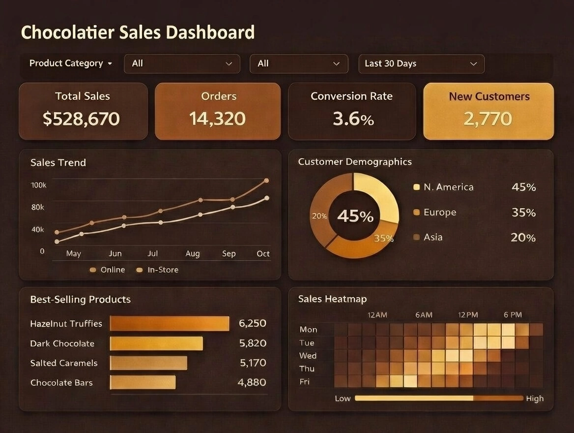
effectively communicate insights... What Are the Metrics Tracked on a
Chocolatier’s Dashboards? - For a chocolatier, dashboards turn the craft of chocolate into a
measurable, improvable business.
A well-designed sales dashboard shows how effectively products are reaching customers and generating
revenue, while a supply chain dashboard reveals how efficiently ingredients and finished goods move from
bean to bar to box.
Together, they help balance artistry, quality, and profitability. For a chocolatier, dashboards turn the
craft of chocolate into a measurable, improvable business.
A well-designed sales dashboard shows how effectively products are reaching customers and generating
revenue, while a supply chain dashboard reveals how efficiently ingredients and finished goods move from
bean to bar to box. Together, they help balance artistry, quality, and profitability... What Are the Filter Types for a Dashboard? - The
most
common way to filter the values of a dimension in a Dashboard is with a Selection List. A Selection List
filters the data in all tables, charts, and output components that are based on the same data block as the
Selection List. A Selection List filters the data displayed by data view components (Tables, Charts, etc.)
and
output components (Gauges, Text). A Selection List can provide either single-selection or
multiple-selection
capability, and can be configured to submit selections immediately when you make the selection or
on-demand
when you press the 'Apply' button... What Are the
Options for Enabling Live Data Refreshing in InetSoft's Dashboards? - Real-Time Data Connectors:
InetSoft provide real-time data connectors to dozens of sources that allow direct connections to live data
sources. This enables dashboards to pull the most current data in real-time, ensuring that the information
displayed is always up-to-date. Scheduled Data Refresh: Dashboards can be configured to refresh data at
scheduled intervals. While not "live" in the sense of real-time, this approach ensures that the
data
is periodically updated. Users can set the frequency of data refresh based on their specific needs. Push
Data
Updates: The BI platform supports push mechanisms where data sources can push updates to the dashboard
when
changes occur. This can be useful for scenarios where immediate updates are critical. Integration with
Streaming Data Sources: For scenarios involving streaming data, InetSoft's platform supports integrations
with
streaming data sources. This allows dashboards to display data as it is generated, providing a real-time
view... What Are Top 10 Open-Source Dashboard Tools? -
InetSoft's StyleBI is an open-source dashboard tool designed for business intelligence and data
visualization. It offers a flexible and scalable solution for organizations looking to analyze and present
data effectively. Pros: Web-Based Access: StyleBI is accessible via a web browser, eliminating the need
for local installations. Customizable Dashboards: Users can create interactive, multidimensional charts
with various filtering options. Integration with Multiple Data Sources: It allows access to disparate data
sources without requiring a centralized data warehouse. User-Friendly Interface: Designed for ease of use,
making it accessible to both technical and non-technical users. Cons: Requires IT Support for Deployment:
Initial setup may need assistance from IT staff. Limited Advanced Analytics: While it provides strong
visualization, it may lack some advanced predictive analytics features. Smaller Community: Compared to
tools like Grafana or Kibana, StyleBI has a less extensive user base... What Are the Top Obstacles to
Deploying Web Based Dashboards? - Deploying web-based dashboards can be a complex process that
involves
various challenges and obstacles. Some of the top obstacles to deploying web-based dashboards are: Data
integration and connectivity: One of the primary obstacles is connecting and integrating data from various
sources into the dashboard. This may involve dealing with different data formats, APIs, databases, and
data
transformation processes. Data quality and consistency: Ensuring data quality and consistency can be a
significant challenge. Data may have missing values, inconsistencies, or errors, which can affect the
accuracy
and reliability of the dashboard. Cleaning and validating data is crucial to maintain the integrity of the
information presented. Scalability and performance: Web-based dashboards often need to handle large
volumes of
data and concurrent user requests. Ensuring scalability and optimizing performance can be challenging,
especially when dealing with complex visualizations or real-time data updates. Balancing the load on the
servers and minimizing response times are critical considerations. Security and access control: Dashboards
may
contain sensitive or confidential information. Implementing robust security measures to protect data from
unauthorized access is essential. Access control mechanisms, user authentication, and data encryption
should
be carefully implemented to ensure data privacy and prevent potential breaches... What Are the Types
of
Market Research That Benefit from Dashboard Analytics? - Descriptive Research: Purpose: This type
aims
to describe the characteristics of a population or phenomenon. It provides a snapshot of the current
situation. Example: Surveys or questionnaires to understand customer demographics. Exploratory Research:
Purpose: This is used when the problem or issue is not well understood. It helps in identifying potential
solutions or avenues for further investigation. Example: In-depth interviews, focus groups, or case
studies.
Causal Research: Purpose: Causal research aims to establish a cause-and-effect relationship between
variables.
It helps in understanding how changes in one variable affect another. Example: A controlled experiment to
determine how changes in pricing affect sales. Quantitative Research: Purpose: This involves the
collection
and analysis of numerical data. It focuses on measurable variables and statistical analysis. Example:
Surveys
with closed-ended questions, data analytics, and statistical modeling... What Can Be Mashed Up in SharePoint
Dashboard? -
SharePoint is a versatile platform developed by Microsoft that serves as a comprehensive solution for
information management and collaboration within organizations. It's capable of storing a wide range of
information, making it a crucial tool for businesses of all sizes. Here are the various types of
information
that can be stored in SharePoint: Documents and Files: SharePoint is renowned for its document management
capabilities. It allows users to create, upload, store, and share documents, spreadsheets, presentations,
PDFs, and other file types. These files can be organized into libraries and folders for easy access and
management. Lists and Databases: SharePoint enables the creation of custom lists that can be used to store
various types of structured data. These lists can function like simple databases, making them suitable for
tasks like tracking tasks, managing inventory, collecting survey data, and more. Calendars: SharePoint
includes a calendar feature that allows users to schedule and track events, meetings, deadlines, and other
important dates. This is particularly useful for teams that need to coordinate their schedules... What
Dashboards
Do PR Managers Use? - Media Monitoring: Dashboards can aggregate data from media monitoring tools,
allowing PR managers to track mentions, sentiment analysis, and media coverage across different channels.
By
monitoring media activities in real-time, PR managers can identify emerging trends, respond to news
coverage
promptly, and assess the overall sentiment surrounding their brand or organization. Coverage Analysis:
Dashboards enable PR managers to analyze the reach and impact of their media coverage. They can track
metrics
such as the number of impressions, reach, share of voice, and media outlet performance. By visualizing
this
data on a dashboard, PR managers can identify high-performing channels, measure the effectiveness of PR
campaigns, and assess the overall visibility of their brand or key messages. Reputation Management:
Dashboards
allow PR managers to monitor and manage their brand's reputation. They can track online sentiment,
customer
feedback, and social media mentions to gauge public perception. By monitoring reputation metrics on a
dashboard, PR managers can identify potential issues, address negative sentiment, and take proactive
measures
to maintain a positive brand image... What
Do Builders of Roads and Transportation Infrastructure Use Dashboard Design Systems For? - Builders
of
roads and transportation infrastructure typically utilize dashboards to monitor and manage various aspects
of
their projects efficiently. These dashboards can provide real-time insights, track key performance
indicators
(KPIs), and facilitate data-driven decision-making throughout the lifecycle of a project. Here are some
elements commonly found on dashboards used by builders of roads and transportation infrastructure: Project
Progress: Overview of project milestones and timelines. Progress tracking of construction activities,
including completion percentages for different phases of the project. Visualization of project schedules
and
critical path analysis. Resource Allocation: Allocation and utilization of resources such as labor,
equipment,
and materials. Monitoring of resource availability and potential bottlenecks. Analysis of resource costs
and
budget utilization. Budget and Cost Management: Tracking of project expenditures against budget
allocations.
Visualization of cost breakdowns by category (labor, materials, equipment, overhead, etc.). Forecasting
future
costs and budget projections... What Do Businesses Track in SharePoint
Dashboards? - SharePoint dashboards are versatile tools that can be customized to track a wide range
of
metrics and data depending on the specific needs and goals of an organization. The types of information
that
people track in SharePoint dashboards can vary greatly across different industries, departments, and
functions. Here are some common categories of data that people often track: Project Management Metrics:
SharePoint dashboards are frequently used to track project progress, including key milestones, task
completion
rates, project timelines, and resource allocation. Project managers can use these dashboards to monitor
project health, identify bottlenecks, and make data-driven decisions to keep projects on track. Document
Management: SharePoint is renowned for its document management capabilities, and dashboards can be used to
track various document-related metrics such as document access statistics, version history, document
approval
workflows, and document storage utilization... What Does the
Department of Health and Safety Regulations Track on Its Dashboard? - The Department of Health and
Safety Regulations typically tracks a variety of key metrics on its dashboard to monitor and ensure
compliance
with health and safety standards, protect public health, and promote workplace safety. Here are some
common
metrics that may be included on a dashboard maintained by a Department of Health and Safety Regulations:
Incident and Injury Rates: Number of Workplace Injuries: Tracking the total number of workplace injuries,
including minor injuries, major incidents, and fatalities. Injury Rate: Calculating the rate of injuries
per
100 full-time employees or other relevant metrics, providing insights into workplace safety performance.
Occupational Health Metrics: Number of Occupational Illnesses: Monitoring the occurrence of occupational
illnesses and diseases, including respiratory conditions, dermatitis, hearing loss, etc. Exposure Levels:
Tracking exposure levels to hazardous substances, chemicals, and environmental factors in the workplace...
What Features Are Required for an
SQL
Server Dashboard Tool? - An effective SQL Server dashboard tool should possess a set of essential
features to provide users with meaningful insights and facilitate data-driven decision-making. Here are
key
features required for an SQL Server dashboard tool: Data Connectivity and Integration: SQL Server
Integration:
Seamless integration with SQL Server databases to retrieve and visualize data directly. Support for
Multiple
Data Sources: Ability to connect to various data sources beyond SQL Server for comprehensive data
analysis.
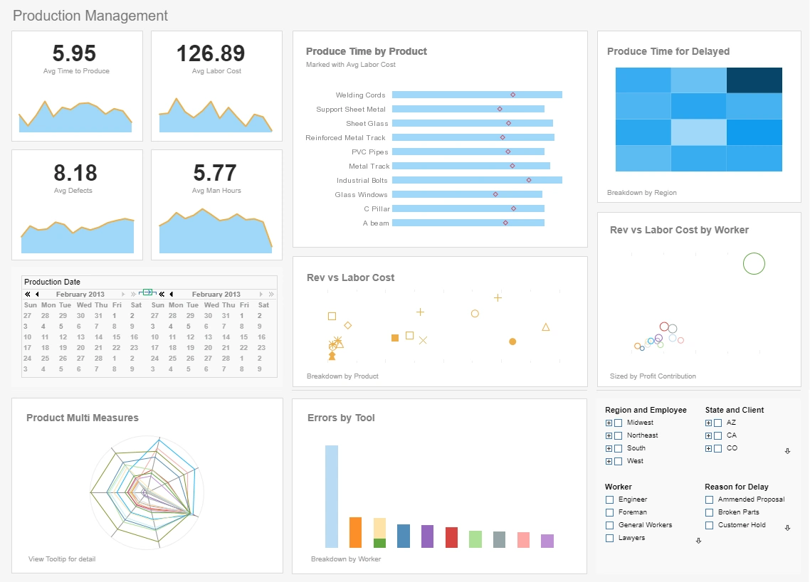
dashboard software vendor example More Dashboard Examples #1 Ranking: Read how InetSoft was rated #1 for
user
adoption in G2's user survey-based index User-Friendly Interface: Drag-and-Drop Design: Intuitive,
drag-and-drop interface for building dashboards without extensive technical expertise. Customization
Options:
Flexibility to customize dashboard layouts, themes, and components to meet user preferences. Real-Time
Data
Updates: Live Data Streaming: Support for real-time or near-real-time data updates to provide users with
the
latest information. Scheduled Refresh: Ability to schedule automatic data refreshes at specified
intervals.
Data Visualization: Rich Chart Types: Availability of a variety of chart types (bar charts, line charts,
pie
charts, etc.) for diverse data representation. Maps and Geographic Visualization: Capability to
incorporate
maps and geospatial visualizations for location-based insights. Interactive Elements: Interactive features
such as drill-downs, tooltips, and filters for a dynamic user experience... What-If Analysis
Dashboard - InetSoft's what-if analysis feature assists analyists in quantifying uncertainty in
causal
relationships and optimizing resource allocation while guiding decisions. What-if analysis is the
exploration
of cause and effect relationships in data. This is one of the greatest strengths of the Data Worksheet,
making
use of the following features: • Embedded tables • Cell references in formulas • Dynamic
table
updating Suppose that all of our big customers have been requesting discounts, and we therefore decide to
give
a 5% discount on all large orders. Since we need to recover the lost revenue incurred by this discount, we
will simultaneously need to increase the sales total on all smaller orders by 5%. To implement this
discount
plan, we need to decide where to place the boundary between “large order” and “small
order” so as to maintain the company's total revenue. This 'price break' value can be discovered
through
what-if analysis... What If
Dashboard
Example - So now, we’ll look at an example of a what if dashboard, and the scenario that we
would
like to cover here, what we like for anyone to take away from that is that the what if scenario
we’re
looking at my projected revenue, it is not an equation that we force upon you. It’s not an equation
that
we prepackage. This is an example of an equation that you develop because every vertical is different.
Every
business is different. Every customer base is different. You might not just want to calculate overall
revenue.
You might want to look at a specific or particular product price change or overall price changes. So, what
you
can do is you can leverage our tool and the powerful data worksheet which we’ll show in a minute.
That
powerful worksheet tool enables you to take that calculation and you can tie input variables such as
changing
the growth rate percentage, and you can see how that projection is going to look based on that. You can
have
as many input variables that are tied to input elements as you need in order to have a very comprehensive
what
if scenario for your business use. Now, I’ve had feedback from customer who actually uses it to make
business decisions based on the new market conditions. They actually make changes to the prices of certain
product based on demand and based on what their forecasting number looked like... What Is on a Bed
Management Dashboard? - A bed management dashboard typically displays real-time information about
bed
availability, occupancy, and patient flow within a hospital or healthcare facility. Some of the key
metrics
that may be included in a bed management dashboard are: Bed availability: The number of available beds in
each
department or unit of the hospital, including the total number of beds and the number of occupied and
unoccupied beds. Occupancy rates: The percentage of beds that are currently occupied, broken down by
department or unit. This can help administrators identify areas where demand for beds is high or where
there
may be excess capacity. Admission and discharge rates: The number of patients admitted to and discharged
from
the hospital each day, broken down by department or unit. This can help administrators anticipate bed
demand
and adjust staffing and resources accordingly. Length of stay: The average length of time patients are
staying
in the hospital, broken down by department or unit. This can help administrators identify areas where
patients
may be staying longer than necessary or where discharge planning could be improved. Patient flow: A visual
representation of how patients are moving through the hospital, from admission to discharge. This can help
administrators identify bottlenecks or areas where patients are experiencing delays or long wait times...
What Is a Dashboard? - Dashboard
software, sometimes referred to as digital dashboards or data dashboards, is often analogized to the
dashboard
in a car. This analogy is a starting point, but it is far from capturing all the ideas embedded in
dashboard
software. On a high level, dashboard software is a versatile visual app that converts data into useful
information. Dashboard software's primary benefit comes from its easy-to-understand, easy-to-use nature.
When
first presented, most likely in a web app, summarized key performance indicators (KPI) are presented in a
single page. The visual nature of the interactive charts allows users to effortlessly answer the most
important questions. After reviewing KPIs, business users can further benefit from dashboard software's
interactive analytic ability. In-place analysis, drilldown paths, and team collaboration are visually
driven
processes that require no special skills to master... What Is Dashboard
Embedding? - The idea of dashboard embedding has been rather popular in the last several years,
especially in the fields of business intelligence and data analytics. It lets enterprises convey vital
insights and visualizations by integrating interactive data dashboards into external apps, websites, or
portals. This article will examine the many facets of dashboard embedding, as well as its advantages,
applications, and enabling technology. Dashboard embedding easily integrates business intelligence (BI) or
data visualization dashboards into other software, websites, or platforms. Users may see and interact with
dashboard charts, graphs, and reports without leaving the host application or website using this
integration.
In essence, it broadens the use of data analytics by providing insightful information to a larger group of
people, such as partners, clients, or staff. By offering a single interface, dashboard embedding improves
user
experience. Users can obtain vital data without having to go between programs, which makes workflow more
streamlined and effective... What
Is In a Data Governance Dashboard? - Organizations are increasingly realizing the necessity for
efficient data governance as the relevance of data continues to rise. To guarantee that data is accurate,
dependable, and secure, rules, processes, and standards must be established. One of the key tools in any
data
governance program is a dashboard, which provides an overview of key metrics and indicators related to
data
quality, usage, and compliance. In this post, we'll look at what a data governance dashboard is and how it
may
assist enterprises in efficiently managing their data. Defining Data Governance Dashboards A data
governance
dashboard is a tool that businesses use to monitor and manage their data assets. It offers a thorough
overview
of an organization's data environment, including data sources, definitions, provenance, metrics for data
quality, and consumption trends. To make sure that data is maintained consistently, uniformly, and
securely,
data governance teams, data stewards, and other stakeholders often utilize the dashboard... What Is the Difference Between a
Dashboard and a Scorecard? - For a short explanation of the difference between the two, when one is
used
versus the other, please see this InetSoft article. These can be designed by a non-technical person with a
drag-and-drop designer. The first is an example from a college admissions department tracking their
applications, admission rate, enrollment and retention rate by gender and racial equity. The second is
from a
litigation firm monitoring their case won-loss-decline rate, how their cases were sourced, and the type of
proposal received, and how they performed against their competitors. The third is from the risk management
department of a multinational corporation measuring the amount of loss per incident by status and year...
What Is The Difference Between a
Visualization and a Dashboard? - Making sense of data in a way that is simple to understand is
becoming
more and more crucial as organizations continue to gather enormous volumes of data. Dashboards and
visualizations may help with this. There are important distinctions between visualizations and dashboards,
despite the fact that they both convey data visually. In this post, we'll examine the distinctions between
dashboards and visualizations and explain why companies would want to use them. What Is a Visualization? A
visualization is a graphic depiction of facts that makes it simple and fast to comprehend. Data is
presented
in an understandable fashion using visualizations, which might include charts, graphs, and diagrams. Data
patterns, trends, and linkages that may not be readily obvious from a spreadsheet or database can be found
using visualizations... What
Is the Process for Building a KPI Dashboard? - You should start with a top-down approach, work with
senior management to find out what they think the key performance indicators are. “Key” is
important in order to come up with a finite number of truly important metrics. Eight to 10 is usually the
right number. They should be chosen because the reflect “Performance,” and they are the ones
that
employees can affect with their actions and decisions. Once you have those, that will germinate the
development of deeper level KPIs at the operational and departmental levels. You can then break those
measures
out and rank them on a couple of criteria. First which are the most important for getting the results they
need to get? Second, you have to determine what is collectible. A lot of times companies start out having
already a third of their desired KPIs being measured and monitored... What Is
the
Role of an Operations Dashboard? - The role of an operations dashboard is to provide a real-time,
consolidated view of essential operational data and key performance indicators (KPIs) in a visually
informative and easily accessible manner. Operations dashboards are used to monitor and manage various
aspects
of an organization's operations, processes, and performance. Here are the main roles and functions of an
operations dashboard: Centralized Data Visualization: An operations dashboard serves as a centralized
platform
that brings together data from multiple sources and systems. It aggregates data from various departments,
processes, and systems, providing a comprehensive and holistic view of the organization's operations.
Real-Time Monitoring: Operations dashboards update data in real-time or near-real-time. This feature
enables
stakeholders to monitor critical metrics and key data points as they happen, facilitating proactive
decision-making and timely responses to changes or issues. Performance Tracking: The dashboard displays
key
performance indicators (KPIs) related to operational efficiency, productivity, quality, and other
performance
metrics. It allows managers and teams to track performance against targets, benchmarks, and historical
data...
What Is a Serverless Dashboard - A serverless
dashboard is a cloud-native solution for visualizing and analyzing data that doesn't require you to manage
any infrastructure. Unlike traditional BI tools that demand costly server provisioning and maintenance,
serverless dashboards run entirely on a scalable backend managed by the cloud provider or BI vendor. You
only pay for usage—no fixed costs, no hardware, and no DevOps headaches. Serverless analytics platforms
are revolutionizing how teams deploy dashboards, especially for real-time metrics, customer-facing
analytics, and embedded data visualizations. Here’s what makes a serverless dashboard solution stand out:
Instant Deployment: Launch dashboards without provisioning servers or databases.
Auto-Scaling: Handle thousands of users or queries without performance degradation.
Zero Maintenance: No patching, server tuning, or manual scaling needed.
Usage-Based Pricing: Pay only for what you use—ideal for startups and SaaS providers... What Key Performance Goals
Does a
Cancer Research Institute Have? - A cancer research institute typically has several key performance
goals aligned with its mission to advance scientific knowledge, improve cancer treatment outcomes, and
ultimately find cures for cancer. Some of the key performance goals that a cancer research institute may
have
include: Breakthrough Discoveries: One of the primary goals of a cancer research institute is to make
breakthrough discoveries in cancer biology, genetics, and treatment modalities. This includes identifying
novel cancer biomarkers, elucidating molecular pathways involved in cancer development and progression,
and
developing innovative therapeutic strategies, such as targeted therapies and immunotherapies. Translation
of
Research Findings into Clinical Practice: Another important goal is to translate research findings from
the
laboratory into clinical practice to benefit cancer patients. This may involve conducting clinical trials
to
evaluate the safety and efficacy of new cancer treatments, implementing evidence-based guidelines for
cancer
screening and diagnosis, and optimizing treatment protocols based on scientific evidence and clinical
outcomes. Improving Patient Outcomes: Cancer research institutes strive to improve patient outcomes by
developing more effective and less toxic cancer treatments, enhancing early detection and diagnosis
methods,
and personalizing treatment approaches based on individual patient characteristics, such as... What Kinds of Images
Can Be
Inserted Into an InetSoft Dashboard Display? - Various types of images can be inserted into
dashboard
displays to enhance data visualization and storytelling. Some common types of images that can be
incorporated
into an InetSoft dashboard display include: Static Images: Static images in formats such as JPEG, PNG,
BMP, or
GIF can be inserted into dashboard panels to provide visual context, branding elements, or supplemental
information related to the data being presented. These images can be logos, icons, background images, or
illustrations that complement the dashboard content. Dynamic Images: InetSoft dashboards support dynamic
image
integration, allowing users to display images that change based on user interactions, data selection, or
real-time data updates. Dynamic images can be used to visualize data trends, display charts or graphs
generated from underlying data, or illustrate dynamic content such as maps or diagrams. Charts and Graphs:
InetSoft's dashboarding solutions include built-in charting capabilities that allow users to create and
insert
various types of charts and graphs directly into dashboard displays. These charts and graphs can visualize
data from connected data sources in formats such as bar charts, line charts, pie charts, scatter plots,
heatmaps, and more... Why Pick StyleBI Over
Dashy? - Choosing an open-source analytics platform is never just a technical
decision; it shapes how teams explore data, collaborate, and scale reporting processes over time. When
comparing the open-source edition of StyleBI with Dashy, the contrast becomes clear because the two
projects occupy very different categories despite both being used to present information visually.
Dashy functions primarily as a customizable dashboard for bookmarking links, surfacing high-level widgets,
and providing a lightweight way to organize tools and quick stats.
StyleBI, by contrast, is built as a full business intelligence environment with data modeling, mashing up,
transformation, scheduling, user permissions, and multi-layer visualization capabilities built in. For
organizations that need more than tiles pointing to other tools, that difference becomes the core reason
to choose StyleBI...