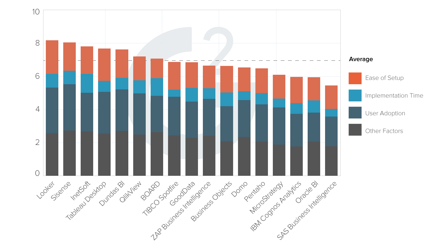
Evaluate InetSoft's Alternative to Apache Superset Dashboards
Are you looking for a good alternative dashboard solution to Apache Superset InetSoft's pioneering dashboard reporting application produces great-looking web-based dashboards with an easy-to-use drag-and-drop designer.
Get cloud-flexibility for your deployment. Minimize costs with a small-footprint solution. Maximize self-service for all types of users. No dedicated BI developer required. View a demo and try interactive examples.


Register for more information and a personalized demo
About
Since 1996 InetSoft has been delivering easy, agile, and robust business intelligence software that makes it possible for organizations and solution providers of all sizes to deploy or embed full-featured business intelligence solutions. Application highlights include visually-compelling and interactive dashboards that ensure greater end-user adoption plus pixel-perfect report generation, scheduling, and bursting. InetSoft's patent pending Data Block™ technology enables productive reuse of queries and a unique capability for end-user defined data mashup.
This capability combined with efficient information access enabled by InetSoft's visual analysis technologies allows maximum self-service that benefits the average business user, the IT administrator, and the developer. InetSoft was rated #1 in Butler Analytics Business Analytics Yearbook, and InetSoft's BI solutions have been deployed at over 5,000 organizations worldwide, including 25% of Fortune 500 companies, spanning all types of industries.

More Resources and Articles about InetSoft's Alternative for Apache Superset Dashboards
42matters App Performance Dashboarding Option - Looking for a good solution for 42matters dashboard reporting? Mashup your mobile app data with other enterprise data for a wider view of performance. InetSoft's pioneering BI application produces great-looking cloud-based dashboards with an easy-to-use drag-and-drop designer. View a demo and try interactive examples. InetSoft's award-winning dashboard software allows users to combine data from disparate and seemingly incompatible sources with sophisticated aggregation options...

Agile Performance Management Company - Since 1996, InetSoft has provided Performance Management Software that is Easy, Agile, and Robust - complete with interactive and monitoring dashboards, scorecards, and drill-down business reporting. Evaluate InetSoft's StyleBI for an afforably priced, quick to deploy, and easy to use performance management solution. Information about InetSoft's Interactive Monitoring Dashboards Monitoring dashboards do not need to be static charts. InetSoft's dashboard software uses a visualization-driven...
Alternative to Azure Application Performance Dashboards - Looking for a good alternative to Azure application insights dashboard? InetSoft's pioneering dashboard reporting application produces great-looking web-based dashboards with an easy-to-use drag-and-drop designer. Mash up your application performance data with any other in your enterprise. View a demo and try interactive examples. With InetSoft, you have access to a web-based business intelligence software application that is easy to deploy and easy to use...
Alternative Reporting Tool for Zendesk - Looking for an alternative reporting tool for Zendesk? Go beyond Zendesk Explore with greater self-service and personalized reporting, advanced chart types, and the ability to create data mashups with other organizational data outside of Zendesk. InetSoft's pioneering dashboard reporting application produces great-looking web-based dashboards with an easy-to-use drag-and-drop designer. View a demo and try interactive examples. StyleBI by InetSoft provides users with an interactive and intuitive dashboarding tool with the ability to report in real-time. As a Java-based application, it delivers web-based dashboards and visuals...
Appearance of a Dashboard Chart - You can change the static appearance of dashboard chart elements by using a static VisualFrame. For example, you can set static colors, sizes, and textures to enhance the aesthetic appearance of a chart. Consider the script below...

API for Executive Dashboards - A VisualFrame object contains information about how data values are mapped to physical properties of chart elements. For example, a BrightnessColorFrame contains information about how data values in a field map to the brightness of corresponding chart elements. Mappings of this type require a Scale. To change the scaling of a VisualFrame object, simply assign a new Scale to the VisualFrame. For example, consider the following chart...
AskNicely Survey Reporting Software - Looking to create customer service dashboards that pull in your AskNicely data in real-time? AskNicely is a cloud-based online survey software that helps businesses create surveys and collect feedback in real time based on Net Promoter Score InetSoft's flagship premium business intelligence software comes with a custom data connector for AskNicely as well as a host of other cloud based and on premise sources. StyleBI was designed to help you integrate any kind of data into your dashboards and reports...
Benefits of Performance Management Products - This is a table of contents of useful product information about, and benefits of, InetSoft's performance management software: 100 Different Performance Tracking Software Packages - There are over 100 different performance tracking software packages. So avoid this trap. Just because balanced scorecard is in the title doesn't mean you are going to have a balanced scorecard, does it? A piece of software is...
Better Manage Data Information - InetSoft's software for creating dashboard charts is used to better manage data information in an easy to read, interactive way. InetSoft's business intelligence software provides many dashboard designing elements that can display data through text and graphics, which makes it easier to handle. InetSoft's software designs dashboards that contain highly visual tables, charts, and other advanced report components, that can all be used in a single report and modified with individual data binding, formatting, and display properties...

Better Than Tibco Spotfire's Visualization Dashboard - Are you looking for alternative to Tibco Spotfire's visualization software? InetSoft offers a web-based server solution that is better suited to enterprises and OEMs, yet is easy to deploy and use. Since 1996 InetSoft has been offering business intelligence applications that are flexible and powerful, serving over 5,000 enterprises and solution providers worldwide. Some of the reasons to evaluate InetSoft against Tibco Spotfire: All Web based solution for creating, interacting with, and modifying visualizations and dashboards. Multiple levels of self-service from business users to power users to business analysts...
Biotech Big Data Analytics - The power of data in contemporary business and science is immense. No industry can really make progress without the analysis of massive information libraries that give us fresh insights and enable new breakthroughs. Biotech is not an exception here as it relies heavily on big data analytics. But how does data science influence the biotech industry? What are the most common use cases of big data in biotechnology? If you are interested in seeing the answers, keep reading to learn more about this amazing topic...
CEO Dashboard Software Example - Manage Keep track of the fast paced market See feedback on performance Detect warning signs of potential problems Analyze Drilldown data that is directly related to your goals and objectives as CEO Visualize solutions to problems using "what-if" analyses Control the data using easy drag and drop features...
Changing Chart Scaling API - A Scale object determines how abstract data values are mapped to physical chart representations such as position, color, shape, etc. The EGraph object and the VisualFrame object both map data values to physical representations, so both of these objects require a Scale. Changing Scaling for Chart Axes See Also Changing Axis Properties, for examples of other axis modifications. To change the scaling of chart axes, simply assign a new Scale to the Chart object. For example, consider the following chart...

Contents of a Useful Analysis Product - This is a table of contents of useful product information about, and benefits of, InetSoft's analysis capabilities built into its business intelligence software for dashboards, reporting, and analytics: 4 Ways How Credit Unions Use Dashboards and Analytics - Like many other businesses now, many credit unions are struggling with continuous technology adoption and innovation. Some may find themselves behind on many important technological trends and face increasing concerns such as cyber security issues...
Create a Chart That Displays a Gauge - In this example, you will create a chart that displays quantity purchased by company. When the user hovers the mouse over a given company, the Chart will display a gauge as a Data Tip. This gauge will display the average quantity purchased by the individual company. 1. Create a new Viewsheet based on the sample 'US Sales' Worksheet. 2. Drag a gauge from the Component tree into the Viewsheet...
Creating an Effective KPI Dashboard - The key to creating an effective KPI dashboard is selecting the right tool, and InetSoft offers a simple and powerful way for users to create a KPI dashboard in order to meet the needs of any business. Key Performance Indicators, or KPI's, are measurable values that indicate how effectively business goals are being met. It is crucial for businesses to keep track of their most important KPI's to ensure ongoing quality performance and overall efficiency...
Demo of Dashboard Alternative to Cognos - Looking for examples of dashboard alternatives to Cognos? InetSoft offers Web-based dashboard reporting software that is more affordable and easier to deploy and use. Below are articles and documentation related to InetSoft software. Dashboard Software Image - InetSoft's applications include dashboard software text packages that allow you to create highly polished and detailed reports on the fly. An Image element displays an image file (gif, jpg, png) on the Viewsheet. To add an Image element to a...

Distinguished Management Dashboard Examples - In order to gain the competitive edge in a particular market, your business needs to be able to read, track, and convert the data that is constantly changing everyday. These interactive dashboards control every aspect of your business. Whether you need to keep track of daily expenses, monthly inventory reports, or quarterly earning, a good management dashboard can help do that. To distinguish itself from others, a good management dashboard will give you the ability to track three key components of your business...
Easy-to-Deploy Visualization Software - InetSoft's StyleBI is an easy to use, interactive data visualization tool that includes real time reporting capabilities. StyleBI is an edition of StyleBI that focuses on business data exploration by combining Data Block technology with visualization. Visualized analysis is constructed in real-time by dropping data items into visual elements such as charts, metrics and selections. The resulting view reveals the intrinsic relationships among the data...
Evaluation of Visual Analytics Solution - Since 1996, InetSoft has offered its visually stunning analytical dashboard software to enterprises and OEMs alike. InetSoft's StyleBI is a comprehensive platform that will redefine your consolidation, reporting, and performance management functions in one easy, agile, and robust dashboard. Visual analysis is a relatively new innovation in information management software that allows a person to explore data in an interactive, visual manner. At its simplest, it means charting and graphing data, but the novelty is in multi-dimensional charting and interactivity...
Examples of KPI Dashboards and Reports - The examples of KPI dashboards shown at the top and bottom of this page come from a set of interactive dashboards that InetSoft has developed and made available in an edition of StyleBI tailored to salesforce.com users. For more details on that solution please see salesforce dashboard information on StyleBI for Salesforce...

How To Design Dashboard Charts - The Chart Editor automatically categorizes numerical fields of a Data Block as "measures" and non-numerical fields as "dimensions." Typically, dimensions are used as X-axis data, and measures are used as Y-axis data. Only dimensions can be used in the 'Breakdown by' field of the 'Data' panel. Measures and dimensions have different properties. You can sort and rank dimension data, and set aggregation methods for the measure data. The following sections explain this in more detail...
InetSoft's Software for Performance Tracking KPI Charts - Looking for tools to create dashboard charts for tracking KPIs, managing performance, and is easy to read? Since 1996 InetSoft has been making dashboard software that is easy to deploy, interactive, and easy to use. Its unique data mashup capabilities enable unified views of corporate performance and maximum self-service. InetSoft's dashboard application is easy enough to be: Deployed in just weeks Learned by end users with minimal training Used by any executive without the aid of IT...
Information About Reporting Interactivity - This is a table of contents of useful product information about InetSoft's reporting interactivity features within Style Report Enterprise and Style Report Professional. Features from both are included in InetSoft's flagship business intelligence software for dashboards, reporting, and analytics - StyleBI. Create a Data Table - InetSoft's StyleBI dashboarding software allows business users to aggregate data from various queries and multiple data sources into a collective data table. This allows information to be analyzed easily and efficiently...
Infusionsoft Marketing Dashboard Solution - Looking for a good solution for Infusionsoft dashboard reporting? InetSoft's pioneering BI application produces great-looking cloud-based dashboards with an easy-to-use drag-and-drop designer. Mash up your marketing campaign data with other enterprise sources for a unified view of marketing performance. View a demo and try interactive examples. Recently, users on G2 Crowd roundly endorsed the superiority of StyleBI over competing BI tool Pentaho. From the user level to the administrative, from data mashups to customization...

Interactive Charts for Cloud Applications - Learn about adding interactive charts to your Web application using InetSoft. Since 1996, InetSoft has been providing developers reporting and visualization tools. Some of the documentation for the charting API follows below. Bind a point-type chart to the sample 'All Sales' query, with 'Company' (top 5) on the X-axis, and Sum(Total) on the Y-axis. Add the following script in the onLoad Handler...
Inventory of BI Tools and Activities - We can take an inventory of what tools and activities, analytical activities that these the other groups of users use, the casual users and the power users. Now we didn't talk too much about this casual user group, but they are represented by the business manager. This chart simply says that 80 percent of the time the casual users are doing very structured types of analysis that can be served through a standard report, a standard interactive report or a dashboard...
Looking at the Performance of Each Team - A lower manager may be looking at the performance of each team. Up at the top right here we are looking at details. So this is the highest level of detail, and as we go down, we are looking at lower levels of detail. At the executive level you think the executive has time to read to every single detail report from a defect report? Let's say that we're in manufacturing, we have 30 machines, each recording 200 transactions a second. Executives are going to be looking through those reports, right? But they will be interested in the aggregations...
Performance Management Chart Examples - These are just some examples of some performance management charts. I know these are a little hard to see, but up in the upper left you have the level of performance, red, yellow, green. On the right you have the trend, and you can see, we used to be in the green. We're trending down, hitting the red now, and then the analysis is in the bottom left hand corner, and the action plan is in the right hand corner. So this is just an example of a reporting format for looking at these four types of information; level, trend, analysis, and action plan...

Performance Management Tool Demo - Investigating performance management tools? InetSoft offers a software solution for dashboards, scorecards and visual analysis that can be easily deployed and used. Read articles below for related information, best practices, and tips. Easy to Use Performance Management Systems - InetSoft's dedicated Performance Management Systems and tools have delivered and continue to offer management reporting, scorecards, and dashboards that are easy to configure and deploy. Its business intelligence software platform, StyleBI, focuses on enterprise reporting and performance management...
Performance Management Tool Examples - Since 1996, InetSoft has provided performance management tools that are Easy, Agile, and Robust - complete with interactive and monitoring dashboards, scorecards, and drill-down business reporting. Evaluate InetSoft's StyleBI for an affordably priced, quick to deploy, and easy to use performance management process...
Pioneering Hadoop Graphical and Report Tools - Looking for good Hadoop graphical report tools? InetSoft's pioneering dashboard reporting application produces great-looking web-based dashboards visualizations for Hadoop environments with an easy-to-use drag-and-drop designer. View a demo and try interactive examples. There is a dizzying array of big data solutions in the marketplace, and it's a daunting challenge to evaluate them all, determine which fit together, and hire the expertise to assemble the puzzle pieces to deliver a useful solution..
Presentation Layer of KPIs - Let's talk about the difference between the presentation layer of KPIs and the back-end. There is a very tight relationship between performance management and master data management, meaning if you're defining the key metrics top to bottom that will help us perform better as a company, those metrics better be right. They better be accurate. Make sure the quality of the data, the integrity of the data, is there to make sure that performance is being managed properly...

Replace Tableau's Visualization Dashboards - Are you looking for alternative to Tableau's visualization software? InetSoft offers a Web-based Tableau alternative that is better suited to enterprises and OEMs, yet is easy to deploy and use. Since 1996 InetSoft has been offering business intelligence applications that are flexible and powerful, serving over 5,000 enterprises and solution providers worldwide. Some of the reasons to evaluate InetSoft against Tableau...
Robust Performance Management Software - Since 1996, InetSoft has provided performance management software that is Easy, Agile, and Robust - complete with interactive and monitoring dashboards, scorecards, and drill-down business reporting. Evaluate InetSoft's StyleBI for an afforably priced, quick to deploy, and easy to use performance management solution. Monitoring dashboards do not need to be static charts. InetSoft's dashboard software uses a visualization-driven approach to enable rapid deployment of self service business dashboards that are highly interactive. This perfomance management system is business user-driven and offers strong analytic and drill-down functions. The key advantages are...
Scorecards for Reporting - Scorecards are a clear approach for monitoring and measuring behavior and performance. You can create scorecards that include of a list of key performance indicators (KPIs) that compare current performance data alongside goals, quotas, and target trends. The scorecard can also include useful information on what needs to be done if goals are not met...
Speed Up Data Comprehension - Simple table formatting increases your audience's comprehension of the underlying data and vastly improves the aesthetic quality of your report. First, let's switch over to design mode and from design mode, let's click on the 'live edit' button. Live edit mode will actually populate your report elements with your actual data making it much easier to know how you want to format it. First, we will start off by clicking on any one of these detail cells...

Substitute for Qlik BI Dashboard Application - Are you looking for Qlik BI dashboard alternatives? InetSoft offers an agile Web-based server solution that is as easy to deploy as it is to use. Some of the reasons to evaluate InetSoft against Qlik: Multiple levels of self-service from business users to power users to business analysts. More flexible data mashup capabilities for multiple data source environments...
Telephone Call Reporting Software - Check out this call reporting dashboard example to explore InetSoft's latest, powerful, report building software. This dashboard refreshes every 5 seconds, feeding the user a constant stream of live data. This is the essence of real time reporting, and this aggressive and powerful BI strategy is extremely useful for helpline, auto dispatch, customer service centers and more...
Tell Me the Definition of Dashboard - Dashboard software, sometimes referred to as digital dashboards or data dashboards, is often analogized to the dashboard in a car. This analogy is a starting point, but it is far from capturing all the ideas embedded in dashboard software. On a high level, dashboard software is a versatile visual app that converts data into useful information...
Useful Information About Visualization Software - This is a table of contents of useful product information about, and benefits of, InetSoft's information visualization capabilities built into its business intelligence software for dashboards, reporting, and analytics: Free Visualization and Charting - If you're looking for Style Chart, InetSoft's free embeddable charting service, we've replaced it with Visualize Free, an easy-to-use, no software download Web-based charting and visualization application. Derived from our commercial business intelligence software, this free charting tool is designed to be very intuitive and interactive...
Web Analytics In Business Intelligence - Looking a business intelligence solution that can incorporate Web site analytics? InetSoft offers a Web-based BI platform that can mashup disparate data sources including Web site logs or data from a Web analytics API. Read articles below about InetSoft's BI and Analytics Solution. An Example of Analyzing Drug Prescription Patterns - Let's continue drilling into this example of analyzing drug prescription patterns. Rather than looking at this by diagnosis or procedure, it's really useful for us to think about where those referrals are really coming from...