An Easy-to-Deploy, Easy-to-Use Data Visualization Tool
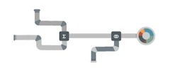
InetSoft's StyleBI is an easy to use, interactive data visualization tool that includes real time reporting capabilities. StyleBI is an edition of StyleBI that focuses on business data exploration by combining Data Block technology with visualization. Visualized analysis is constructed in real-time by dropping data items into visual elements such as charts, gauges, tables, and filters. The resulting view reveals the intrinsic relationships among the data.
Visualization and analysis benefits include:
- Unlimited multi-dimensional charting
- Drag and drop in a web browser, spreadsheet-like design
- Use gauges, thermometers, and other familiar objects
- Use charts, maps, and other advanced visual displays
- Monitoring and analysis oriented views
- OLAP data source mashup and visualization
- Make multi-dimensional charts even more information-rich thanks to new coloring, shape, and sizing options that, for instance, turn a 3D bubble chart into a 4D or 5D chart
- Create multi-charts (aka trellis graphs, visual crosstab, or small multiples).
- Use brushing techniques where by selecting data points in one chart highlights corresponding data points in accompanying charts.

Why InetSoft?
InetSoft's performance dashboard application is easy enough to be:- Deployed in just weeks
- Learned by end users with minimal training
- Used by any executive without the aid of IT
- Adaptable to changing data and business needs
- Used for data exploration through visualization
- Capable of maximum self-service
- Attract the attention of executives
- Meet the demands of power users
- Scale up for organizations of any size
Evaluate StyleBI from InetSoft. It's Easy. Agile. & Robust.
Register for more info and to download free eval software
About InetSoft
Since 1996 InetSoft has been delivering easy, agile, and robust business intelligence software that makes it possible for organizations and solution providers of all sizes to deploy or embed full-featured business intelligence solutions. Application highlights include visually-compelling and interactive dashboards that ensure greater end-user adoption plus pixel-perfect report generation, scheduling, and bursting. InetSoft's patent pending Data Block™ technology enables productive reuse of queries and a unique capability for end-user defined data mashup.
This capability combined with efficient information access enabled by InetSoft's visual analysis technologies allows maximum self-service that benefits the average business user, the IT administrator, and the developer. InetSoft was rasted #1 in Butler Analytics Business Analytics Yearbook, and InetSoft's BI solutions have been deployed at over 5,000 organizations worldwide, including 25% of Fortune 500 companies, spanning all types of industries.

How Is Data Visualization Used in Space Exploration?
Data visualization plays a crucial role in space exploration, where vast amounts of complex data are generated from various missions, telescopes, and spacecraft. Here's how data visualization is used in space exploration:
-
Planetary and Stellar Visualization: Data visualization allows astronomers and scientists to visualize planetary surfaces, stellar structures, and other celestial bodies captured by space probes and telescopes. Visual representations of these data enhance the understanding of planetary features and astronomical phenomena.
-
Mission Monitoring and Control: During space missions, real-time data visualization is used to monitor spacecraft status, trajectory, and health. It helps mission control teams assess mission progress, identify anomalies, and make critical decisions.
-
Orbit Visualization: Data visualization is used to represent the orbits of spacecraft and satellites around celestial bodies, such as planets and moons. These visualizations aid in mission planning, collision avoidance, and optimizing spacecraft trajectories.
div class="py-4">

Solar System Exploration: Visualization of planetary positions, orbits, and alignments is used to plan missions for optimal exploration opportunities. Visualizing data from various planetary missions helps in understanding the dynamics of our solar system.
Exoplanet Studies: Data visualization is used to represent the light curves and radial velocity measurements from exoplanet observations. Visualization helps astronomers identify exoplanets and interpret their properties.
Cosmic Structures and Galaxy Mapping: Visualization techniques are used to represent large-scale cosmic structures, such as galaxy clusters and filaments. These visualizations provide insights into the distribution of matter in the universe.
Simulating Space Phenomena: Data visualization is used to create simulations of space phenomena, such as black hole mergers, star formation, and supernova explosions. These simulations help scientists study and understand these processes.
Telescope Data Analysis: Data visualization techniques are employed to analyze and interpret data from space telescopes like the Hubble Space Telescope and the James Webb Space Telescope. Visualization helps in identifying celestial objects, studying their properties, and capturing stunning astronomical images.
Public Outreach and Education: Visualization of space exploration data is widely used for public outreach and education. Interactive visualizations, 3D models, and virtual reality experiences help engage the public and promote interest in space exploration.
Mission Planning and Design: Visualization tools assist in mission planning by simulating trajectories, spacecraft maneuvers, and planetary flybys. Visualization helps in optimizing mission design and resource utilization.
Space Weather Monitoring: Data visualization is used to monitor and analyze space weather phenomena, such as solar flares, coronal mass ejections, and geomagnetic storms. Visualization aids in understanding space weather's potential impacts on space missions and Earth's environment.
How Is Data Visualization Used in Earth Science?
Data visualization is widely used in Earth science to analyze, interpret, and communicate complex geospatial and environmental data related to the Earth's atmosphere, oceans, land, and ecosystems. Here's how data visualization is used in Earth science:
-
Climate Analysis: Data visualization is used to analyze climate data, including temperature, precipitation, and sea-level rise. Climate scientists create visualizations of climate models, historical climate data, and future climate projections to study long-term trends and assess climate change impacts.
-
Weather Forecasting: Visualization is essential in weather forecasting to present weather model outputs, radar data, satellite imagery, and other weather-related information. Visualizations aid meteorologists in interpreting weather patterns and communicating forecast information to the public.
-
Environmental Monitoring: Data visualization is used to monitor environmental parameters, such as air quality, water quality, and soil conditions. Visualization tools provide real-time or near-real-time visual representations of environmental data, helping to detect pollution and assess environmental health.
-
Geospatial Analysis: Earth scientists use geographic information systems (GIS) and geospatial data visualization to analyze spatial data, create maps, and understand geographical patterns. Geospatial visualizations aid in studying land use, natural disasters, and ecological changes.
-
Remote Sensing: Visualization plays a crucial role in remote sensing, where satellite and airborne sensors collect data on Earth's surface and atmosphere. Data visualization techniques help in interpreting remote sensing data, such as satellite images and hyperspectral data.
-
Earthquake and Volcano Monitoring: Seismologists and volcanologists use data visualization to monitor seismic and volcanic activities. Real-time visualizations of seismic networks and volcanic eruptions aid in understanding geological processes and assessing potential hazards.
-
Oceanography and Marine Science: Data visualization is used to analyze oceanographic data, including sea surface temperature, ocean currents, and marine ecosystems. Visualizations help oceanographers study ocean dynamics, marine life, and climate interactions.
-
Glaciology and Polar Studies: Data visualization is used in glaciology to study ice sheet dynamics, changes in polar ice caps, and their contribution to sea-level rise. Visualizations assist in understanding the impacts of climate change on polar regions.
-
Ecosystem Analysis: Ecologists use data visualization to study ecological systems, biodiversity, and habitat distribution. Visualization tools help in mapping species distribution, tracking ecosystem changes, and visualizing ecological models.
-
Natural Disaster Assessment: Data visualization is employed to assess the impact of natural disasters, such as hurricanes, wildfires, and floods. Visualizations aid in disaster response and recovery efforts by providing situational awareness and spatial analysis.
-
Data Communication and Public Outreach: Earth scientists use visualizations to communicate research findings and environmental information to policymakers, the public, and other stakeholders. Interactive visualizations and infographics help in engaging audiences and raising awareness about Earth science topics.

Topics Related to Data Visualization with Dashboards
Choosing the Best Data Mashup and Exploration Tool for 2023 - What do business decision makers look for when choosing the best data visualization tool for their company? Factors to consider are the ability to mashup different types of data sources, the ability to import data, integration with data warehousing, options for prototyping new data, accessibility, and user-friendly features that speed up decision making. InetSoft's StyleBI BI suite ranks a strong first in all these categories...
Better Visual Intelligence - Companies are employing data visualizer software to transform their raw data into understandable information. Data, or raw numbers without context, does not tell a story. It is only when you analyze data that you start to make insights, and the BI industry has found that visualization is the most cost effective way to make data analysis. InetSoft has created a user friendly solution for data visualization needs, StyleBI. Even a novice with a basic Excel skills can wield the dynamic environment as if they are a data engineer that teaches software development classes at a prestigious tech university...
Interactive Visualizer - With the use of an online data visualizer, you can transform your raw data into visualizations that are not only easy to understand, but also much more efficient for the entire business. Raw data in its natural form is hard to make sense of. Looking at straight numbers it is difficult to see trends or areas that are missing certain goals. However, add visualizations to this data and decision-making becomes a much easier task for all company members...

Data Illustration Software Interactivity - The benefits of data illustration (also known as data visualization) are endless. Businesses can utilize a data illustration in many different ways, taking complex data and creating new levels of understanding for their managers. Normally, raw data is a long tedious list of information. In raw form information can be really hard to decipher, especially within larger data sets. Data aggregated into numbers such as in a report table or calculations done with Excel formulas can also be difficult to draw real insights from...
Accessible Dashboards: Whenever and Wherever - Dashboards are an essential data visualization tool that allow users to explore and analyze their data visually in order to find business solutions. Dashboards benefit enterprises by enabling the easy recognition of strengths and weaknesses, and the easy measuring of KPI's and metrics. An effective dashboard can intuitively convey the same information that could only be gleaned by paging through many different reports...
Key Takeaways From Data Analysis - This page will cover the definition of data analysis and also drill down into the applications of data-centric analysis. By understanding your data and making your it work for you, it's possible to transform raw data into positive actions that will take your organization to the next level. Here is a brief summary of all the different ways to analyze data and ultimately grow your business. Seven Different Ways to Analyze Data: Cluster analysis, Cohort analysis, Regression analysis, Factor analysis Neural Networks, Data Mining, Text analysis...
Dashboard Storytelling with InetSoft - What do business decision makers look for when choosing the best data visualization storytelling tool for their company? Factors to consider include the ability to mashup different types of data sources, the ability to import data, integration with data warehousing, options for prototyping new data, accessibility, and user-friendly features that speed up decision making. InetSoft's StyleBI BI suite ranks a strong first in all these categories...

Visual Data Tool for Data Exploration - Visualization and analysis benefits include: Unlimited multi-dimensional charting, Brushing for data exploration, Drag and drop in a web browser, spreadsheet-like design, use gauges, thermometers, and other familiar objects, Use charts, maps, and other advanced visual displays, Dual purpose input/output elements, Views assembled from sub-level views, Monitoring and analysis oriented views, OLAP data source mashup and visualization...
Visualization Tools and Learning Objectives - Visualization tools are software applications that allow users to create charts, images, diagrams, or animations to effectively communicate a message. When referring to business visualization tools, we need to creating visual guides of how our business is doing, that is easy understood by any level of employee at your company. Visualization is a technique that allows for the representation of data set graphically. When business data is large and very abstract, visualization tools help make the data easier to read and understand. Today, there are visualization tool for search, music, online communities, and almost anything, but none seem to be as vital as those used to dissect crucial business data, which also represent the greatest...
Manipulate Apache Spark Data - Do you need help connecting to and blending your Apache Spark data? Apache Spark is an open-source unified analytics engine for large-scale data processing. InetSoft's software can connect to Spark and other Big Data sources from anywhere, making it easier to manipulate data because it's all in one place. Having a large amount of data is usually a good thing for a business; it's a good indicator of success. InetSoft's program can help manage and analyze data from spreadsheets to Spark. InetSoft can do it all, helping to make your data usable and understandable...
Supply Chain Operations Metrics: Inventory Turnover, Order Fill Rate, OTD, etc. - The effective flow of products and services from suppliers to end consumers is ensured in large part by supply chain management. Supply chain operations analysts play a significant role in this process' optimization by keeping an eye on key performance indicators (KPIs) and using analytics to spot potential areas for development. The performance of supply networks may be improved by supply chain operations analysts using key KPIs and analytics, which we shall discuss in this article...