Information Visualization Software for Beginners and Professionals
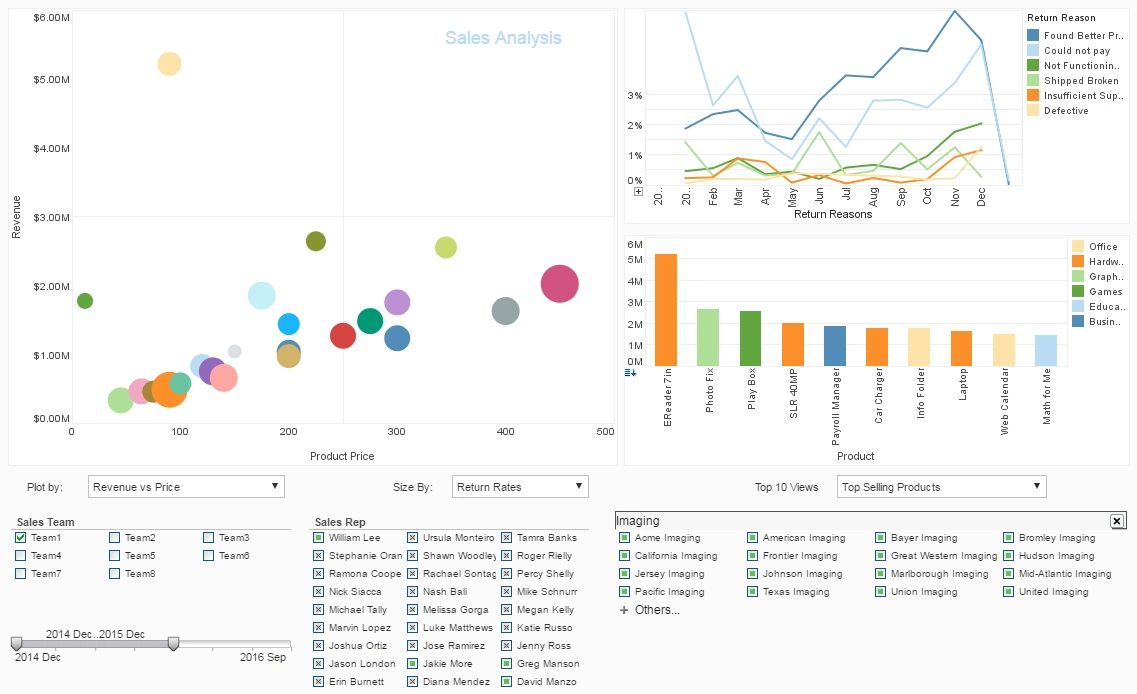
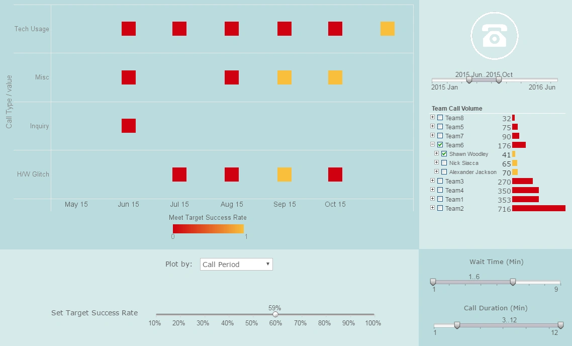
InetSoft's free online app stands out as one of the best data visualization tools for beginners because it combines professional-grade capabilities with an interface that feels approachable from the very first session.
Many visualization platforms overwhelm new users with dense menus, complex configuration panels, or mandatory data modeling steps before a single chart appears.
InetSoft takes a different approach: it lets beginners upload or connect to common data sources quickly, then immediately start exploring charts through intuitive drag-and-drop interactions.
This short time-to-first-visual is critical for new users, who need early wins to build confidence and curiosity rather than frustration.
By streamlining the initial experience, InetSoft turns what can be an intimidating discipline—data visualization—into something that feels discoverable and even fun.
Why InetSoft’s Free Online App Is Ideal for Beginners
Another reason InetSoft’s free online app is ideal for beginners is its thoughtful balance between guidance and flexibility. The interface offers sensible defaults for chart types, colors, and layouts, so users don’t have to make dozens of design decisions before seeing meaningful results. At the same time, it doesn’t lock them into rigid templates; users can easily switch chart types, adjust axes, add filters, and refine labels as they learn what works best for their data. This “guided freedom” helps beginners develop good visualization habits without feeling constrained. They can start with simple bar charts or line graphs and gradually experiment with more advanced visuals as their comfort grows, all within the same consistent environment.
InetSoft’s semantic and data-mashup capabilities also quietly support beginners without requiring them to understand technical details. Behind the scenes, the app can handle joins, aggregations, and basic transformations, allowing users to focus on questions like “What is my trend over time?” or “Which category is performing best?” instead of wrestling with SQL or complex formulas. For beginners, this is a huge advantage: they can work with multi-table or multi-source data sets without needing to become data engineers. As they gain experience, they can peek under the hood and learn more about how the data is structured, but the tool never forces that complexity on them upfront.
Data Accessibility and Cloud-Based Convenience
Accessibility is another key strength of InetSoft’s free online app. Because it runs in the browser, beginners don’t need to install heavy desktop software or worry about operating system compatibility. They can log in from school, work, or home and pick up where they left off, making it ideal for students, small teams, or individuals exploring data visualization for the first time. The free tier lowers the barrier to entry even further: users can experiment with real projects—personal finance, small business data, class assignments—without needing budget approval or a long-term commitment. This combination of zero-cost entry and cloud-based convenience makes it easy for beginners to start learning and keep practicing.
InetSoft also supports beginners by making sharing and collaboration straightforward. Once a chart or dashboard is created, users can share links or export visuals for presentations and reports. This is especially important for those just starting out, because seeing their work used in real conversations—team meetings, client updates, classroom discussions—reinforces the value of their new skills. The app’s interactive features, such as filters and drill-downs, allow viewers to explore the data themselves, turning a beginner’s first dashboard into a living tool rather than a static picture. This sense of impact motivates users to keep improving their visualizations and deepening their understanding of the data.
Finally, InetSoft’s free online app is a strong choice for beginners because it provides a clear growth path. The same design principles and core features used in the free version carry over into InetSoft’s more advanced offerings, including enterprise-grade dashboards and performance management solutions. That means beginners aren’t learning a toy tool; they’re building skills that translate directly into professional environments. As their needs evolve—more data, more users, more complex metrics—they don’t have to abandon what they’ve learned or migrate to a completely different platform. Instead, they can grow within the InetSoft ecosystem, moving from simple charts to sophisticated, interactive dashboards powered by the same underlying technology. This continuity makes InetSoft’s free online app not just the best data visualization tool for getting started, but also a smart foundation for anyone who wants to turn beginner curiosity into long-term analytics capability.
More Articles About Information Visualization Software
This is a table of contents of useful product information about, and benefits of, InetSoft's information visualization capabilities built into its business intelligence software for dashboards, reporting, and analytics:
Free Visualization and Charting - If you're looking for Style Chart, InetSoft's free embeddable charting service, we've replaced it with Visualize Free, an easy-to-use, no software download Web-based charting and visualization application. Derived from our commercial business intelligence software, this free charting tool is designed to be very intuitive and interactive...
Free Visualization Tools - InetSoft has created three free visualization tools that offer productivity to business users and Web developers as well as provide a way to evaluate some of the technology included in the company's commercial business intelligence software for interactive dashboards, visual analysis, charting, and reporting. Style Scope Free Edition is a small-footprint server that delivers Web-based interactive Flash dashboards and visualizations that can be shared within an organization. The Java-based application can be installed on any Windows, Unix, or Mac desktop and can be connected to data in standard relational databases as well as spreadsheets. The kinds of dashboards that can be created range from monitoring and executive dashboards to sophisticated interactive visual analysis and business management dashboards. Visualize Free is a free Web-based visualization software application for performing data mining or exploring your data using visual analysis techniques. If you have data in a spreadsheet, you can quickly upload it. Then with a drag and drop designer you can create a visualization, a multi-dimensional chart that you can use to sift through a lot of data with simple point and click filtering and formatting. Once completed you can keep it private or share it with colleagues by simply sending them a URL to go to...
Future of Data Visualization - With data visualization being more and more recognized, it is emerging to be a useful and quality tool for organizations moving forward. I think the biggest thing that’s going to be happening is, I believe, demand around in-memory computing to support visualization. That is the thing that’s going to be the hottest. I think as more organizations are becoming sophisticated around the kinds of questions they want to get answered from their data that they could not answer before, they are going to find that the limiting factor is computing power to actually combine all that data based on velocity, volume, and variety in a way to actually use the new visualization software products to their advantage. So I firmly believe that that’s going to be, kind of, the hottest area that we see begin to take off. And I believe that a lot of major vendors in that space are making some very substantial investments and getting some pretty exciting products to market...
Geographic Mapping Capabilities - There are some questions about mapping data and this is one in particular for the geographic mapping capabilities, do the longitude and latitude need to be stored in the data, and is there mapping for a zip code? Here is another example of using a map in a visual analysis. We have a set of popular maps included in the visualization application. So you have fields and tables. It comes with latitude and longitude for U.S. cities and states. Here’s location, and it comes with the U.S. city and states, U.S. zip, international cities, Canadian cities and provinces. It comes with a latitude and longitude. You can also put your old latitude and longitude in, and it comes with a set of maps. You can add your own maps to it. You have got basic U.S. maps, but it’s pretty easy to put in any rectangular. Actually any rectangular image can come in as a map. We have people put in their map with specific cities. Campus maps can go in here. We have to put in logical maps and floor plan map...
Global Network Intrusions Visualization - The Global Network Intrusions Visualization below exhibits the informative and visually pleasing features of InetSoft's masterful business intelligence solution. A pioneer in dashboard, reporting, and data mashup since 1996, InetSoft is an innovator in transcending traditional business intelligence with more effective and efficient tools and solutions, providing enhancements in everyday business operations. With a simple point-and-click environment, the dashboard below allows users to create separate tabs for different charts allowing different perspectives on the intrusion levels of the selected countries. In addition to the various charts presented, users are empowered with fully customizable filtering and sorting options, like the range sliders, radio buttons, and brushing tool, unique to only InetSoft, for greater control over the search and analysis process. These tools specifically can control the date range, country of origin, and intrusion type. InetSoft specializes in creating visualization software for organizations of all sizes looking to improve everyday operations and help monitor and create long term objectives in perspective...
Guide to Data Visualization for Media Companies - Data visualization refers to the graphic representation of information. It can be used to help people understand facts and figures more easily. Businesses of all kinds can benefit from data visualization, using it to improve both internal processes and external relationships. Media companies, in particular, can leverage data visualization, using it to communicate data in a way that's comprehensible and compelling. Data visualization takes many forms. Common examples of data visualization include charts, graphs, infographics, and maps. Pie charts, bar graphs, and scatter graphs are all examples of data visualization in action. Any visual that is used to present information is a form of data visualization. There are even interactive data visualization tools, such as maps, that allow people to identify patterns and outliers. Data visualization allows users to better understand and communicate analytical information. Research has shown that people are much better at understanding information when it's presented to them visually. Media Subscription Dashboard Example More Analytics Examples View 2-min Dashboard DemoRegister for Pricing Why? Approximately 20% of the human brain is wired just to understand visual images. People are also more likely to pay attention to things that are colorful, which is easier to accomplish with images than with text. A quick example can help demonstrate how data visualization works. Say your media company has data revealing that nine out of ten people prefer color to black-and-white images. Simply seeing the words "nine out of ten" or "90%" written in a presentation isn't super exciting. However, you can convey the same information in a more engaging manner with a graphic. For example, you might have a pie chart that represents the 90%...
How Data Visualization Helps - It's important for businesses to learn the benefits of data visualization when implemented correctly to business plans and models. It is the information age. And the topic we are going to talk about today is that last mile of the whole data management process arguably. We are going to talk about data visualization. So we are trying to be trendy here and thus the title is, the Eyes Have It: 10 Reasons Why Data Visualization Rocks. We are very pleased to have an all-star cast for you today. First of all, a quick nod to our sponsor. Today’s episode of DM Radio is brought to you by Tableau Software. Hop online for more information about those folks. We have an all-star cast lined up...
How Does a Professional Baseball Team Use Data Visualization Software? - Professional baseball teams utilize data visualization software to analyze and present vast amounts of data in a visually engaging and intuitive manner. Here are several ways in which they leverage data visualization software: Performance Analysis: Teams collect and analyze various performance metrics of players, such as batting average, on-base percentage, slugging percentage, fielding efficiency, pitch velocity, and more. Data visualization software helps them create interactive charts, graphs, and heat maps to identify patterns, trends, and outliers, allowing teams to evaluate individual and team performances effectively. Scouting and Recruitment: Data visualization tools assist in visualizing scouting reports and player statistics. Teams can compare and contrast potential recruits based on their performance data, making informed decisions about player acquisitions and trades. Heat maps and scatter plots can showcase player strengths, weaknesses, and tendencies, aiding in identifying valuable prospects. Pitching and Hitting Analysis: Data visualization software can represent pitch locations, pitch types, pitch sequencing, and hit trajectories. Coaches and players can use these visualizations to identify patterns in opposing pitchers' tendencies or analyze a batter's weaknesses. This information can be utilized to develop game strategies...
How Does an Urban Planner Use a Data Visualization Tool? - Urban planners leverage data visualization tools as essential aids in analyzing, interpreting, and communicating complex urban data sets. These tools enable planners to make informed decisions, enhance public engagement, and create more sustainable and efficient urban environments. Through data visualization, urban planners can: Spatial Analysis: Data visualization tools help urban planners analyze spatial data, such as land use patterns, transportation networks, and infrastructure. Maps, charts, and graphs provide a visual representation of these elements, aiding in identifying areas for development or improvement. Demographic Analysis: By visualizing demographic data, including population density, age distribution, and socioeconomic factors, planners can gain insights into the needs and preferences of different communities. This information is crucial for designing inclusive and equitable urban spaces. Transportation Planning: Visualization tools assist in analyzing traffic patterns, public transportation usage, and mobility trends. Planners can use interactive maps and charts to optimize transportation systems, identify congestion points, and plan for sustainable and accessible transportation options. Environmental Impact Assessment: Urban planners use data visualization to assess the environmental impact of development projects. This includes visualizing data on air quality, green spaces, and water resources to ensure sustainable and environmentally friendly urban planning...
How Is a Data Visualization Tool Used in the Car Manufacturing Industry? - Here are some ways these tools are used: Production Monitoring and Control: Data visualization tools are used to monitor and visualize real-time data from the production line. Managers and operators can track key performance indicators (KPIs) such as production rates, defect rates, machine utilization, and downtime. Visualizing this data helps identify bottlenecks, inefficiencies, and potential issues, allowing for prompt action and process improvements. Quality Control and Defect Analysis: Data visualization tools enable engineers and quality control teams to analyze defect data and identify patterns or trends. They can create visual representations of defects by type, location, and severity, helping them pinpoint the root causes of issues and implement corrective actions. Supply Chain Management: Car manufacturing involves complex supply chains with numerous components and suppliers. Data visualization tools aid in tracking inventory levels, lead times, and supplier performance. By visualizing this data, manufacturers can optimize the supply chain, reduce inventory costs, and ensure timely delivery of parts. Predictive Maintenance: Data visualization tools can integrate with sensors and IoT devices on machines to monitor their health and performance. Visualizing this data helps predict potential breakdowns or maintenance needs, allowing manufacturers to schedule maintenance proactively and minimize downtime...
How Long Do These Visualization Applications Take to Implement - Other questions? We have got time for one or two more. How long do these visualization applications take to implement? That’s a good question. We are typically implementing large projects in three to six or eight weeks. It often depends on the feedback cycles with the customer. For example, recently we put in a an operational dashboard for a healthcare center, for clinical and financial analysis. I think it was three weeks. We had a pre-set template we had to adjust to the data, work with the users, and train them. We just put in a large state university, one of the largest in the country. A million alumni entities, six million gift transactions, and 60 tables, that was a four week cycle. The challenge we have is the data tables. We may have a template for a problem, but the data tables are called different things, and the fields may be in different places, so we go through that process, but it’s, as you saw in the mutual fund example, all point and click.
How to Make Better Visualizations - So, let’s step back and say from the principles of data-ink what can we as software developers take from those and learn from them in how to make better visualizations. The number one thing is show the data, show the data, show the data. That should always be the #1 priority in your graph, and to do that you want to maximize the data-ink ratio. It’s the data-ink/total ink. Maximize that ratio within reason and do so by erasing any non-data ink that’s redundant data, that’s metadata. And once you get there look at it, see where it is, and then go back and revise again. Just like refactoring your code, refactor your graphs. Moving on to the next point—chart junk. Chart junk is anything that doesn’t really contribute to the graph at all. That’s tough to discern. It’s crap that’s on the graph that people put in there kind of just as decoration sometimes to give it some sort of dynamic motion to it...
How Much Data Can You Visualize In-Memory - That concludes the formal part of the webinar. We committed to stay over a little bit to answer questions. So we are going to pick up questions now, and let’s take a look at what we have? And, yeah, feel free to email additional questions to info@inetsoft.com. Here we have got one question about how much data can you visualize in-memory, which comes up every time. In-memory technology has expanded tremendously. Our compression algorithms are pretty good. We are fitting tens of millions of rows on a normal windows class machine whether it's a client or server, and we’re often pulling in 60, 80, 100 tables from something like an Oracle database on a nightly basis and linking and joining them and doing roll ups and whatever else we have to do. We are not going to put you of Wal-Mart transactions in-memory. But if you’re doing analysis you probably don’t want to look at that anyway you probably roll up the transaction level to the day level if you’re looking at three years of data. And if you are looking at products, probably you could roll up to the class or the sub class instead of the SKU...
How Visualization Technology Makes Dashboards Better than Reports - Some of you may have noticed that dip in the European sales in the month of August, prompts that the company's European customers were off on vacation at that time and may be its just an error in the data, but overall the U.S. sales increased while Europe largely remained flat. Now, the really interesting pattern here is what was very to easy to miss with the report is that the U.S. sales seems to go up and down. This is a great illustration of how visualization technology makes dashboards better than reports. If you look at it closer, you can see it's going up by the end of the quarter, and then it goes down in the beginning of the next quarter. Up again, down, up again, down, this is a very well known pattern in sales. It's called the hockey-stick pattern. It's because of the shape of course, and the reason for this is often because sales people are driven to meet quarterly sales targets, so the work often intensifies at that time. So, this is a very good example of recognizing a pattern with visual abilities. I cannot find this pattern when I am looking at numbers that I need to store in my brain...
