A Cloud Flexible Data Visualization Tool
InetSoft's data visualization tool can be deployed locally on laptop, on a server on premises, or in any private or public cloud anywhere in the world. Minimize data transportation costs and delays in updating charts. Compared to competitive alternatives, InetSoft provides far greater flexibility.
All new clients and partners get free one-on-one business intelligence expert help to accelerate deployment. Get a personalized demo.
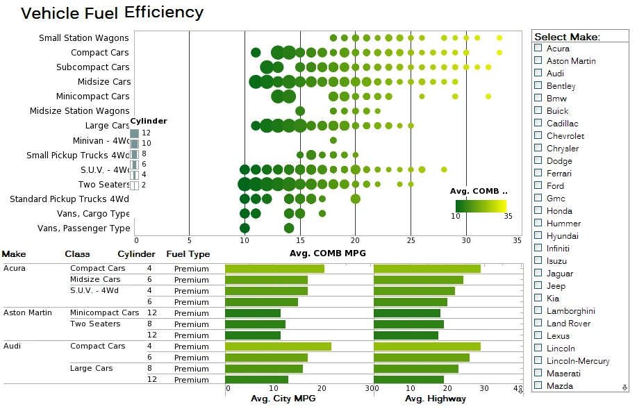
How Is a Data Visualization Tool Used in the Car Manufacturing Industry?
Here are some ways these tools are used:
-
Production Monitoring and Control: Data visualization tools are used to monitor and visualize real-time data from the production line. Managers and operators can track key performance indicators (KPIs) such as production rates, defect rates, machine utilization, and downtime. Visualizing this data helps identify bottlenecks, inefficiencies, and potential issues, allowing for prompt action and process improvements.
-
Quality Control and Defect Analysis: Data visualization tools enable engineers and quality control teams to analyze defect data and identify patterns or trends. They can create visual representations of defects by type, location, and severity, helping them pinpoint the root causes of issues and implement corrective actions.
-
Supply Chain Management: Car manufacturing involves complex supply chains with numerous components and suppliers. Data visualization tools aid in tracking inventory levels, lead times, and supplier performance. By visualizing this data, manufacturers can optimize the supply chain, reduce inventory costs, and ensure timely delivery of parts.
-
Predictive Maintenance: Data visualization tools can integrate with sensors and IoT devices on machines to monitor their health and performance. Visualizing this data helps predict potential breakdowns or maintenance needs, allowing manufacturers to schedule maintenance proactively and minimize downtime.
-
Energy Efficiency and Environmental Impact: Car manufacturers strive to improve energy efficiency and reduce their environmental impact. Data visualization tools can display energy consumption patterns across different stages of the manufacturing process. This information assists in identifying energy-intensive processes and optimizing energy usage.
-
Employee Performance and Training: Visualizing workforce data can help monitor employee performance, training progress, and safety compliance. Manufacturers can use this data to identify skill gaps, optimize training programs, and ensure a safe working environment.
-
Market and Sales Analysis: Car manufacturers can use data visualization tools to analyze sales data, market trends, and customer preferences. Visualizations of sales figures, market share, and geographic sales distribution help in making strategic decisions and understanding market demand.
-
Product Lifecycle Management: Data visualization tools can be integrated with product lifecycle management (PLM) systems to display the entire lifecycle of a vehicle, from design to production and end-of-life. This comprehensive view aids in understanding product performance, identifying design flaws, and planning for product updates or recalls.
-
Competitive Analysis: Visualization of market data, consumer feedback, and competitor information enables car manufacturers to assess their competitive position and make informed decisions about product improvements and marketing strategies.
What Data Visualizations Does a Quality Control Supervisor Use?
-
Control Charts: Control charts are essential tools in quality control. They display process data over time and include control limits that represent acceptable variation. QC supervisors use control charts to monitor variations in a process and detect any special causes of variation that may lead to defects or deviations from the desired quality standards.
-
Histograms: Histograms are graphical representations of the distribution of a set of data. QC supervisors use histograms to analyze the frequency and spread of measurement values in a sample, helping them understand the distribution of defects or quality characteristics.
-
Scatter Plots: Scatter plots are used to visualize the relationship between two variables. In quality control, supervisors may use scatter plots to identify correlations between process parameters and product quality. They can use this information to optimize process settings and reduce variability.
-
Pareto Charts: Pareto charts display the frequency of occurrences of various defects or issues in descending order. QC supervisors use Pareto charts to prioritize the most significant quality issues, enabling them to focus efforts on addressing the most critical problems first.
-
Fishbone Diagrams (Ishikawa Diagrams): Fishbone diagrams are used to identify the root causes of a problem. QC supervisors can create these diagrams to visually map out the potential causes of quality issues and investigate the underlying factors contributing to defects.
-
Box Plots (Box-and-Whisker Plots): Box plots provide a visual summary of the distribution of data, showing the median, quartiles, and outliers. QC supervisors use box plots to understand the spread of measurement values and identify potential outliers or anomalies.
-
Run Charts: Run charts display data points in chronological order. QC supervisors use run charts to observe trends and patterns over time, helping them identify whether a process is stable or experiencing significant changes.
-
Process Capability Analysis: Process capability visualizations, such as Cp and Cpk charts, assess whether a process is capable of producing products within specified tolerance limits. QC supervisors use these visualizations to determine if the process meets quality requirements or if adjustments are necessary.
-
Heatmaps: Heatmaps visually represent data using color gradients. QC supervisors can use heatmaps to analyze large datasets and identify patterns or clusters of defects or quality issues across different product batches or production lines.
-
Gauge R&R (Repeatability and Reproducibility) Studies: Gauge R&R visualizations assess the measurement system's accuracy and consistency. QC supervisors use these visualizations to evaluate the reliability of measurement methods and determine if adjustments or improvements are needed.
More Articles About Using Data Visualization Tools
Articles About Information Dashboard Design - Researching how to design information dashboards? InetSoft offers Web-based dashboard software that includes a drag and drop designer for creating impactful, interactive dashboards for enterprises and ISV's. Read articles below for more information. User-defined groups give you greater flexibility in partitioning the entries in a column for grouping. If you select a user-defined grouping from the menu, aggregations will be based on that user-defined grouping...
Cloud-based Reporting Software - Are you looking to run reporting software wherever you want such as in a private or public cloud infrastructure? Since 1996 InetSoft has been making enterprise reporting software that is easy to deploy and easy to use. Build self-service oriented visual reports and dashboards quickly. The second step in a data pipeline is data transformation. This involves cleaning and transforming...
Consider InetSoft's Dashboard Prototyping Tool - Are you looking for a good dashboard prototyping tool? InetSoft's pioneering dashboard reporting application produces great-looking web-based dashboards with an easy-to-use drag-and-drop designer. Factors to consider include the ability to mashup different types of data sources, the ability to import data, integration with data warehousing, options for prototyping new data, accessibility, and user-friendly features that speed up decision making...
Database Visualization Reviews - One of the biggest benefits we see with this product is our ability to react more quickly to potential problems that affect our bottom line by alerting us to crucial information on a real-time basis. This will allow us to respond very quickly to opportunities and take a more proactive approach to management. In addition to tracking financial data in real-time, we plan to create an interactive dashboard...
For Charting Application Evaluators - As Wikipedia says, a charting application is a computer program that is used to graphically create a graphical representation (a chart) based on some non-graphical data that is entered by a user, most often through a spreadsheet application, but also through a dedicated specific scientific application (such as through a symbolic mathematics computing system, or a proprietary data collection application)...
Good Data Visualization Dashboard Software - Are you looking for good data visualization dashboard software? InetSoft's pioneering dashboard reporting application produces great-looking web-based dashboards with an easy-to-use drag-and-drop designer. Data processing software inspects, cleans, and transforms data, so that a decision maker can aggregate, chart and analyze the data to discover useful information, suggest conclusions, and expedite good decision making...
InetSoft's BI Software for OLAP and Data Warehouses - InetSoft's analysis and reporting software can access OLAP cubes and data warehouses including Microsoft SQL Server Analysis Services, Hyperion Essbase, and SAP NetWeaver. The company's mission is to deliver such business intelligence solutions with a focus on making them easy, agile and robust...
Information About InetSoft's Dashboard Layout Designer - Are you trying to see how to layout a dashboard? Look at dashboard design examples and templates built with InetSoft's Web-based dashboard software. With a drag and drop designer and a library of common dashboard elements, you can quickly create attractive interactive dashboards. Visit the StyleBI product page to learn more, see examples, view a demo, and read customer reviews...
Replacement for Tibco Spotfire's Visualization Dashboards - Are you looking for alternative to Tibco Spotfire's visualization software? InetSoft offers a web-based server solution that is better suited to enterprises and OEMs, yet is easy to deploy and use. Since 1996 InetSoft has been offering business intelligence applications that are flexible and powerful, serving over 5,000 enterprises and solution providers worldwide...
Resources on Comparing Dashboards - Looking to compare dashboard options? Start by viewing demos for each one. InetSoft offers Web-based dashboard software that is easy to use and quick to deploy. Read customer reviews. See examples. Visualize Free provides an easy way to evaluate some of the capabilities of InetSoft's commercial visual analysis product, which is available as a standalone visual analysis and interactive dashboard application in StyleBI, and as part of a complete business intelligence software application in StyleBI...
Tool for Data Transformation for Dashboards - Looking for a good dashboard data transformation tool to prepare your data for interactive dashboards? InetSoft's pioneering dashboard reporting application enables real-time data transformation connected to live data sources to power great-looking web-based dashboards, all with an easy-to-use drag-and-drop designer and SQL editor...
Tool to Build a Real Time Dashboard - Are you looking for a good tool to build real time dashboards? InetSoft's pioneering BI application produces great-looking web-based dashboards with an easy-to-use drag-and-drop designer. One of the benefits of the data services platform is you can have a logical view but then you can present it in different upfront formats. So in this case it can be pushed to...
Try InetSoft's Visualization Dashboard Software - Are you looking for the best visualization dashboard software? Since 1996 InetSoft has been making dashboard software that is easy to deploy and easy to use. Losses Avoided: This KPI measures the total value of losses that are prevented or avoided by fraud prevention measures. A higher losses avoided rate indicates that fraud prevention measures are effective in reducing the overall impact of fraud...
Visuals Provide Deeper Insights - Vital business numbers and information coupled with attractiveness and interactivity suddenly bring a simple display of information to an accessible and visible way to become more successful as an enterprise. Visuals provide deeper insights into key metrics, which in turn allow a business to solve their problems more efficiently and quicker - perhaps a moving gradient on a chart allows a CEO to spot a declining trend...
What Metrics to Put on a Bed Management Dashboard? - A bed management dashboard typically displays real-time information about bed availability, occupancy, and patient flow within a hospital or healthcare facility. Some of the key metrics that may be included in a bed management dashboard are: Bed availability: The number of available beds in each department or unit of the hospital, including the total number of beds and the number of occupied and unoccupied beds...
Which Business Intelligence Tools Should a Startup Use? - Are you looking for the best business intelligence tool for startups? InetSoft partners with entrepreneurs to embed its flexible dashboard BI application, including options for no up-front license investment costs. Solution providers get great-looking web-based dashboards with an easy-to-use drag-and-drop designer. Companies wanting internal BI get personalized handholding for a successful roll-out...


