Information Dashboard Design
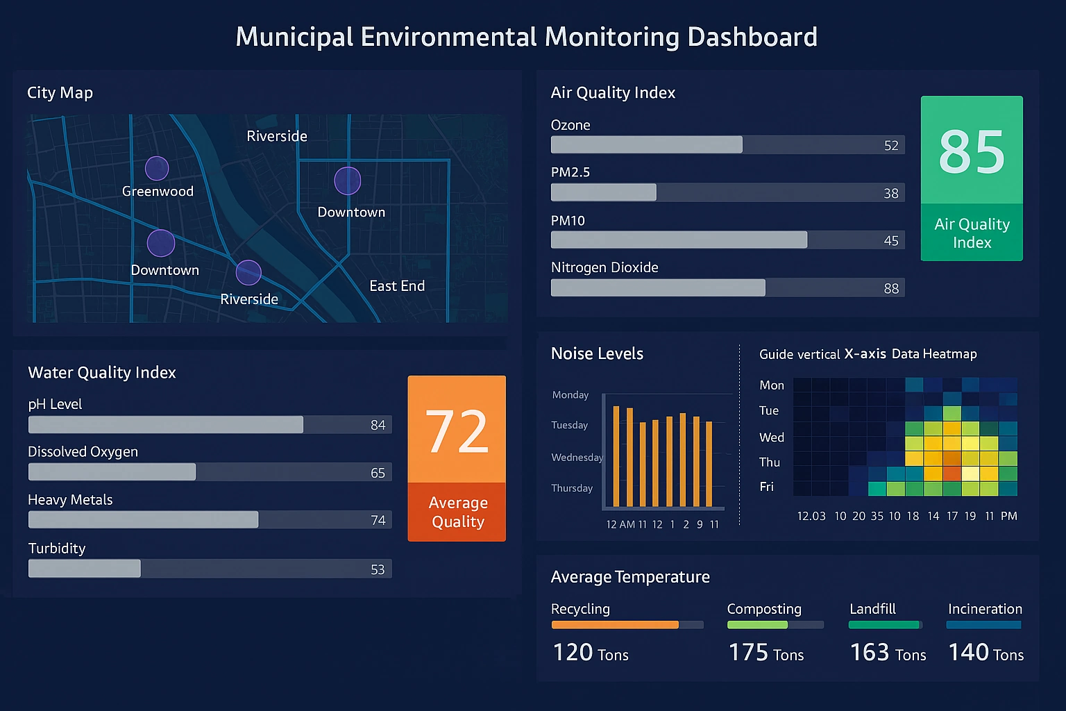
Municipal Environmental Monitoring Dashboard
Track and analyze environmental metrics across municipal facilities and locations. Monitor air quality, water usage, and waste management in real-time. Empower city officials with actionable insights to improve sustainability and regulatory compliance.
Product Analytics Dashboard
Gain comprehensive visibility into product performance and user engagement metrics. Analyze customer behavior patterns, feature adoption rates, and conversion funnels. Make data-driven decisions to optimize product development and enhance user experience.
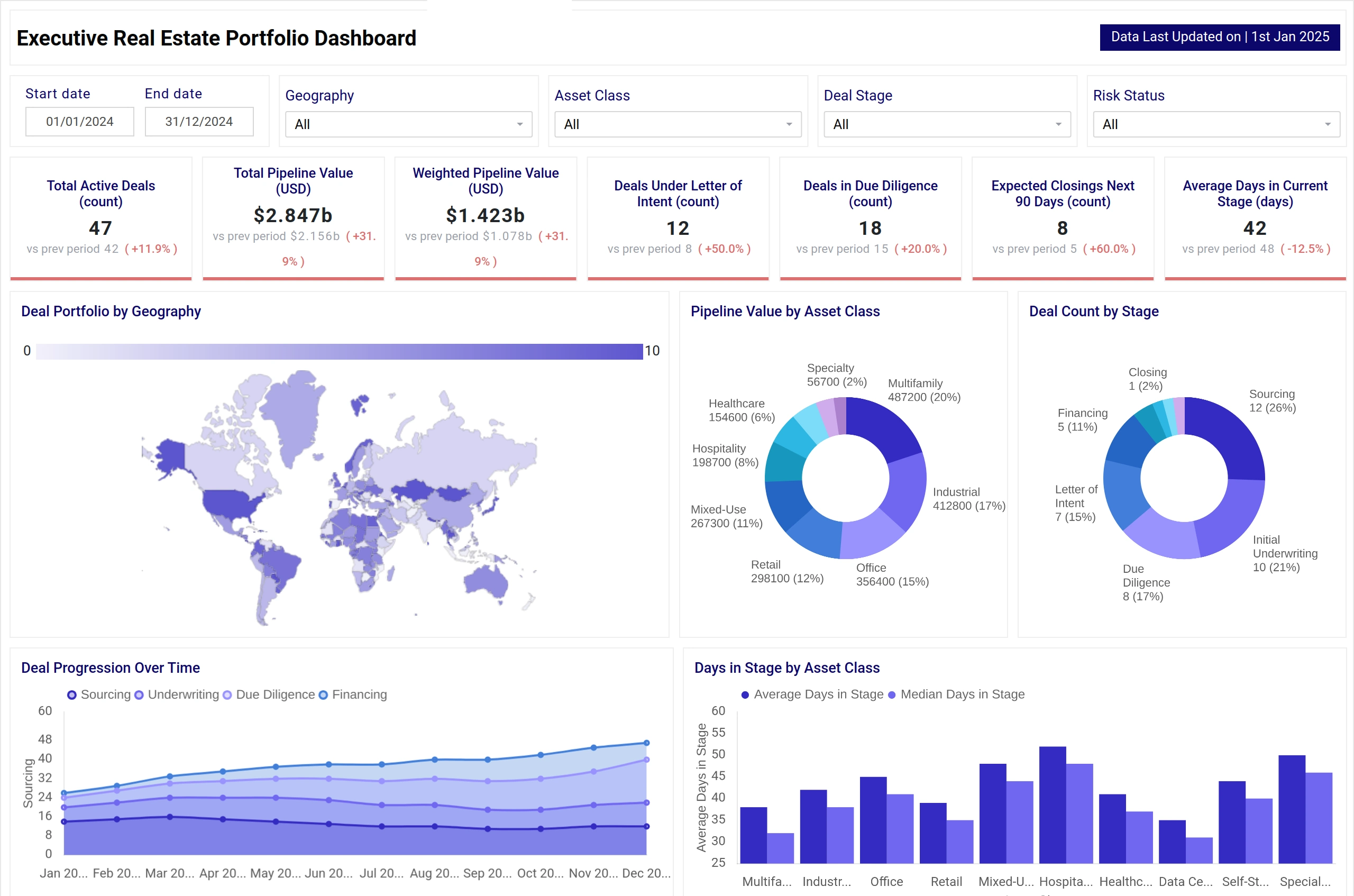
Real Estate Asset Dashboard
Manage and monitor your real estate portfolio with comprehensive property analytics. Track occupancy rates, rental income, maintenance costs, and property valuations. Optimize asset performance and identify investment opportunities with integrated market data.
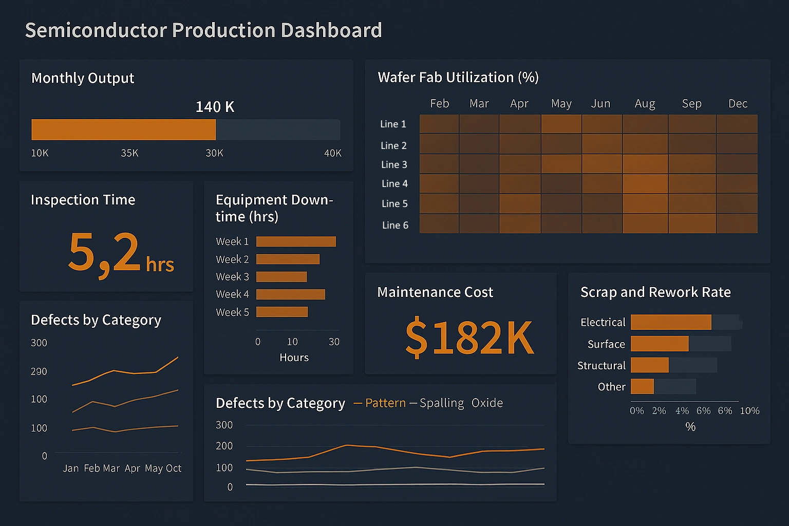
Semiconductor Manufacturing Dashboard
Monitor critical manufacturing processes and equipment performance in semiconductor production. Track yield rates, defect analysis, and production throughput across fabrication facilities. Reduce downtime and improve quality control with real-time alerts and predictive analytics.
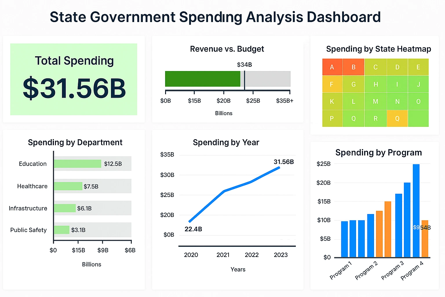
State Government Spending Analysis Dashboard
Analyze government expenditures across departments, programs, and fiscal periods. Ensure budget transparency and identify cost-saving opportunities through detailed spending breakdowns. Support informed policy decisions with comprehensive financial reporting and trend analysis.
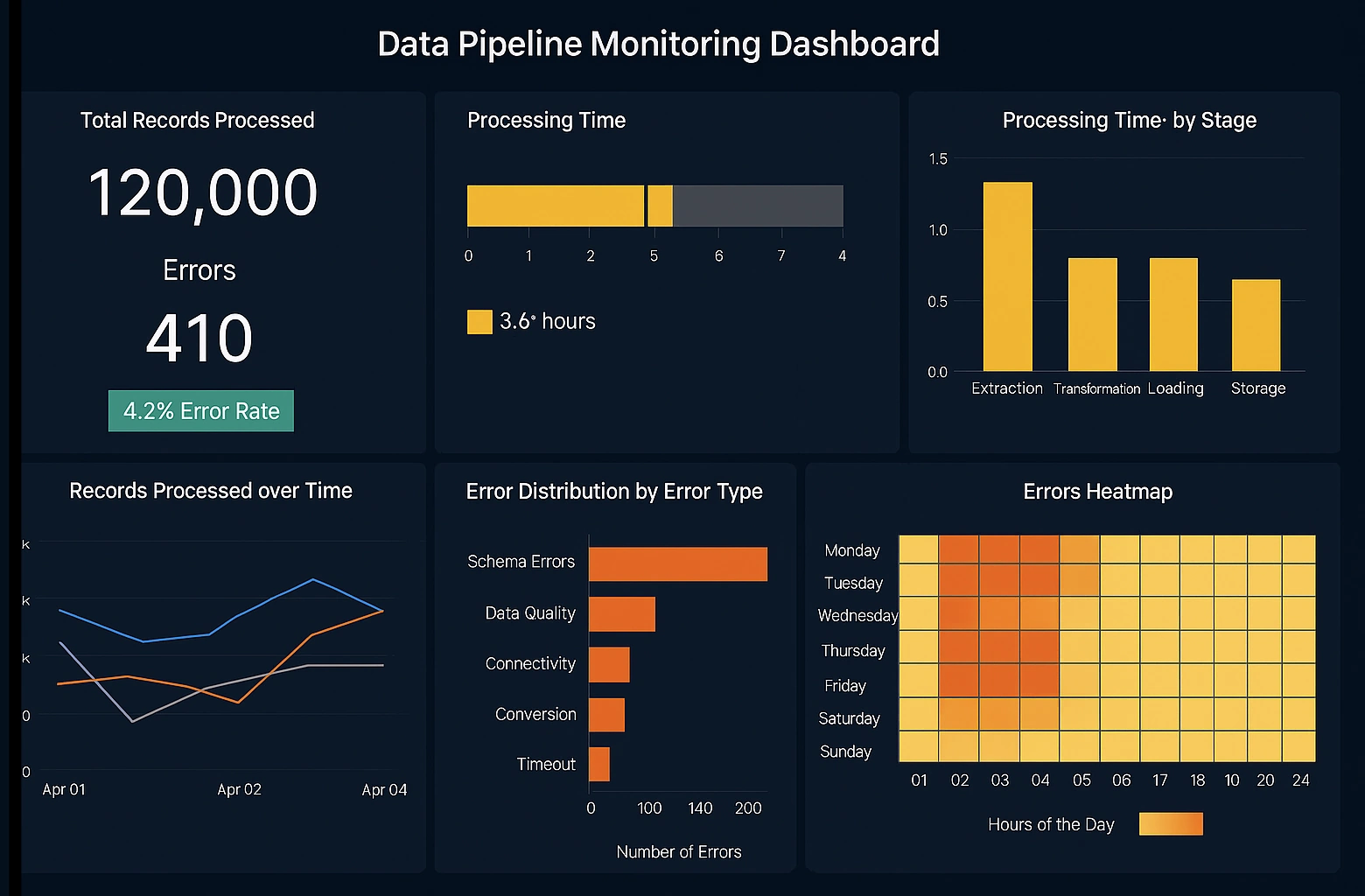
Data Pipeline Monitoring Dashboard
Monitor data flow and pipeline health across your entire data infrastructure. Track processing times, error rates, and data quality metrics in real-time. Ensure reliable data delivery and quickly identify bottlenecks to maintain optimal system performance.
Aggregating Dashboard Data - Users can easily aggregate data and create comprehensive reports from different data sources using InetSoft's award-winning dashboard software. View the example below to learn more about the Style Intelligence solution. To define grouping and aggregation columns (summary columns) for a Data table, follow these steps: 1. Right-click the table's title row and select 'Group and Aggregate'. This opens the 'Aggregate' dialog box. 2. Select the grouping columns by clicking the 'Group' check box next to one or more column names. When you enable grouping for a column, by default each distinct value in the column defines its own group. Aggregation is then based on these groups. For example, if you group a column of state names, each distinct state name will define its own group, and aggregate values will be computed for each of those groups. 3. (Optional) If a user-defined group matches the grouping column data format (String, Double, etc.), you can select the user-defined group from the right-side menu. User-defined groups give you greater flexibility in partitioning the entries in a column for grouping. If you select a user-defined grouping from the menu, aggregations will be based on that user-defined grouping...
Dashboard Design Examples
Agile Manufacturing Dashboard System - Looking for a manufacturing dashboard system that is agile and robust? InetSoft makes dashboard software that is easy to deploy and easy to use, and its unique data mashup capabilities enable unified views of corporate performance and maximum self-service...
Agricultural Analytics Dashboard - Agriculture has gradually transitioned from traditional experiential models into the digital era, and our agricultural dashboard stands as your powerful tool for enhancing crop yield. The InetSoft Agricultural Analysis Dashboard is designed to provide you with a comprehensive understanding of global agricultural production and crop yield in different nations....
Airport Delay Information Dashboard - If you're looking for an Airport Delay Information Dashboard, InetSoft provides the perfect solution. As flights are constantly being delayed and/or changed, it's critical for users to have the most up-to-date information available as any delay in information access can result in missed flight. At InetSoft, we make sure to provide information that is fast and reliable to the frequent or even casual travelers across the United States. With tools to create a simple and aesthetic visual of airport delays and the weather information of airports across the country, information is constantly being updated automatically from live FAA data for an easy, conveniently amassed view for travelers...
Airtable CRM Dashboard Example - Airtable is a cloud collaboration service headquartered in San Francisco. Airtable is a spreadsheet-database hybrid, with the features of a database but applied to a spreadsheet. Users can create a database, set up column types, add records, link tables to one another, collaborate, sort records and publish views to external websites...
Airtable Dashboarding Tool - Looking for a good solution for Airtable dashboard reporting? InetSoft's pioneering BI application produces great-looking cloud-based dashboards with an easy-to-use drag-and-drop designer. View a demo and try interactive examples...

Alerts Are Useful for Executive Dashboards - An alert is a notification that a specified event has occurred, for example, that total sales have fallen below some critical level. You can set an alert based on highlight conditions in a report or Dashboard, or based on Dashboard Output component ranges. To configure an alert for a report or Dashboard, follow the steps below: 1. Create a new scheduled task. See Create a Scheduler Task for instructions...
All in One Business Dashboard - Looking for a good all in one business dashboard solution? InetSoft is a pioneer in self-service dashboard software with a drag-and-drop designer for business users. View a demo and try interactive examples...
Alternative to Apache Superset Dashboards - Are you looking for a good alternative dashboard solution to Apache Superset InetSoft's pioneering dashboard reporting application produces great-looking web-based dashboards with an easy-to-use drag-and-drop designer. Get cloud-flexibility for your deployment. Minimize costs with a small-footprint solution. Maximize self-service for all types of users. No dedicated BI developer required. View a demo and try interactive examples...

Alternative Dashboard Solution for Sage - Are you looking for a good alternative dashboard solution for Sage ERP? InetSoft's pioneering dashboard reporting application produces great-looking web-based dashboards with an easy-to-use drag-and-drop designer. Mash up construction ERP data with other data in your organization. Get cloud-flexibility for your deployment. Minimize costs with a small-footprint solution. Maximize self-service for all types of users. No dedicated BI developer required. View a demo and try interactive examples...
Alternative GoSquared Dashboard Solution - Looking for a good solution for GoSquared dashboard reporting? InetSoft's pioneering BI application produces great-looking cloud-based dashboards with an easy-to-use drag-and-drop designer. Create comprehensive views of your website, CRM, communications, and all other organizational data with InetSoft's data mashup engine. Watch a demo and try interactive examples...
Alternative to Microsoft's Cloud Dashboards - Looking for an alternative to Microsoft's cloud dashboard solution? InetSoft is a pioneer in self-service dashboarding and makes it easy to create attractive dashboards and advanced data visualizations. View a demo and try interactive examples...
Alternative to Microsoft's Team Dashboard App - Are you looking for a good alternative to Microsoft Team's dashboard app? InetSoft's pioneering dashboard reporting application produces great-looking web-based dashboards with an easy-to-use drag-and-drop designer. Mash up Team data with other data in your organization. Get cloud-flexibility for your deployment. Minimize costs with a small-footprint solution. Maximize self-service for all types of users. No dedicated BI developer required. View a demo and try interactive examples...
Alternative to QlikTech's QlikView BI Dashboard Application - Are you looking for alternative to QlikTech's QlikView BI dashboard software? InetSoft offers a Web-based server solution that is as easy to deploy and use, but more flexible and agile. InetSoft's StyleBI is BI platform that facilitates business data exploration by combining data mashup technology with visualization. Data visualizations are constructed in real-time by dropping data items into visual elements such as charts, guages, and selection lists. The resulting view reveals the intrinsic relationships among the data...

Alternative to Tableau's Visualization Dashboard Application - Are you looking for alternative to Tableau's visualization software? InetSoft offers a Web-based server solution that is better suited to enterprises and OEMs, yet is easy to deploy and use. Visualization and analysis features include: unlimited multi-dimensional charting, brushing for data exploration, drag and drop in a Web browser, spreadsheet-like design, use gauges, thermometers, and other familiar objects, use charts, maps, and other advanced visual displays, dual purpose input/output elements, views assembled from sub-level views, monitoring and analysis oriented views, OLAP data source mashup and visualization...
Alternative to Tibco Spotfire's Visualization Dashboard Application - Are you looking for alternative to Tibco Spotfire's visualization software? InetSoft offers a Web-based server solution that is better suited to enterprises and OEMs, yet is easy to deploy and use. Some of the reasons to evaluate InetSoft against Tibco Spotfire: all Web based solution for creating, interacting with, and modifying visualizations and dashboards, multiple levels of self-service from business users to power users to business analysts, more flexible data mashup capabilities for multiple data source environments, comparable array of chart types and attactive design options, extensive report publishing options...
Alumni Engagement Dashboards KPIs and Analytics - A vital component of the success of higher education institutions is alumni involvement. Active alumni may help their alma mater tremendously by offering financial assistance as well as their knowledge. Institutions use analytics and Key Performance Indicators (KPIs) to assess and enhance alumni involvement. We will look at the key KPIs and data that are used to monitor and improve alumni involvement in this article. One of the key performance indicators (KPIs) for gauging alumni involvement is the participation rate. It displays the proportion of former students who actively support the university via contributions, attendance at events, and volunteer work. An alumni base with a high involvement rate is likely very loyal and connected to one another. Measuring alumni gifts is essential to determining their level of financial involvement. Examining patterns over an extended period is crucial in order to determine if graduates are contributing more or less. Analytics can reveal which appeals or campaigns are more successful in generating contributions...
Amazon Aurora Dashboard Software - Nowadays all companies struggle with ever growing stores of data. Due to the increase in data storage technology, data sources have become larger and old fashioned data tools won't cut it. With all of the outsourcing IT to external third party vendors, analysts have more disparate cloud data sources to integratethan ever before. This is where InetSoft comes in. With some traditional tools the user may be able to analyze some of the data, but not combine data from any of 73 different cloud data sources. Basic data tools won't deliver with the same speed and efficiency that InetSoft's Big Data tools will. Information can also be extracted that normal data tools are unable to replicate. This creates knowledge that otherwise wouldn't exist without InetSoft...
Amazon Aurora Dashboarding Tool - Looking for a good solution for Amazon Aurora dashboard reporting? InetSoft's pioneering BI application produces great-looking cloud-based dashboards with an easy-to-use drag-and-drop designer. View a demo and try interactive examples...
Amazon Redshift Dashboard Software - Take your Amazon Redshift data to the next level with InetSoft's BI Solution. StyleBI enhances data utilization by employing a powerful data mashup engine, with custom web connectors for Amazon Redshift and a host of other data sources, both on-premise and in the cloud...

Analogy About Building Dashboards - Today’s podcast is about ‘Top Lessons About Dashboarding.’ I thought it would be fun to start out with an analogy that you like to make about building dashboards. Now, with all this talk about people wanting to try analytical dashboards, I give this analogy of how I have a dashboard in my car which takes up a huge amount of real estate, yet it has very little information. I have a tachometer, but I don’t have a stick shift, right? It is an automatic car. Why do I need a tachometer? My oil gauge and temperature gauge might as well be painted on because they never move. And I look at my gas gauge once to see if I have enough gas. And I live in California so I don’t care how fast I am driving. I just drive fast. So I have this dashboard that is completely inactionable and unintelligent, yet it takes up the majority of my car. What do dashboards need to have to be truly effective? When I take that analogy and place it in the business world and people say they want dashboards, I look at basically how you need to have information coming to the business user that is timely and relevant so they can actually do something about it...
Analytic Dashboard - Information about InetSoft's dashboard software which is intuitive and powerful in its analytic functions. Visual analysis and multi-dimensional analysis are strengths of the product...
Analytic Dashboard Software - StyleBI is a sophisticated analytic tool for business performance, that provides a different level of interactivity and dashboard appeal. While other vendors offer advanced tools for operational use only, our dashboard software provides easy access and employment to any and all users with unique and intuitive data mashup capabilities. This allows users to combine disparate data from a multitude of featured databases...
Analytic Dashboards for Data Science - Are you looking for a good tool to create analytic dashboards for your data science efforts? InetSoft's pioneering dashboard application makes producing great-looking web-based dashboards easy with a drag-and-drop designer and the ability to connect to all types of big data sources. You can also connect it to R ML models and visualize the results of changing feature inputs dynamically. View a demo and try interactive examples...
Analytical Supply Chain Dashboard Example - As you can see atop, dashboards are compelling tools for doing just that. The model dashboard provided tracks many key indicators of performance in a highly visual and comprehensive manner. The first chart shows man hours versus time produced for each type of material produced. Similarly the remaining three bar graphs track important metrics for running a successful business: tools, errors, workers, production time, and products. The bubble graph to the right shows client orders by price and time to produce. It utilizes a unique visual style to display this information in a compact manner. The boxes and calendar on the bottom portion of this display, coupled with the assortment of colors, are what make InetSoft's solution truly unique. By checking off various boxes or modifying the date, users can instantaneously update their dashboard to display information relevant to specific interests. In the top-left most display, man hours and production time have been mashed up in a diagram to provide correspond with specific materials. Employed properly, large quantities of data can be displayed in a meager space...
Analytical vs Operations Dashboards - Analytical or Operations Dashboards? Operations Dashboard There are two main varieties of dashboards: analytical dashboards and operational dashboards. Analytics dashboards are just that, analytical. They are created for the sole purpose of gaining knowledge and insight from data. Users of these dashboards seek insight into the past and the future, wondering what happened and what's to come. Operations dashboards, on the other hand, are not created specifically to learn. They exist to manage the day-to-day occurences of a business. Like anytical applications, operations dasahboards are capable of revealing data trends. Their key function, however, comes from their ability to drill down through current intelligence to get alerts and recognize probable issues that may arise...
Apartment Rental Software Dashboards - The apartment rental industry is no different than any other industry when it comes to the need for effective data analysis and reporting. With software improvements, property managers and owners now have a more convenient way to keep track of their properties and evaluate their performance. Primarily through the use of dashboard reporting, which can simplify numerous property operations. With the right dashboard, you can streamline communication with tenants and service providers, as well as automate rent collection and lease renewals. This versatile tool is truly a lifesaver for anyone working in the property management industry. However, how do you create one for a client's specific needs? In this article, we'll share some key steps to help you create a dashboard reporting in apartment rental software development. From defining your goals and key metrics to implementing must-have features, we'll guide you through the process. Continue reading to learn more...
App Annie Dashboards: Easier Analytics - Looking for a convenient way to access and analyze your App Annie data wherever, whenever? Want to connect to multiple data sources, including those on premise, to a customized BI platform in the cloud? Whether you are looking to build dashboards in the cloud yourself, or have them built by seasoned BI professionals, InetSoft's BI solution is perfect for real-time business dashboards and reporting in the cloud...

Appfigures Dashboards: Easier App Analytics -Looking for a convenient way to access and analyze your Appfigures data wherever, whenever? Want to connect to multiple data sources, including those on premise, to a customized BI platform in the cloud? Whether you are looking to build dashboards in the cloud yourself, or have them built by seasoned BI professionals, InetSoft's BI solution is perfect for real-time business dashboards and reporting in the cloud...
App Developer Performance Dashboards - Are you an app developer looking for dashboard software to monitor your portfolio performance? InetSoft offers a easy-to-use web-based application that can be deployed in days not months. Like all service providers, mobile app developers need to track monthly and daily active users, ARPU, and churn. Other key metrics particular to application providers are downloads and conversion rates. InetSoft's lightweight dashboard application provides easy-to-use tools to design whatever monitoring and analytical dashboads are desired by the marketing function, finance department, or c-suite. Another key area for service providers like app developers is customer churn. Grouping by cohorts of app downloaders or periods of acquisition, comparing retention rates provides insights into application preferences, promotional drivers, and version improvements. This kind of dashboards allows monitoring the stickiness of apps, the ultimate key metric for a solution provider. Other important engagement metrics that can be compared across applications and acquisition periods include conversion rates.

Application Performance Metrics Dashboard Tool - Looking for a application performance metrics dashboard tool? InetSoft's flexible dashboard application produces great-looking cloud-based dashboards with an easy-to-use drag-and-drop designer. Mash up your application performance data with any other inside or outside your enterprise. View a demo and try interactive examples...
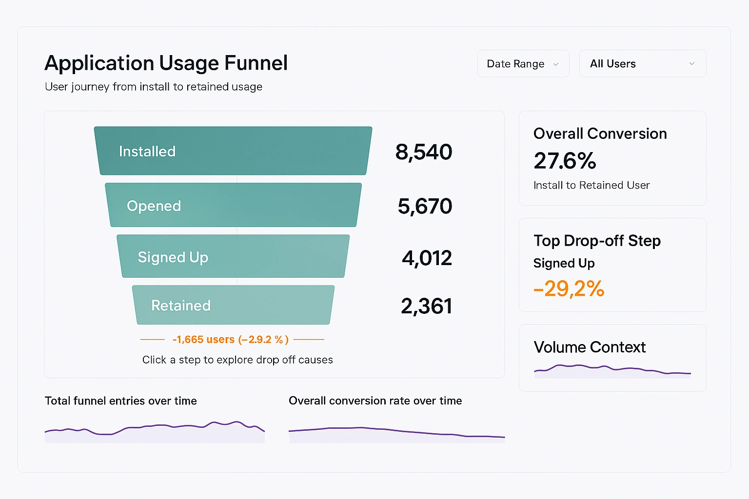
Application Usage Funnel Analysis Dashboard - An application usage funnel analysis dashboard is designed to explain how users move through an application, where momentum builds, and where friction causes drop off. Unlike generic usage dashboards that focus on isolated metrics, a funnel dashboard provides a structured narrative of user behavior from entry to meaningful retention. When implemented correctly, it becomes a shared reference point for product, engineering, and operations teams. The primary purpose of this dashboard is to make user progression visible and measurable. It answers questions such as how many users begin using the application, how many complete critical actions, and how many return after initial exposure. The dashboard is not meant to catalog every event but to highlight the stages that matter most to application success...
Application for Web Dashboards - Looking for a good application for web dashboards? InetSoft is a pioneer in self-service dashboarding with pricing comparable to Power BI. View a demo and try interactive examples...
Are Dashboards Dead or Not? -Dashboards, as a method of data visualization and presentation, have been around for decades and have been a staple of business intelligence and data analysis. In recent years, however, there have been discussions about whether dashboards are dead or if they are still relevant in the era of big data and advanced analytics. On one hand, the rise of big data and the increasing amount of information available has made traditional dashboards less effective. They can no longer handle the sheer volume of data, and the static nature of dashboards means that they cannot provide real-time insights. In addition, with the increasing popularity of data visualization and self-service analytics, users have come to expect more interactive and customizable experiences, which traditional dashboards are not equipped to provide. On the other hand, dashboards are still widely used and are still seen as a valuable tool for data presentation and analysis. The simplicity and ease of use of dashboards make them accessible to a wider audience, including non-technical users who may not have the skills or knowledge to use more complex data visualization tools. Dashboards also allow users to quickly see the key metrics and trends in their data, which is critical for decision making and problem solving...
ASP Dashboard - A listing of the features and benefits for an ASP looking to embed dashboards in their application, for instance, the ability to mash up disparate data sources and many integration points including user management...

Asana Dashboard Software - Project managers foremost need project progress and coordination information such as dashboards displaying Gantt charts. However, the dashboards must be able to go beyond core project management data to give a holistic view of all factors that can impact on-time, on-budget delivery. Asana is a web and mobile application designed to help teams organize, track, and manage their work. InetSoft's Style Intelligence comes with a custom Asana data connector for incorporating project management data...
Assisted Living Companies Use Dashboards - Are you a manager of an assisted living community in charge of operations? Find out how senior care operations managers track the most up-to-date company information on one screen. Assisted living companies and physical therapy businesses rely on dashboards to gain crucial insights into the performance of their businesses. They compete in a large industry, and so it's important for both kinds of companies to have performance dashboards to add more value to everyday tasks. History of Dashboards Dashboard are common features in almost all apps, including Google Analytics. It is an essential tool for business and website owners who want to track the performance of their sites and users. Google first made it available for administrators to use in their website analytics tool on the 13th of July, 2007. The history of this can be traced back to when it was known as Urchin Web Analytics, which was a freeware program that became available for download on 10th of February, 2000. It was developed by Josh Williams and Matt Cutts...
Attorney Performance Management Dashboards - I am looking at this attorney performance management dashboard on my PC, but of course, in your environment this could also be in an iPad as well or another sort of device. So let’s move ahead. I get this first report here. Can you tell me what I am looking at? Ron: Yes, this is the main focus of the cluster performance chart. It takes just a couple of minutes to get your head around it. And then once you have done that, it’s quite easy to use..
Automated DevOps Dashboards - Are you looking for a good DevOps dashboard tool? InetSoft's pioneering dashboard reporting application produces great-looking web-based dashboards with an easy-to-use drag-and-drop designer. Get cloud-flexibility for your deployment. Minimize costs with a small-footprint solution. Maximize self-service for all types of users. No dedicated BI developer required. View a demo and try interactive examples.
Automating Dashboards - The fact that I know that something changed was good, but my assumption was bad. So you really have to follow up and ask questions, and make sure you are interpreting the data correctly. We used to have an associate vice president who would look at data and make really inappropriate conclusions from the data. And it did nothing but hurt our ability to address the data correctly. You do have to make sure that you are using data in an appropriate way. Once you do have that data formatted as useful information, that you it can really help you accelerate the operations efficiency of your department. It can also help you get the things that you need. When we went to build this dashboard, these were my requirements. I want no manual intervention. Why? It doesn’t happen. The data load might happen the first few times...
Automotive Industry Data Dashboards - All car manufacturers understand that there is a need for transformation in the market. However, the challenge is: how do they start transforming themselves when their processes and employees are distributed in dozens of countries? How do they become agile and innovative? Before automotive manufacturers begin the transformation process, they must create a roadmap or strategy. To do this successfully, they need to implement a dashboard system. Traditional Business Dashboards Between the invention of accounting and the 1980s, there were no significant changes in the business. The one thing that mattered to most businesses was how much revenue and profits they made. Financial statements were prepared and reported to GAAP. And that was all...
Azure Application Insights Dashboard - Looking for a good alternative to Azure application insights dashboard? InetSoft's pioneering dashboard reporting application produces great-looking web-based dashboards with an easy-to-use drag-and-drop designer. Mash up your application performance data with any other in your enterprise. View a demo and try interactive examples...