Automating Dashboards
This is the continuation of a transcript of a presentation by Stu Worman from Indiana University at an IT conference for unversity IT professionals.
What the real value here is that you are making people ask questions. What is changing? What is different? And is this OK? Sometimes it is ok. To make these decisions in context, so let me tell you what happened here.
This was a year ago. It was August 10th. We were going live with our course management system. As user support director, I am preparing. We have got everything ready. We prepared for six months for this day. But we know it’s going to be a big day. Things are going to happen.
I look at the data. We’re getting about 200 extra calls the first couple of days, and I thought, that's probably right. But I saw the support center manager in the hallway and said “so, I guess you’re getting hit a little bit, huh, with this course management system going live?” He’s like "no, not really. What really happened is we just expired all the DHCP licenses the same day for the people who had stayed on campus all summer." They were the ones calling. It wasn’t about the course management system at all.
The Importance of Data Context and Interpretation
So the fact that I know that something changed was good, but my assumption was bad. So you really have to follow up and ask questions, and make sure you are interpreting the data correctly. We used to have an associate vice president who would look at data and make really inappropriate conclusions from the data. And it did nothing but hurt our ability to address the data correctly.
So you do have to make sure that you are using data in an appropriate way. Once you do have that data formatted as useful information, that you it can really help you accelerate the operations efficiency of your department. It can also help you get the things that you need.
When we went to build this dashboard, these were my requirements. I want no manual intervention. Why? It doesn’t happen. The data load might happen the first few times. And then something will get in the way, and then a month will go before you catch up.
You can’t make a decision a month in arrears. Everything has to be automated. I wanted the data there. I wanted it to be no more than 24 hours old, and I wanted it to be something automatic. Nobody had to think about this. I didn’t want any staff have to do anything. So that we could make these decisions, I wanted all of the processes to be automated.
Six Dashboards in Use at the University
1. Student Enrollment Dashboard
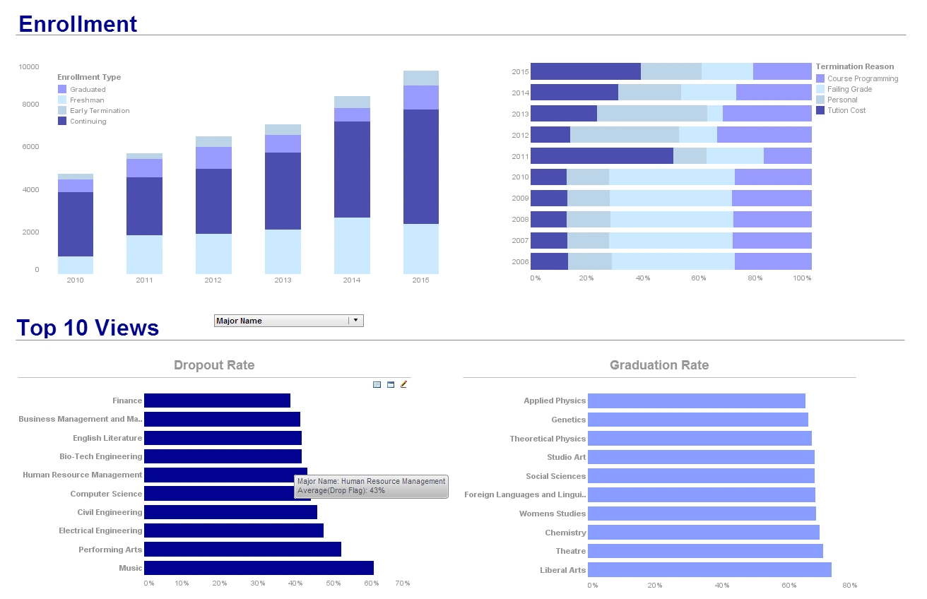
The Student Enrollment Dashboard provides a comprehensive overview of current and historical student enrollment trends at the university. It displays various metrics such as total enrollment numbers, demographic breakdowns (age, gender, ethnicity), and program-specific enrollments. Users can see trends over several academic years, compare enrollment statistics across different faculties and departments, and identify any shifts in student demographics. The dashboard also includes visualizations like line graphs for trend analysis, bar charts for categorical comparisons, and heat maps to show geographic origins of students. This dashboard is particularly useful for university administrators and planning committees to make informed decisions on recruitment strategies and resource allocation.
2. Academic Performance Dashboard
The Academic Performance Dashboard is designed to track and analyze student performance across different courses and programs. It displays key indicators such as average GPA, pass/fail rates, and grade distributions. Users can filter data by department, course level, and instructor, allowing for detailed performance comparisons and trend analysis. The dashboard also features interactive elements like scatter plots to correlate various factors affecting academic success and box plots to compare distributions of grades. This dashboard helps faculty and academic advisors identify patterns of academic achievement and areas where students may need additional support or resources.
3. Financial Aid and Scholarships Dashboard
This dashboard provides a detailed view of the financial aid and scholarships disbursed to students. It includes metrics such as the total amount of aid awarded, the number of recipients, and the breakdown of aid types (grants, loans, scholarships, work-study). Visualizations like pie charts and stacked bar charts illustrate the distribution of financial aid across different student demographics and academic programs. Additionally, trend lines show changes in financial aid distribution over time. This dashboard is essential for the financial aid office to monitor the effectiveness of aid programs, identify gaps in funding, and ensure equitable distribution of resources.
4. Faculty and Staff Dashboard
The Faculty and Staff Dashboard provides insights into the university's workforce composition and dynamics. It displays metrics such as the total number of faculty and staff, breakdowns by role (professors, administrative staff, support staff), and demographic information. Users can view data on hiring trends, staff turnover rates, and faculty qualifications. Visualizations include bar charts for role distribution, line graphs for hiring trends, and demographic pyramids for age and gender distribution. This dashboard aids human resources in workforce planning, diversity initiatives, and identifying areas where additional staff may be needed.
5. Research and Grants Dashboard
The Research and Grants Dashboard highlights the university's research activities and funding. It displays metrics such as the total number of research projects, grant amounts received, and the distribution of funding across departments and research areas. Users can explore data on grant application success rates, principal investigators, and funding sources. Visualizations include bubble charts to show the size and impact of research projects, line graphs for funding trends, and network diagrams to illustrate collaborations. This dashboard is crucial for research offices to track the progress of research initiatives, identify successful funding strategies, and foster interdisciplinary collaborations.
6. Campus Safety and Security Dashboard
The Campus Safety and Security Dashboard provides a comprehensive overview of campus security metrics and incident management. It displays data on reported incidents, campus emergency alerts, security patrol coverage, and response times. Users can view heat maps showing incident locations across campus, trend analyses for different types of security events, and real-time status updates on emergency systems. The dashboard includes visualizations like geographic mapping for patrol routes and incident clusters, time-series charts for response time analysis, and alert status indicators. Key metrics include emergency response times, number of safety escorts provided, parking violations, and safety training completion rates among staff and students. This dashboard is essential for campus security personnel, university administrators, and emergency response coordinators to maintain a safe campus environment, allocate security resources effectively, and ensure compliance with safety regulations.


