Analytical or Operations Dashboards?
There are two main varieties of dashboards: analytical dashboards and operational dashboards.
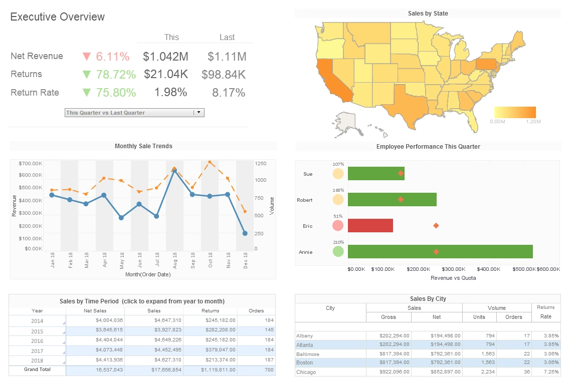
Analytics dashboards are just that, analytical. They are created for the sole purpose of gaining knowledge and insight from data. Users of these dashboards seek insight into the past and the future, wondering what happened and what's to come.
Operations dashboards, on the other hand, are not created specifically to learn. They exist to manage the day-to-day occurrences of a business.
Like analytical applications, operations dashboards are capable of revealing data trends. Their key function, however, comes from their ability to drill down through current intelligence to get alerts and recognize probable issues that may arise.
Which Type of Dashboard Is Right for Me?
Well, the answer to that question depends completely upon certain parameters:
First and foremost, why do you need any dashboard in the first place? If you need deeper insight into your business or are searching for trends, use an analytical dashboard. If you are interested in KPI awareness or time sensitive matters, an operations dashboard if for you.
Who will be using this dashboard? The overall feel of the dashboard will be determined based on the end user. For executives or analysts, use an analytical dashboard; for managers and standard business users an operations dashboard is more appropriate.
What is the end goal? What are you hoping to achieve by utilizing a dashboard? If you have strategic goals, go with an analytical dashboard. If you are tracking against goals; an operational.
Finally, an important thing to consider is where your source data is stored. Operations dashboards are typically more suited to improving the visibility of singular systems and applications as opposed to multiple data sources.

What Is an Analytical Operations Dashboard?
An analytical operations dashboard is a powerful tool used by organizations to monitor, analyze, and visualize key performance indicators (KPIs) and operational metrics in real-time or near-real-time. It serves as a central hub where data from various sources and systems are collected, transformed, and presented in a visually intuitive format, enabling stakeholders to make informed decisions and gain actionable insights into the overall health and performance of their operations.
In essence, an analytical operations dashboard goes beyond simple data visualization. It leverages advanced analytics and data processing techniques to provide a comprehensive view of an organization's operational activities. This includes tracking metrics related to production, sales, supply chain, customer service, financial performance, and more. By aggregating and presenting this data in a clear and concise manner, decision-makers can quickly identify trends, anomalies, and areas for improvement, ultimately leading to better strategic planning and operational efficiency.
One of the key features of an analytical operations dashboard is its ability to facilitate data exploration and analysis. Users can interact with the dashboard, drilling down into specific data points, applying filters, and comparing different metrics to uncover underlying patterns and correlations. This empowers organizations to identify root causes of issues and take proactive steps to address them, rather than simply reacting to problems after they occur.

Furthermore, modern analytical operations dashboards often incorporate predictive and prescriptive analytics. Predictive analytics uses historical data and machine learning algorithms to forecast future trends and outcomes, helping organizations anticipate demand fluctuations, identify potential risks, and optimize resource allocation. Prescriptive analytics goes a step further by suggesting specific actions to optimize outcomes based on the insights generated from the data.
Opinions on analytical operations dashboards can be quite positive due to the transformative impact they can have on businesses. They enable data-driven decision-making across all levels of an organization, fostering a culture of accountability and continuous improvement. With the growing complexity of today's business environment and the deluge of data available, having a centralized and intuitive dashboard becomes indispensable for extracting meaningful insights and maintaining a competitive edge.
However, it's worth noting that the effectiveness of an analytical operations dashboard heavily depends on data quality and the relevance of the selected KPIs. If the underlying data is inaccurate, incomplete, or outdated, the insights drawn from the dashboard could be misleading or inaccurate. Therefore, investing in data quality and establishing robust data governance practices is essential to ensure the reliability of the insights derived from the dashboard.
An Analytical Dashboard Example for the FMCG Industry
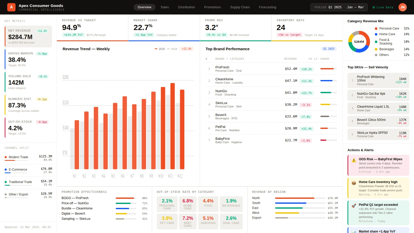
An analytical dashboard like this FMCG example is built for decision-makers who need to understand performance patterns, not just react to today's tasks. It would be especially useful for category managers, sales directors, revenue growth teams, supply chain planners, finance analysts, and executives responsible for commercial performance across multiple brands or channels. Unlike an operational dashboard that focuses on immediate workflow execution, this screen helps users step back and compare results against targets, evaluate changes over time, and identify where deeper investigation is required. It is designed for weekly business reviews, monthly planning cycles, quarterly forecasting, and strategy discussions where leaders need a shared view of revenue quality, brand contribution, market momentum, and inventory health.
The top row of KPI cards summarizes the most important analytical questions at a glance. Net revenue, gross margin, volume sold, numeric distribution, and out-of-stock rate show whether the business is growing efficiently or simply pushing volume at the expense of profitability. Revenue versus target and market share help leaders judge commercial execution in the context of plan and competition, while promo ROI measures whether trade spending is creating productive lift. Inventory days adds another strategic layer by showing whether the company is carrying too much stock or risking shortages. Together these metrics let an analyst balance growth, profit, market coverage, and working capital instead of optimizing one measure in isolation.
The larger visualizations show how the story develops across time, brands, and categories. The weekly revenue trend chart compares current performance with the prior year, making it easy to spot acceleration, flattening demand, or inconsistent promotional lift across the quarter. The top brand performance table ranks product lines by revenue, year-over-year change, and share, which helps category leaders identify which brands are driving the portfolio and which are losing momentum. The category revenue mix donut adds a portfolio view by showing how sales are distributed across personal care, home care, food, beverages, and other segments. That combination is useful for portfolio planning because it reveals whether growth is concentrated in a narrow set of products or broadly distributed across the business.
On the right and lower portions of the dashboard, the analysis becomes even more actionable. The top SKU sell velocity panel highlights which items are moving fastest, giving planners insight into demand intensity at the product level. Promotion effectiveness compares campaigns such as BOGO, bundle, digital, and sampling offers, helping marketing and sales teams understand which tactics are producing the best commercial response. The out-of-stock rate by category turns availability into a measurable risk signal, while revenue by region shows whether growth is balanced geographically or overly dependent on a few territories. Even the alerts panel contributes to analysis by surfacing exceptions such as stock coverage risks or unexpected target overachievement that deserve immediate follow-up during a business review.
What makes this a strong analytical dashboard is the way the visuals connect strategic questions across functions. A sales leader can see rising revenue but also notice weak margin or uneven regional results. A supply chain planner can connect sell velocity with inventory days and out-of-stock exposure. A finance analyst can compare promo ROI with revenue growth to determine whether gains are sustainable. An executive can use the whole page to move from summary metrics to the brand, region, category, and SKU drivers underneath them. In practice, this is the kind of dashboard organizations use to decide where to invest, where to correct, and where to probe further, which is exactly what analytical dashboards are meant to do.
An Analytical Dashboard Example for Retention and Churn Analysis
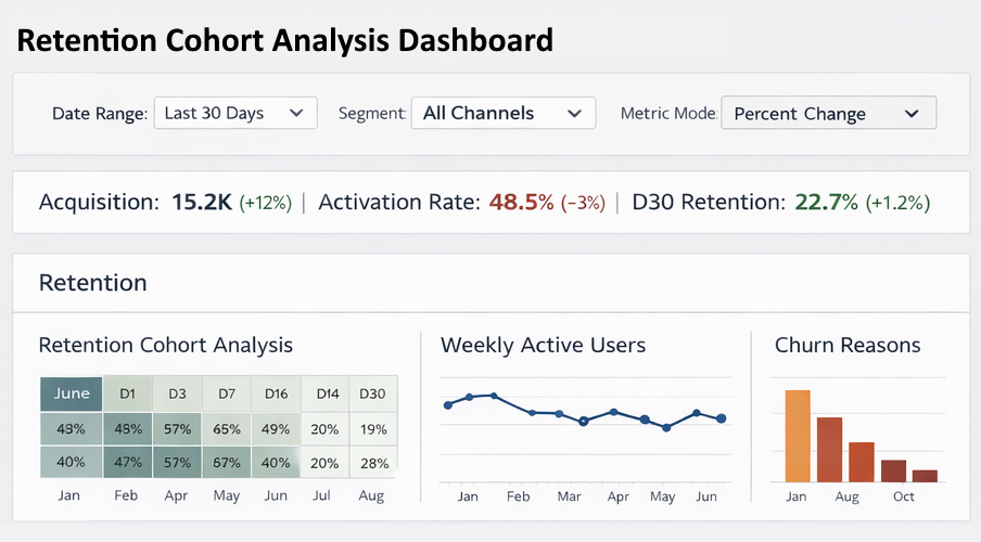
This retention cohort analysis dashboard is another strong example of an analytical dashboard because it is designed for people trying to understand user behavior over time, not simply manage today's transactions. It would be valuable for product managers, customer success leaders, growth marketers, subscription business owners, digital analysts, and SaaS executives who need to measure whether new users are becoming active customers and whether existing customers are staying engaged. A dashboard like this is often used in recurring-revenue businesses, mobile apps, online services, e-commerce membership programs, and digital platforms where long-term value depends on keeping cohorts active after acquisition. The main question it answers is not just how many users arrived, but how well those users activated, returned, and avoided churn after they joined.
The filters across the top show that this dashboard is built for analytical exploration. Users can change the date range, segment, and metric mode, allowing them to compare retention behavior for all channels, paid search, email, organic traffic, or any other acquisition source. That matters because retention rarely behaves the same way across every segment. One campaign may drive a large number of signups but poor activation, while another brings fewer users who stay longer and spend more. The KPI strip beneath the filters gives a concise executive summary of the funnel: acquisition, activation rate, and D30 retention. Together those measures show how efficiently the business turns attention into engaged customers. If acquisition rises while activation falls, leaders know the top of the funnel is growing but quality may be slipping. If D30 retention improves, the company may be improving onboarding, product fit, or lifecycle messaging.
The retention cohort analysis grid is the analytical center of the page. By organizing cohorts by month and then showing retention checkpoints such as day 1, day 3, day 7, day 14, day 16, and day 30, the dashboard helps analysts see exactly when user drop-off occurs. That is far more informative than a single aggregate churn number. A product team can tell whether users are failing immediately after signup, disengaging during onboarding, or fading later after initial success. Because cohorts are displayed side by side, trends become visible across time. If newer cohorts are retaining better than older ones, that may indicate recent product improvements are working. If newer cohorts decline more quickly, the team can investigate changes in pricing, acquisition mix, or user experience.

The supporting charts deepen the analysis. Weekly active users provides trend context by showing whether engagement is stable, rising, or deteriorating over the selected period. That helps leaders distinguish a one-time cohort anomaly from a broader activity pattern affecting the whole customer base. The churn reasons bar chart adds qualitative direction to the quantitative retention data by surfacing the most common causes behind user loss. Depending on the business, those reasons might reflect pricing friction, lack of product value, technical issues, missing features, or competitive alternatives. When a dashboard combines retention percentages with likely churn drivers, teams can move faster from observation to action.
What makes this dashboard particularly analytical is that it supports diagnosis, prioritization, and forecasting all at once. A growth marketer can evaluate which channels bring durable users, a product manager can judge whether onboarding changes improved early retention, and a customer success leader can identify which accounts or segments need intervention before churn spreads. Executives can also use the same screen to estimate customer lifetime value trends because retention and churn directly influence revenue durability. In practice, this dashboard is the kind of tool organizations use when they want to learn why customers stay, why they leave, and which levers will most improve long-term growth.
An Analytical Dashboard Example for Financial Advisors
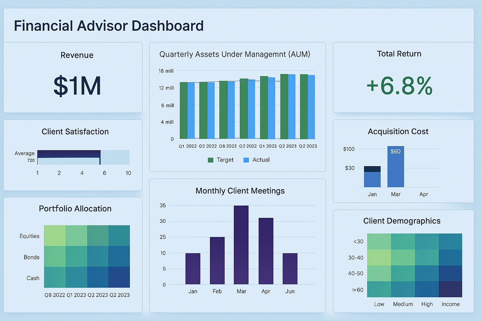
This financial advisor dashboard is a strong analytical example because it gives wealth managers and advisory leaders a way to evaluate client performance, growth, service activity, and portfolio composition from a strategic point of view. It would be most useful for individual financial advisors, branch managers, regional directors, practice owners, and operations analysts supporting an advisory business. It can also help compliance and client service teams because it summarizes how client relationships are performing over time rather than only showing today's appointments or transactions. In that sense, it is analytical rather than operational: the goal is to understand which parts of the advisory business are growing, which client segments are most valuable, whether the portfolio mix is aligned with client needs, and where improvement opportunities exist across acquisition, retention, and asset management.
The large KPI tiles at the top immediately frame the business questions that matter most. Revenue gives a direct summary of production, showing whether the advisor or team is generating the fee income needed to support growth targets. Total return adds a client-outcome measure, making it possible to evaluate performance from the investor's perspective rather than only the firm's. Quarterly assets under management, shown as a target-versus-actual bar chart, is especially important because AUM sits at the center of most advisory economics. Rising AUM may reflect new client wins, stronger markets, deeper wallet share, or successful retention. When actual results lag target, managers know they need to investigate whether the issue is acquisition, outflows, weak market performance, or low share of client assets.
The rest of the visuals show how the practice is functioning underneath those headline measures. Client satisfaction, displayed as a score or gauge, gives a relationship-health signal that can help predict future retention and referral strength. Monthly client meetings shows whether advisors are maintaining the engagement cadence needed to support trust, planning, and upsell opportunities. If meetings fall while satisfaction later declines, the dashboard helps make that connection visible. Acquisition cost adds another analytical layer by showing how expensive growth is over time. That metric matters because an advisory business can increase revenue while still becoming less efficient if marketing, prospecting, or onboarding costs rise too quickly. Leaders can use these views together to judge whether growth is productive, service is strong, and the client experience is being maintained.

The heatmaps make this dashboard even more analytical. Portfolio allocation helps advisors see how client assets are distributed across equities, bonds, and cash over several quarters, which is useful for monitoring drift, risk exposure, and changing investment posture. A branch manager could quickly notice whether portfolios are becoming too conservative, too concentrated, or inconsistent with prevailing strategy. Client demographics adds another layer by showing the mix of client age groups and income bands. That kind of analysis supports business development planning because it reveals where the current client base is concentrated and where gaps exist. For example, an advisor may discover that higher-income younger clients are underrepresented, or that a mature client base requires stronger succession, retirement income, and estate-planning services.
What makes this dashboard especially valuable is that it lets different roles answer different strategic questions from the same page. An individual advisor can prepare for review meetings by checking returns, satisfaction, and meeting activity. A practice leader can assess whether the team is acquiring clients efficiently and building assets fast enough. An executive can compare business growth with service quality and portfolio composition to judge the long-term health of the advisory model. In short, this is the kind of analytical dashboard that helps financial firms understand not just what happened, but why performance is changing and where they should focus next.