Analytical Supply Chain Dashboard Example
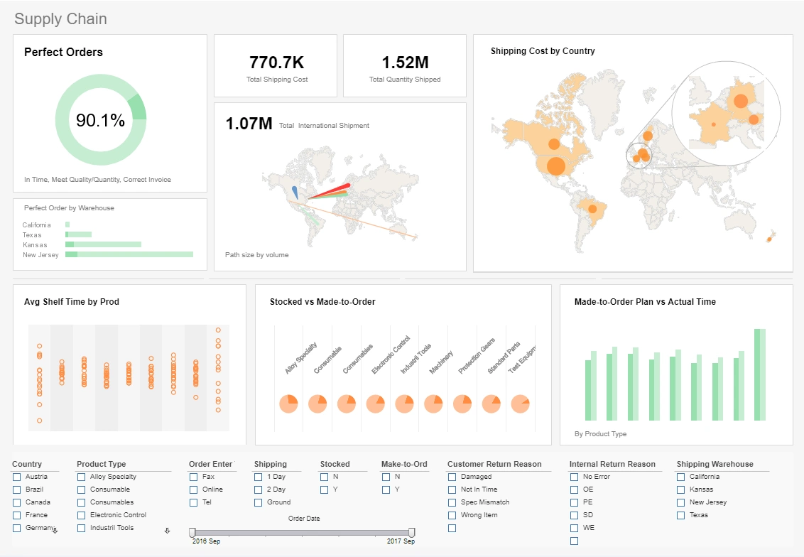
In this example if of an analytical supply chain dashboard, you have got six charts and two KPI cards. Each chart can be expanded and drilled into. With a technique called brushing, you can select a data point in one chart and see if it has connections in any other chart. The selection list lets you filter all the charts at once to a specific area of interest.
The first metric displayed is the percentage of perfect orders. A perfect order is one that is accurately picked, packed, and delivered to the customer without any errors or issues. In industries like e-commerce and retail, achieving a perfect order rate of 90% or higher is considered quite good. This means that 90% or more of the orders are processed and delivered without any mistakes or complications.
The chart below it shows average shelf time by product. Average shelf time refers to the amount of time a product spends on the shelf before it is sold or removed from inventory. A low average shelf time might indicate that products are selling quickly, which is generally positive for revenue and cash flow. However, it could also imply that the company is carrying too little inventory, which could result in stockouts and missed sales opportunities.
Supply Chain KPIs in the Consumer Goods Industry
-
Perfect Order Rate: The percentage of orders that are delivered to the customer without any errors or issues.
-
On-Time Delivery (OTD): The percentage of orders delivered on or before the promised delivery date.
-
Order Fill Rate: The percentage of customer orders that are completely fulfilled in a single shipment.
-
Inventory Turnover: The number of times inventory is sold or used up in a given period. This indicates how efficiently a company is managing its inventory.
-
Stockout Rate: The percentage of times when a product is not available when a customer wants to purchase it.
-
Supplier On-Time Delivery (SOTD): The percentage of orders received from suppliers on or before the agreed-upon delivery date.
-
Lead Time: The average time it takes for a product to move from order placement to delivery.
-
Forecast Accuracy: The degree to which actual demand matches the forecasted demand.
-
Fill Rate: The percentage of customer demand that is met from available inventory.
-
Shelf Availability: The percentage of time a product is in stock and available for customers to purchase.
-
Return Rate: The percentage of products sold that are returned by customers.
-
Cost per Order: The total cost incurred for processing and delivering an order.
-
Transportation Costs as a Percentage of Sales: The percentage of sales revenue spent on transportation.
-
Supplier Lead Time: The time it takes for a supplier to deliver goods after receiving an order.
-
Cash-to-Cash Cycle Time: The time it takes for a company to convert its investments in inventory back into cash.
-
Obsolescence Rate: The percentage of inventory that becomes obsolete and cannot be sold.
-
Fill Rate by Product Line: The percentage of orders filled for specific product lines.
-
Customer Order Cycle Time: The time it takes from when a customer places an order to when it is delivered.
-
Overall Equipment Effectiveness (OEE): A measure of how well a manufacturing unit performs relative to its designed capacity during the periods when it is scheduled to run.
-
Supplier Quality Index: A metric that assesses the quality of materials and products received from suppliers.
-
Warehouse Utilization Rate: The percentage of a warehouse's capacity that is being used.
-
Transportation Mode Efficiency: The evaluation of which transportation modes (e.g., truck, rail, air) are most cost-effective and efficient.
-
Customer Service Level: A measure of how well a company meets its customers' expectations regarding product availability and delivery.
-
Customer Lifetime Value (CLV): The predicted net profit a company can expect to earn from a customer throughout their entire relationship with the business.
-
Sustainability Metrics: Measures related to environmental impact, such as carbon emissions, water usage, and waste reduction.

