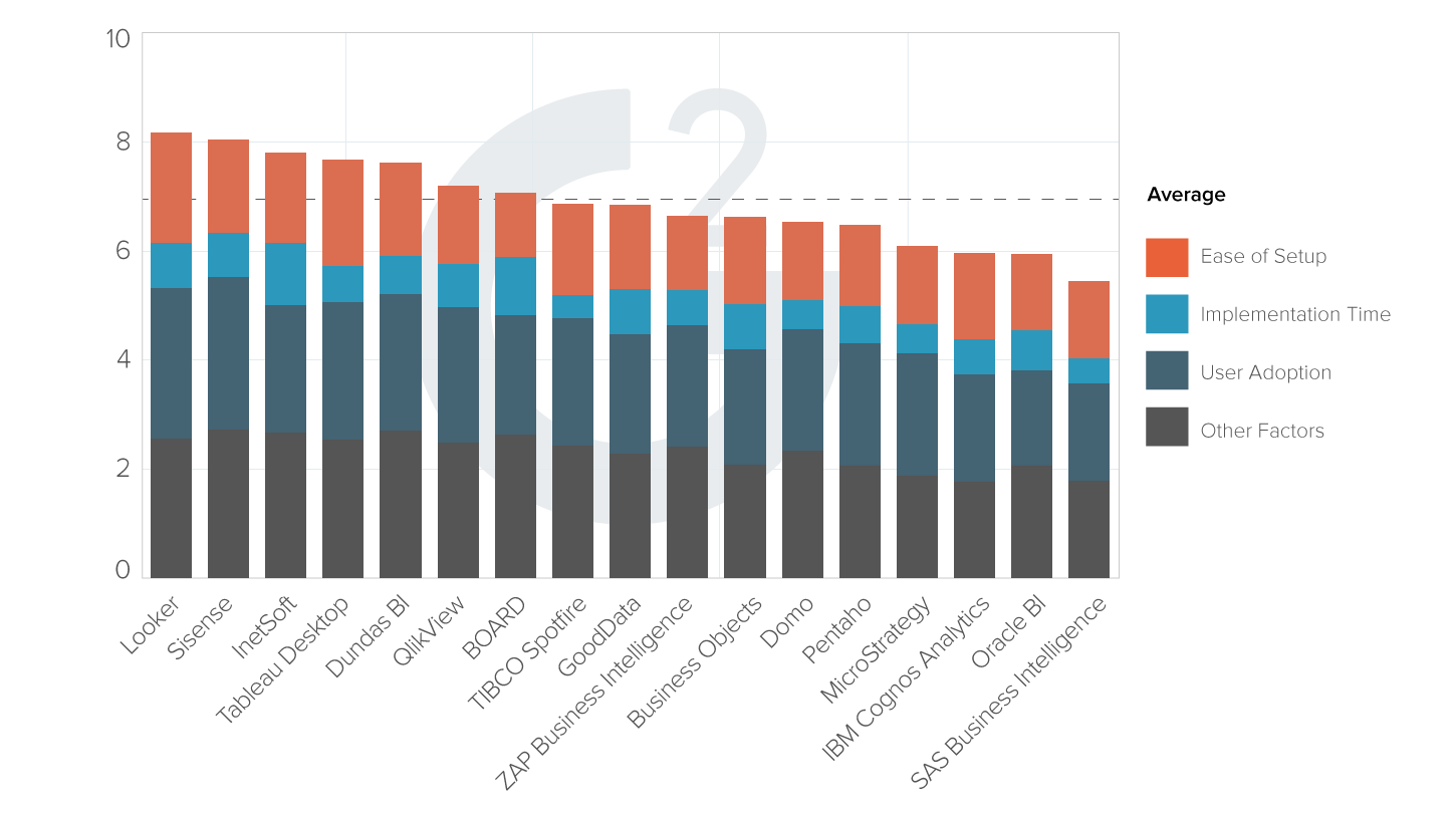
Evaluate InetSoft's Data Visualization Dashboard Software

Are you looking for good data visualization dashboard software? InetSoft's pioneering dashboard reporting application produces great-looking web-based dashboards with an easy-to-use drag-and-drop designer. View a demo and try interactive examples.

data visualization dashboard software sample

Register for Pricing
View 2-min Demo
Read Reviews
 

Register for more information and a personalized demo

About InetSoft

Since 1996 InetSoft has been delivering easy, agile, and robust business intelligence software that makes it possible for organizations and solution providers of all sizes to deploy or embed full-featured business intelligence solutions. Application highlights include visually-compelling and interactive dashboards that ensure greater end-user adoption plus pixel-perfect report generation, scheduling, and bursting. InetSoft's patent pending Data Block™ technology enables productive reuse of queries and a unique capability for end-user defined data mashup.

This capability combined with efficient information access enabled by InetSoft's visual analysis technologies allows maximum self-service that benefits the average business user, the IT administrator, and the developer. InetSoft was rated #1 in Butler Analytics Business Analytics Yearbook, and InetSoft's BI solutions have been deployed at over 5,000 organizations worldwide, including 25% of Fortune 500 companies, spanning all types of industries.

advanced bi solution customers

What KPIs and Metrics Are Displayed in the Data Visualization Dashboard of a Steam Generation Plant?

A data visualization dashboard for a steam generation plant typically displays key performance indicators (KPIs) and metrics related to the operational efficiency, performance, safety, and environmental impact of the plant's steam generation processes. These metrics help plant operators, engineers, and managers monitor the health of the plant, identify potential issues, and optimize operations. Here are some common KPIs and metrics that may be displayed in such a dashboard:

  1. Steam Generation Capacity: This metric measures the maximum amount of steam that the plant is capable of generating under optimal conditions. It provides insights into the plant's capacity utilization and potential for meeting demand.

  2. Steam Generation Rate: The rate at which steam is produced by the boilers or steam generators, typically measured in pounds per hour or kilograms per hour. Monitoring steam generation rate helps assess the plant's ability to meet current demand and respond to fluctuations in steam requirements.

  3. Boiler Efficiency: Boiler efficiency measures the effectiveness of converting fuel or energy inputs into steam output. It is typically expressed as a percentage and takes into account factors such as fuel consumption, heat loss, and steam quality. Improving boiler efficiency can reduce fuel costs and environmental impact.

  4. Steam Quality: Steam quality refers to the purity and dryness of the steam produced by the boilers. It is important for ensuring efficient and reliable operation of steam-driven equipment and processes. Monitoring steam quality helps identify issues such as water carryover, wet steam, or impurities in the steam.

  5. Fuel Consumption: Tracking fuel consumption, such as natural gas, coal, or biomass, provides insights into the plant's energy consumption patterns and operating costs. Variations in fuel consumption may indicate changes in steam demand, boiler efficiency, or fuel quality.

  6. Emissions Monitoring: Monitoring emissions of pollutants such as carbon dioxide (CO2), nitrogen oxides (NOx), sulfur dioxide (SO2), and particulate matter helps ensure compliance with environmental regulations and minimize the plant's environmental impact. Emissions data can be displayed in real-time or aggregated over specific time periods.

  7. Water Usage: Water usage metrics track the consumption of water for steam generation, cooling, and other plant processes. Monitoring water usage helps identify opportunities for water conservation, minimize water waste, and ensure sustainable water management practices.

  8. Heat Rate: Heat rate measures the efficiency of converting fuel energy into steam energy, typically expressed in British thermal units (BTU) per kilowatt-hour (kWh) of electricity generated. Lower heat rates indicate higher efficiency and lower operating costs.

  9. Pressure and Temperature Monitoring: Monitoring steam pressure and temperature at various points in the steam generation system helps ensure safe and efficient operation. Deviations from optimal pressure and temperature ranges may indicate issues such as boiler fouling, steam leaks, or inadequate insulation.

  10. Equipment Health and Maintenance: Tracking equipment health indicators such as vibration, temperature, and operating hours helps identify potential equipment failures or maintenance needs. Predictive maintenance based on real-time data can minimize downtime and extend equipment lifespan.

  11. Safety Performance: Safety performance metrics track indicators such as accident rates, near misses, and compliance with safety protocols and regulations. Ensuring a safe working environment is critical for protecting personnel, equipment, and the surrounding community.

  12. Historical Trends and Forecasts: Historical trends and forecasting tools provide insights into past performance and enable predictive analysis of future steam generation patterns, demand fluctuations, and operational requirements. This information helps optimize resource allocation and planning.

#1 Ranking: Read how InetSoft was rated #1 for user adoption in G2's user survey-based index Read More

More Resources and Articles about InetSoft's Data Visualization Dashboard Software

Agile Data Visualization Software - Since 1996 InetSoft has been delivering easy, agile, and robust business intelligence software that makes it possible for organizations and solution providers of all sizes to deploy or embed full-featured business intelligence solutions. Application highlights include visually-compelling and interactive dashboards that ensure greater end-user adoption plus pixel-perfect report generation, scheduling, and bursting...

Analysis Program to Help You Visualize - Are you looking for a data analysis program to help you visualize and analyze data, answer business queries, and increase overall project efficiency? Since 1996 InetSoft has been making BI software that is easy to setup and easy to use, allowing users to build self-service oriented dashboards and visual analyses quickly...

Analytic Data Visualization Dashboard Solutions - Dashboards utilize visualization as their primary means of information presentation. Analytic dashboards take this one step further with rich interactivity and self-service customization. Furthermore, data manipulation access should also be provided to data knowledgeable power users...

Best Data Visualization Techniques - Today's topic is data visualization how to techniques. Making pretty pictures, right? That's part of it. Where did the concept originate? The idea of data visualization really came from a Yale professor named Edward Tufte. And so, I'm a software developer, and a lot of the applications I build are designed to capture data, and sometimes massive amounts of data. What's the biggest problem with data? It's trying to understand it once you capture it, trying to present that back in a meaningful way. Trying to curate it...

Business Data Visualisation Software - Researching data visualisation solutions for your organization's internal use or to embed in a commercial application? Want an enterprise solution that is easy to deploy and easy to use...

view gallery
View live interactive examples in InetSoft's dashboard and visualization gallery.

Business Software for the Visualization of Data - Researching solutions for the visualization of data for your organization's internal use or to embed in a commercial application...

Completed Dashboard Solution Examples - Dashboards are essential data visualizations that allow users to explore and analyze their data intuitively in order to find business solutions. Easily completed dashboards benefit enterprises by enabling the fast recognition of strengths and weaknesses, as KPIs and metrics are updated to follow changing business conditions. A well completed dashboard visually conveys the same information that could only be gleaned by paging through many different reports...

Dashboard Options for OLAP Databases - InetSoft's dashboard and data visualization software can access many of the popular OLAP databases such as Oracle Hyperion Essbase, Oracle OLAP, MS Analysis Server, and SAP NetWeaver BW. In addition to accessing a single OLAP server for advanced dashboarding and analytics, InetSoft's powerful data mashup engine allows for combining and manipulating data with other data types (see All Data Sources for others), saving on additional ETL efforts...

Dashboards for the Working Professional - Dashboards have become the number one business intelligence tool in use today. Dashboards supply professional users with an quick look at key performance indicators pertinent to business operations. Dashboards provide the working professional world with a means of gauging the temperature of their business versus the rest of their industry...

Read the top 10 reasons for selecting InetSoft as your BI partner.

Dashboards Via a Web App - Looking to view and/or build dashboards via a web app? InetSoft's dashboard web application can be installed either on-premise or in the cloud, on a remote server provided by Amazon web services or any other provider...

Data Processing and Charting Software - Data processing software inspects, cleans, and transforms data, so that a decision maker can aggregate, chart and analyze the data to discover useful information, suggest conclusions, and expedite good decision making...

Data Visualization Makes BI More Accessible - You had some interesting thoughts about how we have gotten here and what it all means. Well, what do you think the history is about, the sort of how and why of the consumerization of BI...

Data Visualization and Mining Software - Researching data visualization and data mining solutions for your organization? Deploy a small-footprint, easy-to-use HTML5-based data visualization application from InetSoft. As an innovator in reporting software since 1996, InetSoft has pioneered the evolution from static reporting towards interactive visualization of data...

Read what InetSoft customers and partners have said about their selection of Style Report as their production reporting tool.

Data Visualization Yields Faster Insights - What are some examples of how data visualization yields faster insights? I can think of a few examples in the marketing realm. Day of the week patterns can easily be identified in Web site traffic. Very quickly, looking at a daily traffic chart the troughs on the weekend are obvious, if you're a company serving businesses, for instance...

Data Viz Embedded in BI - I think to start with, it's just the shift from data and BI as this kind of static model of presentation to something that's interactive. When you think about BI and the Data Viz that is embedded in BI, it's like graphs and charts. It's very static. It's kind of like the way we used to do word processing where you typed your words, and then you formatted them after the fact. BI is kind of like typesetting for numbers, and the interaction of the Data Viz tool changes that...

Diversified Financial Services Company Selects Dashboard Software - InetSoft Technology (www.inetsoft.com), an innovator in dashboard, reporting and data mashup solutions, announced that PlainsCapital Corporation has selected InetSoft's Style Scope to allow executives to track key internal performance metrics and customer activity by way of real-time data visualization and interactive financial dashboards...

Easy Dashboard Solutions - Dashboards are an essential data visualization tool that allow users to explore and analyze their data visually in order to find business solutions. Dashboards benefit enterprises by enabling the easy recognition of strengths and weaknesses, and the easy measuring of KPI's and metrics. An effective dashboard can intuitively convey the same information that could only be gleaned by paging through many different reports...

Read what InetSoft customers and partners have said about their selection of Style Scope for their solution for dashboard reporting.

Evaluate InetSoft's Easy Dashboard Creation Software - Looking for a tool for easy dashboard creation? InetSoft is a pioneer in self-service dashboard design with a drag-and-drop designer for business users. View a demo and try interactive examples...

Evaluate Interactive Visualization Dashboards - Click on an image to open one of these live interactive dashboards in a new tab. These industry specific visualization dashboards allow you to get a feel for how easy it to use InetSoft's dashboard software...

Good Decision Making Software - I would have to say sort of the biggest promise that data visualization offers is the ability to get some answers to questions that have been eluding organizations for a long time. And so I think that encouraging everybody in an organization to think about those, we like to call, crunchy questions that need to be answered and then apply some of these sophisticated techniques to get the answer. I mean the more organizations can begin to really look at that, looking at those specific applications and those kinds of questions, they are going to get a speed to value that is far faster than anything they have seen with any other technology investments to date...

Graph Visualization Software Application - Looking for a graph visualization software application to plot your data in a visually comprehensible manner? InetSoft's dashboard software combines all common styles of graphing with interactive filtering, allowing you to comb your data for new insights into patterns and trends...

data intelligence
Learn how InetSoft's data intelligence technology is central to delivering efficient business intelligence.

How to Download InetSoft's Data Visualization Software - Are you looking to download data visualization software? Since 1996 InetSoft has been making business software that is easy to deploy and easy to use. Build self-service oriented dashboards and visual analyses quickly. View a 3-minute demo and download a free version...

Incorporate Interactive Visuals - Visual data analysis is the expansion of analytical reasoning to incorporate interactive visuals and dashboards. This allows companies to greatly increase their overall efficiency by increasing their understanding of information critical to the business. Looking at traditional static reports and numbers can only convey so much information, and makes it almost impossible to spot relevant trends and correlations within data. However, visual data analysis tools allow users to see those numbers in a chart, gauge, or crosstab in order to get a better understanding of what the data is saying...

Interactive Online Data Visualizer - With the use of an online data visualizer, you can transform your raw data into visualizations that are not only easy to understand, but also much more efficient for the entire business. Raw data in its natural form is hard to make sense of. Looking at straight numbers it is difficult to see trends or areas that are missing certain goals. However, add visualizations to this data and decision-making becomes a much easier task for all company members...

Key to Creating an Effective KPI Dashboard - The key to creating an effective KPI dashboard is selecting the right tool, and InetSoft offers a simple and powerful way for users to create a KPI dashboard in order to meet the needs of any business. Key Performance Indicators, or KPI's, are measurable values that indicate how effectively business goals are being met. It is crucial for businesses to keep track of their most important KPI's to ensure ongoing quality performance and overall efficiency...

data intelligence icon
Learn how InetSoft's native big data application is specifically designed for a big data operating system.

New Dashboard Software Solution - A business intelligence dashboard is a data visualization tool that helps managers make key decisions. BI Dashboards are typically single screen displays that show the current status of key performance indicators in an organization. As technology advances, new business intelligence applications are emerging. At the same time, these programs are becoming more complex, leaving managers and not-IT employees frustrated...

Simpler Visual Analytics Software - Are you looking for a simpler, more effective way to explore data than traditional static reports? Visual analytics software from InetSoft provides insight into solving problems and answering data questions using interactive graphics and drill down reports...

Simplified Creation of Data Visualizations - So I am going to create another data visualization. I think I will simplify it a little bit. I will show you something along the way. I drag product type in market. Now we just have the states. I can make it a density plot. And in fact, I can even break it down further, and here is a density plot of all the area codes in this data set. And as you can see, there are some significant outliers, and there are also a lot of them that follow along a linear curve. And actually, if I select the trend line, you can see that that's significant...

Solution to Design a Business Dashboard - Designing a dashboard can be challenging, but when done properly can be very beneficial for your business. It's important to know what the best dashboard practices are. The benefit of a dashboard is that everything is in once place therefore it allows the user to quickly understand information through well designed graphs and charts that make the data easier to see visually...

Read the Style Intelligence datasheet for a detailed explanation of the platform's capabilities and features.

Solving a Data Visualization Problem - So that's the second example of how data visualizations are quick at solving a problem. The concept here that you've seen in the demos is how charts that you put on pages address business issues. Combinations of visualizations then show a story of performance for a unit or for a problem. There is a set of charts we work with...

Tool for Business Data Visualization - Visualization is the subsection of analysis that turns data into visible insight. Traditional data visualization tools used to be aimed at highly trained professionals. They used complicated inputs and statistical models to enable their users to discover low-level patterns. InetSoft's visualization application, the viewsheet, is a business intelligence tool that brings the power of visualization to both business executives and mainstream users alike...

Tool For Data Visualization Storytelling - What do business decision makers look for when choosing the best data visualization storytelling tool for their company? Factors to consider include the ability to mashup different types of data sources, the ability to import data, integration with data warehousing, options for prototyping new data, accessibility, and user-friendly features that speed up decision making...

Try the Best Visualization Dashboard Software - Are you looking for the best visualization dashboard software? Since 1996 InetSoft has been making dashboard software that is easy to deploy and easy to use. Build self-service oriented interactive visualizations quickly. View a demo and read customer reviews...

Learn how InetSoft's data intelligence technology is central to delivering efficient business intelligence.

Visualized Data Powerful for Persuasion - I think one of the reasons that I list it in the abstract is that data visualized is more powerful in being able to persuade people. You can just more quickly and easily assimilate something about a set of information if you see it visually. I mean sometimes numbers are obvious if you have one million versus 10. Everybody knows that a million is a whole lot more than 10...

Visually Compose SQL Queries for Dashboards - Designers and analysts have the freedom to choose how to write SQL queries in the web app. SQL-fluent users might prefer to hand write SQL aided with meta-data to have maximum flexibility. Other power users would simply compose queries visually. This approach removes the need for exact knowledge of particular database's SQL syntax...

Which Decision Support System Dashboard? - Looking for good decision support system dashboards? InetSoft's pioneering dashboard reporting application produces great-looking web-based dashboards with an easy-to-use drag-and-drop designer. View a demo and try interactive examples...