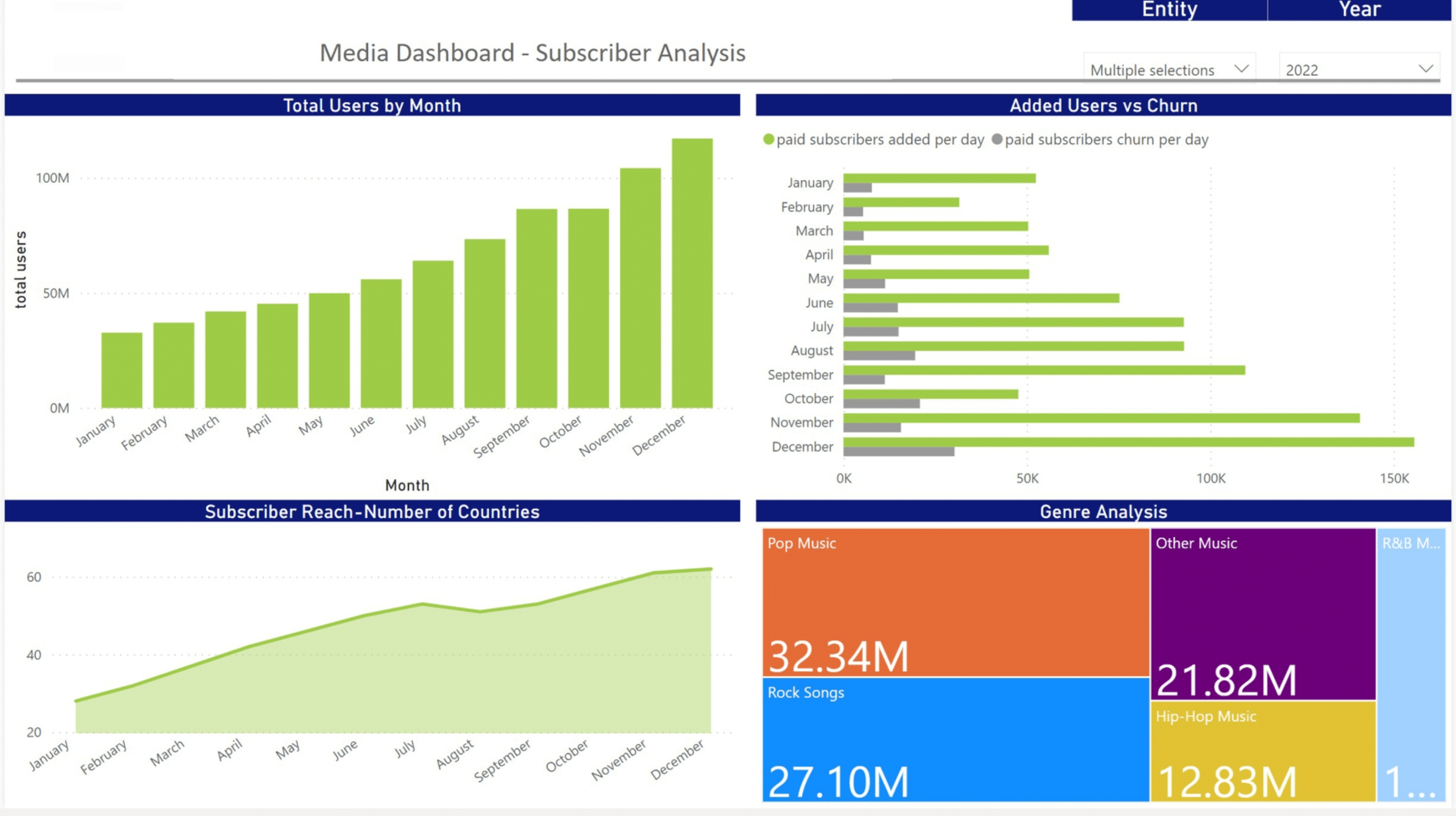
Guide to Data Visualization for Media Companies
What is data visualization?
Data visualization refers to the graphic representation of information. It can be used to help people understand facts and figures more easily. Businesses of all kinds can benefit from data visualization, using it to improve both internal processes and external relationships. Media companies, in particular, can leverage data visualization, using it to communicate data in a way that's comprehensible and compelling.Data visualization takes many forms. Common examples of data visualization include charts, graphs, infographics, and maps. Pie charts, bar graphs, and scatter graphs are all examples of data visualization in action. Any visual that is used to present information is a form of data visualization. There are even interactive data visualization tools, such as maps, that allow people to identify patterns and outliers.
Data visualization allows users to better understand and communicate analytical information. Research has shown that people are much better at understanding information when it's presented to them visually.
Why? Approximately 20% of the human brain is wired just to understand visual images. People are also more likely to pay attention to things that are colorful, which is easier to accomplish with images than with text. A quick example can help demonstrate how data visualization works. Say your media company has data revealing that nine out of ten people prefer color to black-and-white images. Simply seeing the words "nine out of ten" or "90%" written in a presentation isn't super exciting. However, you can convey the same information in a more engaging manner with a graphic. For example, you might have a pie chart that represents the 90%.
How can media companies use data visualization internally?
Data visualization can be leveraged internally and externally. Implementing data visualization on the inside is often a good starting point, giving companies a chance to test out theories and techniques before broadening their audience. One way to use data visualization internally is to present information to employees, shareholders, or investors of your media company. This could include quarterly earnings, for example, or employee turnover rates.
You might show employee turnover rates using bar charts, for example, and demonstrate quarterly or annual profits and losses with pie charts. When sharing and printing such images, it can be helpful to convert PDF to JPG files. This makes it easier to extract and isolate graphics from PDF. Try a PDF to JPG online converter to transform images into JPGs while maintaining the image's resolution and overall quality.
Data visualization can also help media companies make internal business decisions. With the right data, you can make informed, better choices. For example, you might use data to gain insights into customer demographics and behavior or to create personalized marketing campaigns. Business data can also be used to streamline operations or mitigate risk. All of this can add up to a safer, more reliable business strategy.
How can media companies use data visualization externally?
Once you've used data visualization internally, you will gain confidence in the techniques and tools. You can then expand your use of data visualization, applying it externally as well. DBS Interactive discusses some of the ways that media companies can use data visualization and analytics. These tricks can be used for all kinds of media, from social media to content marketing, news articles, long-form thought-leader articles, and more.
Media companies can use data visualization to grab people's attention and boil down complicated information into easier-to-understand visuals. For example, say a newspaper is writing an article about the growing trend of craft breweries in the U.S. They might include an interactive map of the United States. Users can then click on their state to see how many craft breweries it has and where they are located. It's more engaging than written text.
Media companies can also use data visualization to create catchy infographics. For example, say a media company wants to convey stats about how many vacation days people have in different countries around the world. They might show the number of days overlaid on an outline of the relevant country. The added visual component makes this quick fact easier to understand and remember. Consider using tools to create concise and quick infographics made with AI, simplifying complex stories into easily digestible facts.
Handy technologies and tools for data visualization
There are many data visualization tools that can help media companies excel. InetSoft's free account is one useful tool. It's used to create interactive maps, charts, and graphs. You can connect different data sources and the tool generates your desired visual in mere minutes. There is 2 free versions called Individual and Business that you can try out before investing in the paid version, StyleBI. You'll unlock additional functionality with the paid version.
Another useful tool is QlikView, which is both a data visualization and discovery platform. Microsoft Power BI is another piece of tech that doubles as a business intelligence tool. It can generate reports too. Yet another handy tool is Datawrapper, which lets you create maps and charts in your browser. All you have to do is upload data files, such as a .CSV file with the relevant info. The tool then creates a line, bar, column, pie, scatter, or area chart.
Plotly lets you create charts, maps, and interactive graphs. You can share links to the data visualizations you create directly with people online, for example, via your social media accounts. Every graph made in Plotly has a unique URL. Plotly lets you choose from diverse maps and plots, so you can select the visual format that best suits your needs. The intuitive interface makes Plotly easy to use and a great choice if you're new to data visualization.
Sisense is another data visualization tool that can create interactive elements. The simple interface is easy to use, and you can integrate the tool with other technologies like Tableau, Qlikview, and Microsoft Excel. Speaking of Microsoft Excel, don't write off this old-school tool when it comes to data visualization. Excel can automatically generate scatter plots, bar charts, and more. You just have to input data into a table.
Tips for making the most of data visualization
Having the tools is only half the battle. You also need to know how to best implement data visuals. There are a few best practices to keep in mind. First of all, identify your audience. Think about who the visual is for and what the purpose is of sharing the visual with that specific audience. For example, maybe you are trying to get them to buy a product, click on a link, or read an article.
Next, ensure your visuals are clear and high-quality. Make sure you choose the right visual for the given purpose. Your target audience will help determine this. Further, any images should be clear, without fuzziness, and straightforward. They should be clearly labeled. Finally, visuals should be engaging. Bright colors and fun designs can make visuals more interesting for your audience.
If you don't have any experience with data visualization, hitting all those items on the checklist can be tough. A company like InetSoft can help by taking care of your data analysis and visualization for you. Entrusting the job to a professional will allow you to proceed with confidence. Plus, you can then save your energy for other core business tasks, sparing yourself hassle and stress.
Data visualization is a great way for media companies to create more engaging and interactive data. This can be used both internally and externally. The key to success is ensuring that visuals tell a compelling story and are well-designed. If you don't have the skills to harness the power of data visualization yourself, trust a professional provider to take care of the task for you. You can then make the most of your data.


