Market Research and Analysis Dashboard
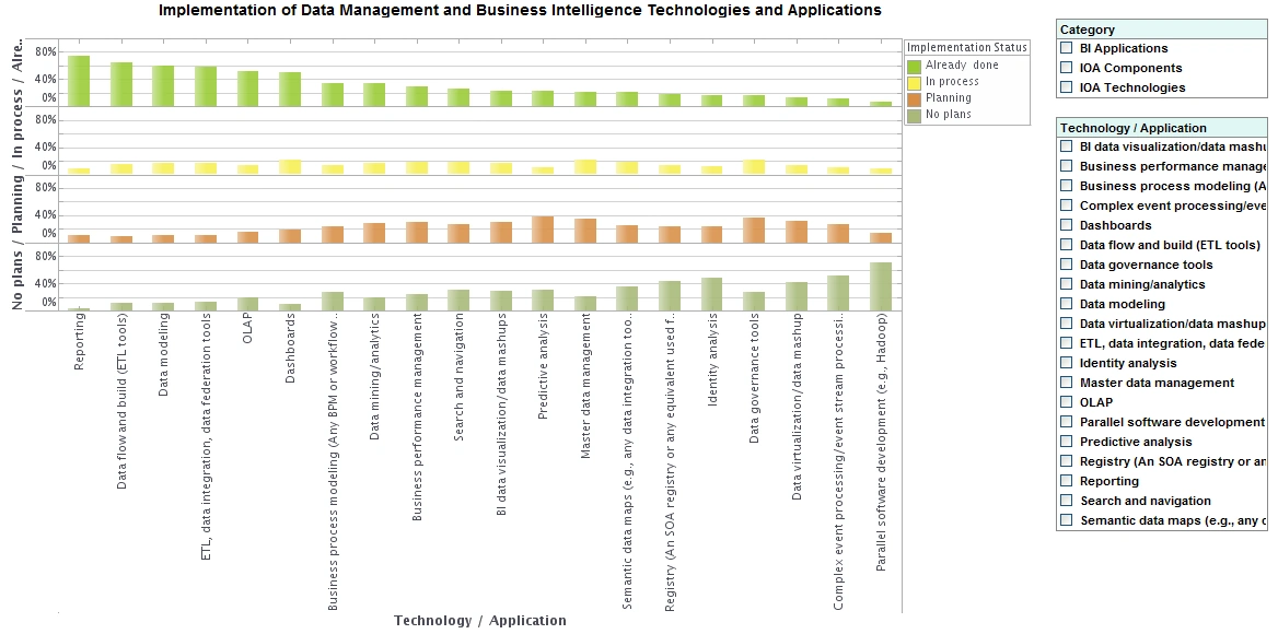
Below is an example of an interactive web-based market research and analysis dashboard built using InetSoft's StyleBI. Such a dashboard allow all end-users, not just statisticians, to slice and dice market research results. With more ways to look at the results, more insights can be found. And each view can be saved as a bookmark to share with others later.
Tracking and presenting research findings with an application like this is more valuable and easier to use than tools such as Excel and PowerPoint. Charts like this one can display answers to a particular question, or multiple questions at once. InetSoft's software is driven by the user and is easily customized to meet specific needs or inquiries at any time within its drag-and-drop design.

What Are the Types of Market Research That Benefit from Dashboard Analytics?
-
Descriptive Research:
- Purpose: This type aims to describe the characteristics of a population or phenomenon. It provides a snapshot of the current situation.
- Example: Surveys or questionnaires to understand customer demographics.
-
Exploratory Research:
- Purpose: This is used when the problem or issue is not well understood. It helps in identifying potential solutions or avenues for further investigation.
- Example: In-depth interviews, focus groups, or case studies.
-
Causal Research:
- Purpose: Causal research aims to establish a cause-and-effect relationship between variables. It helps in understanding how changes in one variable affect another.
- Example: A controlled experiment to determine how changes in pricing affect sales.
-
Quantitative Research:
- Purpose: This involves the collection and analysis of numerical data. It focuses on measurable variables and statistical analysis.
- Example: Surveys with closed-ended questions, data analytics, and statistical modeling.
-
Qualitative Research:
- Purpose: Qualitative research explores non-numerical data to understand underlying motivations, opinions, and behaviors.
- Example: Focus groups, interviews, content analysis, or observational studies.
-
Primary Research:
- Purpose: Primary research involves collecting data directly from original sources. It's tailored to address specific research questions.
- Example: Surveys, interviews, experiments, and observations conducted by the researcher.
-
Secondary Research:
- Purpose: Secondary research involves the use of existing data sources, which have already been collected by other parties. It's useful for gaining a broader understanding of a topic.
- Example: Utilizing industry reports, academic papers, government publications, and market studies.
-
Competitive Analysis:
- Purpose: This focuses on evaluating and understanding the strengths and weaknesses of competitors in the market.
- Example: Analyzing competitors' products, pricing, marketing strategies, and customer reviews.
-
Customer Feedback and Satisfaction Surveys:
- Purpose: These aim to gather opinions and feedback from customers about a company's products or services.
- Example: Customer surveys, Net Promoter Score (NPS) surveys, and online reviews.
-
Trend Analysis:
- Purpose: Trend analysis involves examining historical data to identify patterns and make predictions about future market conditions.
- Example: Analyzing sales data over several years to identify growth or decline trends.
-
Product Testing and Development Research:
- Purpose: This type involves testing prototypes or new products to gather feedback and make improvements before launching them in the market.
- Example: Beta testing, focus groups to evaluate product prototypes.
-
Market Segmentation Research:
- Purpose: This helps in dividing a market into distinct segments based on characteristics like demographics, behaviors, or preferences.
- Example: Analyzing customer data to identify different target segments.
-
Social Media and Online Presence Analysis:
- Purpose: This involves monitoring social media platforms and online communities to understand customer sentiments, trends, and brand perception.
- Example: Sentiment analysis, tracking social media mentions and engagement.
What KPIs Are Used in Brand Equity Tracking?
-
Brand Awareness:
- Definition: The extent to which consumers recognize or recall a brand.
- KPI Metrics: Unaided awareness (spontaneous recognition), aided awareness (recognition with cues), brand recall.
-
Brand Recognition:
- Definition: The ability of consumers to identify a brand by its attributes or logo.
- KPI Metrics: Recognition rates in surveys or tests.
-
Brand Recall:
- Definition: The ability of consumers to remember a brand without any prompting.
- KPI Metrics: Recall rates in surveys or tests.
-
Brand Image/Perception:
- Definition: The overall perception and association that consumers have with a brand.
- KPI Metrics: Consumer surveys on brand attributes, sentiment analysis of social media mentions.
-
Brand Association Strength:
- Definition: The strength of the connection between a brand and specific attributes, values, or emotions.
- KPI Metrics: Likert scale ratings or scores indicating the strength of association.
-
Brand Loyalty:
- Definition: The degree to which consumers consistently choose a particular brand over competitors.
- KPI Metrics: Customer retention rates, repeat purchase frequency, Net Promoter Score (NPS).
-
Customer Lifetime Value (CLV):
- Definition: The total value a customer brings to a brand over their entire relationship with it.
- KPI Metrics: Average CLV, segmented CLV, CLV trends over time.
-
Customer Advocacy:
- Definition: The willingness of customers to recommend or advocate for a brand.
- KPI Metrics: NPS, customer referrals, social media shares and recommendations.
-
Market Share:
- Definition: The portion of the total market that a brand controls.
- KPI Metrics: Percentage of market share, share of wallet within a specific category.
-
Brand Equity Index:
- Definition: A composite score that combines various brand-related metrics to provide an overall measure of brand health.
- KPI Metrics: Calculated index based on weighted metrics like awareness, perception, loyalty, etc.
-
Brand Sentiment:
- Definition: The overall sentiment (positive, negative, neutral) associated with a brand in consumer discussions or reviews.
- KPI Metrics: Sentiment analysis scores, sentiment distribution.
-
Brand Reach and Exposure:
- Definition: The number of people who come into contact with the brand's messaging or content.
- KPI Metrics: Impressions, reach, engagement rates on various marketing channels.
-
Competitive Benchmarking:
- Definition: Comparing a brand's performance against its competitors in terms of various brand equity metrics.
- KPI Metrics: Comparative scores in surveys, market share comparison.
-
Brand Equity Growth:
- Definition: Tracking the increase in brand value and positive consumer perceptions over time.
- KPI Metrics: Year-over-year growth in brand equity metrics.
-
Brand Equity Return on Investment (ROI):
- Definition: Assessing the financial return generated from brand-building efforts.
- KPI Metrics: Calculated based on the revenue or sales attributed to brand equity initiatives.
More Articles Related to Market Research Dashboards
Answer Any Question of Your Data - For example, an executive might want to know: has this salesperson always been a better performer in this product division, or are they just connected to a larger customer? StyleBI can visualize all of the necessary dimensions and measures easily and in different combinations so the user can render the most accurate conclusion...
Call Reporting Software Example - Check out this call reporting dashboard example to explore InetSoft's latest, powerful, report building software. This dashboard refreshes every 5 seconds, feeding the user a constant stream of live data. This is the essence of real time reporting, and this aggressive and powerful BI strategy is extremely useful for...
Data Mining Made Easy - Cutting costs and increasing revenue is an established goal for all businesses. In order to accomplish this, data must be collected and then analyzed for any readjustments that must be made. That's where data mining comes in handy. So the question is what is data mining and how can it help...
Data Science Resources - Looking for data science information resources? InetSoft's data science functions are built into its industry pioneering BI platform. Read articles about its capabilities and request a personalized demo. AI in the Education Field - As the modern-day classroom becomes even more modern with the use of machine learning, AI has spawned a debate on whether this move would benefit everyone or not. First, consider the students...
Example of an Analytical Supply Chain Dashboard - In this example if of an analytical supply chain dashboard, you have got six charts and two KPI cards. Each chart can be expanded and drilled into. With a technique called brushing, you can select a data point in one chart and see if it has connections in any other chart. The selection list lets you filter all the charts at once to a specific area of interest...
How to Use Interesting Features - Here we'll teach you how to use some interesting features of InetSoft's Web-based business intelligence tool. You can add highlights to a dashboard, interactively zoom into a chart. When you bind the text, textbox, table or chart element to data, you can specify a highlight for the element. A highlight is a conditional format that applies a visual effect based on the value of the data displayed by the element...
InetSoft's Approach to Data Mining - InetSoft offers an advantage over competitors by combining unique, intuitive visuals with a user-friendly interface that makes analyzing data quick and easy. With InetSoft's web-based technology, users can access data from just about any source, regardless of database size...
Maximum Self-Service BI Dashboard Tools - When you are shopping for BI dashboard tools there are some automatic concerns you have. Flexibility, power, speed, compatibility all come to the forefront of your mind. A great dashboard generator will have a marriage of tools that address every area of business IT and BI needs. That is what makes InetSoft's BI software so attractive to so many users. Since 1996...
Product Demonstration of Data Mashup - First, I am going to walk through what the end-user can do with our BI application, and so I will show a bunch of pre-built interactive dashboard examples. Then I will segue a little bit into the self-service BI capabilities, showing both data mashup and the interactive visualizations that again we are putting in the hands of the end-users. And then I can touch on a couple of the new features that are specific in Version..
Real Time AskNicely Reporting - A user can design KPIs that respond in real time and to drilling and brushing, highlighting and more interactive techniques. The mission of InetSoft is to supply a catalyst for efficiency and problem solving through cutting-edge BI, so special care was taken during the latest update of the flagship software, StyleBI, to include a powerful reporting engine that is capable of delivering static and dynamic reports, such as this call reporting dashboard...
Three of the Best Dashboard Designs - Why is it important to find out what makes the best dashboard design? A well-designed dashboard is easy on the eyes and allows users to quickly observe trends and correlations in their data. While designers can often fall for the temptation to overload their dashboards with too many elements, a crisp and efficient organization of KPI's will save the end users time and reduce mental strain in performing data analysis...
Tool for Graph Customization - When using InetSoft's graph visualization software, it is evident that customization is the highest priority. Users are free to choose from various types of graphs and charts, as well as tables, crosstabs, and gauges. From there, users can manipulate the size, color, text elements, and layout of an element with unlimited design options. Not only can users create a virtually unlimited number of graphs using their datasets, but InetSoft's graph...
Usage Analysis Dashboard Example - The Usage Analysis Dashboard here exemplifies the powerful tools and features of InetSoft's interactive web-based analytical dashboard. As a pioneer in business intelligence solutions, InetSoft paves the way for dashboard, reporting, and data mashup solutions for organizations across different industries...
Using a Radar Chart to Compare Multiple Product Measures - A radar chart, also known as a spider chart or star chart, is a type of chart used to display multivariate data in the form of a two-dimensional chart of three or more quantitative variables represented on axes starting from the same point. The data is plotted in the form of a polygon, with each vertex of the polygon representing one of the variables...
Which Are this Year's Top 10 Dashboard Tools? - In the world of business intelligence, what would qualify as a 'top 10' dashboard tool? With so many new dashboard tools and BI solution systems, it can become a headache searching for the right solution for your organization. At InetSoft, we simplify the problem for you, plus more. Since 1996, InetSoft has been transcending BI solutions for organizations of all sizes...
Why Use a Network Chart? - Network charts are obviously desirable when attempting to visualize and describe relationships between a large number of participants, whether these parties are humans, machines, corporations, subway stations, or any other objects that sustain peer relations of some kind. Network charts seek to provide a qualitative understanding of structure and importance rather than...


