What You Should Know About Executive Dashboards?
Data may be seen in real time in a wide variety of ways. Executives find it simpler to conduct analyses and come to choices when data is accessible in a single location. In this post, we'll define an executive dashboard and discuss the advantages of using it for reporting. We'll also provide advice on how to create your own executive dashboard while maximizing its benefits.
How do executive dashboards work?
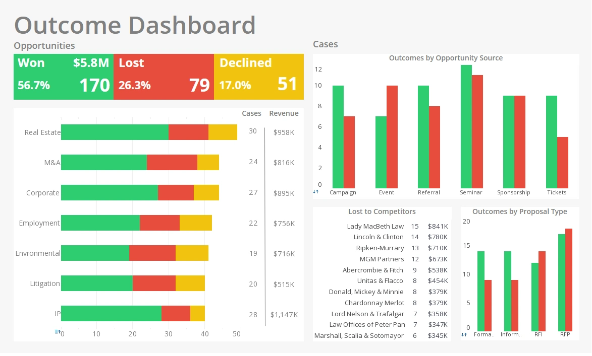
Executive dashboards are personalized user interfaces that provide your company's data graphically and in an orderly fashion. You may gather data using executive dashboards to monitor team objectives, make adjustments, spot patterns, forecast outcomes, and more.
Your executive dashboards promote strategic decision-making by showing the most important facts for your business in real time, eliminating the need for further, pointless research.
Executive dashboards provide:
- A user-friendly graphical interface
- Metrics that may be changed to suit your requirements
- Information gathered from many sources and agencies
- A system that makes it simple to get current information
Executive dashboards need to provide the most relevant data from your company in the shortest period of time. Your key performance indicators (KPIs) and other metrics that reflect the organization's health may be relevant data for your business.
Executive dashboards' several types
Executive dashboards come in four different categories. The distinctions between these categories depend on the data you decide to show in your dashboard and the intended use of your data.
Among the 4 different kinds of dashboards are:
Strategic:
Strategic dashboards will probably incorporate high-level data and concentrate on long-term plans. A comparison of the number of clients or firm income year over year may be included in your strategic dashboard as a manager.
Analytical:
Large volumes of information are included on analytical dashboards, which analysts use to spot patterns or forecast future events. Financial data from previous years or measures measuring customer satisfaction may be included in this dashboard.
Operational:
Operational dashboards provide information on shorter time horizons and operational activities, such as project budgets, overall budget expenditures over a quarter, and cost per purchase.
Tactical:
To monitor employee or project performance, tactical dashboards are employed. Clicks, impressions, cost per hire, and employee production are just a few examples of the metrics in this dashboard.
There are elements on some executive dashboards that fit into more than one category. As a project manager, for instance, your dashboard may have tactical and strategic elements, while a CFO's dashboard can include analytical and strategic elements.
How to create a top-notch executive dashboard
These guidelines might help you create an executive dashboard that is suitable for your team. If you want to create a dashboard that helps you lead effectively, you must know what data to present and how to display it.
Name your target audience.
You'll assist a certain audience inside your firm using the important KPIs on your executive dashboard. If you're a project manager, for instance, your data sets could pertain exclusively to your teams' projects. Choosing the audience, you want your data to serve is the first step in creating an executive dashboard. As a result, you'll be able to customize your dashboard for that audience and make the best selections possible.
Identify your core consumers by asking the following questions:
- What are the aims of my group?
- How can I evaluate the effectiveness of my team?
- What information is required for team or business improvements?
- What information can I use to improve my leadership?
You may go to the following phase, where you'll establish the success metrics for your executive dashboard, after you have a firm understanding of your target audience and can respond to the questions above.
Set your KPIs
The performance measures you'll see on your executive dashboard are your KPIs. The audience you defined in tip number one should be served by the KPIs you choose, whether you want to present them as graphs, tables, or charts.
One of your team's objectives, for instance, as a project manager on the marketing team, would be to diversify content creation across all marketing channels. This aim should be expressed as a SMART goal so that it can be measured. The SMART version of that objective, for instance, is to create 10 pieces of content each month for each of the three channels—social media, email, and website.
The following metrics would be on your KPI dashboard in this example:
- Finished projects are arranged by channel.
- Sorting incomplete projects by team member and channel
- Unassigned projects are arranged by priority and channel.
- Chart demonstrating goal-related progress
Other KPIs that provide you with a high-level perspective of your team and the strategic corporate objectives might be included in your executive dashboard. Metrics that gauge team member performance or the business's general marketing success may be appropriate to add.
Make your dashboard unique
When creating your dashboard, many factors are important than just your data sets. To guarantee a top-notch user experience, it's as crucial to get the visual depiction perfect. Your decision-making may be impacted by how you interpret the facts. Depending on the kind of company operations you engage in, your dashboard design will change. Think about the various dashboard designs discussed above.
For instance, a data analyst's dashboard design will have a lot of data, so they'll need to decide how to effectively graphically present it in order to understand it and spot patterns.
Make sure the data you use has a purpose
Your dashboard's data should provide a unified narrative. Making a data dashboard is useless if you can't see the data clearly and make inferences from it.
Recalling our earlier example, you wanted to produce 10 pieces of content per month for your website, email list, and social media accounts. Your dashboard should respond as follows in this scenario:
- How many projects have we finished, and for what kind of marketing?
- How many unfinished initiatives exist, and for which marketing channels?
- How are unfinished projects being prioritized?
- Who is responsible for finishing unfinished projects?
- How far away from our objective are we?
Whoever is looking at your dashboard should be able to respond to these inquiries with the information shown.
Use a reporting tool to create your dashboard
The ideal approach to automate your dashboard and provide real-time data analyses is using reporting software. Some reporting solutions only provide certain sorts of data, such as website traffic and SEO. As an alternative, universal reporting technologies combine several kinds of data to provide consolidated reports. You may build a management dashboard that tracks the progress of the work being done across your firm using universal reporting tools.


