Topology of the Visualization Vendor Landscape
This is the transcript of a Webinar hosted by InetSoft on the topic of "The Topology of the Visualization Vendor Landscape." The speaker is Abhishek Gupta, Product Manager at InetSoft.
As I was thinking of an agenda for today’s Webinar, I was thinking of talking about how to create a topology or framework for sorting out what visualization does. I could talk about the different kinds of visualization vendor options out there because this is a field where every tool is not the same.
There are some solutions that focus on displaying information more like static reports. There are others that are more aimed at exploration, and it’s the set of tools out that focus on data discovery and analysis and those associated challenges that often all get grouped in the same bucket from a marketing perspective.
So I thought it would be enlightening to try to create a framework to sort some of this out and clarity some of the differences. So we’ll go through that, and then we’re going to talk about who leads where, profiling some of the visualization vendors, and we will look at what really matters and then go through some use cases.

This Webinar will last 30 minutes and will be followed by a Q&A session. It’s being recorded and will be available for viewing later, and the PowerPoint material here will be available as well. So let’s jump right in. Data visualization tools are very popular today. That’s because they offer many benefits. We know a picture is a worth thousand words. The same is true for data visualization. But the primary benefit of these tools is that enables users spot trends and outliers, and then make a plan.
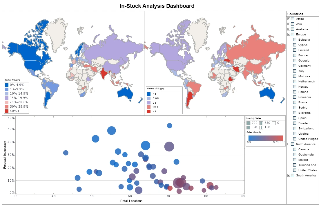
There’s a variety of different chart types, pies, bars, lines, and most sophisticated ones like maps and scatter plots. Users can see exactly what is in the data without having to scroll through all the detail. A second major benefit depends on speed of thought analysis. OCD tools are built on in memory databases where the data is downloaded into memory and allows users to ask questions and answers and then asking questions at the speed of thought.
Most data visualization tools allow analysts to publish their findings to all the other users on a server so they can take what they found and clean it up it, save on a server and provide access to the users what they want. So those are the three main benefits of data visualization tools, and there are many others. But these are the primary ones, to spot trends and outliers, enable speed of thought processing and analysis, and the ability to publish analysis tools.
There are some things to consider when implementing a data visualization tool. The first is that tools work fast when running against prepared data. By prepared data I mean data warehouses or data marts. The data has been sanitized, cleansed and integrated. I have to say that data visualization tools can run against other types of data, but it’s a lot easier if they get it prepared.
The second point, a lot of these tools started their life at desktop tools. That is because most of them were designed for power users or analysts who prefer to work with desktop applications where they can download the data. It’s offered more flexibility to do the kinds of analysis that they want to.
Understanding Data Visualization Tool Variations
So there is nothing wrong with desktop visualization tool, but if you want to scale it to the enterprise and give access to many more people to these tools and their output, you have to make sure that the tool also runs on low cost servers. And finally not all data visualization tools are created equally. There are main different types of variations.
This chart helps to understand the variations of some of the data visualization tools. Let me explain the Y axis first. On the Y axis it is a dimension that goes from reporting to analysis, and by reporting here I mean the use of data or content that is more static, less interactive where you are looking at metrics that are predefined and dimensions that are predefined more than ad-hoc.
And their functions or options are the most simple in nature. It’s not to say that reports can’t be interactive and support very complex functionality which some do. But in a visualization world, this is what I am talking about. Some of the simpler visualization tools offer more static predefined uses of simple calculations. On the other hand the more complex or advanced visualization tools offer higher degrees of interactivity, greater degrees of exploration and support more complex functions including data mining functions.
On the X axis I am talking about data complexity, and here is the primary difference between an environment that has low complexity or high degree. Is the data prepared and sanitized and integrated, like I said earlier.
When evaluating visualization tools, it’s important to consider how well they handle increasing data complexity. Some tools are optimized for simple, well-structured datasets, while others are designed to manage large, diverse, and sometimes unstructured data sources. The ability to connect to multiple data sources and perform real-time analysis can be a key differentiator for organizations with complex data environments.
Another factor to consider is the level of customization and extensibility offered by the tool. Advanced visualization platforms often provide APIs, scripting capabilities, and plugin architectures that allow users to tailor the tool to specific business needs. This flexibility can be crucial for organizations that require unique visualizations or need to integrate the tool with other enterprise systems.
Finally, user experience and accessibility play a significant role in the adoption of data visualization tools. Solutions that offer intuitive interfaces, responsive design, and support for collaboration tend to be more widely embraced across teams. Ensuring that the tool is easy to use for both technical and non-technical users can maximize its impact and foster a data-driven culture within the organization.


