Visual Analysis Example Using Airline Performance Data
This is the continuation of the transcript of a Webcast hosted by InetSoft on the topic of "Faster Business Intelligence: Visual Reporting." The speaker is Mark Flaherty, CMO at InetSoft.
Here is another visual analysis example that uses airline on-time performance data from the Federal Aviation Administration. The colors represent on-time performance for a certain time block by day of week with red being the worst and green the best. Again, we can uncover systemic problem areas much faster than we could using tables of information.
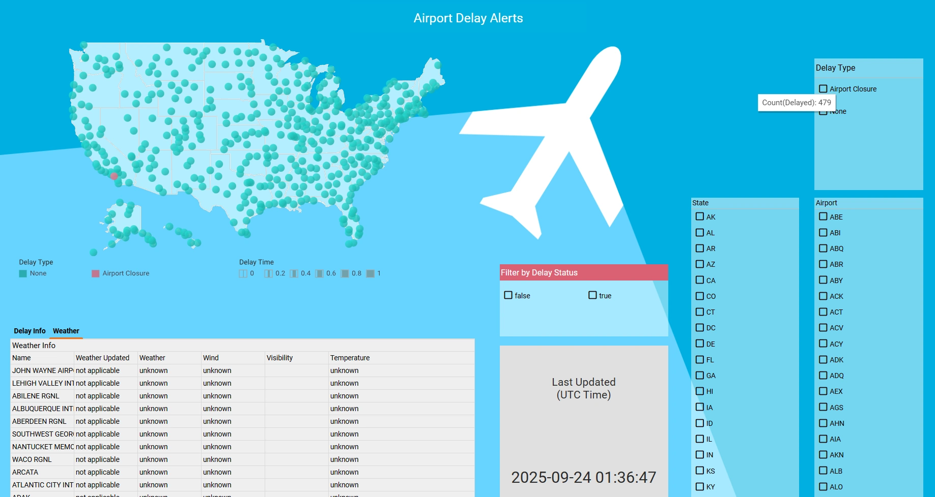
Rather than discuss this some more let's just take a look at StyleBI in action. Airports are geographical entities so a map is a logical way of summarizing airport information. By using the latitude and longitude information of airports this analytical map now has marked the location of all the airports in my data.
Next, I will color code these airports using the on-time percent measure, and from this default range of colors I can see there is a lot of variation in airport performance. If I open up the option menu here, I can personalize the color distribution of my liking simply by adjusting the performance bands in terms of color and the corresponding range of values that those colors represent.

Focusing on Specific Airports
Now if I want to focus my attention to specific airports, I can use the filter selection list here. I can make my choices based on geographic attributes such as state where I can exclude the non-contiguous states of Alaska and Hawaii. I can also create a cohort of airports for instance by adjusting this ranking slider, I can get the top 25% of airports by volume. The map responds quickly to my actions by refreshing the data.
This instant feedback is critical for speed of thought analysis by business people. I can also interact directly with data on the map so I can zero-in on the area of interest which for me is Washington DC. And using the mouse I can select three airports near me. This map is showing on-time performance of airports at a glance. I can add another view of that data to see more detail. In fact, I can create many views of information. And this is very powerful because it empowers business people to create dashboards from their data instantly without support from IT.
Here, I will create a graph matrix visualization. I will begin by placing airport on the rows. Notice that only three airports appear because that’s what I narrowed down my analysis to on the previous map. Knowing that performance can change by day of week and time of day, I will now create a matrix of hour blocks and then I will color code these blocks by using on-time performance.
Take a look. The data has suddenly come alive. Look at Washington Dulles. It's clearly popping out as a performance leader during the morning hours. Baltimore seems to be an airport to avoid in the afternoon. Style Intelligence allows you to detect patterns and problem areas very easily using such visual output. Not only that, once I see something of interest, I can go deeper into the analysis.
For example, what if I live in Baltimore, and I have to fly out of there? Maybe I can find a particular carrier in Baltimore that does better than others. I will keep this view, and I will call it On-Time by Hour. But I will use this as my starting point, and I will create another view and call this one On-Time by Carrier. Here let's say I am interested in looking at traffic out of Baltimore in the afternoon.
So I will select the hours of interest and choose to see detail by carrier. Now I can see the various carriers departing out of Baltimore. To get a sense of their relative flight volume out of Baltimore I would choose to size these squares by number of flights. Southwest is clearly the dominant carrier out of Baltimore but also worst in terms of performance.
There are other carriers with much smaller volume that seem to be better performing so may be there is an inverse correlation. At the top, I can see AirTran has moderate flight volume, and also it's pretty good in terms of performance. Maybe I will consider AirTran for my next flight. In less than 5 minutes, I have created my own dashboard of on-time performance data showing three different data visualizations using simple drag and drop point and click actions. Let me turn now to the presentation.
Another advantage of this approach is the ability to easily share insights with colleagues. Dashboards and visualizations created in Style Intelligence can be saved, exported, or embedded into presentations and reports. This facilitates collaboration across teams and ensures that everyone is working from the same up-to-date information, leading to more informed decision-making throughout the organization.
Furthermore, the flexibility of visual analytics tools allows users to customize their views according to their specific needs. Whether it's adjusting filters, changing visualization types, or drilling down into granular data, business users have the freedom to explore data from multiple perspectives. This adaptability is crucial for uncovering hidden trends and responding quickly to changing business conditions.
In summary, leveraging visual analysis with airline performance data demonstrates the power of interactive dashboards in modern business intelligence. By enabling rapid exploration and intuitive understanding of complex datasets, organizations can identify opportunities, address challenges, and drive better outcomes with greater efficiency. The ability to visualize and interact with data is transforming the way businesses operate and compete in today's data-driven world.