A Large Library of Interchangeable Visualizations
This is the continuation of the transcript of a Webcast hosted by InetSoft on the topic of "Faster Business Intelligence: Visual Reporting" The speaker is Mark Flaherty, CMO at InetSoft.
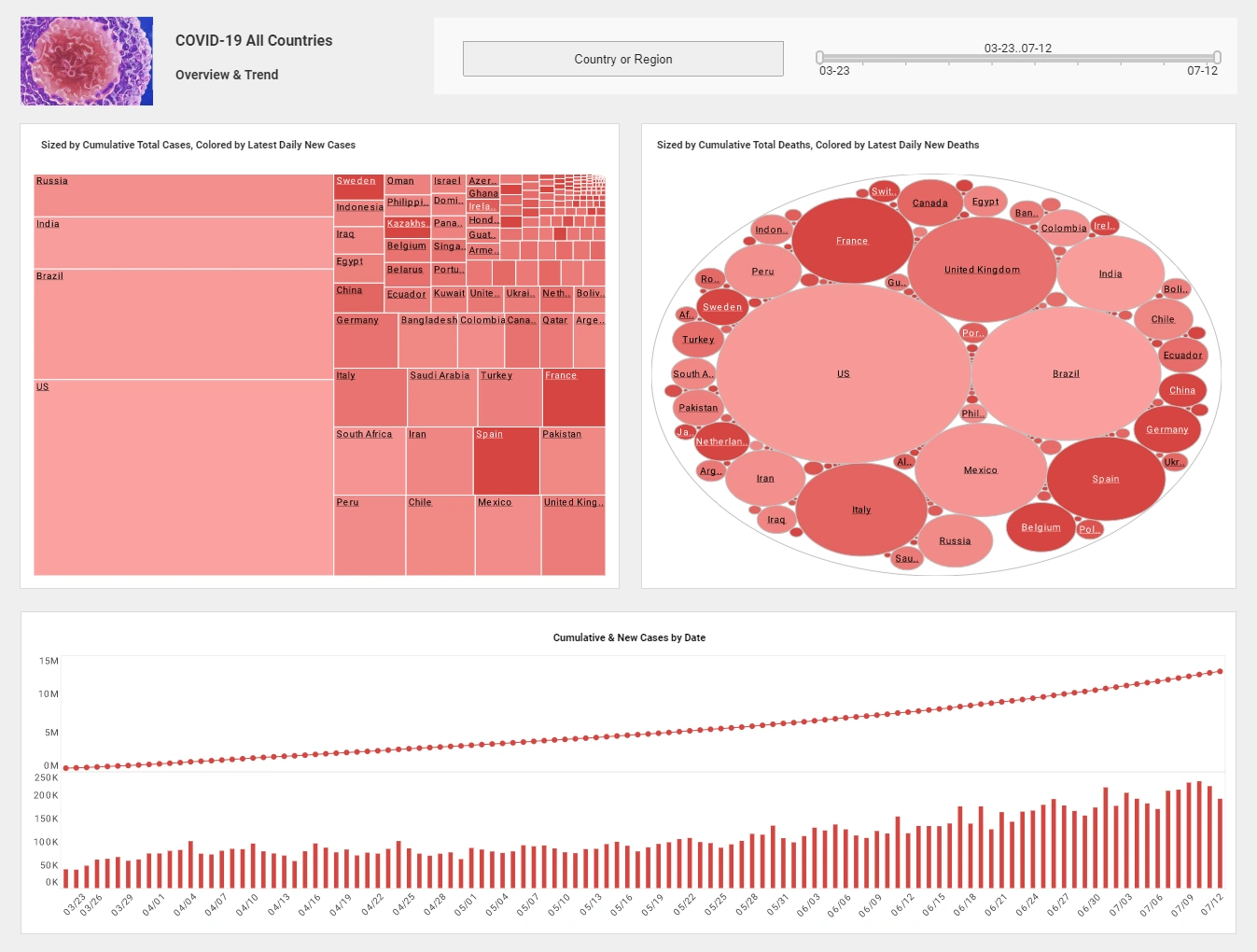
In the airline demo, we used a map and a graph matrix. StyleBI has a large library of interchangeable visualizations including bubble charts, area charts, heat maps, line charts, bar charts, and many others, and they are all designed to help you get the answers you need. Over time, we will continually add to this visualization library to deliver even more insights. With StyleBI, getting to the answer is simple and fast.
As you saw in the demo, it's really a five step process. First, you pick your visualization type, second, you select the data objects, and third, you simply drop those into the analytical drop zones, and the data begins to appear. You conduct your analysis literally at speed of thought. Four, you can filter the data to refine your analysis to see just the information you want and five, your visualizations appear and change as you modify the analysis. It all happens so quickly that you can change your mind, rearrange the data, change your visualization and filter data all this without help from IT.
The StyleBI experience is very empowering. Business people will finally feel like they are in control of getting the answers they need when they need them. StyleBI can be used to analyze data from any database. A business person can point StyleBI to any set of data and begin exploration. That data can be in a database. It can be in an OLAP cube, or just simply in an Excel spreadsheet.
Now equally powerful is that the business person can also use StyleBI to analyze personal data which is usually in a spreadsheet. So you can upload that spreadsheet data, and it’s automatically converted to a cube of information available for analysis. With uploaded data, there is no lengthy data modeling process or special expertise that is required. StyleBI recognizes all the business attributes and metrics for you so you can begin getting answers in just minutes.
Let’s take a look at exactly how this works. Here you can see a large spreadsheet of slot machine data from a casino. This spreadsheet is 1.3 million cells large. To start, let’s upload that spreadsheet so we can start analyzing the data. Select the Import Data option and follow a simple wizard process to upload the data. Choose file. You’ve browsed to your file. Select your file, and then go ahead, and click Next.
The wizard has automatically determined which columns are business attributes and which ones are business metrics. You can modify the names to reflect the appropriate industry terminology. For example, the column slot win in casino parlance is really slot hold, and by the way hold is the money the casino keeps for hold so it essentially is slot machine’s gross profit. I’ll click publish, and the spreadsheet will be converted to a multidimensional cube. In under a minute I have my data ready for investigation without any help from IT.
And at this point I am ready to begin my analysis. I can either create a classic BI report, a document or a dashboard or use the visual exploration capability. So I will select Create Analysis. So to start let’s choose a graph matrix visualization. You can see all the available business attributes and metrics from my important spreadsheet on the far left. First, we’ll drag slot machine type to the columns. That’s penny, nickel, quarter and so forth.
Next, we’ll drag slot machine to the rows because it's a good idea to figure out how your machines are performing, and it's usually pretty important where they are. We’ll drag a coin in to the X-axis and this is essentially the slot machine revenue. Then drag slot hold to the Y-Axis, again this is the gross profit. And now, we have our graph matrix that displays 80 unique scatter plots on one screen. It’s an easy way to compare the performance of each slot machine type by location.
Now ideally, you want to see each slot machine placed in the upper right hand corner of each square. That means it has large revenue and profits. But really I’d like to know how each machine is performing. So I’ll drag slot machine into the break-by, and I’ll be able to see all 600 of my machines. Immediately, I can see patterns emerge, and I can spot poor performing slot machines. Two of my $100 slot machines are performing particularly poorly. I definitely want to investigate further, but I want to keep this view as well. So let me bookmark it with the name Slots Performance.
Now let’s investigate those $100 slot machines further. I’ll select this graph, and I’ll have the ability to do many things like drill but I’m just going to keep this set of data only. Now, I am only looking at just this one scatter plot. To easily distinguish the different slot machines, let me drag slot machine into the color-by section. I want my scatter plot bubbles to also convey more information particularly on profit margin. I don’t have that metric so I’ll create it.


