Mini (In-Line) Charts
InetSoft has been providing award-winning business intelligence software since 1996. With a unique approach to in-memory database technology, our BI platform is robust and scalable. Key for a successful BI strategy and to maximize adoption, our BI solution is easier to deploy and use and supports advanced data mashups for maximum self-service.

An Example of When to Use Mini Charts
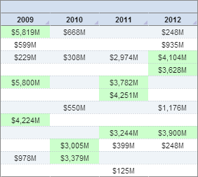
To the left we have a section of a standard chart showing some sort of monetary data. It's a very simple display that clearly associates dollar amounts with various years. What it doesn't do, however, is offer any sort of insight into said data.
There are multiple ways to analyze the data provided in this chart; you could create formulas that calculate various measures (standard deviation, mean, etc.), but that would still only give you numbers. You could map each value on a graph, but that could prove confusing with so many data points.
The cleanest way to solve this issue is to use mini (in-line) charts. Mini charts display visual information side-by-side with raw data in order to paint a clearer picture of the story behind the data, particularly trend data.
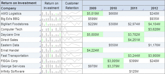
Take a look at this second chart. It is the same display, but with mini charts embedded in the data:
You'll notice immediately, with the aid of the charts, that patterns exist within the data, regardless of the fact that the embedded lines and bars display no actual numerical data. With a quick scan, you can get a sense for how the data has been doing for the past four years.
Why Use In-line Mini Charts?
In-line mini charts, often referred to as sparklines, are small, simple charts that are integrated within the text of a report, dashboard, or data table. These charts provide a quick, visual representation of data trends and patterns without taking up much space or requiring the reader to navigate away from the main content. There are several reasons why in-line mini charts are beneficial:
1. Quick Data Interpretation
In-line mini charts allow for rapid data interpretation. By providing a visual summary directly alongside the data, users can quickly grasp trends and changes without needing to analyze rows and columns of numbers. This is especially useful for busy professionals who need to make decisions based on data insights at a glance.
2. Enhanced Data Visualization
Data visualization is key to understanding complex data sets. In-line mini charts enhance traditional data tables by adding a visual element that can highlight trends, outliers, and patterns that might not be immediately obvious from the raw data. This makes it easier to compare data points and identify significant variations.
3. Space Efficiency
One of the primary advantages of in-line mini charts is their compact size. Unlike traditional charts that require separate sections or pages, mini charts are integrated directly within the text or data table. This space efficiency is crucial in reports and dashboards where screen real estate is limited and maintaining a clean, uncluttered layout is important.
4. Contextual Insights
By placing mini charts directly next to the relevant data, they provide contextual insights that are immediately apparent. This contextual integration helps users understand the data in relation to the surrounding information, making it easier to draw meaningful conclusions.
5. Trend Identification
In-line mini charts are particularly effective for identifying trends over time. Whether it's tracking monthly sales figures, stock prices, or any other time-series data, mini charts offer a clear visual representation of how the data is evolving. This can be crucial for making informed decisions based on historical performance.
6. Improved Data Comparisons
When dealing with multiple data sets, in-line mini charts facilitate easier comparisons. For example, in a table showing sales performance across different regions, mini charts can quickly show which regions are trending upwards or downwards, enabling better comparative analysis.
7. Increased Engagement
Visual elements like mini charts can make reports and dashboards more engaging. Users are more likely to interact with and explore data that is presented in a visually appealing manner. This increased engagement can lead to deeper insights and more effective data-driven decision-making.
8. Real-Time Data Monitoring
In contexts where data is updated frequently, such as in financial markets or operational dashboards, in-line mini charts provide a real-time visual snapshot of the latest trends. This enables users to monitor performance continuously and respond quickly to any changes.
Types of In-line Mini Charts
-
Line Sparklines: These are simple line charts that show data trends over a period. They are useful for tracking metrics like sales, website traffic, or stock prices over time.
-
Column Sparklines: These mini bar charts can highlight variations in data, such as monthly revenue or production levels. They are particularly good for showing changes in discrete data points.
-
Win/Loss Sparklines: These are specialized column sparklines that show positive and negative values, often used in financial data to indicate gains and losses over a period.
-
Area Sparklines: Similar to line sparklines but with the area under the line filled in. These can be used to show cumulative data or emphasize the magnitude of changes.
Best Practices for Using In-line Mini Charts
-
Keep it Simple: The purpose of mini charts is to provide a quick visual cue. Avoid overcomplicating them with too much detail. They should be straightforward and easy to interpret at a glance.
-
Use Appropriate Scales: Ensure that the scales used in mini charts are appropriate for the data being displayed. Consistent scaling across similar charts helps in making accurate comparisons.
-
Integrate with Context: Place mini charts directly next to the relevant data points or text. This ensures that the visual representation is immediately associated with the data it represents.
-
Highlight Key Trends: Use mini charts to highlight key trends and changes in the data. This could involve using color coding to indicate positive or negative trends.
-
Maintain Readability: Ensure that mini charts do not clutter the page. They should enhance readability, not detract from it. Balance the use of mini charts with the overall layout of the report or dashboard.

More Articles About Charting
Cost per Ton of Material Moved - The operational costs related to mining and processing the ore may be better understood by measuring the cost per ton of material transported. Budgeting and cost optimization are aided by it...
Extracting a Date Component - The CALC library provides a number of functions to extract different components of a date object: year, month, day, quarter, etc...
Project Cost KPIs - Project analysts may compare a project's cost to its budget with the use of project cost KPIs. The most typical cost KPIs are as follows: Cost Variance: Cost variance is a measurement of the discrepancy between the actual cost and the budgeted cost. This KPI aids project analysts in identifying any cost reductions or overruns...
Tool to Make Funnel Charts Online for Free - To easily and quickly create Funnel Charts online for free, create a Free Individual Account on the InetSoft website. You will then be able to upload a spreadsheet data set, as shown below. Once you have done that, you will be able to proceed to the Visualization Recommender, which will get you started creating a dashboard. To start with a Funnel Chart, select the 'Stage' field and a measure (e.g., 'ID') that you want to use, and then press the Full Editor button at the top bar of the Recommender...