How To Choose The Right Chart Style For Your Data Story
Choosing the right chart style is one of the most important decisions you make when you design a dashboard or a report. The same dataset can feel clear, confusing, persuasive, or misleading, depending on how it is visualized. When you treat charts as storytelling tools, not just decorations, you start to ask better questions, such as what relationship you want to highlight, who the audience is, and how quickly they need to understand the message.
A good chart style matches the structure of the data and the purpose of the analysis. Some charts are best for comparing categories, others for showing trends over time, others for revealing relationships between variables. In this guide, you will walk through common chart styles, see when to use each one, and learn how to align them with the story you want to tell.


How To Choose The Right Chart Style For Your Data Story
Choosing the right chart style is one of the most important decisions you make when you design a dashboard or a report. The same dataset can feel clear, confusing, persuasive, or misleading, depending on how it is visualized. When you treat charts as storytelling tools, not just decorative elements, you begin to ask better questions, such as what relationship you want to highlight, who the audience is, and how quickly they need to understand the message.
A good chart style matches the structure of the data and the purpose of the analysis. Some charts are best for comparing categories, others for showing trends over time, and others for revealing relationships between variables. In this guide, you will walk through common chart styles, see when to use each one, and learn how to align them with the story you want to tell.
Start With The Question, Not The Chart
Before you pick a chart style, pause and ask what question you are trying to answer. Are you comparing categories, tracking change over time, showing parts of a whole, or exploring correlations between variables. The question should drive the chart choice, because each chart type emphasizes a different aspect of the data.
You should also consider the audience. Executives often want quick, high level comparisons, while analysts may want more detail and interactivity. A chart that works well in a technical exploration may be too dense for a summary slide. Once you know the question and the audience, you can choose a chart style that supports both.
Bar Charts, Clear Comparisons Across Categories
Bar charts are the workhorse of data visualization. They are ideal when you want to compare discrete categories, such as product lines, regions, or customer segments. The length of each bar makes differences easy to see, even at a glance, which is why bar charts are often the safest default.
Use a bar chart when your main question is which category is bigger, smaller, or similar. Horizontal bars work well when category labels are long, while vertical bars are better when you want to emphasize the progression from left to right. Avoid cluttering bar charts with unnecessary colors or effects, because those details distract from the simple comparison that makes bar charts effective.
Line Charts, Showing Trends Over Time
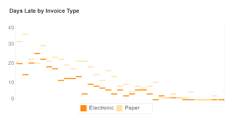
Line charts are best when you want to show how something changes over time. Each point represents a moment, and the line connects those moments into a trend. This makes line charts perfect for metrics such as revenue by month, website traffic by day, or production volume by shift.
Use a line chart when the time dimension is continuous and the shape of the curve matters. You can plot multiple lines to compare trends across products or regions, however, keep the number of lines reasonable so the chart remains readable. If the audience needs to see exact values, consider adding subtle markers or labels at key points, while still letting the overall trend remain the focus.
Pie Charts, Parts Of A Whole With Caution
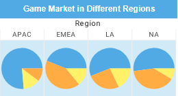
Pie charts show how a whole is divided into parts. They can be effective when you have only a few categories and one clear message, such as one segment dominating the rest. However, they are easy to misuse, because people are not very good at comparing angles or areas.
Use a pie chart only when you want to emphasize a small number of categories that sum to a meaningful whole, such as market share or budget allocation. If you have many slices, or if the differences between them are small, a bar chart will usually communicate the story more clearly. When in doubt, ask whether the same information would be easier to read as a simple bar chart.
Scatter Plots, Revealing Relationships Between Variables
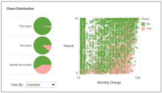
Scatter plots are designed to show the relationship between two numeric variables. Each point represents a pair of values, such as price and quantity, or age and income. Patterns in the cloud of points can reveal correlations, clusters, or outliers that would be hard to see in a table.
Use a scatter plot when your question is whether one variable moves with another, whether there are distinct groups, or whether certain points behave differently from the rest. Adding a trend line can help the audience see the overall direction, while color or size can encode additional dimensions, such as category or intensity. Scatter plots are especially useful in exploratory analysis, where you are looking for unexpected patterns.
Heatmaps, Patterns In Dense Or Matrix Data
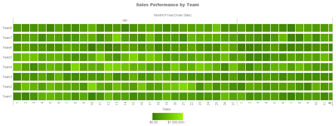
Heatmaps use color to represent values in a grid or matrix. They are useful when you have many combinations of two dimensions, such as time of day and day of week, or product and region. Instead of reading individual numbers, the viewer sees patterns of intensity, such as hotspots or gaps.
Use a heatmap when you want to highlight where values are high or low across a dense set of intersections. Choose a color scale that is intuitive, such as light to dark or cool to warm, and make sure the legend is clear. Heatmaps are powerful for operational dashboards, where you want to spot anomalies quickly, such as spikes in incidents or drops in service levels.
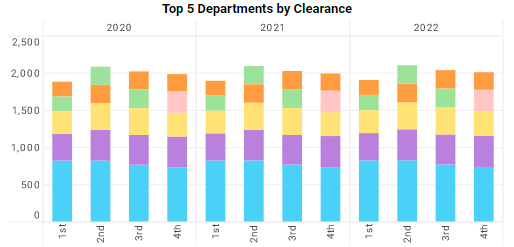
Stacked Bar Charts, Comparing Parts And Totals
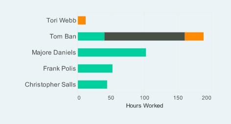
Stacked bar charts extend the basic bar chart by dividing each bar into segments that represent parts of the total. They are useful when you want to compare overall totals across categories, while also showing how those totals break down. For example, you might show total revenue by region, with each bar stacked by product line.
Use stacked bars when the total is important and the composition adds context. They work best with a small number of segments, because too many colors make the chart hard to read. If the composition itself is the main story, and you need to compare segment sizes across categories, consider a grouped bar chart instead, where each segment has its own bar.
Align Chart Style With The Data Story
Once you understand the strengths of each chart style, the next step is to align them with the story you want to tell. If your story is about growth, a line chart that shows a clear upward trend may be the best choice. If your story is about one category outperforming others, a bar chart that highlights the leader will be more effective.
You should also think about emphasis. Color, ordering, and labeling all influence what the viewer notices first. Use color sparingly to highlight the most important series or category, and keep the rest neutral. Order categories in a meaningful way, such as descending value, so the pattern is easy to see.
Avoid Common Pitfalls In Chart Selection
Some chart problems come from choosing a style that does not match the data. For example, using a pie chart for values that do not sum to a meaningful whole, or using a line chart for categories that are not ordered. Other problems come from overloading a chart with too many series, labels, or decorative elements.
To avoid these pitfalls, keep asking whether the chart answers the original question quickly and honestly. If the viewer has to work hard to decode the chart, consider a simpler style. If the chart could be misread, adjust the scale, labels, or annotations to make the message clearer. Clarity should always win over cleverness.
Building A Chart Style Toolkit
Over time, you can build a personal toolkit of chart styles that you trust for different situations. Bar charts for category comparisons, line charts for trends, scatter plots for relationships, heatmaps for dense patterns, and stacked bars for totals and parts. With this toolkit, you can move quickly from question to visualization, because you already know which styles fit which stories.
The more you practice, the more natural these choices become. You start to see data in terms of comparisons, trends, distributions, and relationships, and you match each pattern to a chart style that reveals it clearly. In the end, choosing the right chart style is about respect for your audience and for the data, because a well chosen chart lets the story speak for itself.