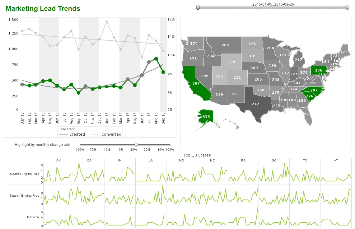
Introducing the Sparkline Chart Type
This is the continuation of the transcript of a Webinar hosted by InetSoft on the topic of "Building a Winning Dashboard" The speaker is Abhishek Gupta, sales engineer at InetSoft.
We're looking to add context to a lot of subjects. But do we actually need that type of precision to list all the data points? Do we need the values for all these 8 points, or is there a better way to quickly get that general sense of what happened in the last 12 weeks. So what we do here, is we introduce what we call sparkline charts. These are basically just multiple miniature line charts. They allow us to show different lines for every agent, so there is no need for legends.
As you can see, there's no labels on those. If you want, you can configure it, so that you can click on the sparkline, and then you can pop up a bigger line with all the values or you can may be drill through to another report. Basically, do whatever you want to, to get that specific detail, but in this case, the simple sparkline gives us a lot more insight and help us to overcome those kneejerk reactions.
So you can see here that Heidi, for example, her value of 73 has actually been a pretty good value looking at her previous weeks, where she has actually consistently been improving in the last few weeks. So basically in the last five weeks, her trend is going upwards. So definitely the sparkline chart type helps us elevate the discussion that we have around the data, and this is just one example of how using context can make your data much more useful and actionable.
In this case, there is no action required, because she is on the right path, so show context. We can also take look at the average handling time for all these agents. Now, I don't want to pick on Heidi, but her average today is 26 minutes, which is quite high compared to the others, but how useful is this average really? What does the distribution across all the calls look like?
Maybe that's just one call, where she had the 26-minute long call, or maybe she is consistently taking 26 minutes to handle calls. Maybe she had a few outliers that are skewing the average. Averages are used everywhere on dashboards because they are simple summaries, but the utility, particularly in cases like this is really quite limited.
Edward Tufte, who is known as the godfather of modern data visualization and also a rather polarizing figure in our world, he wrote the following. He said to clarify, you want to add detail. Now imagine if you were to list out all the handling times of every single call, agent by agent for the entire day. That's quite a large report. It could be a huge report. Well, we've done it here by simply creating a dot or symbol for every call that's been made today.
The placement on the table is determined by the average handling time, squares represent calls, phone calls, and triangles represent web chats, and we can see that Heidi and a few others had a few calls with abnormally long handling times. Perhaps, we can click on them to get more information and maybe even see things such as the transactional level data and what exactly happened in that call and why that matter took so long to resolve.
So this picture is much clearer than a simple average, and really it makes that point of to clarify, you want to add detail. This is data visualization's value proposition. It allows you to consume enormous amounts of data in a single glance. Outliers, exceptions, patterns, trends, correlations, distributions, everything, can be analyzed in a glance.
Now take a look at this sheer volume of data we've packed in here. There's hundreds upon hundreds of data points on this dashboard. It is interactive, but look at how much insight we are getting even without touching anything. Another example that we can use to add detail in this case is what we call an information tooltip.
What Is a Good Use Case for Using Sparkline Charts in DevOps?
Sparkline charts are an excellent tool for visualizing trends and patterns in a compact format, making them particularly useful in DevOps environments. Here are some good use cases:
-
Monitoring System Performance: Sparkline charts can display CPU usage, memory consumption, or network traffic over time. Their compact size allows them to be embedded in dashboards, providing a quick overview of system health.
-
Tracking Deployment Metrics: They can show the success rate of deployments, the number of errors, or the time taken for each deployment. This helps teams identify trends and improve their deployment processes.
-
Visualizing Log Data: Sparkline charts can represent the frequency of specific log events, such as errors or warnings, over a given period. This makes it easier to spot anomalies or recurring issues.
-
Analyzing Build Pipeline Efficiency: They can illustrate the duration of build processes or the success rate of builds over time, helping teams optimize their CI/CD pipelines.
-
Comparing Metrics Across Environments: Sparkline charts can be used to compare performance metrics between different environments, such as development, staging, and production, in a single view.
Their ability to condense data into a small, easily interpretable format makes them a valuable addition to any DevOps toolkit.


