Comparing InetSoft, Kyvos, Astrato, Upsolve AI, and Tellius for Intuitive Dashboards
The analytics landscape has expanded dramatically, with organizations seeking platforms that balance data preparation, dashboard interactivity, scalability, AI‑driven insights, and deployment flexibility. InetSoft, Kyvos, Astrato, Upsolve AI, and Tellius represent five distinct approaches to modern BI.
Each platform excels in different areas, from semantic modeling and embedded analytics to cloud‑native visualization and AI‑assisted exploration. This article provides a detailed comparison to help teams understand which solution best aligns with their requirements.
Overview Of The Platforms
InetSoft is a mature, full‑stack BI platform offering data preparation, semantic modeling, dashboards, pixel‑perfect reporting, and embedded analytics. Kyvos specializes in OLAP acceleration at massive scale, enabling sub‑second queries on trillions of rows. Astrato is a cloud‑native visualization tool built on top of Snowflake, emphasizing live querying and modern UI design. Upsolve AI focuses on AI‑driven analytics automation, using natural language to generate insights and dashboards. Tellius blends BI with augmented analytics, offering guided insights, conversational querying, and machine‑learning‑powered exploration.
Comparison Table
Data Connectivity And Modeling
InetSoft stands out for its built‑in data preparation and semantic modeling layer. Users can blend, join, and transform data visually, creating reusable business definitions and governed metrics. This eliminates the need for external ETL tools for many workflows. The platform supports both live and cached data, enabling hybrid architectures.
Kyvos takes a different approach, focusing on OLAP cube acceleration. Instead of modeling data for dashboards, Kyvos builds massive multidimensional cubes that allow extremely fast queries. This is ideal for enterprises with billions or trillions of records but requires a strong data engineering foundation.
Astrato relies heavily on Snowflake for data modeling. It does not include a full semantic layer but instead encourages modeling within the warehouse. This works well for teams already invested in Snowflake’s ecosystem.
Upsolve AI minimizes the need for modeling by using AI to interpret datasets and generate insights automatically. While convenient, this approach may lack the precision required for governed enterprise reporting.
Tellius offers a hybrid model: it supports data mashup and transformations while also providing AI‑driven modeling suggestions. Its semantic layer is lighter than InetSoft’s but more flexible than Astrato’s.
Dashboarding And Visualization
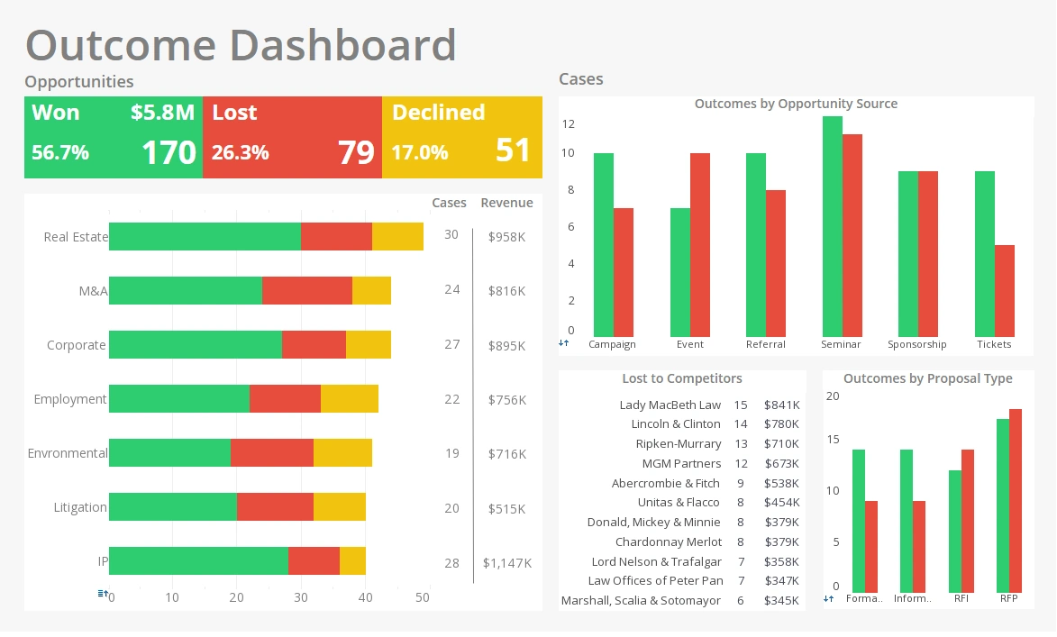
InetSoft provides a highly customizable dashboard designer with granular control over layout, styling, interactivity, and responsive behavior. It supports advanced features such as drill‑through, dynamic filtering, custom actions, and pixel‑perfect formatting. This makes it suitable for both operational dashboards and executive reporting.
Kyvos is not primarily a dashboarding tool; instead, it integrates with BI front ends like Tableau, Power BI, and MicroStrategy. Its value lies in accelerating those tools rather than replacing them.
Astrato excels at modern, cloud‑native dashboards with a sleek UI. Its visualizations are intuitive and optimized for live querying. However, customization is more limited compared to InetSoft.
Upsolve AI automatically generates dashboards using natural language prompts. This is ideal for rapid prototyping but may not meet the needs of teams requiring precise design control.
Tellius provides interactive dashboards with strong exploratory features. Users can drill into anomalies, run automated insights, and ask questions conversationally. Its visualizations are functional but not as customizable as InetSoft’s.
AI And Augmented Analytics
InetSoft includes predictive analytics and machine‑learning integration but focuses more on governed BI than automated insight generation. It supports embedding AI models and visualizing their outputs within dashboards.
Kyvos does not emphasize AI; its strength is performance rather than automated insights.
Astrato includes light AI features through Snowflake integrations but does not offer native augmented analytics.
Upsolve AI is the most AI‑centric platform in this comparison. It uses natural language to generate dashboards, summarize insights, and automate analysis. This is powerful for non‑technical users but may lack transparency for regulated industries.
Tellius blends BI with AI, offering anomaly detection, automated insights, natural‑language querying, and ML‑powered explanations. It provides more control and transparency than Upsolve AI while still enabling rapid exploration.
Scalability And Performance
InetSoft supports both in‑memory acceleration and live querying, making it suitable for mid‑size and large enterprises. Its performance scales well across embedded deployments and multi‑tenant environments.
Kyvos is the clear leader in scalability. Its OLAP engine is designed for massive datasets, enabling sub‑second queries on cloud data lakes. Organizations with extreme data volumes often choose Kyvos specifically for this capability.
Astrato’s performance depends heavily on Snowflake. When paired with a well‑optimized warehouse, it performs well, but it lacks its own acceleration layer.
Upsolve AI is optimized for smaller to mid‑size datasets. Its AI models may struggle with extremely large or complex data environments.
Tellius scales reasonably well and includes query acceleration features, but it is not designed for the extreme scale that Kyvos targets.
Deployment And Integration
InetSoft offers the most deployment flexibility: cloud, on‑premises, hybrid, and fully embedded. Its white‑labeling capabilities make it ideal for SaaS providers and enterprises needing custom UI integration.
Kyvos is cloud‑focused but can integrate with on‑premises data lakes. It is typically deployed in large enterprise environments with strong engineering teams.
Astrato is cloud‑only and tightly coupled to Snowflake. This simplifies deployment but limits flexibility.
Upsolve AI is SaaS‑only, with limited customization or embedding options.
Tellius supports cloud and hybrid deployments, offering more flexibility than Astrato or Upsolve AI but less than InetSoft.
Total Cost Of Ownership
InetSoft provides strong value by combining data preparation, dashboards, reporting, and embedding into a single platform. This reduces the need for multiple tools and lowers long‑term costs.
Kyvos can be expensive due to its enterprise focus and infrastructure requirements. It is best suited for organizations that truly need extreme scale.
Astrato offers competitive pricing but may require additional Snowflake costs depending on usage.
Upsolve AI is cost‑effective for small teams but may require additional tools for governance or modeling.
Tellius sits in the mid‑range, offering strong value for organizations seeking augmented analytics without the complexity of enterprise OLAP.
InetSoft Is the Most Versatile
Each platform in this comparison serves a different purpose. InetSoft is the most versatile, offering a unified BI stack with strong customization, governance, and embedding capabilities. Kyvos is unmatched for large‑scale OLAP acceleration. Astrato provides modern, cloud‑native dashboards for Snowflake users. Upsolve AI delivers rapid, AI‑generated insights for non‑technical teams. Tellius blends BI and AI to support guided exploration and conversational analytics.
The right choice depends on your organization’s data volume, governance needs, deployment preferences, and desired balance between manual control and AI automation. For teams seeking a flexible, enterprise‑ready platform that supports both operational dashboards and embedded analytics, InetSoft remains a strong and future‑proof option.


