Next Point for Great Dashboard Design
This is the continuation of the transcript of a Webinar hosted by InetSoft on the topic of "Building a Winning Dashboard" The speaker is Abhishek Gupta, sales engineer at InetSoft.
And this is a good segue to next point for great dashboard design. You want to make every pixel count. You don't want to waste attention on something that is not important. Like the title of your dashboard, bright background colors, or big lines. The difficult problem is often what you need to get rid of and not what you need to add to your dashboard. So that's where really you can make your dashboard effective.
A great way to achieve that is by applying the data-ink-ratio. That's another rule by Tufte, which is saying that the ink you use on your dashboard to present data divided by the total ink that you use on your graphics will help your dashboard to be more data centric. So you want to have a higher number, and that's where your design is more effective.
So let's take a look at an example that explains that rule. So here's a loaded ink ratio chart, and I am going apply a few changes to it to make it a high data ink ratio chart. So first I am going to remove the background, and then I would remove the frames. Only change to a single color, remove the effects, remove the gridlines, reduce the font width.
I will use direct labels instead of axis labels, and now what I can do is, I compare the two versions side by side. You can see on the left-hand side, you have a high data ink ratio and on the right-hand low data ink ratio, and you can see how the lessened side chart is much easier to read and use and in my mind, also more visually appealing, versus the right-hand side chart.
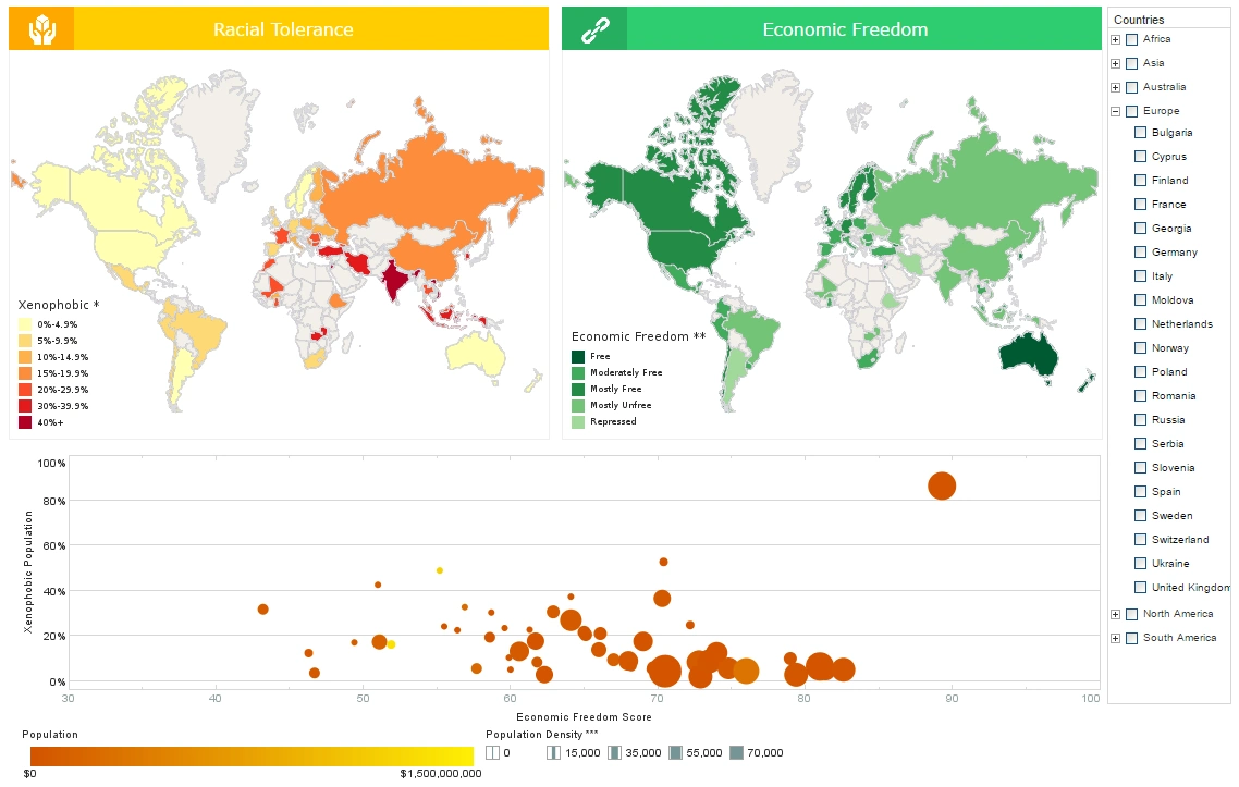
Here's another example of a dashboard designed by students, which I mentioned earlier. It's a dashboard we would implement according to his design in the InetSoft application, and often these designs are heavily implementing this rule as you can see on this dashboard, almost every pixel is used for data and there's lots of it on this dashboard.
I think it's a good proof to the point I was making in the beginning our products, which are always allowing you to serve 100% of the use cases. It's actually quite hard in most technologies to get rid of things rather than add things and being able to achieve this type of a design requires a lot of flexibility with your solution. Again, this sample is also available in our sample gallery. If you want to take a look just go to the website and open the gallery and you can see that sample live on your computer.
The number six tip for better dashboard design, take answers as far as you can. You want to keep asking why and what happens next. Not because you want to be annoying but because we are always pushing people to think about the next step. Now that you have this number, what are you going to do with it?
So, in this example, we have actuals and targets expressed in dollars here, but what are the numbers that you actually need. Maybe what you want is the variance. If that's the case, we should actually show that versus the expenses and the targets. Maybe what you want is the actual percentage, not the dollar value for that variance, so again, we can show exactly that.
So you want to try to take these answers as far as you can and by pushing those further. The question then becomes can we go beyond this to make it easier to see the right information and actually improve decision making capabilities. Can we make the process more scientific than ad hoc? Can we gain from control over the process? This push to continuously take things to the next level is what innovation and great design is all about.
Case Study: Revolutionizing Insights – Dashboard Redesign for SwiftSports Apparel
SwiftSports Apparel is a leading sportswear manufacturer specializing in high-performance athletic clothing. Based in Oregon, the company serves global markets with a focus on innovative designs and sustainable practices. With rapid growth and increasing competition, SwiftSports relied on performance dashboards to monitor operations, sales, and customer engagement. However, its legacy dashboards fell short of meeting the dynamic needs of its diverse teams.
In 2023, SwiftSports initiated a comprehensive redesign of its dashboards to enhance usability, improve data visualization, and drive actionable insights.
Challenges with Legacy Dashboards
-
Complex Navigation
- The dashboards were cluttered with excessive information, making it difficult for users to find relevant data quickly.
- Non-intuitive layouts required extensive training, particularly for new team members.
-
Poor Data Integration
- The dashboards relied on fragmented data sources, resulting in incomplete or inconsistent insights.
- Key systems such as ERP, CRM, and supply chain tools were not fully integrated.
-
Limited Customization
- Different teams (e.g., design, marketing, production) had diverse data needs, but the dashboards lacked the flexibility to cater to specific requirements.
-
Weak Visualization
- Static charts and outdated graphics failed to convey trends effectively, hindering data-driven decisions.
-
Inefficient Performance
- Long load times and frequent crashes frustrated users, leading to reduced adoption across teams.
The Redesign Process
SwiftSports partnered with a data analytics firm to overhaul its dashboard ecosystem. The redesign focused on improving user experience (UX), leveraging advanced data integration, and enhancing visual storytelling.
Key Steps in the Redesign Process:
- Stakeholder Consultations
- Conducted workshops with department leaders to understand pain points and define key performance indicators (KPIs).
- Collected feedback from end-users to identify usability issues and desired features.
- Data Integration Enhancement
- Unified data sources using a robust data mashup tool, ensuring seamless integration from ERP, CRM, production, and marketing systems.
- Established real-time data pipelines to provide up-to-date insights.
- Streamlined Layout and Navigation
- Designed dashboards with clear hierarchies and intuitive navigation.
- Introduced role-based views tailored to specific teams (e.g., product designers, sales managers, and supply chain analysts).
- Advanced Visualization Techniques
- Incorporated dynamic visuals like heat maps, trend lines, and interactive drill-down charts.
- Used color coding and icons to highlight anomalies or urgent issues.
- Performance Optimization
- Upgraded underlying technology for faster load times and smoother user experiences.
- Implemented responsive designs to ensure compatibility with mobile devices and tablets.
Impact of the Redesign
- Enhanced User Adoption
- User satisfaction scores for the dashboards increased by 85%.
- Teams reported spending 40% less time searching for critical information.
- Better Decision-Making
- The marketing team used real-time sales data to adjust campaigns, leading to a 20% increase in ROI.
- The production team identified bottlenecks using visualized workflow data, reducing lead times by 15%.
- Increased Efficiency
- Integrated supply chain data enabled predictive insights, reducing stockouts by 30%.
- Customized dashboards allowed team-specific focus, leading to faster resolution of issues.
- Improved Collaboration
- Cross-functional teams could share insights easily through standardized metrics and shared dashboards.
- Enhanced collaboration between designers and sales teams led to a 10% increase in product launch success rates.
- Scalable Design
- The redesigned dashboards could accommodate future data sources, such as customer sentiment analysis and AI-driven forecasts.
- Mobile-friendly designs empowered field sales teams with instant access to critical KPIs.
Key Lessons Learned
- User-Centric Design: Involving end-users early in the process ensured that the dashboards addressed practical needs, fostering adoption and engagement.
- Real-Time Data Matters: The shift to real-time data integration significantly improved responsiveness to market trends and operational issues.
- Visualization Drives Action: Advanced, interactive visuals helped stakeholders identify patterns and anomalies quickly, enabling timely interventions.
- Customization is Crucial: Role-specific views allowed diverse teams to focus on their priorities, making the dashboards more impactful.
Future Plans
SwiftSports plans to incorporate machine learning models into its dashboards to predict sales trends and optimize inventory further. Additionally, they aim to integrate sustainability metrics to track progress toward environmental goals.

