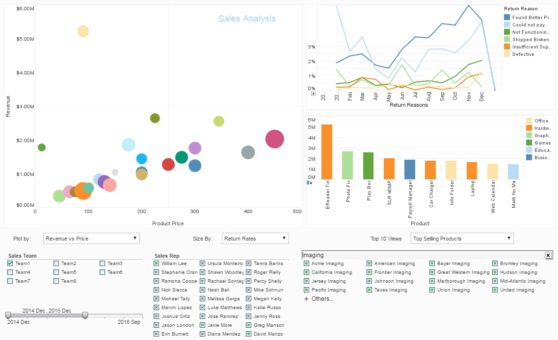
Designing Good Looking Dashboards
This is the continuation of the transcript of a Webinar hosted by InetSoft on the topic of "Building a Winning Dashboard" The speaker is Abhishek Gupta, sales engineer at InetSoft.
And the last lesson for designing good looking dashboards is number seven, content is king. This goes for anything. The long-term success and adoption of the dashboard is really determined by the strength of this content, not the brightness of its color. Go beyond showing the trivial and solving simple problems to taking a stab at the complicated problems. Those are the problems that dashboards should be solving.
These are the conversations that you should be having during the meetings. When you are designing dashboards, there are the basics that you want to have. You don't want to have the debate around colors and effects, much more on the content of the dashboard. Dashboard should really serve to elevate your discussions and you can think of it as going from an old and classy TV to a high-definition screen.
The enhanced resolution does not necessarily make people look better or simply enhance their appearance. We can just ask newscasters and the makeup artists. The additional visual power simply exposes more information, whether it is flattering or not, so the conversation you have about your data should take advantage of this extra power and enhance precision.
So let's summarize what we have learned about designing effective good-looking dashboards. To get adoption for a dashboard, we need to look at relevance, integration, and design. Relevance, you want to put the focus on people and give them choices. For integration, you want to make dashboard a part of a system that you already have in place, and you want to maybe integrate with an email notifications or any other mechanism that you can use to push that into their workplace environment.
For design, you want to show the data and do not distort it. You want to show context, add detail. Decorate as little as possible, make every pixel count, and take answers as far as you can and remember that content scheme. Now, I hope this has given you a better understanding of dashboards and perhaps some new ideas about how they can be used more effectively.
One more point I want to mention here is that you want to make sure you have the right tools to track your adoption rates. Here's an example of a dashboard, which comes built in with InetSoft's BI platform, and this allows the administrators to track the users and dashboard adoption. So they can actually understand, which dashboards are being used.
Which users are using those dashboards? How long are the dashboards are being viewed? How active are the users are in the systems in terms of how often they log in? This one really gives you the tool to understand which dashboards you may be want to fine tune their design. Maybe the content of the dashboard is not strong enough.
Maybe you want to find better ways to push the dashboard system to the users. Maybe you want to open capabilities to the users who are very active in the system, so a great way to understand how successful your implementation are just by being able to track your adoption. So, I hope this gave you a good understanding of some of the best practices we use to increase our dashboard adoption.
Case Study About a Rural Electric Cooperative Designing Good Looking Dashboards
Rural electric cooperatives (RECs) play a crucial role in delivering electricity to remote and underserved areas. These cooperatives often operate in resource-constrained environments but are increasingly leveraging technology to manage their operations efficiently. This case study explores how a rural electric cooperative used data visualization and dashboard design to optimize their operations, enhance member engagement, and improve decision-making.
The Cooperative: BrightEnergy Rural Electric Cooperative
BrightEnergy REC is a mid-sized rural electric cooperative serving approximately 40,000 households and businesses across multiple rural counties in the Midwest. With increasing pressure to modernize their grid and improve operational efficiency, BrightEnergy realized they needed to harness data more effectively.
Key Challenges:
- Operational Inefficiencies: The cooperative was struggling with outdated systems for managing energy distribution, leading to inefficiencies in detecting outages, over-consumption, and energy loss.
- Member Engagement: Member-owners (customers) found it difficult to access clear information about their energy usage and bills, leading to frustration.
- Data Overload: With the installation of smart meters and other IoT devices, the cooperative was flooded with data but lacked an organized way to visualize and utilize it for decision-making.
- Limited Resources: Unlike larger, investor-owned utilities, BrightEnergy had limited IT resources and budget for developing high-end software tools.
Objective:
To design user-friendly and visually appealing dashboards that provide real-time insights into energy usage, system performance, outages, and member engagement.
Solution: InetSoft's Dashboard and Data Mashup Tools
BrightEnergy turned to InetSoft, a business intelligence (BI) and data visualization software provider, to build customized dashboards for their cooperative. InetSoft's tools provided them with the ability to integrate data from various sources and create real-time dashboards with minimal need for extensive IT resources.
The Dashboard Design Process
- Stakeholder Identification: BrightEnergy identified three primary user groups for the dashboard:
- Operations Team: Responsible for grid management, monitoring outages, and ensuring energy distribution efficiency.
- Executive Team: Needed high-level KPIs for decision-making regarding investments, maintenance schedules, and system upgrades.
- Member-Owners: Everyday consumers who needed easy-to-understand data on their energy consumption and billing.
- Data Integration: Using InetSoft's data mashup capabilities, BrightEnergy integrated data from:
- Smart meters and IoT devices tracking real-time energy usage
- Weather data sources to predict energy demand based on local conditions
- Outage reports from grid monitoring systems
- Financial and billing systems for member-owner data
This mashup of data from diverse sources allowed the dashboards to present a holistic view of operations.
- Design Principles: The cooperative's IT and management teams worked with InetSoft's dashboard design
experts to create:
- Clear, Minimalistic Layouts: They avoided clutter by emphasizing only the most critical data for each user group.
- Interactive Elements: Users could click on various metrics to drill down into more detailed views.
- Color Coding and Visual Cues: Energy usage and outage alerts were color-coded (e.g., green for normal operation, red for urgent issues) for easier interpretation.
- Mobile-Friendly Design: Since many staff members and member-owners accessed the dashboard on mobile devices, the design was responsive and easy to navigate on small screens.
- Custom Dashboards for Different Users:
- Operations Team Dashboard:
- Real-time grid performance indicators.
- Instant outage detection and location maps.
- Energy flow and consumption analytics.
- Predictive alerts based on weather forecasts and energy demand patterns.
- Executive Team Dashboard:
- High-level KPIs such as energy production vs. consumption.
- Financial health metrics, including revenue projections.
- System maintenance schedules and capital expenditure tracking.
- Member-Owner Dashboard:
- Personalized energy usage data, displayed in a visually appealing, easy-to-understand manner.
- Graphs showing energy usage trends over time.
- Bill breakdowns with explanations of charges.
- Simple comparison tools to show how individual usage compares with neighborhood or community averages.
- Operations Team Dashboard:
Results:
- Improved Operational Efficiency:
- The operations team was able to reduce the time it took to detect and resolve outages by 30%.
- Predictive maintenance alerts helped avoid costly equipment failures, reducing maintenance costs by 15% in the first year.
- Energy loss due to inefficiencies dropped by 12%, as the dashboard allowed them to pinpoint problem areas more quickly.
- Enhanced Decision-Making:
- Executives used the dashboards to make better-informed decisions about infrastructure investments, based on real-time data rather than quarterly reports.
- Energy usage patterns identified by the dashboards enabled the cooperative to plan energy distribution more efficiently, resulting in a 10% improvement in energy allocation.
- Increased Member Satisfaction:
- Member-owners were more engaged with their energy usage, as they now had a user-friendly platform to track consumption.
- Transparency in billing through detailed breakdowns reduced the number of billing inquiries by 25%.
- The cooperative received overwhelmingly positive feedback from member-owners, particularly on the ability to compare their usage to community averages.
- Cost-Effective Solution:
- InetSoft's platform allowed the cooperative to deploy a powerful data visualization tool without the need for a large IT staff or budget.
- The low-code, easy-to-use nature of the platform meant that the cooperative could update and maintain dashboards in-house.


