Questions about Dashboard Design Principles
This is the continuation of the transcript of a Webinar hosted by InetSoft on the topic of "Building a Winning Dashboard" The speaker is Abhishek Gupta, sales engineer at InetSoft.
So what I'll do next now is I'll open the floor for some questions about dashboard design principles. If there are some questions, you are welcome to type them into the gotowebinar question panel, and I'll try to address them within the remaining time.
Okay, so a couple of questions here. I should have probably mentioned at the beginning, will we get the recording of this presentation? Then, the answer is yes. The recording will be available and will be sent out to you, everybody that registered to this webinar in a follow up email in a couple of days.
So there's another question here about how to specifically design and create dashboards in InetSoft? So, there is a great webinar on our webinar space on the website, I don't remember the exact name of it, but if you go to webinar page, it will be quite clear and done a few months ago, it actually shows you moving from data to dashboard showing you step by step how you create the dashboard. So definitely there is this type of webinar available to you if you want to watch it.
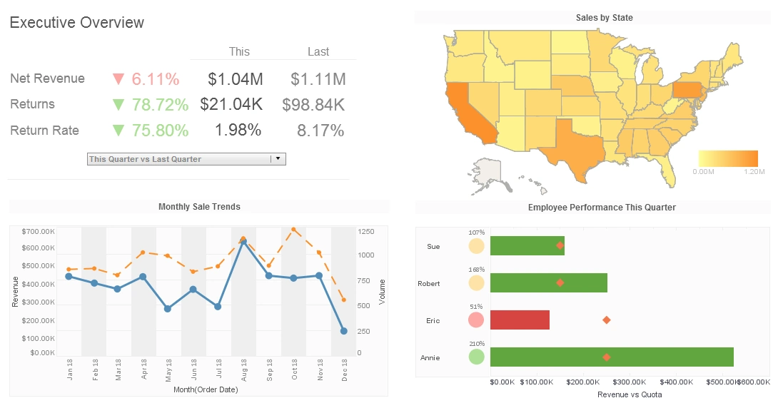
So there's a question here about the choice of a data visualization that we use on our dashboard, specifically, should I be using gauges and other types of visualization that help with the visual appeal that the people perceive? I think the answer to that is it really depends on the environment you are operating.
We see manufacturing organizations, where the manufacturing device is actually used, gauges and needles, so it could make a lot of sense to use radial gauges on those dashboards. Typically, radial gauges are not great from the point of view of the real estate they consume on your dashboard. They take a lot of space, they don't convey a lot of information.
So I would rather use bullet graphs or other ways of visualizing information rather than using radial gauges, but again, it could make sense depending on the environment. You need to take different factors into consideration when you design a dashboard and as I mentioned earlier, there is a whole lot of best practices around the right type of visualization to choose from.
In InetSoft, we give that power to the users to be able to switch between the different types of visuals on the fly, so they can decide for themselves, but definitely with the original design you want to get the right visual from the get go. One more thing I would mention about that, and that's related to another question we had here around training.
As part of our training courses, we definitely talk about not just technology and how to implement a different data visualization solution using InetSoft, but also about data visualization best practices, and we talk about the right choice of visualization for the right data. So there is an unrelated question here to the topic of today's webinar and a few questions about that, so we will get to all of the other questions that are unrelated to today's topic or that we don't have time to get to, with follow up emails.
Specifically that question is, can we visualize data from Hadoop in InetSoft? The answer is yes, we can definitely connect to different Hadoop environments. There are different ways to do it. We can connect to a Hive or Impala and many others. So the answer to that is, is yes.
Can InetSoft Be Embedded into Another Cloud Application?
The short answer is yes. InetSoft's architecture supports embedding into other cloud platforms, allowing businesses to extend its capabilities within their existing ecosystems. This integration empowers organizations to provide advanced data analytics functionality directly within their software without requiring users to switch applications.
Embedding InetSoft within a cloud application delivers significant benefits, both for the developers of the host application and its end users. For developers, it eliminates the need to build analytics capabilities from scratch, saving time and resources. Meanwhile, end users gain immediate access to sophisticated data visualization and reporting tools without leaving the host application. This embedded approach enhances user experience, streamlines workflows, and ensures that users can derive insights from their data in real time without additional software installations.
InetSoft provides APIs and SDKs that facilitate seamless embedding into cloud-based applications. Using these tools, developers can customize InetSoft's user interface to match the host application's design and functionality, ensuring a cohesive look and feel. Additionally, InetSoft's REST APIs enable interaction with its data processing and visualization capabilities, making it possible to integrate dynamic dashboards, charts, and reports into existing systems. This flexibility ensures that organizations can tailor the embedding process to meet their specific requirements.
InetSoft is cloud-agnostic, meaning it can integrate with virtually any cloud service, including AWS, Microsoft Azure, Google Cloud Platform, and others. This versatility ensures that businesses operating on diverse cloud infrastructures can incorporate InetSoft's tools without worrying about compatibility issues. Whether the host application is built as a Software-as-a-Service (SaaS) offering or a private cloud deployment, InetSoft's modular architecture supports various deployment scenarios.
When embedding a third-party tool like InetSoft into a cloud application, security and data privacy become critical considerations. InetSoft adheres to industry-standard security practices, including data encryption, role-based access control, and multi-factor authentication, to safeguard sensitive information. Additionally, it can integrate with the host application's authentication systems, such as OAuth or SAML, ensuring that end users enjoy a seamless and secure login experience.
The ability to embed InetSoft into cloud applications makes it an appealing choice for industries ranging from finance and healthcare to retail and logistics. For example, a SaaS application in healthcare might embed InetSoft to enable medical practitioners to visualize patient data securely. Similarly, e-commerce platforms can use InetSoft to analyze sales trends, inventory levels, and customer behaviors within their existing dashboards. This versatility highlights how InetSoft can meet the diverse needs of organizations across various sectors.
While InetSoft offers strong embedding capabilities, organizations must consider potential challenges. Integrating a third-party tool into an existing application requires technical expertise to ensure compatibility and optimal performance. There may also be licensing and cost considerations when embedding InetSoft, as its pricing model might vary based on usage. Careful planning and collaboration between development teams and InetSoft's support staff are essential to mitigate these challenges and ensure a smooth integration process.


