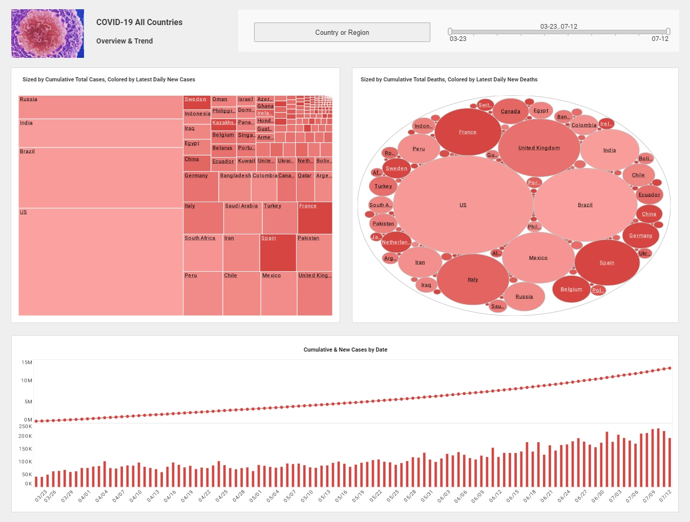
Demo of Creating a Dashboard with SurveyMonkey
This is a continuation of the transcipt of a webinar hosted by InetSoft. The speakers are Ben Williams, Marketing Manager, and Katie Roussey, Systems Engineer.
Now this is actually looking to do a live connect to the SurveyMonkey, so it might take a moment for it to retrieve the metadata and pull that back. I'm just going to go ahead and close out, that way we're not waiting for my connection to SurveyMonkey to finish authenticating. But it's going to give you a really great way to create new data sources and create new data worksheets, just direct from this listing here with leveraging the new APIs for more rapid development where you don't necessarily need to go back to Style Studio to do so.
Now the big feature that is coming with this version is our new viewsheets relabeled at dashboards, currently the new dashboard recommender or wizard. When you actually go to create a new dashboard, you can always do it the more traditional way where you just select the particular data set that you want to work with, and go to okay and get the standard dashboard editor that you've been getting in visual composer with versions like the previous 2 with the minor enhancements around that. However, you can also enter into open wizard.
Now once you are in open wizard, it will actually jump right into a visualization recommender depending on the data source, or data set that you've chosen to work with. If it happens to be a data worksheet, you would see the appropriate data blocks listed out because I chose a data model, I'm seeing the appropriate entities labeled out here. I can expand to now select the particular fields that I want to use, so it's just checking them off.

Now immediately as I start saying, oh I want to use this text based column product category, it will start to say, huh what can I do with this field? Only this field. If I back off, it's like, oh, okay, we're starting again from scratch. If I start with, hey, what if I do something with just a measure? You'll notice that in some cases, you might actually get other options like a lightweight gauge. With our option for a gauge or even a chart depending on the situation you might jump to utilizing the chart and utilizing it for different counts, distinct counts, whatever it is.
As I grab different fields, if I am introducing too many variables, it might make more sense to use something like crosstab. Then it's like, hey why don't you look at the data in this way? Why don't you look at the data that way? I can jump to a detailed table. The recommender will allow me to see the data from different points of view in a rapid way without having to say, well let me play with my data in a crosstab. Let me play with my data in a chart. Let me play with my data in a detail table. I can now do all of that side by side by side by jumping back and forth.
Now, what you'll notice is that when I am in the chart recommender, it will give me options like what about a scatter option? How would you place that? What about doing more radar style? How would you do that? Then if you say, okay, you know what, no I don't want this particular design here. As you can see it's going to give me simple ways to control things like what calculation it's doing? Is it doing a sum? Is it doing an average, doing a number in stock? But as you go into this, you might say, you know what, I really want more specific control over my chart. I do want a chart, but I want to do very specific controls over the chart as I am creating and selecting, I can enter into full editor. Then this is back to the traditional data binding, where you can select specific charts.
Now once you start making certain changes, you're not going to necessarily be able to jump back to the wizard, so that it's saying like everything would be lost for specific changes if I go back to the wizard. I'm now defaulting back to the wizard recommender, and the way that it defaults the chart binding. That is something to keep in mind is that once you go into very specific binding in a full editor, you wouldn't necessarily be able to jump back into the wizard if you've made multiple recommendations and customization.
Once I jumped into finish, what you'll notice is that we're in a lightweight layout mode for quick wizard design of dashboard, which means that I go to place my next component, and I'm back in my recommender. I can go ahead and I can stick with, yeah, no, I do want the gauge types here. Okay, I'm going to go ahead, I'm going to add another element. I want to have this be a filter component, have it be a list. Go into my next component, and maybe I actually do want to, with my few fields, create a standard crosstab.
As I do this is going to assign general spacing and side based off the type of component I'm selecting in the recommender. It's going to allow me to continue to place components in this lightweight grid. Once you select continue, you're not going to be able to get back into the wizard aspect of it, but you can always go back into the visualization or recommender for the binding. You'll notice I'm now in full layout view.
Now I can do free form layout, so it's not going to be going back to that lightweight grid. However, if I were to enter into make changes to my chart, to make changes to my table, because I left it in the visualization recommender versus full editor, I am able to now make changes that I want to make to this chart. Depending on -- maybe I've changed my mind, and now I can go in and I can start to size my components and maybe adjust the layout as I prefer for my dashboard as I'm designing. The recommender is going to give you a way for rapid viewing of your designed components for different calculations, different chart types, chart versus table, do rapid, what about this? What about this? What about this? Make choices.
The great thing is, is that by seeing it different ways, you might have thought, oh I never thought that I would actually use my data that way, it's going to give you that lightweight way of having it give you different options without you having to have the forethought of okay, I want to explicitly go in and do a specific chart type and make those specific configurations, is going to allow you to explore this a little bit more. We believe that this is going to make dashboard design a lot easier. You're like, well, can I actually get into that visualization recommender once I'm no longer in that wizard grid mode? The answer is yes, you could start with either chart or a crosstab. Drag and drop, just like before.
When I click the edit, I am in the visualization recommender. Even though I added a chart, if I were to go in and select a few key fields that I want to see my details on, it might even recommend, hey, I started with the chart and it's like, hey, you know what, I think maybe you should start with the table. From there we can go ahead and make certain changes, and make adjustments to how we want things. Easy conversion of dimension to measure through simple buttons here. Very easy way to see the summary or detail information depending on what we're looking to do right here.
You can see it's saying, oh this is a measure, oh this is a dimension and then maybe applying specific formatting depending on the situation. Now you will be able to very easily do the rapid formatting, as you had done previously with the dashboard designer starting in with the last version. The format panel is still going to be there when I am back to my visual composer view. However, when I am in this recommender, it's not the same as the full binding editor, it's not going to have you applying filtering here, it's not going to have you doing right click properties. It's only going to have you picking fields and exploring various data binding depending on the details that you want to see, what kind of information you're looking to really design and stylize into, say, a detailed table like I am currently putting together onto my dashboard.
As you can see I can set different settings, and so on if I want to set the sort order. I can still do various different changes here. But when I go ahead and I select finish, I now have an additional table where I had dragged and dropped my chart out. When you're designing, you can always get into the visualization recommender, that is a key thing to remember, but you wouldn't be able to jump back to the lightweight wizard whereas add component, add component, add component. Here, you have to explicitly start with dragging out a component into a position, but once you enter into edit, you can go into that visualization recommender and explore playing with various combinations of your fields.
In some cases, you might find that, hey I never thought about visualizing these two fields together in this way, and it's going to give you that elimination by doing those different changes. That's a great thing to have, and it is one of the main features along with those additional chart types actually being explicit binding and all the new data sources that are available. Those really are the major features that are going to be a part of the next version.


