Good Analytics Software Examples
Are you searching for the best analytics software examples? InetSoft provides examples from its highly-rated, easy to use dashboard analytics software.
Manufacturing Analytics
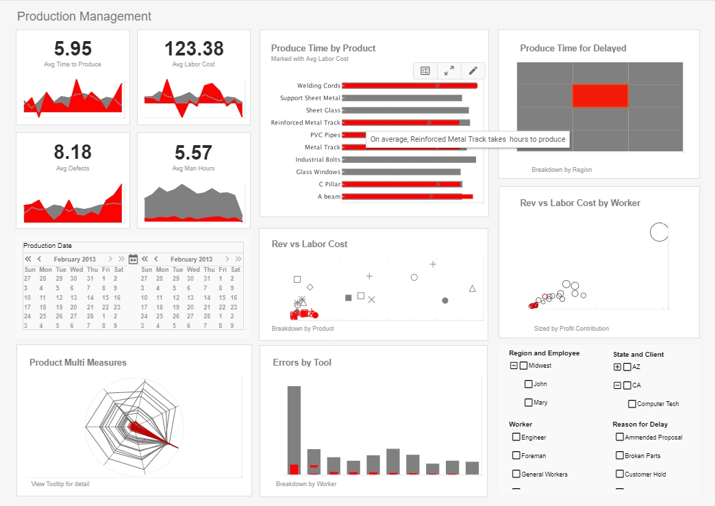
This manufacturing analytics example gives an overview of production times, costs, and errors, displayed with a variety of charts and text kpis. Incorrectly done jobs in the South has been brushed, causing the category's proportion to be displayed on all of the other dashboard charts.
Efficiency Analytics
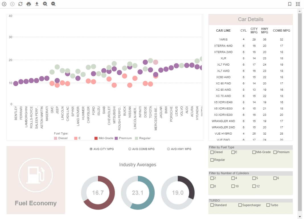
This analytics example uses multidimensional charting and KPI guages to display the fuel efficiency of over 500 different vehicles. A detail table displays each vehicle's individual data, enabling brand outliers to be identified.
Customer Service Analytics
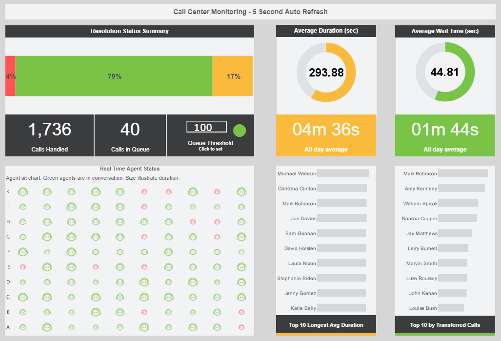
This live customer service dashboard gives shows call center managers how many calls their employees are handling and how long they are taking. The dashboard refreshes ever 30 seconds, with individual employees represented with icons that change color when the employee is on the phone.
Claims Analytics
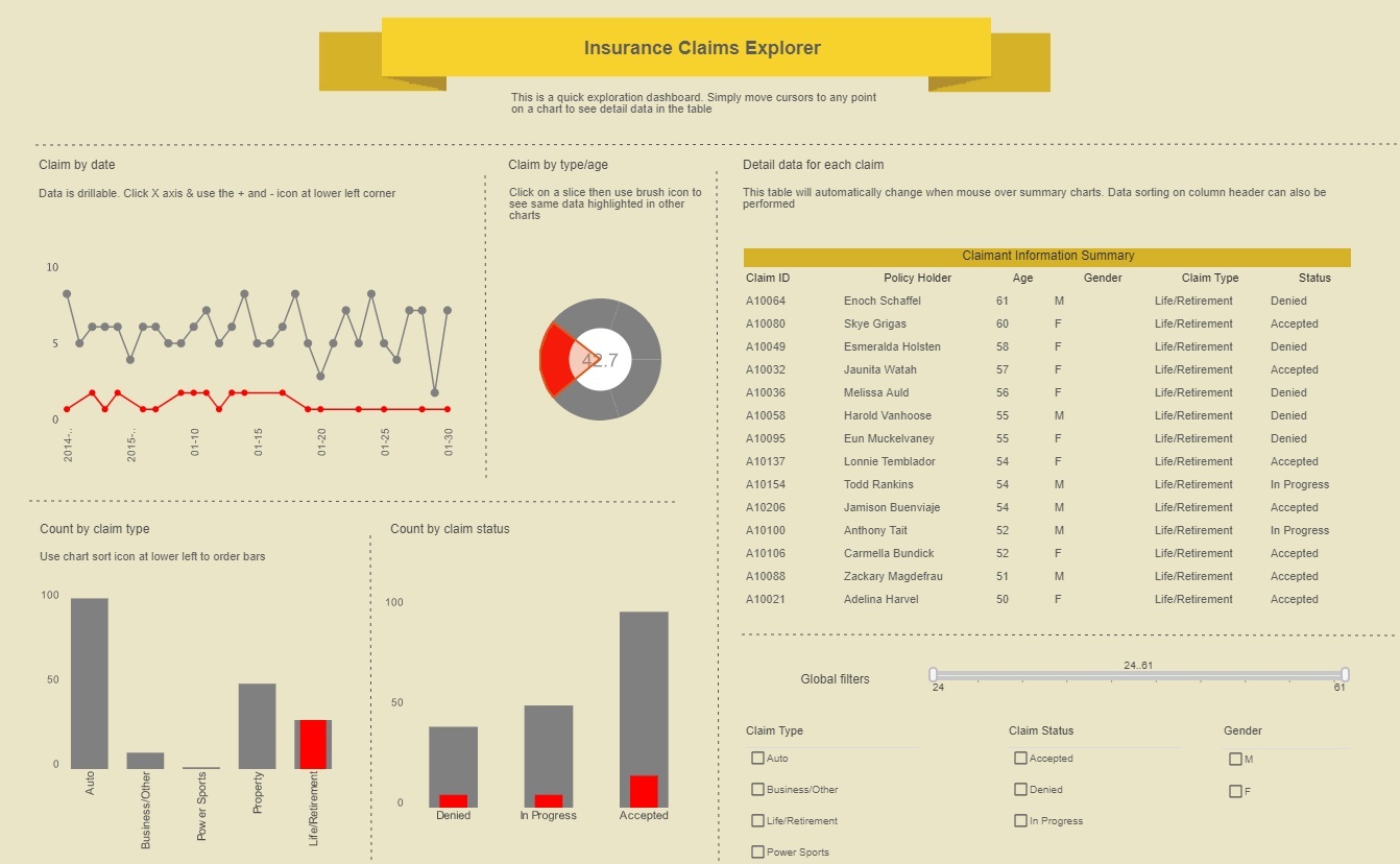
This insurance analytics example gives an overview of insurance claims by type, date, and status. A section of the claim by type/age chart has been brushed, resulting in its proportion being highlighted on all the other charts.
Healthcare Informatics
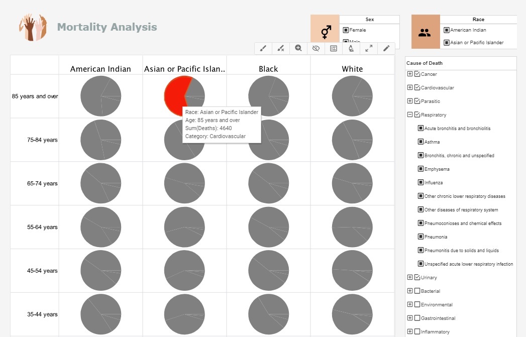
This health analysis breaks down mortality causes along a variety of demographics categories, including, race, age, and sex. This type of analytics can help healthcare providers asses patient risk for various ailments and adjust care accordingly.
Government Analytics
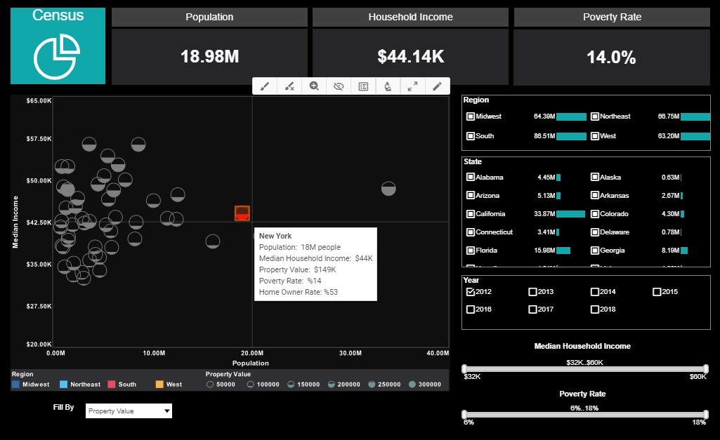
This government analytics dashboard displays US census demographics broken down by state, covering state populations, incomes, property values, and rates of home ownership. With additional fields being displayed by color and fill, this analysis is a great example of how multidimensional charting can aid in data exploration.
College Analytics
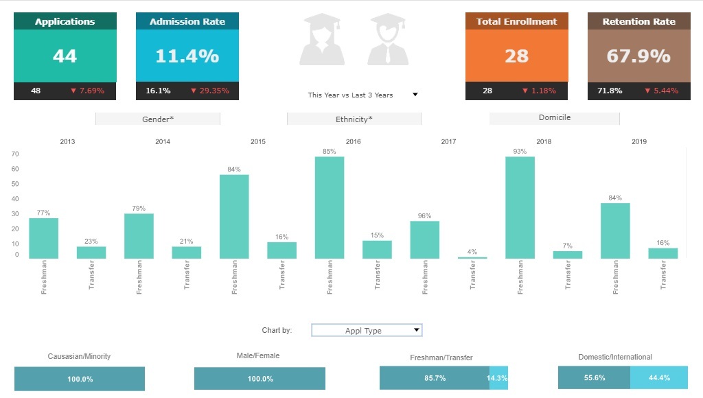
This college admissions analysis breaks down admissions by various demographic and psychographic factors, such as race, gender, major type, transfers, and year. Large, easy to read text KPIs display the dashboard's most important aggregates, with percent change from previous period displayed underneath them.
Construction Analytics
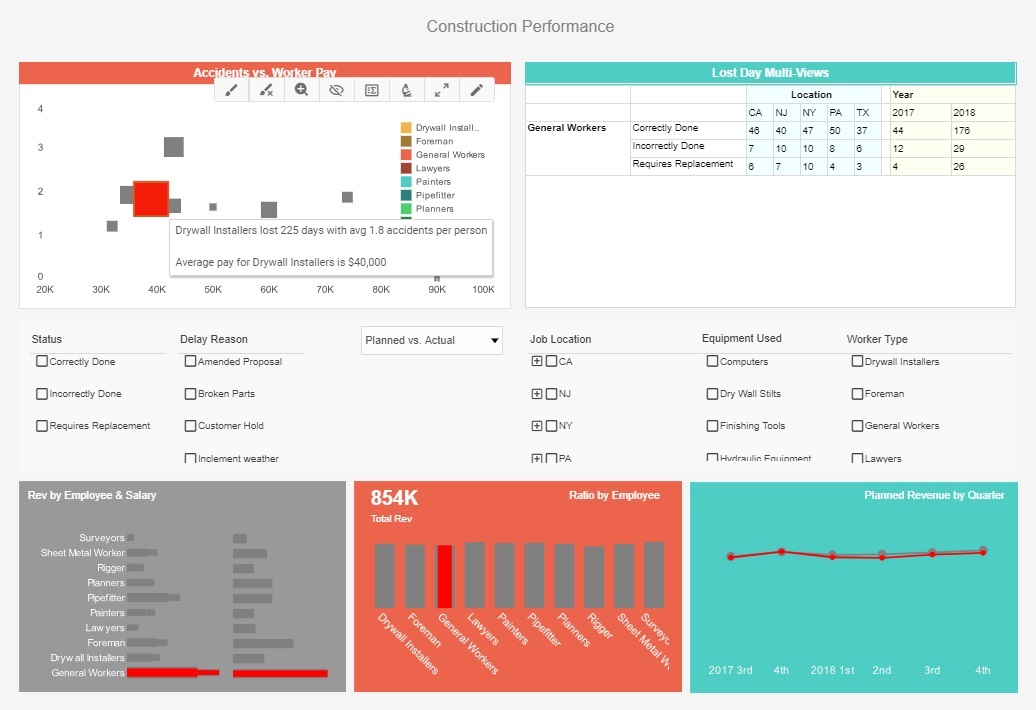
This construction analytics dashboard gives foremen a high level view of projects, costs and revenue, and worker safety. In this screenshot, the category of general workers is selected, causing the crosstab table to display data for only that category.
Utility Analytics
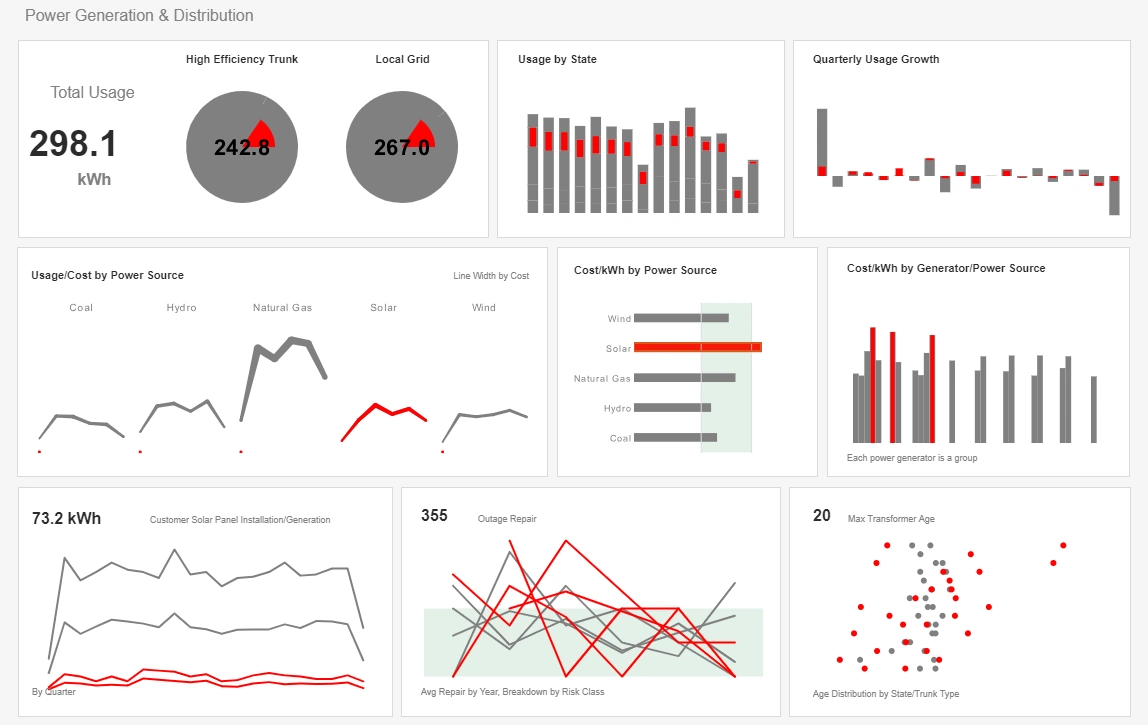
This utility analytics dashboard example gives power plant executives a broad overview of power consumption and equipment maintenance. In this screenshot, solar power is brushed, causing the proportion of power usage from solar to be highlighted in charts throughout the dashboard.
Data Protection Posture Management
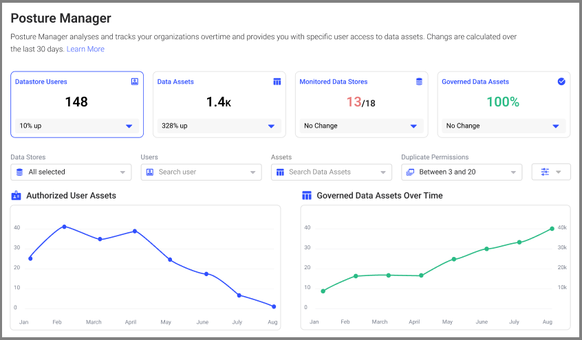
This Data Protection Posture Management dashboard centralizes data security metrics across an organization, giving security and compliance teams a single pane of glass for tracking encryption coverage, access anomalies, and sensitive data discovery. The dashboard blends summary KPIs with drillable charts that show which systems and datasets present the highest exposure, enabling prioritized remediation. Interactive timelines reveal policy exceptions and the impact of recent configuration changes, while heat maps highlight regions and application stacks with the most sensitive data. By correlating access patterns with data classification, teams can quickly identify privileged accounts exhibiting risky behaviors. The result is a pragmatic workflow: detect, investigate, and reduce exposure through targeted policy updates and access controls — all without heavy custom engineering.
Email Marketing Performance
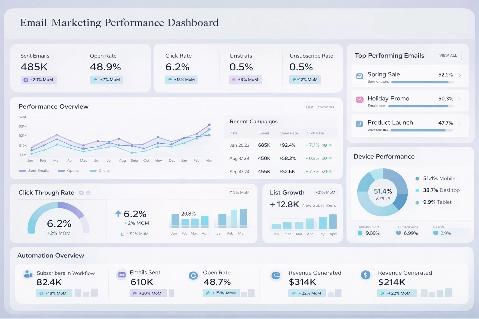
This Email Marketing Performance dashboard combines delivery, engagement, and conversion metrics to give marketing teams a holistic view of campaign health. Aggregated KPIs show open and click-through rates, bounce rates, and unsubscribes while cohort analyses reveal how segments perform over time. The visualizations include funnel conversion charts and revenue-attribution widgets that link campaign activities to pipeline outcomes. Marketers can segment by audience, offer type, and timing to identify high-value patterns and execute A/B tests. Anomaly detection flags sudden drops in engagement or spikes in bounces, enabling prompt investigation. The dashboard is built for iterative optimization: measure, test, and refine messaging to steadily improve campaign ROI and subscriber quality.
Emergency Medical Services
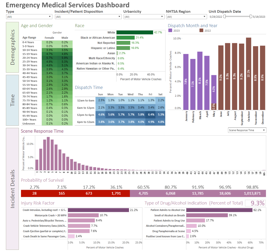
The Emergency Medical Services dashboard surfaces critical operational metrics such as response times, unit availability, and incident severity, enabling dispatchers and clinical managers to make faster, data-driven decisions. A live map overlays active incidents, resource locations, and hospital statuses to guide dynamic routing and destination choices. Historical trend charts highlight seasonal patterns and regional hotspots, helping planners allocate staffing and assets more effectively. Integration with quality metrics ensures that patient outcomes and handoff delays are also visible, supporting continuous improvement initiatives. The dashboard’s alerting features notify teams when response performance degrades below targets so corrective action can be taken immediately.
Data Governance Overview
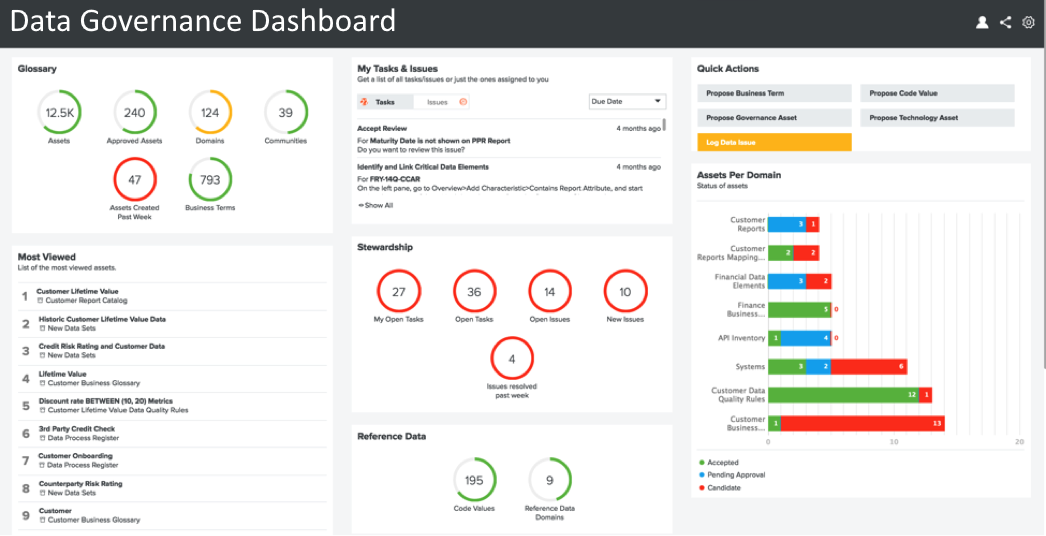
The Data Governance dashboard provides stakeholders with visibility into data lineage, stewardship assignments, and policy compliance across the enterprise. It combines metadata inventories with usage metrics so governance teams can see where critical assets are used and whether governance policies are being followed. Interactive lineage views trace transformations and data flows between systems, helping auditors and stewards validate data quality and provenance. The dashboard also tracks training completion and stewardship tickets so organizations can measure governance program maturity and prioritize remediation activities where they will have the greatest impact.
Data Protection Controls
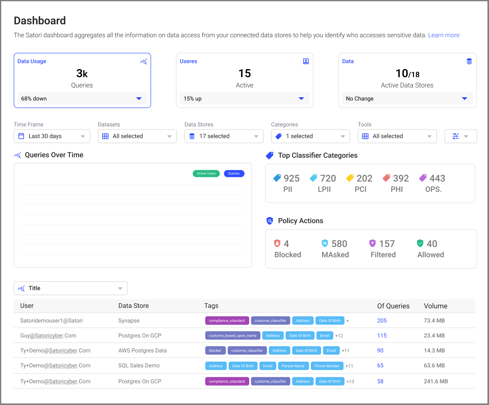
This Data Protection dashboard focuses on controls and remediation status: encryption coverage, access reviews, and recent remediations. Security teams use the dashboard to track outstanding high-priority tickets and confirm that encryption and masking policies are enforced across sensitive datasets. Compliance tiles summarize audit findings, showing which datasets or systems need immediate attention. The integrated timeline helps teams correlate policy changes with improvements in protection posture, enabling measurement of control effectiveness over time.
Data Risk Analytics
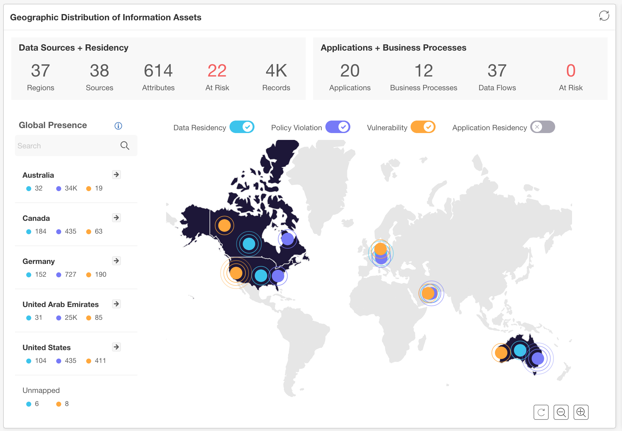
Data Risk Analytics combines vulnerability, access, and sensitivity signals into a unified risk score for datasets and systems. Analysts can slice risk by business unit, technology stack, or geography to find concentrated exposure. The dashboard includes prioritization recommendations that factor in business criticality and exploitability, helping security teams sequence remediation efforts to reduce aggregate risk faster. Visual trend lines reveal whether risk is improving after patching or control changes, closing the loop between remediation activity and measurable risk reduction.