Interactive Visualization Gallery
Click on an image to demo an interactive visualization. These interactive dashboards allow you to get a feel for how easy it to use InetSoft's visualization software.
Call Center Rep Dashboard
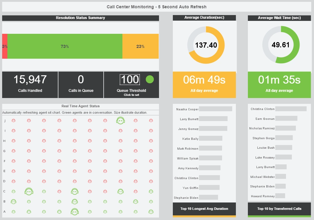
This interactive dashboard helps call center managers supervise their customer service reps. An agent status chart shows, in real time, who is on the phone and for how long.
Multi-dimensional Analysis
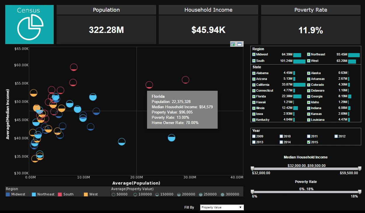
This multidimensional analysis of United States census data uses fill and color to add two extra dimensions to it's main chart. A drop down list with 5 different measures to plot by fill adds another level of interactivity.
Real Estate Dev Dashboard
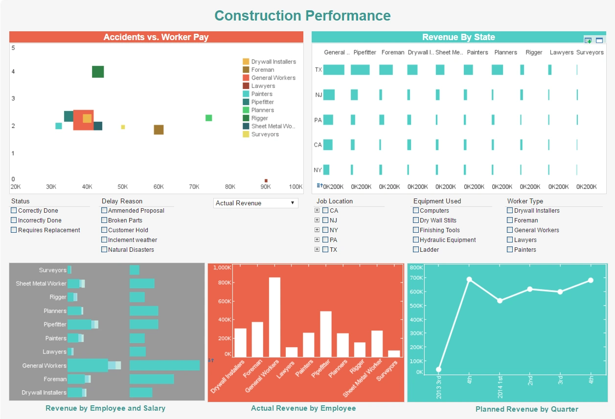
This dashboard gives property developers an overview of construction projects, including costs, timeliness, and worker safety. Drildown buttons on the Revenue by Quarter chart enables the user to pinpoint periods of high and low activity.
Airport Status Visualization
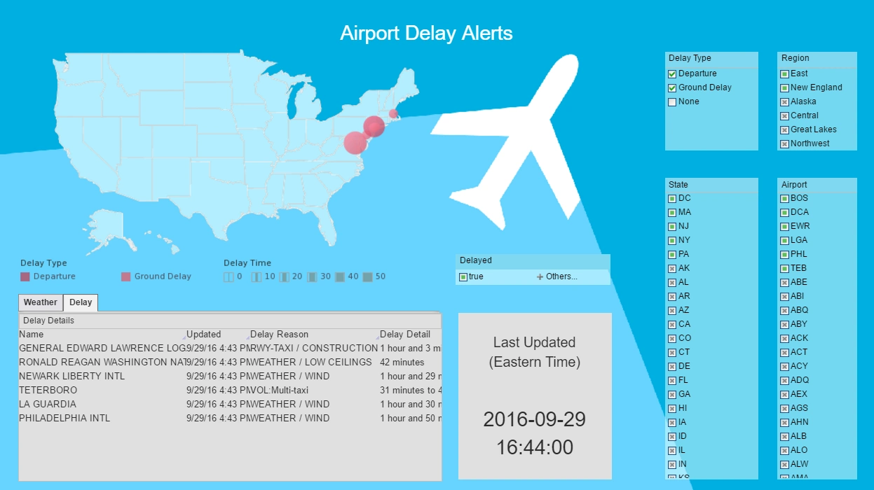
This airport status visualization pulls in live flight and weather daya in real-time. Interactive selection lists range all the way from general region to specific airport, allowing the user to view the data as granularly as they would like.
Medical Office Visualization
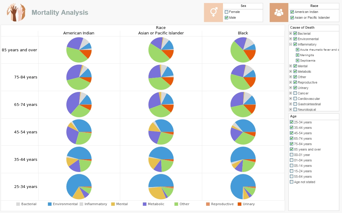
This medical office visualization displays the most common mortality causes by various demographics, including race, age, and sex. Interactive filters for all of these attributes allow providers to zero in on the top risk factors for their particular patients.
Weather Map Visualization
This weather map visualization tracks the path of hurricanes over 25 years. Having two identical map charts side by side, with independent interactivity, makes it easy to compare one year to another.
Efficiency Analysis
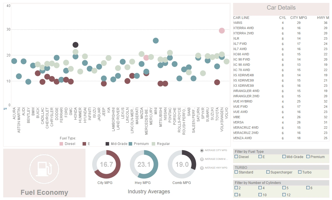
This visualization displaying the fuel efficiancy of various vehicles once again displays the utility of having color as an extra dimension. A radio button changes the means by which efficiency is measured, enabling a simpler, clearer dashboard layout.
World Freedom Visualization
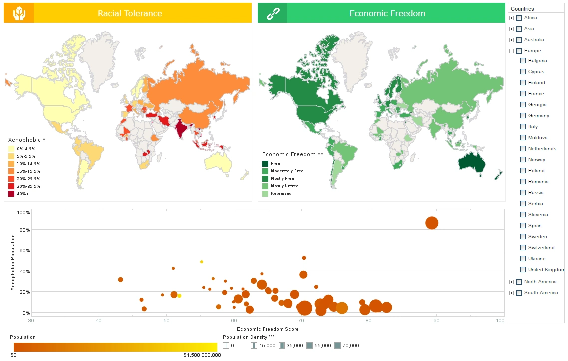
This interactive visualization comparing tolerance with economic freedom combines the best of both world by using both map charts and a multidimensional bubble chart. The addition of color and sizing on the bubble charts results in a total of four measures displayed in a single chart, allowing complex sociological patterns to be explored.
OLAP Visualization
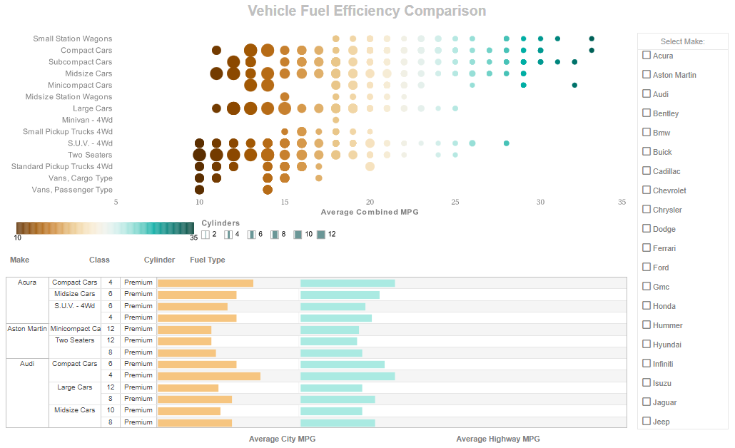
This alternate version of the fuel efficiency analysis highlights how bar chart elements can be incorporated into tables. This crosstab table displays the individual vehicles efficiency ratings sorted neatly in a hierarchy of brand, style, number of cylinders, and fuel type.
Grant Analysis Dashboard
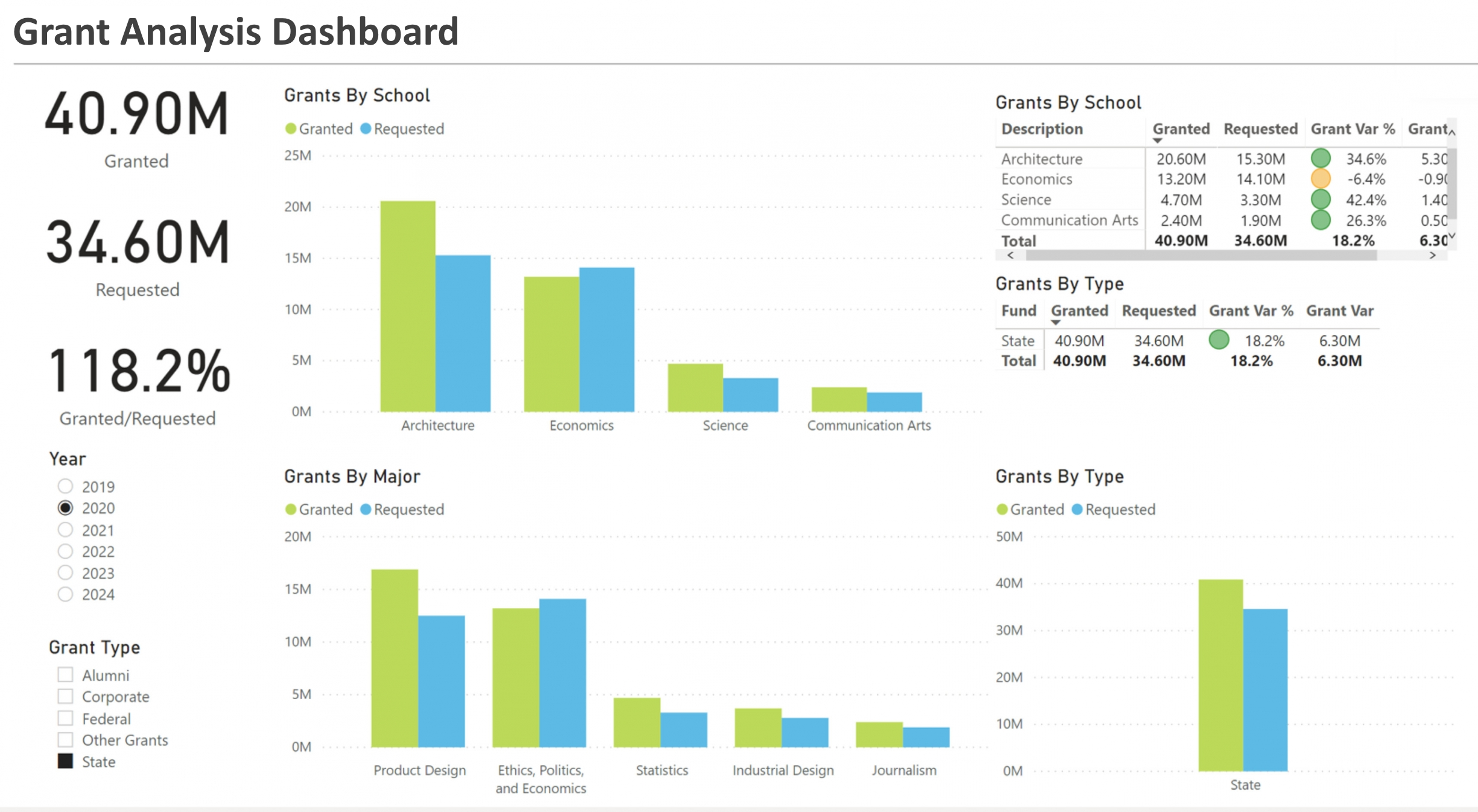
This grant analysis dashboard brings together multiple funding sources, award timelines, and project performance indicators to give program managers a clear, unified view of grant activity. Interactive visualizations enable users to filter by funder, fiscal year, program area, and stage of completion so they can quickly identify which awards are underspent, which projects are at risk of missed milestones, and where opportunities exist to reallocate resources. Time-series charts highlight trends in award velocity and burn-rate, while geographic maps show regional concentrations of funded projects. Built-in storyboards and annotation tools let analysts capture insights and share contextual notes with stakeholders. The dashboard also includes exportable data tables and configurable alerts to notify teams when spending thresholds or schedule slippages occur, helping organizations maintain compliance and optimize impact.
Emergency Management Dashboard
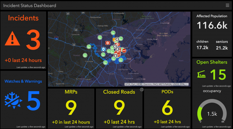
This emergency management dashboard is designed to support rapid decision-making during incidents by aggregating real-time feeds, resource inventories, and incident reports into a single interactive workspace. Operators can monitor event timelines, shelter capacities, response team locations, and supply levels with geospatial overlays and live markers. Filtering and drill-downs allow users to focus on the most critical neighborhoods or infrastructure nodes, while heatmaps surface hotspots of calls or impact. Built-in runbooks and scenario toggles let planners simulate resource reallocation and evaluate the effects on response times and coverage. With configurable dashboards for operations, logistics, and public information, this tool helps coordinate multi-agency responses and keep stakeholders informed through exportable summaries and visual briefings.
Financial Advisor Dashboard
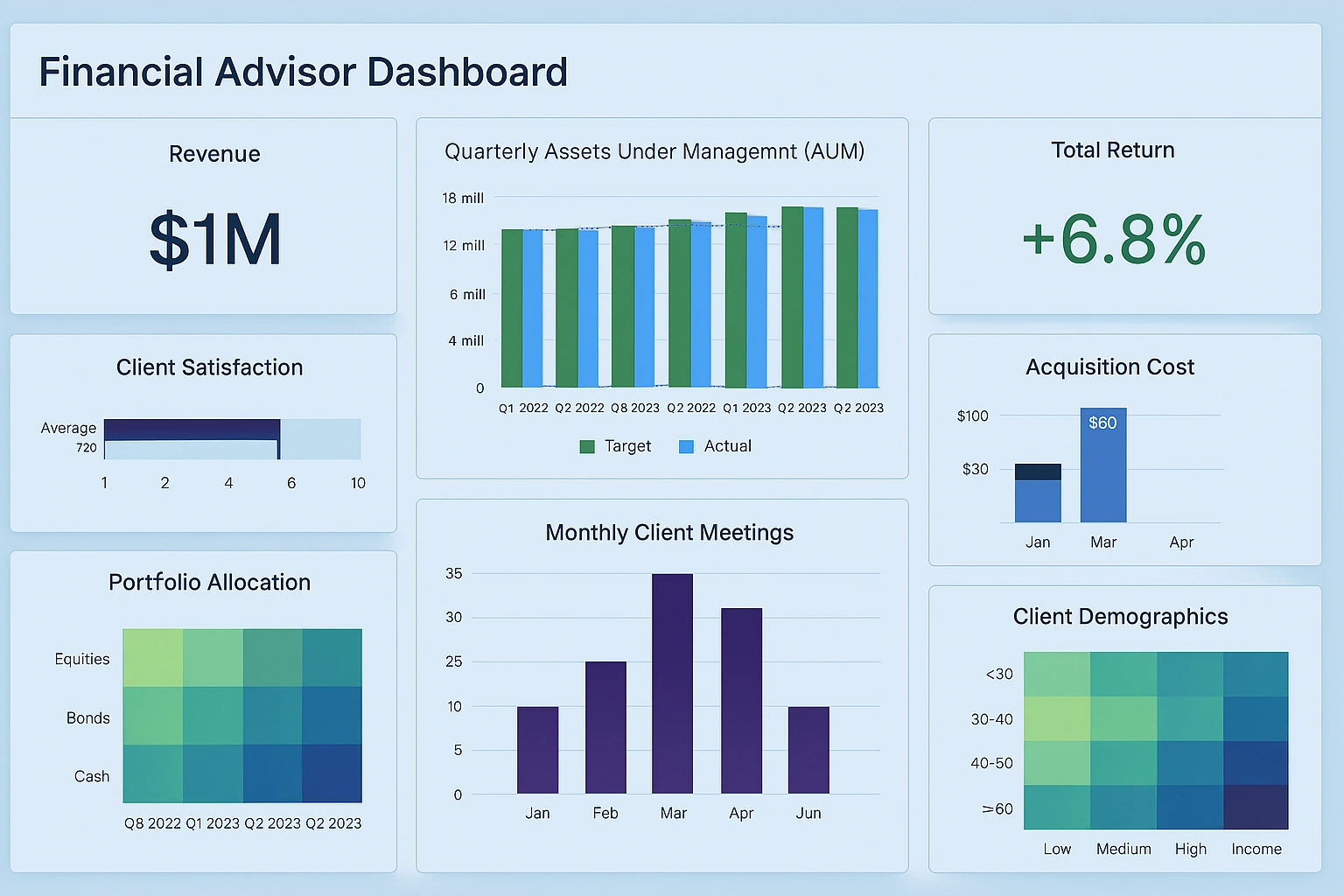
This financial advisor dashboard consolidates client holdings, performance attribution, and risk metrics into an intuitive interface that supports portfolio reviews and scenario planning. Advisors can interactively compare asset classes, visualize exposures, and model rebalancing strategies to show clients potential outcomes. The dashboard surfaces P&L drivers, contribution by sector, and holdings-level details while providing client-level KPIs such as target allocation divergence and tax impact estimates. Integrated commentary panels and snapshot exports make it easy to create personalized reports for meetings, and the drill-through capability lets advisors move from high-level performance charts to transaction-level detail without leaving the dashboard, improving both transparency and client trust.
Heavy Civil Construction Dashboard
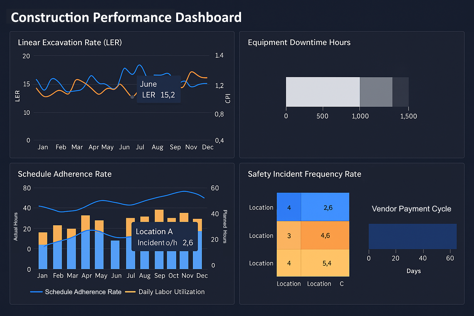
This heavy civil construction dashboard brings project schedules, cost-to-complete forecasts, equipment utilization, and safety metrics into one actionable view for construction managers and owners. Gantt-style visualizations show critical path activities and float, while overlays of actual versus planned costs reveal where projects are trending over budget. Equipment and crew dashboards enable rapid decisions on shifting resources between sites to avoid delays, and embedded QA/safety indicators help identify sites that require immediate attention. Interactive filters let users compare portfolios, assess contractor performance, and produce executive-ready summaries that highlight risks, contingencies, and opportunities to accelerate milestones.
Home Health Provider Dashboard
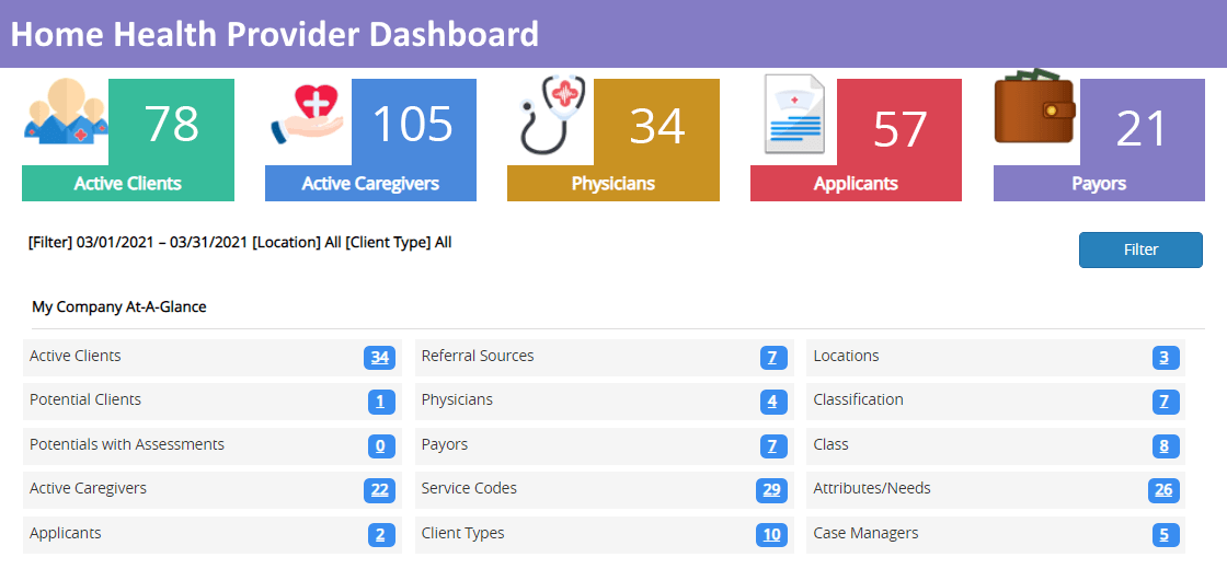
This home health provider dashboard focuses on patient outcomes, visit adherence, and workforce scheduling to improve care delivery and operational efficiency. Clinicians and managers can monitor patient risk scores, visit completion rates, and medication adherence with visual cues and cohort filters. Route and schedule optimization views minimize travel time between visits while balancing clinician workload, and patient-level drill-downs reveal specific care gaps that need intervention. Quality measures and payer-specific reporting are integrated to support compliance and reimbursement workflows, and the dashboard supports care transitions with handoff summaries and exportable care plans.
Homebuilder Production Scheduling Dashboard
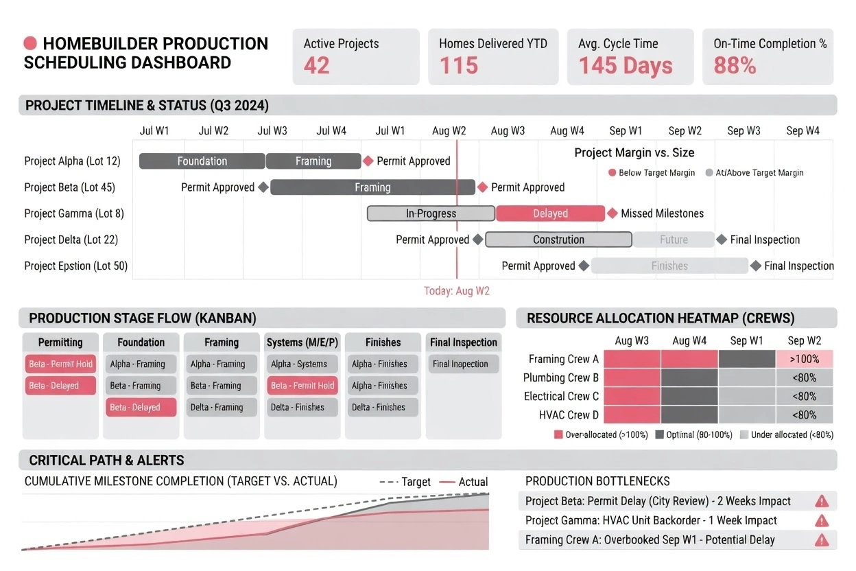
This production scheduling dashboard for homebuilders helps planners manage lot schedules, subcontractor assignments, supply chain readiness, and handover dates across communities. Visual timelines and traffic- light indicators surface build stage bottlenecks and materials lead-time risks, while capacity views allow managers to balance multiple production lines. Interactive scenario tools let teams model the impact of shifting subcontractor crews or adjusting milestone targets, and integrated procurement status flags show whether key materials are on schedule. The dashboard enables better coordination between sales, construction, and warranty teams, reducing cycle times and improving customer satisfaction.