Top Reporting Software Examples
Are you searching for the top reporting software examples? InetSoft provides examples from its highly-rated, easy to use dashboard reporting software.
Digital Experience Dashboard
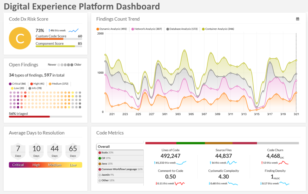
The Digital Experience Dashboard brings together customer engagement metrics, session paths, and conversion funnels into a single, interactive view so analysts can understand how users move through a product or website. Behavioral cohorts can be selected to compare retention curves, while heatmaps and click-density overlays reveal friction points in the interface. Time-based trend charts expose how changes to content or campaigns affect key engagement metrics, and segmentation controls let teams analyze specific audience slices by geography, device, or acquisition channel. Exportable snapshots and annotation features allow teams to capture hypotheses and hand them off to product owners or UX teams for quick iteration. Configurable alerting completes the loop by notifying stakeholders when experience KPIs fall outside acceptable bounds.
Digital Observability Dashboard
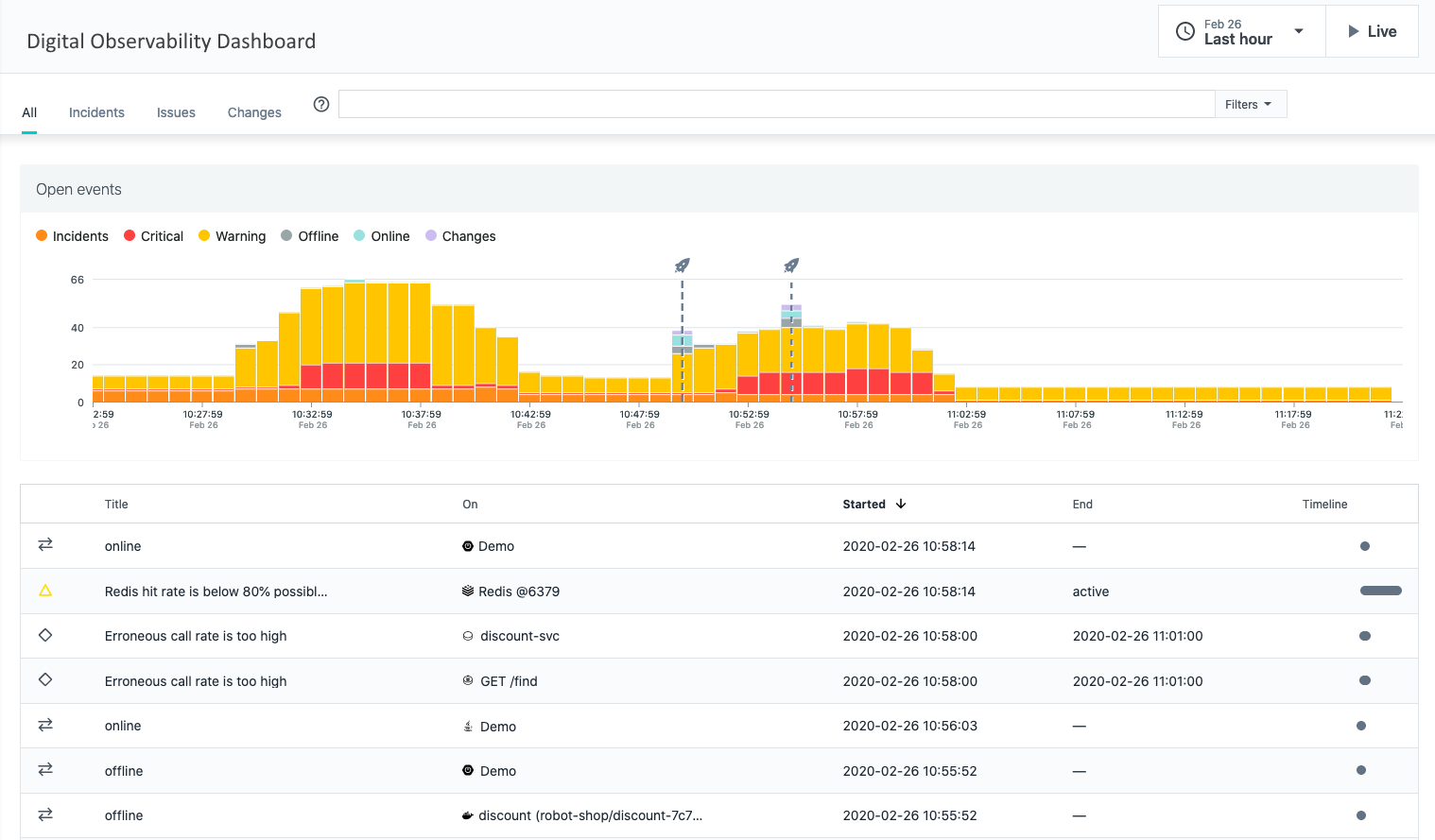
The Digital Observability Dashboard correlates telemetry from frontend, backend, and CDN services to give operations and SRE teams a unified view of user-impacting issues. Throughput, error rates, and latency metrics are displayed alongside real user monitoring (RUM) samples so teams can quickly map performance degradations to code deploys or configuration changes. Interactive filtering by service, region, and time window enables root-cause exploration, while anomaly detection highlights unusual patterns that warrant investigation. The dashboard also surfaces capacity pressures and resource saturation signals, supporting both immediate incident response and longer-term capacity planning conversations.
Emergency Room Dashboard
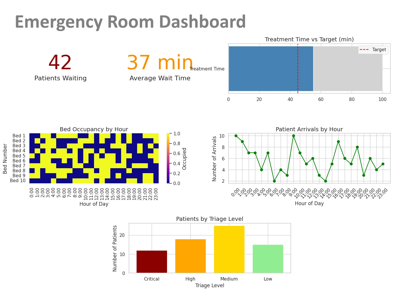
This Emergency Room Dashboard aggregates patient flow, triage levels, and bed availability to help clinical leaders manage throughput and prioritize care. Real-time visuals show arrival rates, average wait times, and clinician workload, enabling rapid reallocation of staff and rooms when bottlenecks are identified. Drill-downs reveal case-mix by acuity and expected length-of-stay, supporting decisions about transfer, admission, or expedited discharges. Integrations with bed management and scheduling systems provide situational awareness across the hospital, while predictive indicators estimate near-term crowding risk so administrators can proactively deploy surge plans and keep patient safety metrics within targets.
Endpoint Protection Dashboard
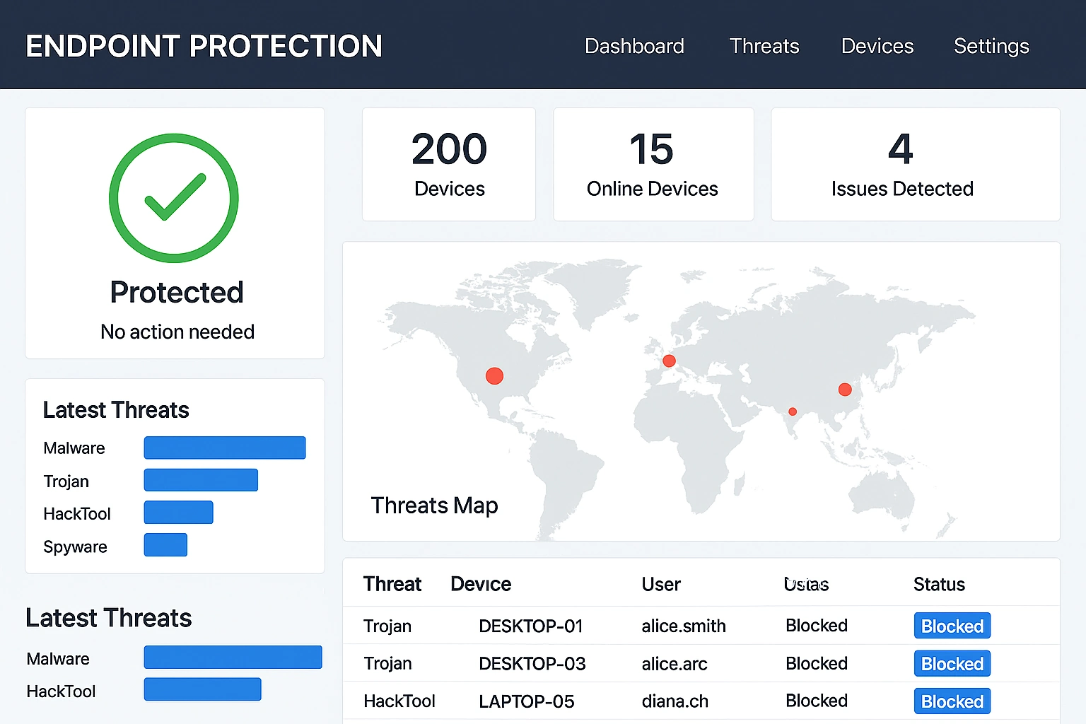
The Endpoint Protection Dashboard centralizes threat telemetry, patch status, and device posture to give security operations teams a concise view of enterprise risk. Aggregate threat counts and incident timelines are shown with device-level drill-throughs, enabling analysts to quickly scope outbreaks and contain compromised endpoints. Compliance heatmaps indicate which business units are overdue for critical updates, and integration with ticketing systems allows incidents to be tracked through remediation workflows. The dashboard supports prioritization by risk score so teams can focus on high-impact vulnerabilities and automate containment actions where possible.
Facebook Ads Dashboard
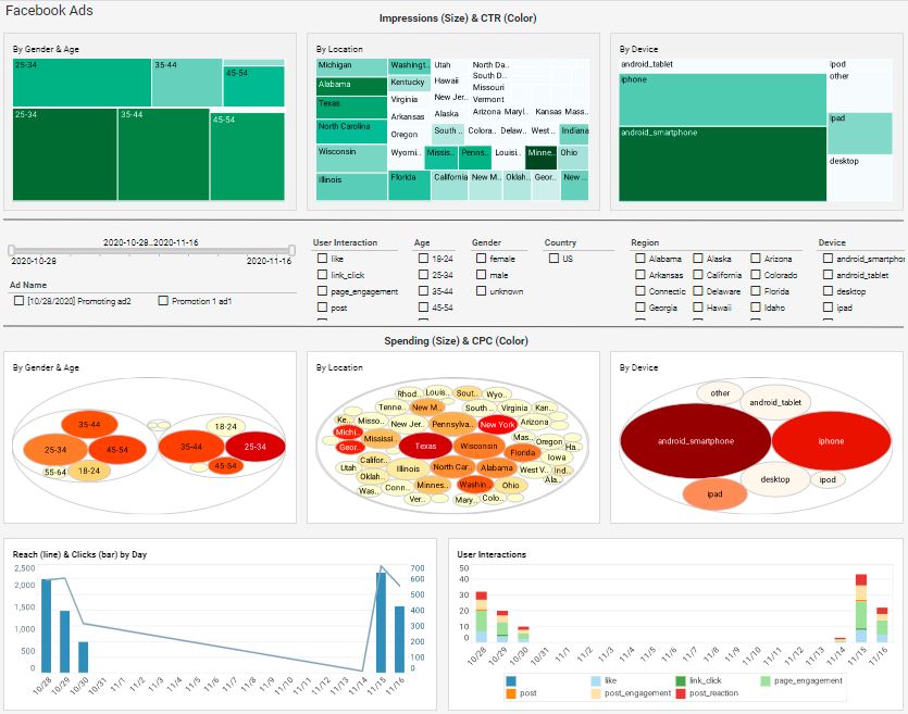
The Facebook Ads Dashboard brings campaign spend, engagement, and conversion metrics into a single workspace so marketers can optimize ROI across ad sets and creative variants. Time-series charts show spend velocity and cost-per-action trends, while attribution overlays allow teams to compare lift across channels. Audience segmentation tools enable comparisons of creative resonance by demographic or interest cluster, and the dashboard supports budget pacing alerts to prevent overspend. Exportable summary reports make it easy to present campaign performance to stakeholders and iterate quickly on creative or targeting strategies.
Global Network Performance Dashboard
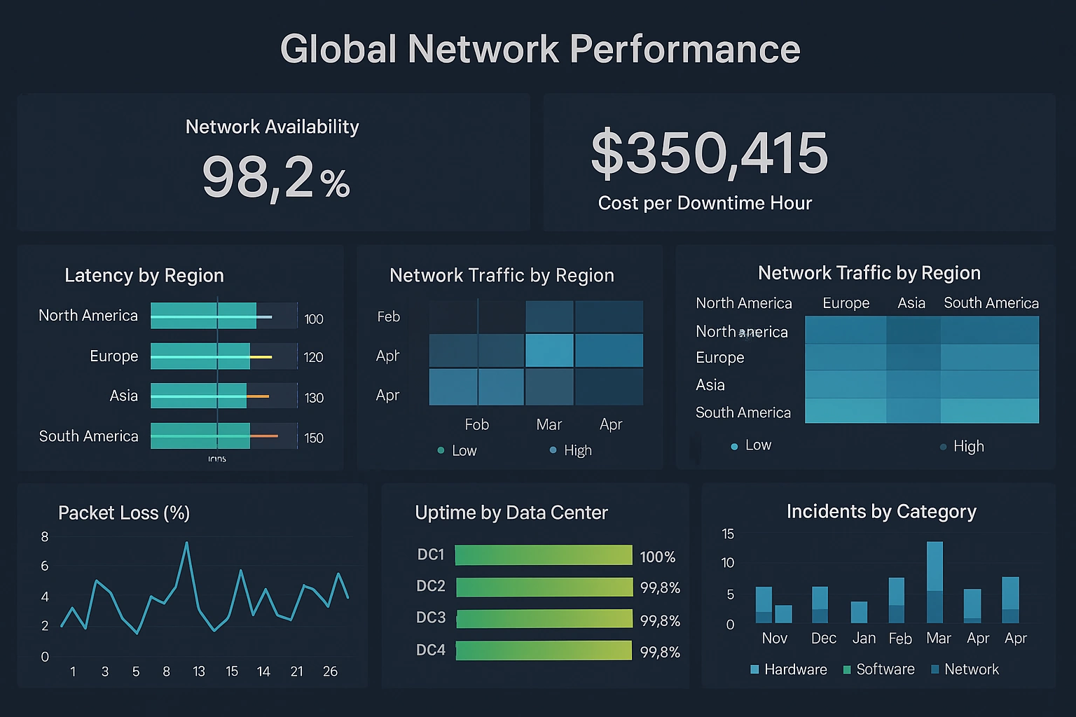
The Global Network Performance Dashboard visualizes latency, packet loss, and throughput across points of presence so network engineers can identify regional degradations and route around congestion. A world map highlights affected nodes and interactive drill-downs show hop-by-hop metrics for problematic paths. Time series and SLA-trend charts enable teams to measure provider performance and correlate incidents with maintenance windows or configuration changes. The dashboard is useful for both tactical incident response and strategic peering and capacity decisions.
Supply Chain Reporting
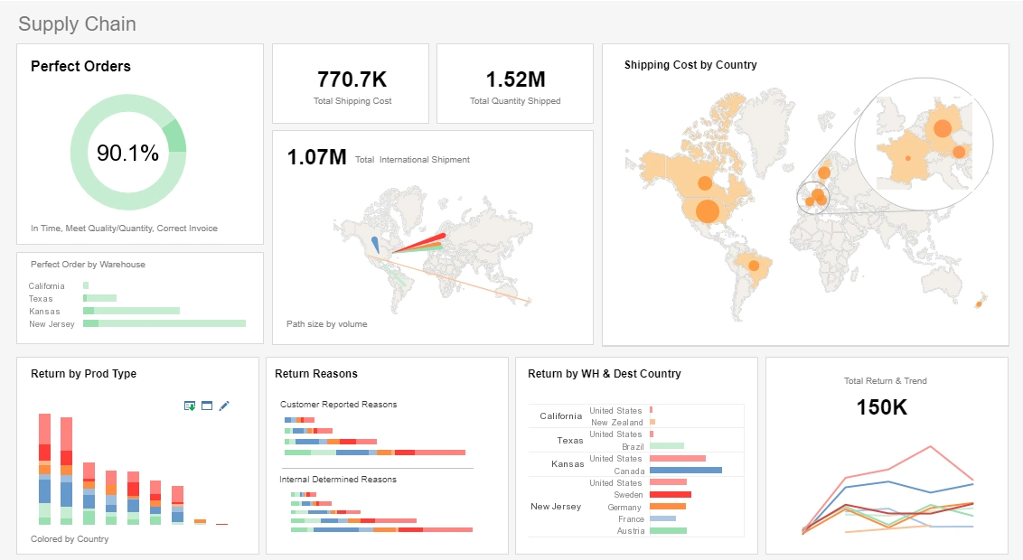
This supply chain reporting example delivers the most important global shipping aggregates in one easy-to-read report. A spotlight effect on one of the map charts highlights the location of some of the biggest shipment locations.
Utility Reporting
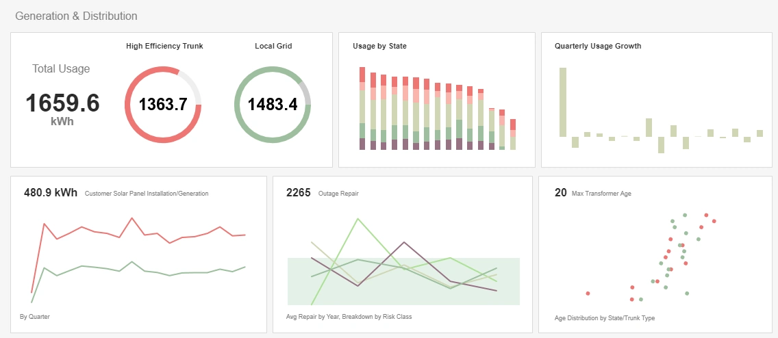
This utility report gives updates on power usage as well as various maintenance priorities that concern anyone maintaining a power grid. Color is used to visualize extra dimensions throughout, enabling more to be reported on less charts.
Manufacturing Reporting
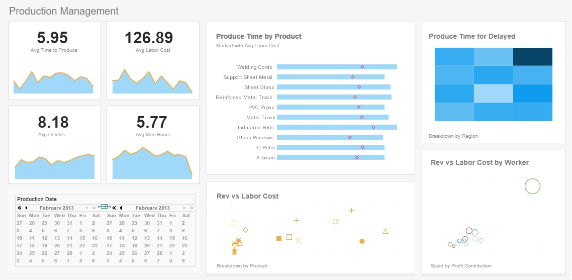
This interactive manufacturing report example gives an overview of production times, costs, and errors. The Produce Time by Product chart compares production times for each product to set benchmarks, helping managers to assess performance at-a-glance.
Marketing Reporting
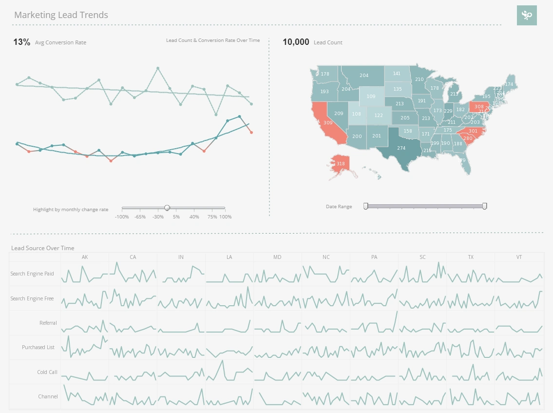
This marketing lead report displays important aspects of the sales funnel, by displaying leads by source, state and date. Both top charts include a highlight feature based on monthly change rate, whose threshold can be adjusted using a slider.
Commerce Reporting
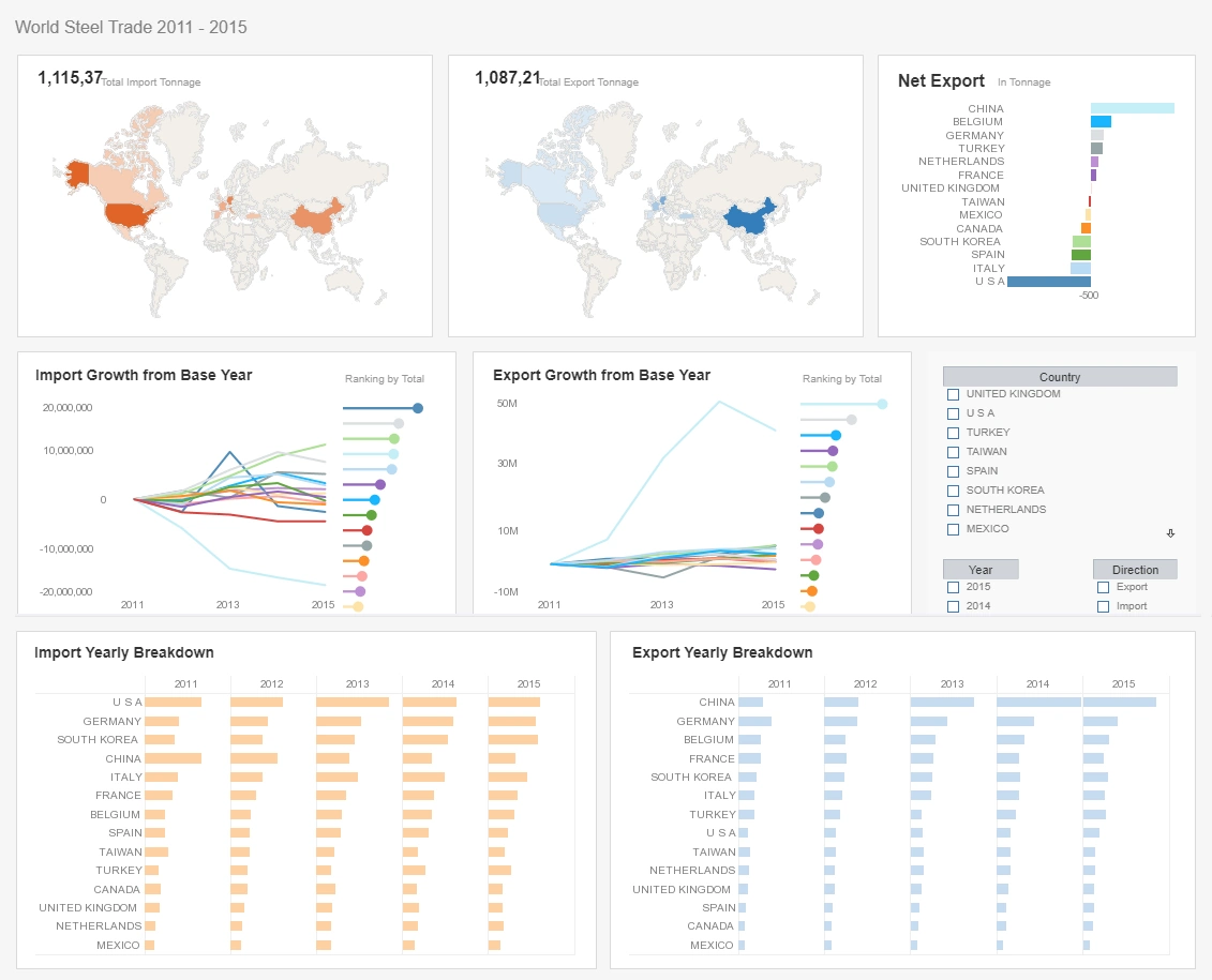
This commerce reporting example paints a detailed picture of global imports and exports, with seven different charts, three of them multidimensional. With so many countries displayed, narrowing down the analysis with a selection checklist can make analysis exponentially easier for the end-user.
Machine Learning Reporting
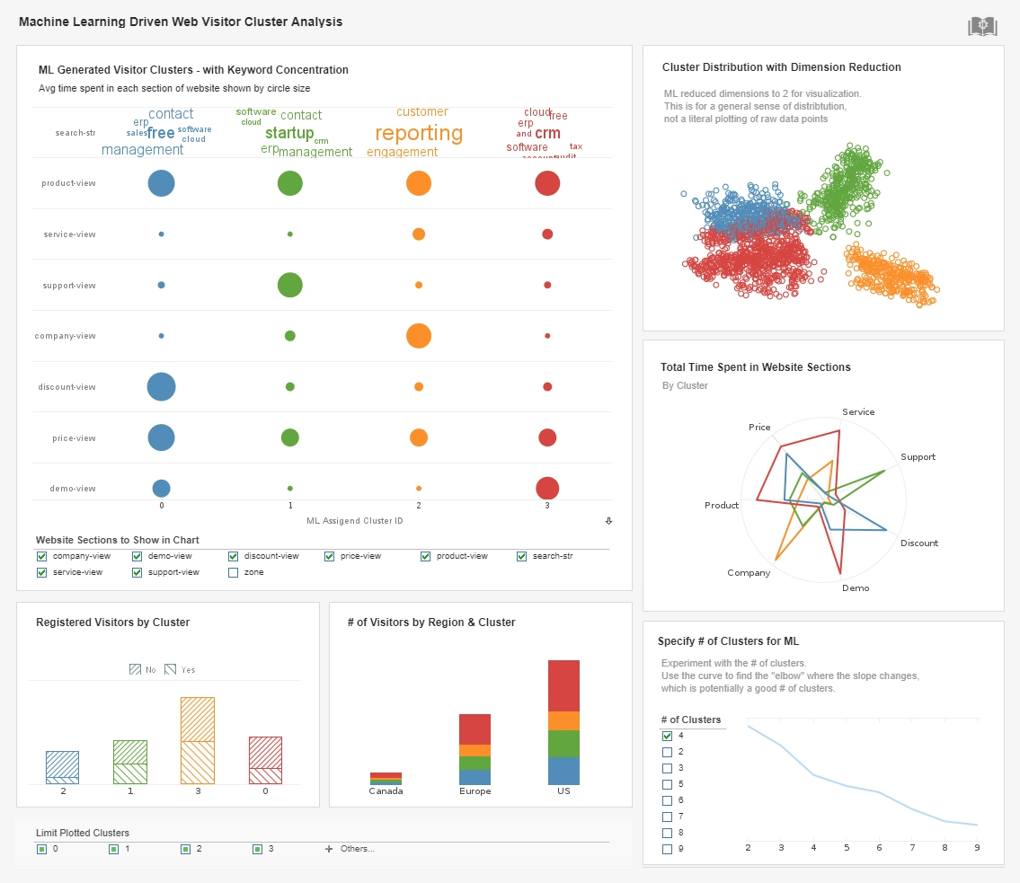
This machine learning driven report breaks website traffic down into different clusters based on keywords, website section and region. The option to change the number of clusters analyzed by the intelligent algorithm aids in human analysis.
Automated Reporting
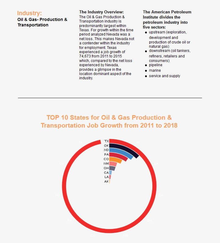
This oil and gas report combines a chart with text description of the findings. A spiral chart is used to depict the top ten oil and gas producing states.
Production Reporting
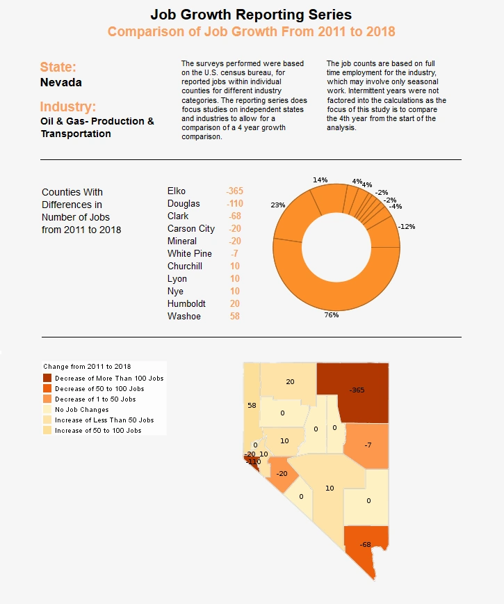
Financial Reporting
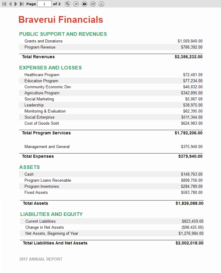
This more traditional financial report relies entirely on tables instead of charts. The report consistsu of aggregates, and aggregates of aggregates.