Best Dashboard Creator for Enterprises in 2026
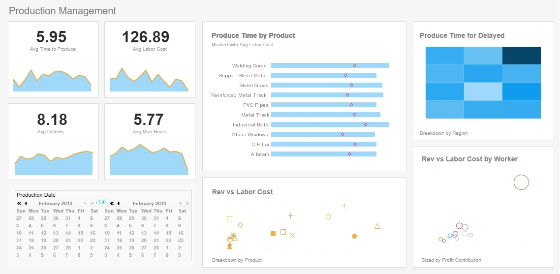
A dashboard creator is a software tool that enables users to build interactive, visual summaries of their data using charts, tables, KPIs, and filters. It provides a guided environment where both non‑technical users and data professionals can transform raw information into clear, actionable insights.
Core Purpose
The primary purpose of a dashboard creator is to make data easier to understand and explore. It helps organizations monitor performance, identify trends, and make decisions based on real‑time or historical information.
Who Uses Dashboard Creators?
- Business users who need simple, drag‑and‑drop reporting
- Data analysts who require deeper modeling and mashup capabilities
- Executives who rely on KPI scorecards and high‑level summaries
- Developers embedding dashboards into applications

Key Capabilities
- Drag‑and‑drop visual design
- Data blending and mashup across multiple sources
- Interactive filtering, drill‑down, and drill‑through
- Real‑time monitoring and alerts
- Sharing, exporting, and embedding options
InetSoft’s dashboard creator combines ease of use for beginners with advanced modeling features for technical users, making it suitable for both self‑service analytics and governed enterprise reporting.
InetSoft's Easy Dashboard Design
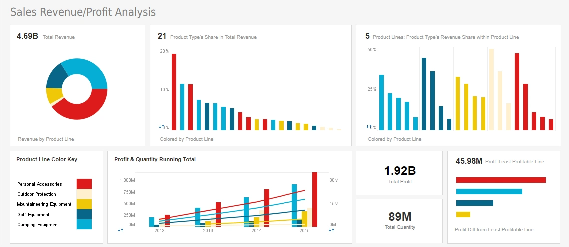
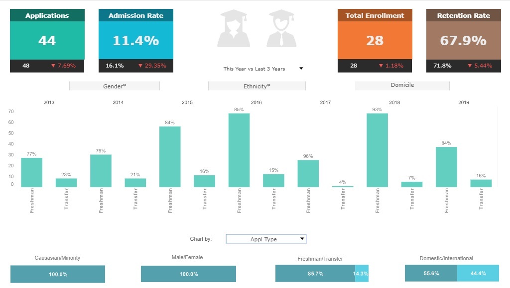
InetSoft's dashboard creator is flexible; it offers a simple drag-and-drop interface for less technically inclined users as well as complex scripting capabilities for IT and programmers. Because of this malleability, the tool's applications can be quite varied.
StyleBI, InetSoft's all encompassing business intelligence suite, gives every day uses the power to create highly interactive viewsheets with little to no knowledge of the code that makes them tick. The system uses a series of charts, gauges, selection boxes, and various other elements to create professional monitoring tools in minutes.
Each element has multiple forms, allowing users to differentiate the look of each display quite heavily. In fact, it would be possible to create the same dashboard under the hood with countless different visual representations.
InetSoft as a Dashboard Leader
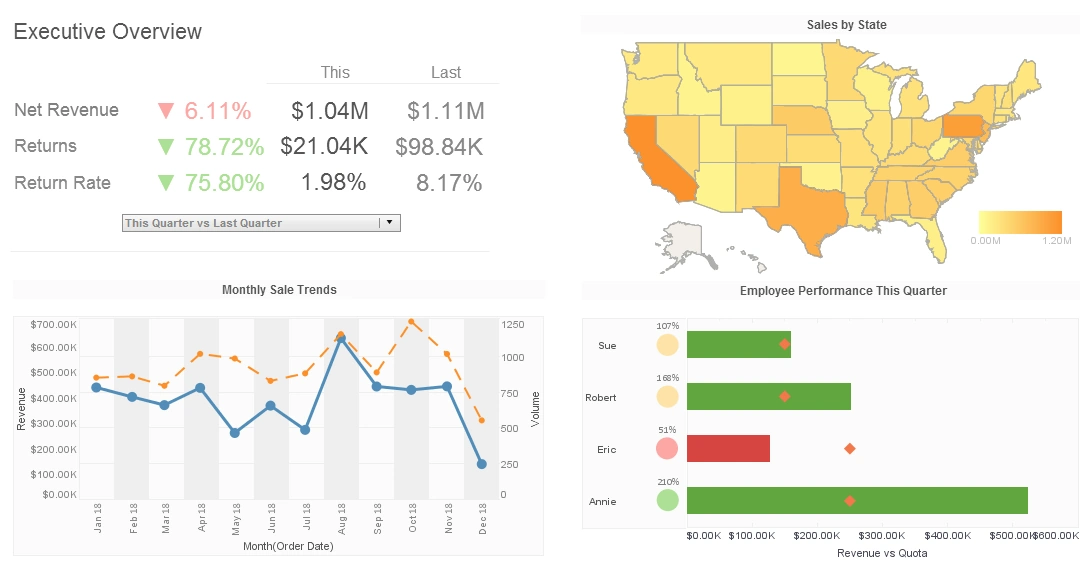
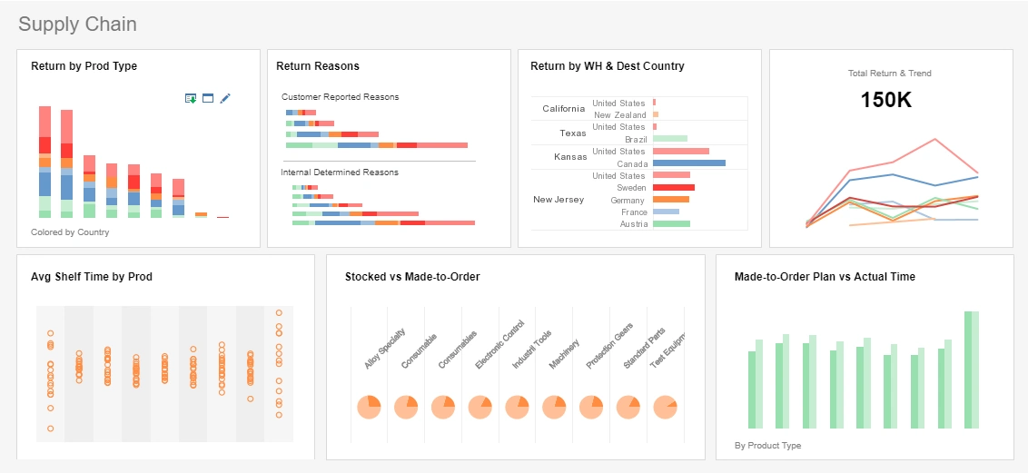
Interactive Executive Dashboards
InetSoft's dashboard software uses a visualization-driven approach to enable rapid deployment of self-service business dashboards. They are business user-driven and offer strong analytic functions. The key advantages are:
- Monitor, explore, and analyze and drilldown into details
- Easy to use, modify, and create
- Leverage user-driven data mashup
- Suitable for executive dashboards and power-user exploration
Scorecards for Performance Management
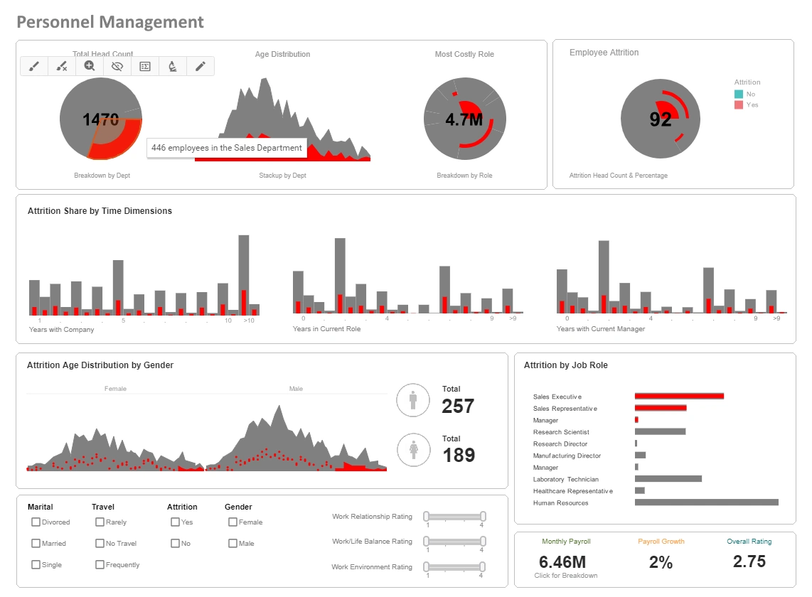
As in all performance management software applications, scorecards are a well-defined method for monitoring, measuring, and managing performance by tracking metrics. The InetSoft Scorecard consists of a list of key performance indicators (KPIs) that compare current performance data against goals, quotas, and target trends. The scorecard also incorporates information on what action to take if the specified goals are not met. The key advantages are the added capacities for:
- Exception-based management
- Actionable business intelligence
- Exception alerts for associated KPI
Scorecards are an optimal solution for tracking dashboard metrics, centralizing all the KPIs that would be included in a business or executive dashboard.
What Makes A Dashboard Creator Good?
A good dashboard creator is like the Swiss Army knife of data tools—it combines power, flexibility, clarity, and usability in one package. The best ones aren't just about slapping some charts on a screen; they tell stories, guide decisions, and adapt to the needs of different users. Here's a deeper dive into what makes a dashboard creator genuinely good:
1. User-Centric Design & UX
The best dashboard tools are built with the end-user in mind. This means:
- Intuitive Interface: Even non-technical users should be able to drag-and-drop widgets, filters, and visualizations easily.
- Responsiveness: It should work seamlessly across devices—desktop, tablet, and mobile.
- Customization: Users should be able to personalize views without needing a dev team every time.
- Role-Based Access: Different users (execs, analysts, field reps) see different levels of detail based on their role.
2. Strong Data Integration Capabilities
- Wide Connectivity: A good dashboard tool should pull data from databases (SQL, NoSQL), cloud services (AWS, Google Cloud, Salesforce), APIs, Excel sheets, etc.
- Real-Time Data Support: For businesses that rely on up-to-the-minute data (e.g., logistics, finance), real-time streaming capabilities are essential.
- Data Blending / Mashups: Being able to combine data from multiple sources in a seamless way (like InetSoft's Data Mashup does) without requiring extensive ETL work is a big plus.
3. Powerful Visualization Engine
- Diverse Chart Types: Beyond bar and pie charts, you want scatter plots, treemaps, heatmaps, gauges, Gantt charts, geographic maps, etc.
- Interactive Features: Zooming, drill-downs, filters, clickable elements, tooltips—interactivity turns passive data into active insight.
- Conditional Formatting & Alerts: Visual cues like color changes or popups when KPIs go off-target are incredibly valuable.
4. Performance & Scalability
- Fast Loading Times: Even with large datasets, the dashboard should load quickly. Lag kills user trust and adoption.
- Scalable Architecture: Whether it's a small team or a global enterprise, the platform should scale without performance degradation.
5. Security & Governance
- Data Privacy: Especially for industries like healthcare, finance, or government, the dashboard must comply with regulations (HIPAA, GDPR, etc.).
- Granular Permissions: Control who can view, edit, or share dashboards, down to row-level security if needed.
6. Embedded Analytics & Extensibility
- Embeddability: The ability to embed dashboards into other platforms (e.g., internal portals, customer-facing apps) is key for integrated experiences.
- SDKs & APIs: A solid developer ecosystem allows teams to extend functionality, automate tasks, or build custom components.
7. Collaboration Features
- Annotations & Comments: Letting users mark up charts or leave notes for others bridges the gap between data and decision-making.
- Scheduled Reporting & Sharing: Auto-emailing reports or sharing dashboards in Slack/Teams enhances visibility.
8. Smart Features (AI/ML & NLP)
- Natural Language Queries: Tools like Power BI and ThoughtSpot let users ask questions in plain English and get visual answers—huge for accessibility.
- Predictive Analytics: Some platforms offer built-in forecasting, anomaly detection, or AI-driven insights, which can be game changers.
9. Continuous Improvement & Community
- Regular Updates: Frequent improvements show that the platform is evolving with user needs.
- Active Community & Support: A strong user community, knowledge base, and responsive support make a big difference, especially when troubleshooting.
10. Cost-Effectiveness
- Transparent Pricing: Some tools scale cost aggressively with users or data volume, which can be prohibitive.
- ROI-Driven: A good dashboard creator should save more money (or generate more value) than it costs—period.
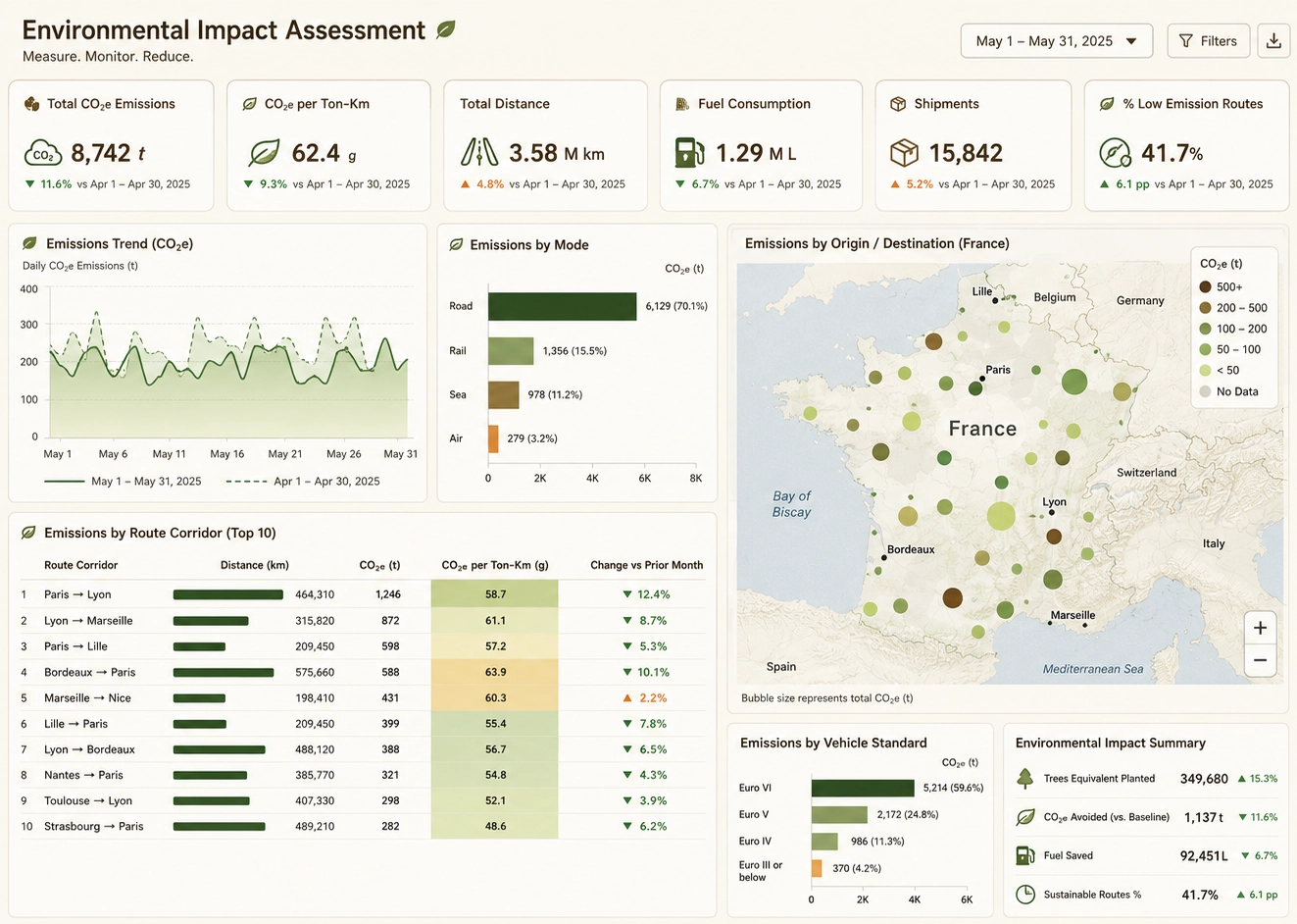
Dashboard Creator Comparison
What Enterprises Need in a Dashboard Creator
Enterprises require more than basic charting tools. They need a dashboard creator that supports governed metrics, secure data access, scalable performance, and seamless integration with enterprise data platforms. InetSoft delivers these capabilities through a flexible architecture designed for large-scale analytics deployments.
- Governed Metrics — Enterprises rely on consistent KPI definitions across departments. InetSoft’s semantic modeling ensures every dashboard uses the same trusted metrics.
- Role-Based Access — Fine-grained permissions allow administrators to control who sees what, including row-level security for sensitive financial or operational data.
- Scalability — InetSoft supports high-volume data refreshes, distributed workloads, and multi-tenant deployments suitable for global organizations.
- Data Platform Integration — Native connectivity to Snowflake, BigQuery, Databricks, SQL Server, Oracle, and REST APIs ensures dashboards are built on unified, enterprise-grade data.
- Collaboration & Versioning — Enterprises need workflow approvals, version history, and shared dashboard libraries. InetSoft provides governed collaboration across teams.
- Embedded Analytics — InetSoft’s embedding capabilities allow enterprises to deliver dashboards inside portals, SaaS products, and customer-facing applications.
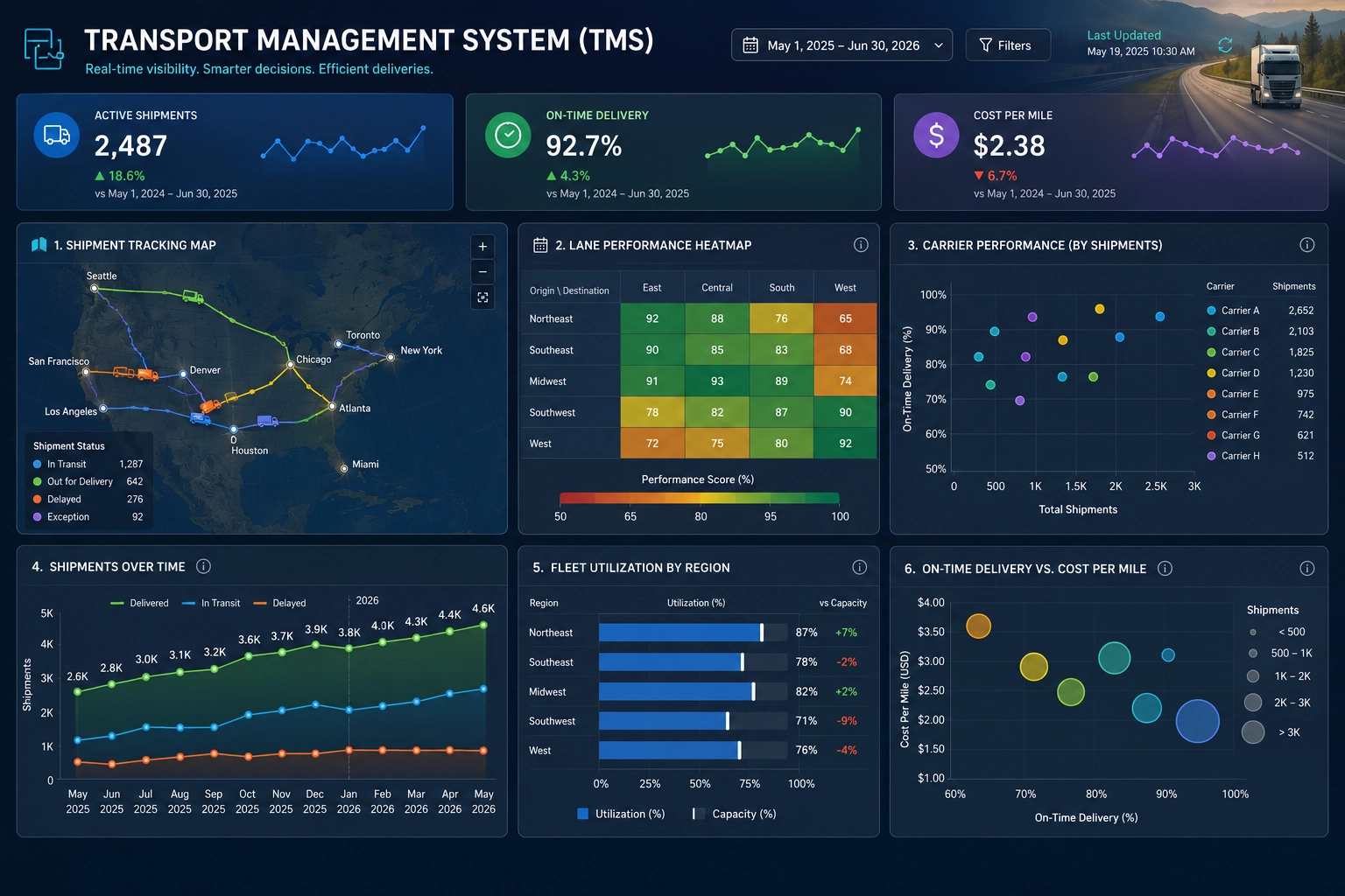
Enterprise Architecture & Scalability
Enterprise analytics environments demand a dashboard creator that can scale horizontally, integrate with modern data platforms, and support thousands of concurrent users. InetSoft’s architecture is built for these requirements, offering flexible deployment options and high-performance data processing.
Scalable Deployment Options
- Hybrid Cloud Support — Deploy InetSoft on-premise, in private cloud, or across hybrid environments without sacrificing performance or governance.
- Distributed Processing — InetSoft’s engine distributes workloads across nodes to handle large datasets and complex calculations.
- High-Volume Data Refresh — Enterprises can schedule frequent refreshes or use live connections to ensure dashboards always reflect current operational data.
Enterprise Data Platform Integration
- Warehouse-Native Models — InetSoft leverages transformations already defined in Snowflake, BigQuery, Databricks, and other enterprise warehouses.
- API & Microservices — REST and SOAP APIs allow InetSoft to integrate with enterprise applications, workflow engines, and custom data services.
- Multi-Tenant Embedding — Ideal for SaaS providers and large enterprises serving multiple business units or clients.
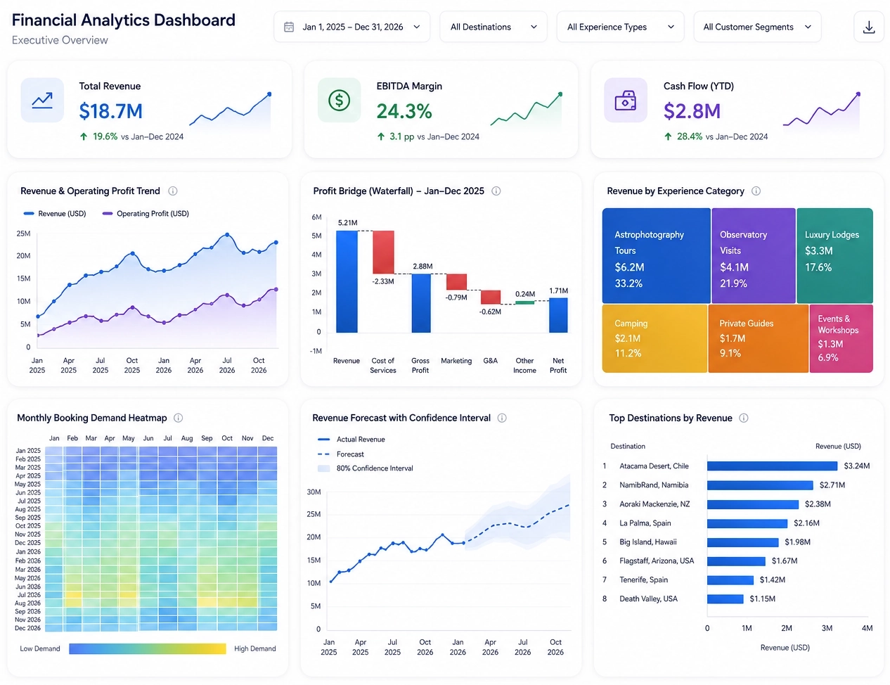
Security & Compliance for Enterprise Dashboards
Enterprise analytics requires strict security controls, compliance certifications, and governance features that protect sensitive data. InetSoft provides a robust security framework designed for regulated industries and large-scale deployments.
Enterprise Security Features
- Row-Level Security — Ensure users only see the data they are authorized to access, even within shared dashboards.
- SSO & SAML Integration — Support for enterprise identity providers including Azure AD, Okta, Ping Identity, and custom SAML configurations.
- Audit Trails — Track dashboard access, data usage, and administrative changes for compliance and governance.
- Version Control — Maintain historical versions of dashboards and data models for regulatory and operational requirements.
Compliance Support
- SOC 2 Alignment — InetSoft’s architecture supports SOC 2-aligned security practices for enterprise deployments.
- Data Residency Controls — Deploy in specific regions or environments to meet regulatory requirements.
- Encryption Standards — Support for TLS encryption in transit and secure storage options for sensitive data.
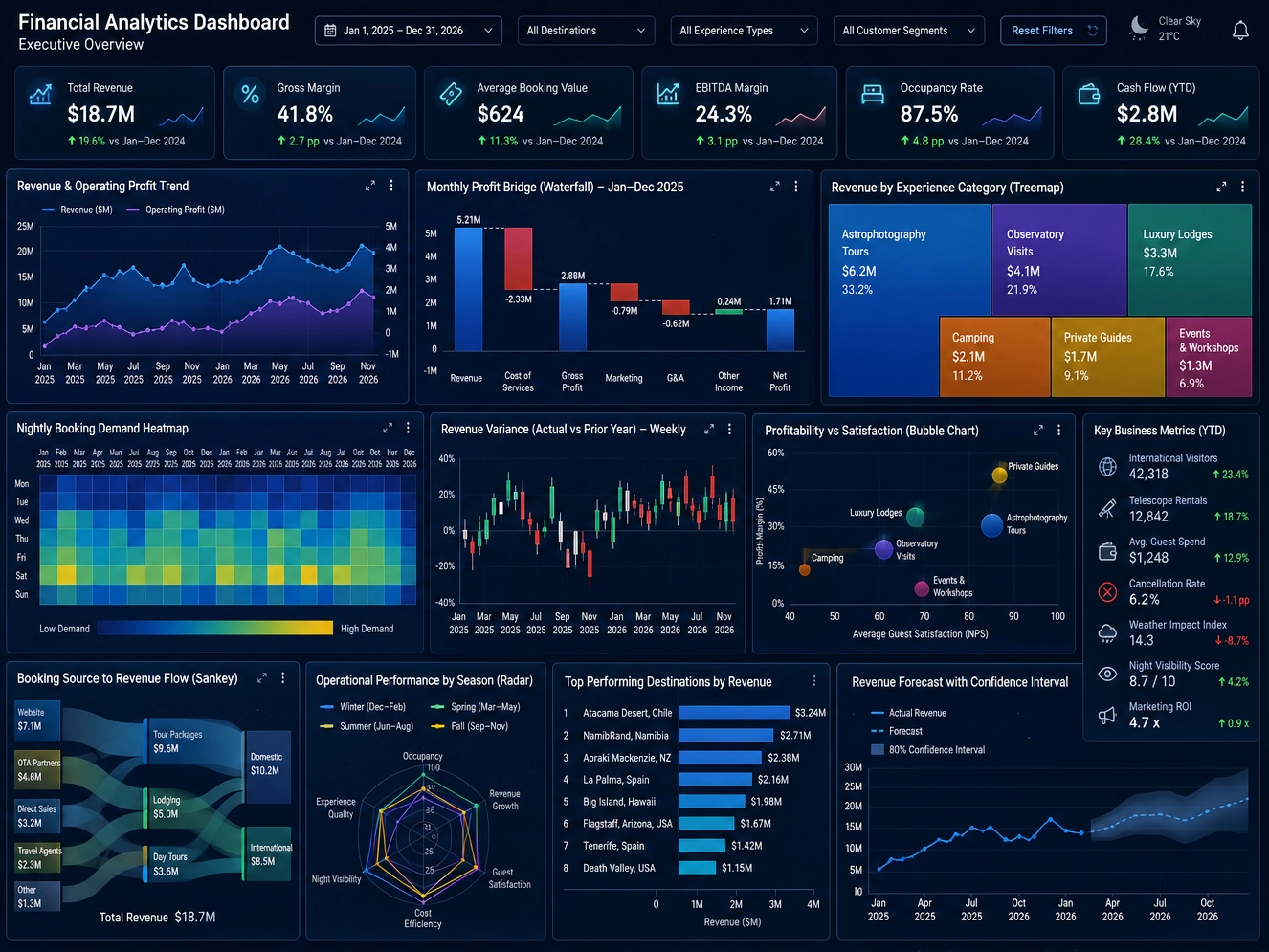
Comparison: InetSoft vs Enterprise BI Suites
Enterprises evaluating dashboard creators often compare InetSoft with platforms like Power BI, Tableau, Looker, and ThoughtSpot. The layout below highlights how InetSoft aligns with enterprise requirements while offering advantages in flexibility, embedding, and cost efficiency.
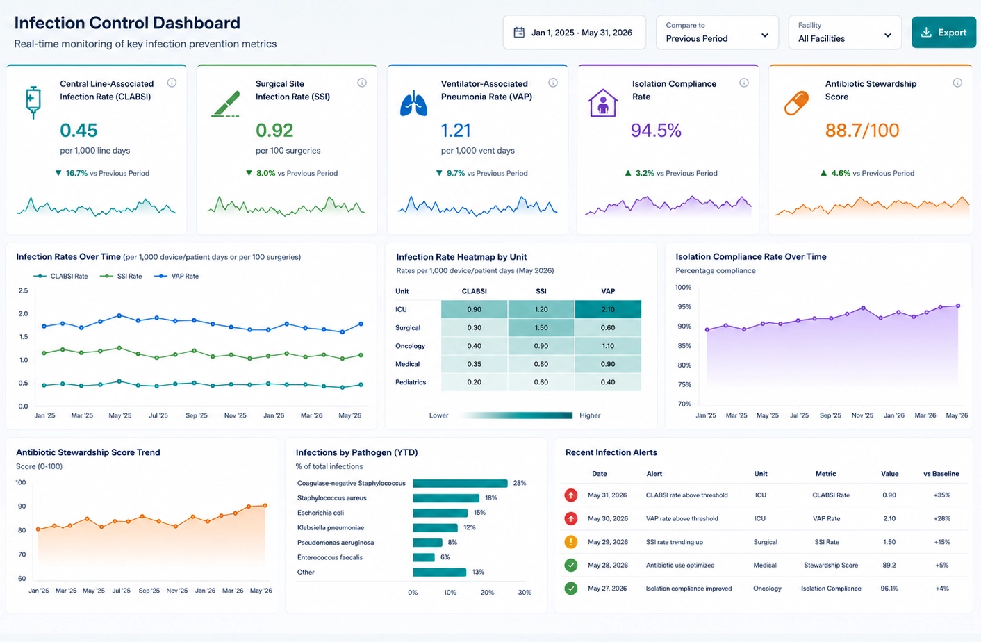
Dashboard Creator FAQ
What is a dashboard creator?
A dashboard creator is a software tool that lets users build interactive visual dashboards using charts, tables, KPIs, and filters. It helps turn raw data into clear insights for monitoring and decision-making.
Who should use a dashboard creator?
Dashboard creators are used by business users, analysts, executives, and developers who need to explore data, track performance, or embed dashboards into applications.
What makes InetSoft different from other dashboard creators?
InetSoft combines ease of use for beginners with advanced data modeling for technical users. It supports semantic modeling, data mashup, governed metrics, and flexible deployment options including cloud, on‑premise, and hybrid.
Is InetSoft suitable for non‑technical users?
Yes. InetSoft provides a drag‑and‑drop interface that allows non‑technical users to build dashboards without scripting, while still offering advanced options for power users.
Does InetSoft support real‑time dashboards?
Yes. InetSoft can connect to live data sources and refresh dashboards automatically, making it suitable for operational monitoring and real‑time analytics.
Can I blend data from multiple sources?
InetSoft includes data mashup and semantic modeling features that allow users to combine data from databases, cloud applications, spreadsheets, and web services.
Does InetSoft offer embedded analytics?
Yes. InetSoft provides full embedding capabilities with styling, security controls, and integration options for SaaS products and internal applications.
Does InetSoft include AI‑assisted features?
InetSoft offers guided exploration, automated structure suggestions, and smart recommendations that help users build dashboards more efficiently.
How long does it take to create a dashboard?
Most users can build a basic dashboard in minutes using drag‑and‑drop tools. More advanced dashboards with complex data models may take longer depending on requirements.
Can dashboards be shared or exported?
Yes. Dashboards can be shared through links, embedded in applications, or exported to formats such as PDF or images for reporting.
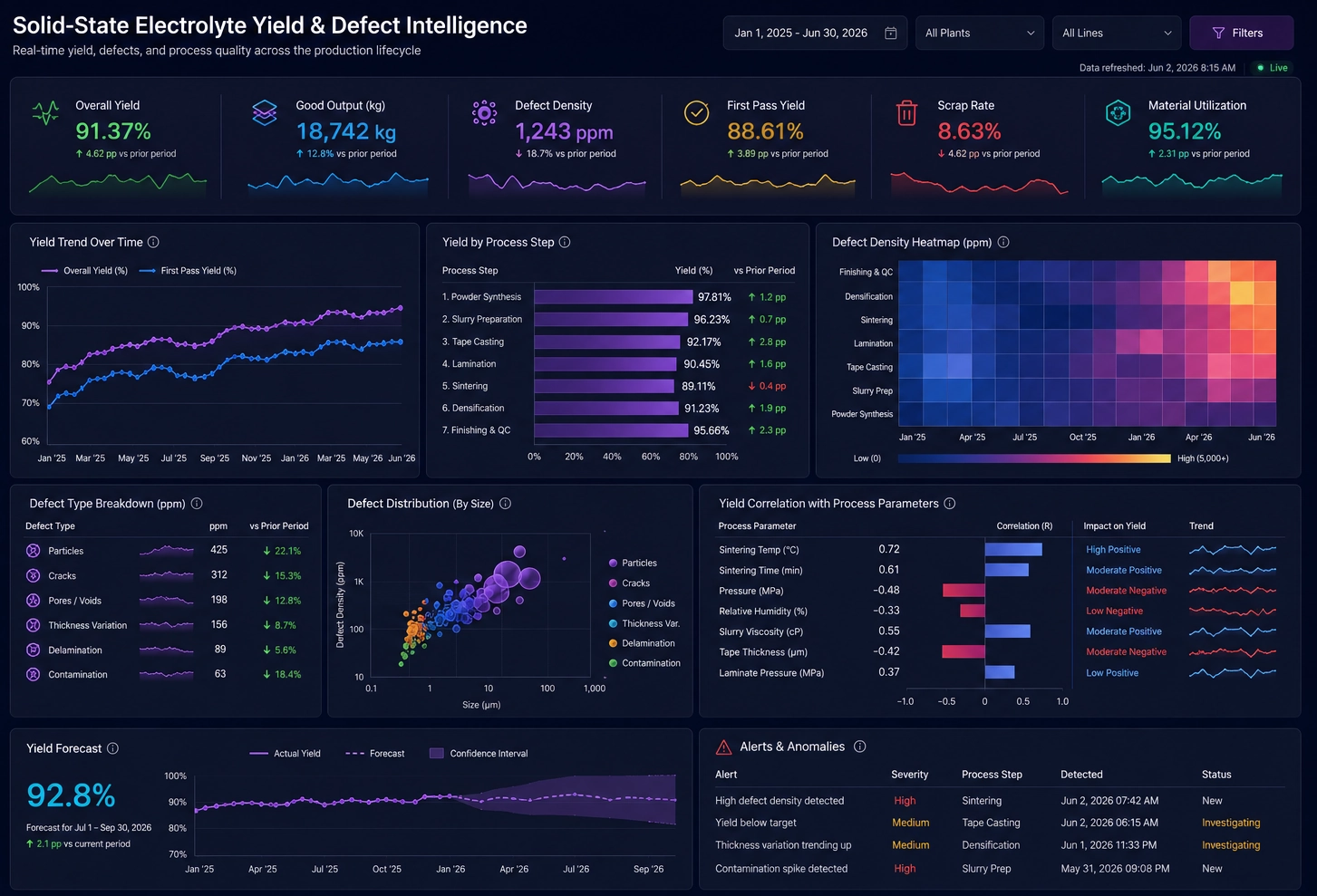
Enterprise Dashboard Creator FAQs
What makes a dashboard creator enterprise-grade?
An enterprise-grade dashboard creator must support governed metrics, secure data access, scalable architecture, and integration with modern data platforms. InetSoft provides these capabilities through flexible deployment options, semantic modeling, and strong governance features.
How does InetSoft handle scalability for large enterprises?
InetSoft supports distributed processing, high-volume data refreshes, and hybrid cloud deployments. This allows enterprises to scale dashboards across thousands of users and large datasets without performance degradation.
What security features are required for enterprise dashboards?
Enterprises require row-level security, SSO and SAML authentication, audit trails, version control, and encryption standards. InetSoft includes all of these features to support regulated industries and large-scale deployments.
How does InetSoft compare to Power BI, Tableau, Looker, and ThoughtSpot?
InetSoft offers flexible deployment, governed metrics, strong embedding capabilities, and predictable pricing. While other platforms excel in specific areas such as visualization or semantic modeling, InetSoft provides a balanced solution ideal for enterprises needing governance, scalability, and embedded analytics.
Can InetSoft integrate with enterprise data platforms?
Yes. InetSoft connects to Snowflake, BigQuery, Databricks, SQL Server, Oracle, and REST APIs. This ensures dashboards are built on unified, enterprise-grade data models.
Does InetSoft support multi-tenant or embedded analytics?
InetSoft supports multi-tenant embedding for SaaS providers and large enterprises. Dashboards can be embedded into portals, applications, and customer-facing environments with full security controls.
What compliance standards does InetSoft support?
InetSoft aligns with SOC 2 practices, supports data residency controls, and provides encryption for data in transit. These features help enterprises meet regulatory and governance requirements.