Bullet Charts - Definition, When To Use, and Types
This page discusses the uses of bullet charts, and explains how you can create them in both Google Data Studio and InetSoft. This page also provides access to a free online tool for creating bullet charts and complete functioning business intelligence dashboards.
Contents
Definition of a Bullet Chart
Why Use a Bullet Chart?
How to
Make a Bullet Chart
How to Create a Bullet Chart in
Google Data Studio
Tool to Make Bullet Charts
Online for Free

Definition of a Bullet Chart
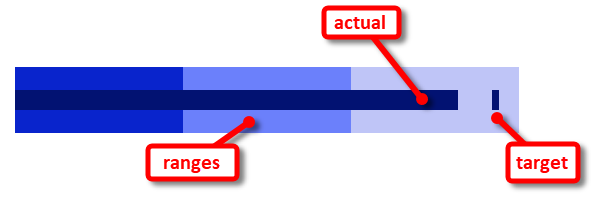
Abullet chartis a graphical display that is used to compare the performance of a measure to a target value, and is also sometimes referred to as a bullet graph or a performance bar chart. It consists of a horizontal bar that represents the range of possible values for the measure, with a smaller bar representing the actual value of the measure and a symbol, typically a small circle, triangle, or bar, representing the target value.
For example, a bullet chart might be used to show the sales performance of a company compared to its sales target for a particular month. The chart would show the range of possible sales values, the actual sales for the month, and the target sales value. By looking at the chart, it would be easy to see how close the company came to meeting the target.
Why Use a Bullet Chart?
The benefit of the bullet chart is that it is compact and easy to read, making it useful for displaying data in dashboards or other types of visual displays where space is limited. The key attribute that distinguishes the bullet chart from a standard bar chart is the peripheral information, the ranges and target. Since this information is not a part of a traditional dataset, as it does not represent actual recorded performance, the ranges and targets would not appear in a typical chart based on queried data. The addition of this contextual information in the bullet chart makes the chart uniquely suited to presenting performance within the framework of established expectations.
How to Make a Bullet Chart in InetSoft
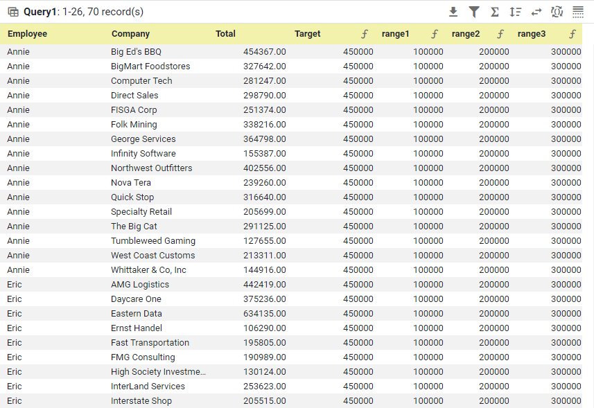
You can create a bullet chart with InetSoft using the built-increateBulletGraph()function. The data should be arranged as follows:
Drag a Chart component from theToolboxpanel into a dashboard in Visual Composer, and then right-click the Chart and select 'Properties' (or select 'Properties' from the '...' button in the Chart toolbar). Select theScripttab in the 'Properties' dialog box, and enter the following script:
dataset = viewsheet['Query1'];
graph = createBulletGraph('Total', ['range1','range2','range3'],'Target',0x0000FF, ['Company'],['Employee'],'vertical=false');
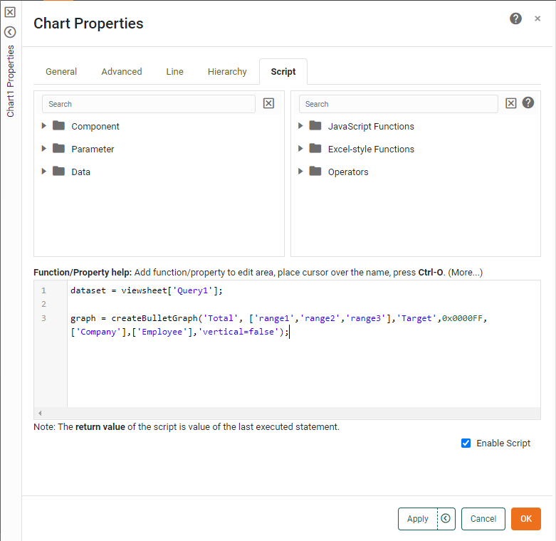
PressOKto generate the bullet chart.
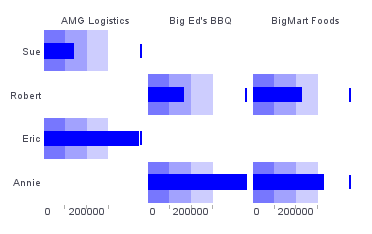
ThecreateBulletGraph()script function is quite versatile in that is can handle multiple dimensions to create a grid of charts (trellis chart), and allows ranges and targets to be specified as part of the data set. This facilitates easy automation of chart generation with a variety of different settings.
How to Create a Bullet Chart in Google Data Studio
Creating a bullet chart in Google Data Studio is fairly simple, but also rather limited, as only a single measure and dimension can be represented in a given chart. Rather than generating a grid of charts, such as shown above for thecreateBulletGraph()function, Google Data Studio will generate just a single one, such as the chart of Annie's sales to BigMart Foods. Other Charts need to be created independently. Also, the ranges and targets need to be set manually using properties in Data Studio, rather than being provided as part of the data set, which makes automation of multiple charts more cumbersome.
To create a bullet chart in Google Data Studio, first connect to your data or upload a data file. Then pressAdd a chartand selectBullet.
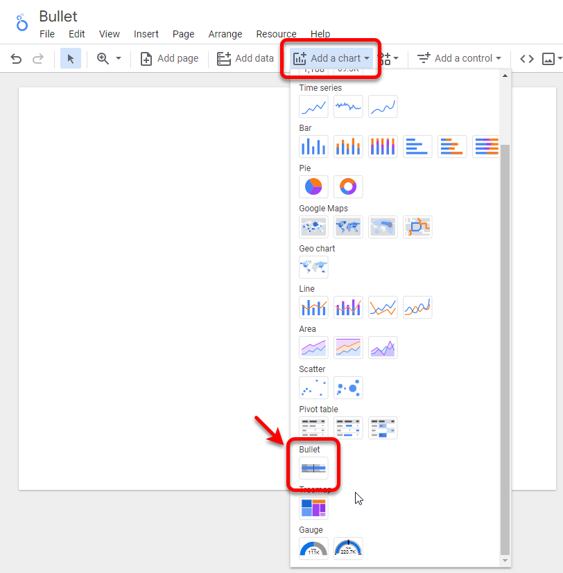
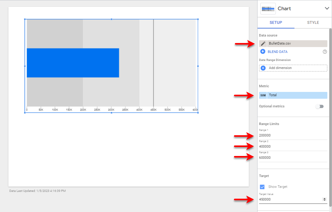
Size the chart as desired and use theSetuptab to set the 'Data source' to your uploaded data or cloud data source. Drag the desired measure to the 'Metric' region, and then set the ranges and target value as desired. This completes the bullet chart.
Tool to Make Bullet Charts Online for Free
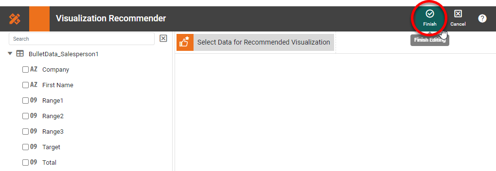
To easily and quickly create Bullet Charts online for free,create a Free Individual Accounton the InetSoft website. You will then be able to upload a text data set, as shown below:

Once you have done that, you will be able to proceed to the Visualization Recommender, which will get you started creating a dashboard. To start with a bullet chart, though, you can skip the Recommender by pressing theFinishbutton at the top bar of the Recommender.
Then pressContinueto go to Visual Composer.
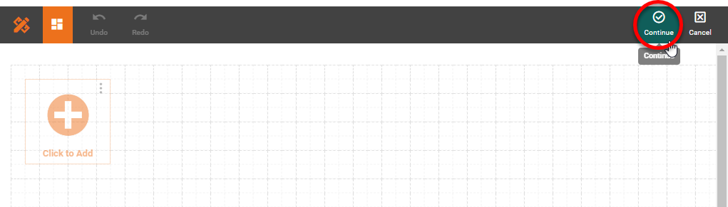
Proceed to add a Chart component using Visual Composer, and add thecreateBulletGraph()script shown earlier to create the desired bullet charts.
When Should You Use Bullet Charts?
Bullet charts are highly effective for displaying
performance metrics in a compact, insightful format—especially when you need to
convey how a quantitative measure compares to qualitative ranges and a target
value. They were developed by Stephen Few as a more informative alternative to
gauges and meters. You should consider using bullet charts in the following
scenarios:
1. When You Want to Show Performance Against a Target
The primary use case for a bullet chart is to display how
well a measure (e.g., sales, revenue, or response time) is performing against a
predefined target. The target is usually represented as a vertical line, while
the actual value is shown as a bar. Behind it, shaded bands indicate
qualitative ranges likepoor,satisfactory, andexcellentperformance.
- You’re tracking monthly sales performance against a target goal. A bullet chart can show actual sales as a bar, the target as a line, and background bands for performance ranges.
2. When Dashboard Space Is Limited
Bullet charts are incredibly space-efficient. Unlike gauges, which take up a circular footprint, bullet charts are linear and compact. This makes them ideal for dashboards where multiple KPIs need to be displayed side by side in a dense layout.
- A business intelligence dashboard for an executive shows 10+ KPIs—sales, profit margin, net promoter score, etc. Bullet charts allow each metric to be visualized clearly without crowding the screen.
3. When You Want to Replace Inefficient Gauges and Meters
Traditional gauges often prioritize aesthetics over clarity, using a lot of space to convey relatively little information. Bullet charts fix this by offering a more data-rich, minimal design, with space to show actual, target, and comparative ranges all in one view.
-
A supply chain dashboard previously used dial gauges
to show delivery time targets. Bullet charts improve clarity by showing
how each region compares to the target, including thresholds for
unacceptable delays.
4. When You Want to Incorporate Qualitative Context
Qualitative performance bands (e.g.,low,medium,high) can be visually represented in the background of a bullet chart. This layering of context gives a quick at-a-glance understanding of how the metric fits into a larger performance narrative.
-
Example:In a customer support setting, average ticket
resolution time could be plotted against customer satisfaction bands—less
than 4 hours = “great,” 4–12 hours = “okay,” 12+ = “needs improvement.”
5. When You Want to Track Progress Over Time—But Don’t Need a Time Series
While bullet charts are not designed for trends over time like line charts, they are useful when you want to presentprogress to datewithin a time-bound framework (e.g., YTD performance, month-to-date progress).
-
Example:A nonprofit organization can use bullet charts to show
progress toward fundraising goals
for various campaigns, with targets for
the quarter and shaded bands representing expectations.
When Not to Use Bullet Charts
Despite their strengths, bullet charts aren’t always ideal:
-
Not
for time-series data:If
you need to show trends or fluctuations over time, line
or area charts are
more suitable.
-
Not
for comparing many categories:If you need to compare dozens of products, locations, or
segments at once,
a bar or dot plot may be easier to scan.
-
Not
always intuitive for casual users:Some users unfamiliar with bullet charts might take a
moment to interpret
them, especially if they’re used to dials or simple bars.