How an Aerospace Pyrotechnics Manufacturer Uses StyleBI to Deliver Reports and Dashboards
One aerospace manufacturer, known for designing advanced pyrotechnic devices such as separation bolts, cartridge actuators, and flight termination systems, has taken this philosophy to heart. Their not-so-secret weapon? InetSoft's StyleBI, a lightweight, open-source business intelligence tool that delivers real-time, actionable insights through interactive dashboards and embedded analytics.
This article dives into how the company's IT and analytics teams deployed StyleBI to modernize their reporting workflows, what kind of analytics they run, and how visual storytelling helps engineers and executives align on explosive (pun intended) performance goals.


Pyrotechnics, Precision, and the Pressure to Perform
In aerospace pyrotechnics, product life cycles span decades, but decisions are made in seconds. Every bolt that separates a spacecraft payload must perform perfectly under incredible thermal and mechanical stress. Even minor anomalies in assembly line torque application, supply chain variation, or telemetry sensor data can result in costly delays—or worse, mission failure.
Before adopting StyleBI, this manufacturer relied on fragmented spreadsheets, manually generated PDF reports, and vendor-specific monitoring tools that lacked interoperability. Engineering and operations worked in silos, making root-cause analysis time-consuming and reactive.
IT leadership saw an opportunity: unify data from ERP, QA, sensor logs, and MES into a single, accessible, and highly customizable analytics platform.
Choosing StyleBI: Lightweight, Extensible, and Open
Why did the team select StyleBI, InetSoft's open-source sibling of its enterprise-grade solutions?
- Lightweight Deployment: The containerized deployment with built-in Jetty support allowed the IT team to get up and running without investing in heavyweight infrastructure.
- Data Mashups: StyleBI's ability to blend SQL-based data with NoSQL (MongoDB for sensor logs) enabled time-aligned analysis of production variables and failure logs.
- Custom Embedding: The team wanted to embed real-time dashboards into their in-house quality control application. StyleBI's API support and simple authentication made that seamless.
Real-Time Manufacturing Metrics: Dashboards in Action
Let's explore how StyleBI is being used across the organization:
1. Torque Variance Dashboard – Assembly Line Monitoring
Users: Manufacturing engineers, shift supervisors Data Sources: Torque wrench logs, operator ID logs, lot tracking in ERP
Key Charts:
- Heat Map of Torque Application per workstation: Color-coded by deviation from spec.
- Box-and-Whisker Plots of torque by bolt type, highlighting outliers.
- Trend Line of Mean Torque over the last 30 days, with control limits drawn dynamically based on Six Sigma thresholds.
Outcome: Engineers can immediately identify which workstations are drifting toward non-compliance and intervene before defects are baked in.
2. Flight Readiness Scorecard
Users: QA, program managers, execs Data Sources: QA sampling rates, defect logs, calibration reports, environmental test results
Key Visuals:
- Stacked Bar Chart showing monthly defect rate by component category.
- Radar Chart (Spider Plot) comparing readiness metrics across 7 programs, including test success rate, supply chain stability, and component reliability.
- Conditional Formatting Table of FMEA risk scores, red-flagging high-risk assemblies.
Outcome: A 360-degree view of which programs are greenlit for next-stage integration—without scouring through 15 PDFs.
3. Supplier Quality Index
Users: Procurement, quality analysts Data Sources: Supplier on-time delivery logs, incoming inspection reports, cost of quality calculations
Key Analytics:
- Pareto Chart of defect sources, showing the 20% of vendors causing 80% of failures.
- Scatterplot Matrix correlating supplier lead time, defect rate, and cost per unit—identifying value vs. volatility.
- Trend Chart for Vendor Scorecards, overlaid with purchase volume for prioritization.
Outcome: Procurement can renegotiate with data on their side or identify alternate vendors before a critical failure cascades.
Embedded Alerts: From Data to Action
One of the more clever integrations is the use of StyleBI's embedded alerts and conditional logic. For instance, if a defect is logged on a critical flight component twice within a week, an alert is triggered in the supplier dashboard. A rule-based engine flags the data point, sends a webhook to Slack, and opens a corrective action ticket in their Jira instance.
This is one area where StyleBI's extensibility shines. While the platform isn't a full-blown workflow engine, the combination of filters, data-driven triggers, and APIs made it straightforward for IT to bridge analytics and operations.
IT's Role: From Report Builders to Insight Enablers
For the IT department, the transition to StyleBI was more than a tooling change—it was a philosophical shift. Instead of being bottlenecks for report generation, the team now focuses on:
- Curating semantic models so non-technical users can build their own visualizations.
- Managing data pipelines, ensuring freshness and version control.
- Supporting advanced users with R and Python integration for predictive modeling (e.g., estimating burnout rate based on historical test cycles and environmental exposure).
Engineers can now run time-series regressions, build what-if dashboards, and publish them to cross-functional teams—all without waiting for BI team turnaround.
ROI: Saving Time, Boosting Confidence
Within six months of going live with StyleBI:
- Report generation time dropped by 60%
- Assembly line intervention events rose by 25% due to earlier detection of out-of-spec behavior
- Supplier defect rate reduced 15%, driven by visible, accountable scorecards
But perhaps the biggest gain? Confidence. From the shop floor to the C-suite, stakeholders now act on data they trust—visualized clearly, updated continuously, and accessible wherever needed.

Torque Variance Dashboard: Precision Monitoring in Aerospace Assembly
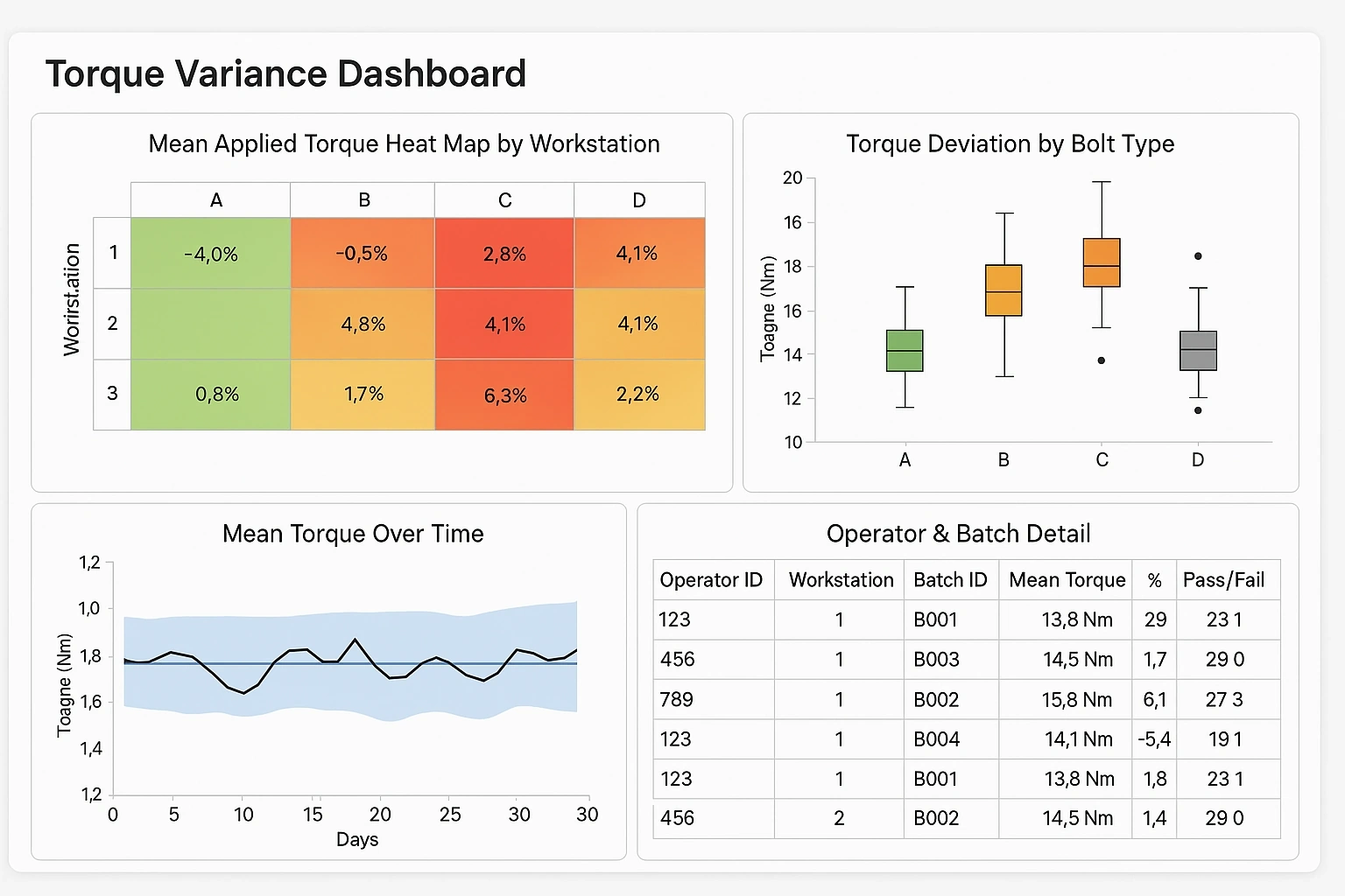
This dashboard is designed to help manufacturing engineers and quality supervisors monitor torque application during assembly processes. In aerospace pyrotechnics, over- or under-torquing fasteners—such as on a separation bolt—can compromise performance or even mission safety. The dashboard provides visual cues for anomaly detection, root-cause investigation, and trend analysis.
Key KPIs and What They Mean
- Mean Applied Torque (per Bolt Type)
- Definition: The average torque applied across all assembly operations for a given bolt type.
- Why It Matters: Some bolt types require tighter tolerances. Monitoring this helps detect systemic drift or calibration issues with tools.
- Torque Deviation (% from Spec)
- Definition: The percentage difference between the applied torque and the required torque spec.
- Interpretation: A value of ±3% may be acceptable; beyond that could trigger inspection or rework.
- Torque Fail Rate
- Definition: The percentage of fasteners in a given batch that failed to meet torque specs.
- KPI Alert Threshold: >1.5% fail rate triggers an amber warning; >3% is flagged in red.
- Operator Drift Index
- Definition: A rolling measure of each operator's deviation from the torque spec over time.
- Usage: Identifies training needs or potential fatigue patterns.
- Workstation Compliance Score
- Definition: A normalized score (0–100) calculated from spec adherence, tool calibration logs, and rework frequency.
- Color Coding: Green (>90), Yellow (80–90), Red (<80)
How to Read the Dashboard
The Torque Variance Dashboard typically consists of four visual panels:
1. Heat Map – Workstation Deviation Matrix
- Layout: Grid with workstations on one axis, bolt types on the other.
- Colors: Green = low deviation; Yellow = moderate; Red = out of spec
- Usage: Quickly shows which workstation-bolt combinations are underperforming.
2. Box-and-Whisker Plot – Torque Distribution
- X-axis: Bolt types
- Y-axis: Measured torque values (Nm)
- Visual Cues: Each box represents IQR (middle 50%), whiskers = range, dots = outliers
- Usage: Helps spot inconsistencies and outliers beyond control limits. For example, if Bolt Type B consistently shows upper whiskers past spec, tightening tool calibration might be needed.
3. Line Chart with Control Bands – Mean Torque Over Time
- Timeline: Daily or per shift
- Series: Actual mean torque with overlaying spec band (± allowed tolerance)
- Highlights: Points breaching control limits are marked
- Usage: Engineers can identify torque drift trends or the impact of process changes.
4. Drilldown Table – Operator & Batch Detail
- Columns: Operator ID, Workstation, Batch ID, Mean Torque, Deviation %, Pass/Fail Count
- Filters: Time range, product line, bolt type
- Interactivity: Clicking a row reveals individual torque application readings for each fastener
Example Insight Scenario
Let's say Bolt Type "CX-39" is frequently installed at Workstation 3. The heat map shows this cell in red. Drilling into the box plot reveals that Workstation 3 has high torque variability for CX-39. The operator table shows that one technician has an Operator Drift Index of -5%, suggesting consistent under-torquing.
This leads to a three-part follow-up:
- QA flags affected batches for inspection.
- Engineering checks the torque wrench calibration.
- The operator is scheduled for refresh training.
Without this dashboard, catching this pattern might take days of detective work—or worse, result in field failures.
StyleBI Features in Play
- Dynamic filtering across bolt types, workstations, time periods.
- User-specific views with access control—operators only see their own metrics, while supervisors get global trends.
- Exportable PDFs for QA audits and compliance documentation.
- Drill-down enabled visualizations using StyleBI's microservices architecture, which makes navigating from trend to source seamless.