Capital Fundraiser Dashboards
Capital fundraiser dashboards are strategic visual tools designed to track, analyze, and communicate the progress of large-scale fundraising campaigns. Unlike annual fund efforts that focus on recurring donations, capital campaigns typically support major initiatives such as building projects, endowments, or long-term infrastructure investments.
These campaigns involve higher donation targets, longer timelines, and more complex stakeholder coordination. A well-designed dashboard transforms raw fundraising data into actionable insight, enabling development teams, executives, and board members to monitor performance, identify risks, and adjust strategies in real time.


Purpose and Strategic Value
The primary purpose of a capital fundraiser dashboard is to provide clear visibility into campaign performance. This includes tracking total funds raised against the campaign goal, monitoring pledge commitments, and analyzing donor participation across different segments. By centralizing this information in one interface, organizations reduce reliance on manual reports and spreadsheets while ensuring decision-makers have up-to-date intelligence.
Strategically, dashboards support three critical objectives. First, they enhance transparency by showing exactly where the campaign stands at any moment. Second, they improve accountability by tying results to specific teams, initiatives, or donor segments. Third, they enable predictive analysis, helping leaders forecast whether the campaign will reach its target within the desired timeframe.
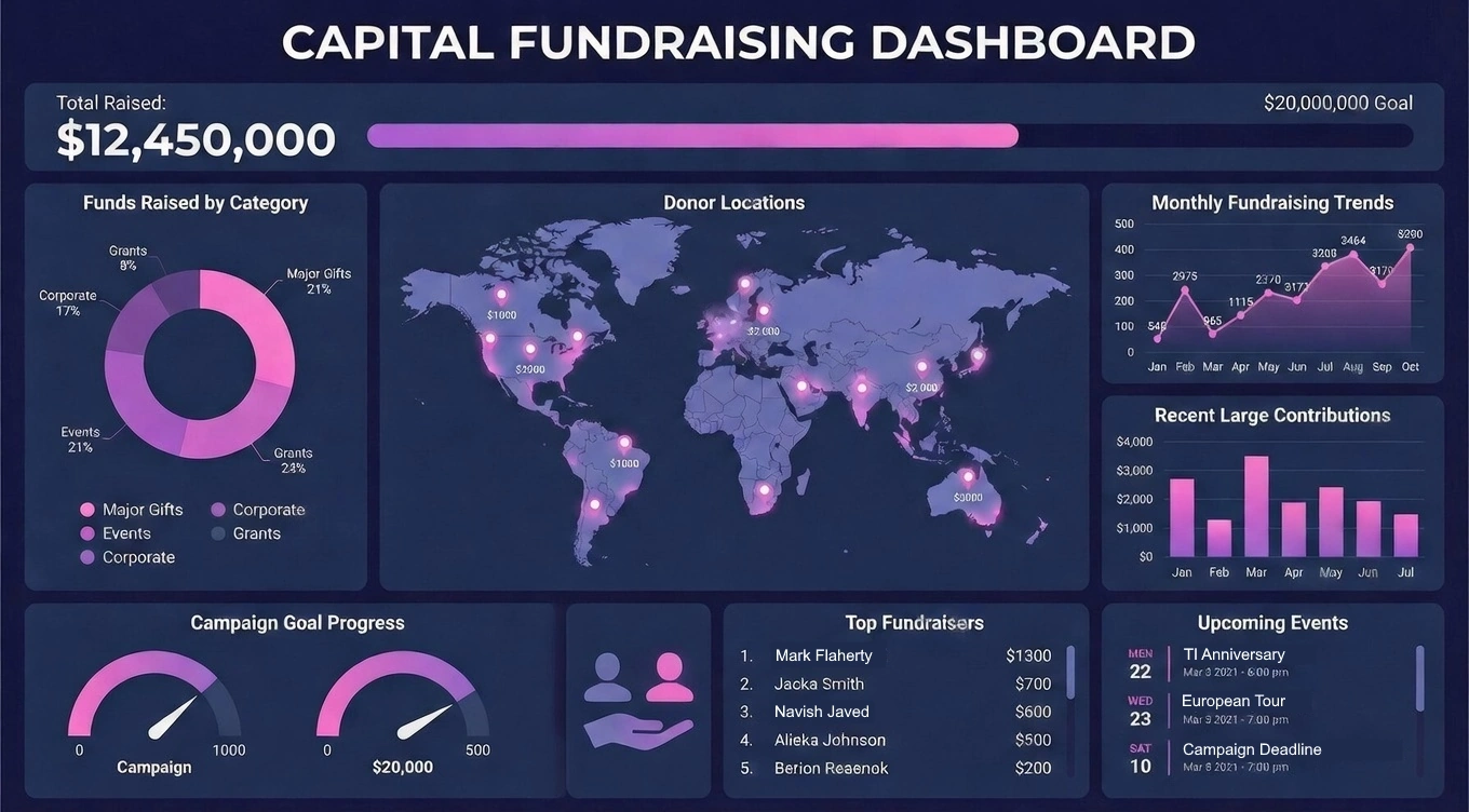
Core Metrics and Key Performance Indicators
Capital fundraiser dashboards rely on a defined set of key performance indicators (KPIs) that reflect campaign health. While each organization may tailor its metrics, several are considered essential:
- Total funds raised vs. goal: A primary gauge of overall progress.
- Pledge commitments: Amounts promised but not yet received, critical for long-term forecasting.
- Cash received: Actual revenue collected, often separated from pledged funds.
- Number of major gifts: Counts of donations above a defined threshold.
- Average gift size: A measure of donor capacity and engagement.
- Campaign phase performance: Tracking progress by quiet phase, public phase, or milestone periods.
These KPIs allow fundraisers to see not only how much money has been raised, but how it is being raised. A campaign heavily dependent on a few large gifts carries different risks than one supported by a broad donor base.
Donor Segmentation and Relationship Insights
Advanced dashboards go beyond financial totals to examine donor behavior. Segmenting donors by category—such as individual, corporate, foundation, or alumni—reveals which groups are driving momentum. Geographic segmentation can identify regional strengths or gaps, while demographic breakdowns highlight trends in age, profession, or giving history.
Relationship management metrics also play an important role. Dashboards may track donor touchpoints, proposal status, and cultivation activities. For example, a view showing how many prospects are in solicitation versus stewardship phases helps development officers allocate their time more effectively. When integrated with donor management systems, dashboards can show the correlation between engagement efforts and gift outcomes.

Pipeline and Prospect Management
A capital campaign depends on a strong pipeline of prospective donors. Dashboards often visualize this pipeline as a funnel or stage-based workflow. Typical stages include identification, qualification, cultivation, solicitation, and stewardship. Each stage can display the number of prospects, estimated gift values, and probability of conversion.
Pipeline dashboards support forecasting by calculating weighted projections based on likelihood of success. For example, prospects in active solicitation may be assigned higher probability scores than those in early cultivation. This allows campaign leaders to see whether their current pipeline is sufficient to meet remaining targets or whether additional prospecting is required.
Time-Based Performance Tracking
Capital campaigns unfold over months or years, making time-based analysis essential. Dashboards commonly include trend lines that show cumulative funds raised over time compared to planned benchmarks. These visuals quickly reveal whether the campaign is ahead of schedule, on track, or falling behind.
Seasonal patterns also emerge through longitudinal analysis. Some organizations notice donation spikes during certain months or events. Dashboards that support historical comparisons enable planners to schedule major outreach initiatives during periods of higher donor responsiveness.
Budgeting and Expense Oversight
In addition to revenue tracking, capital fundraiser dashboards may incorporate campaign expenses. These can include marketing costs, event expenses, and consulting fees. By comparing funds raised to funds spent, organizations calculate return on investment (ROI) for different campaign components.
This financial oversight is especially important for maintaining donor trust. Transparent reporting on how resources are allocated reassures stakeholders that contributions are being used responsibly. Dashboards that integrate expense data help finance and development teams collaborate more effectively.

Visualization and User Experience
The effectiveness of a capital fundraiser dashboard depends heavily on its visual design. Cluttered screens or overly complex charts can obscure key insights. Best-practice dashboards prioritize clarity, using simple bar charts, line graphs, progress gauges, and summary tiles.
Color coding is often used to indicate status levels, such as green for on-target performance and red for areas of concern. Interactive features like filters and drill-downs allow users to move from high-level summaries to detailed views without switching systems or generating new reports.
User experience design should account for different audiences. Board members may prefer concise, high-level overviews, while development staff require operational detail. Role-based views ensure that each user sees the information most relevant to their responsibilities.
Integration with Data Sources
To remain accurate and timely, capital fundraiser dashboards must connect with underlying data systems. Common sources include donor management platforms, accounting software, and event registration tools. Automated data refreshes reduce the risk of errors associated with manual entry and improve confidence in reported figures.
Data integration also supports consistency. When fundraising totals in the dashboard match financial records in accounting systems, discrepancies are minimized and reporting credibility increases. This alignment is especially important during audits or when sharing progress with external stakeholders.
Security and Data Governance
Fundraising data contains sensitive financial and personal information. Dashboards must therefore be designed with security and governance in mind. Access controls restrict who can view or edit data, while encryption and secure authentication protect information in transit and at rest.
Governance policies define how metrics are calculated and who owns each data element. Clear definitions prevent misunderstandings, such as whether “funds raised” includes pledges or only cash received. A consistent data dictionary ensures that all users interpret the dashboard the same way.

Communication and Stakeholder Engagement
Capital fundraiser dashboards are powerful communication tools. Visual summaries can be shared in board meetings, donor briefings, and internal reviews. Rather than presenting static slides, organizations can use live dashboards to demonstrate transparency and professionalism.
Public-facing versions of dashboards may also be used for marketing purposes. For example, a simplified progress indicator on a campaign website can encourage donors by showing how close the organization is to its goal. This real-time feedback can motivate additional giving and foster a sense of collective achievement.
Challenges and Limitations
Despite their benefits, capital fundraiser dashboards present several challenges. Data quality is a common issue, especially when donor information is incomplete or outdated. Inconsistent data entry practices can undermine the accuracy of visualizations.
Another challenge is overemphasis on quantitative metrics. While numbers are essential, qualitative factors such as donor relationships and community goodwill are harder to measure. Dashboards should complement, not replace, professional judgment and relationship-building efforts.
There is also a risk of information overload. Including too many charts or metrics can distract users from what truly matters. Successful dashboards strike a balance between comprehensiveness and simplicity.
Future Trends in Capital Fundraising Analytics
As data analytics evolves, capital fundraiser dashboards are becoming more predictive and personalized. Machine learning models are increasingly used to estimate donor propensity and gift size, feeding these insights directly into visual reports. Scenario modeling tools allow campaign leaders to test different strategies and see projected outcomes.
Mobile-friendly dashboards are also gaining traction, enabling executives and fundraisers to access campaign updates on smartphones or tablets. This supports more agile decision-making and real-time responsiveness during critical campaign phases.
Capital fundraiser dashboards represent a convergence of data management, analytics, and strategic communication. By translating complex fundraising activity into clear visual narratives, they empower organizations to manage campaigns more effectively and transparently. From tracking progress toward ambitious goals to analyzing donor behavior and forecasting future performance, these dashboards serve as both operational tools and strategic guides.
When thoughtfully designed and properly governed, a capital fundraiser dashboard becomes more than a reporting mechanism. It becomes a shared lens through which stakeholders understand the campaign’s story, challenges, and successes. In an environment where trust, accountability, and performance are paramount, such dashboards play a vital role in turning fundraising ambition into measurable achievement.

Private Equity Capital Fundraising Dashboards
Private equity capital fundraising dashboards are specialized analytics tools designed to monitor and manage the complex process of raising capital from limited partners (LPs). Unlike nonprofit or public fundraising efforts, private equity fundraising is driven by institutional relationships, multi-stage negotiations, and long investment horizons. A well-structured dashboard brings together performance, pipeline, and investor relationship data into a single visual environment, allowing general partners (GPs) and investor relations teams to make informed, timely decisions.
The core function of a private equity fundraising dashboard is to track progress against the fund’s target size. This includes commitments received, soft circled capital, and remaining gap to close. Visual indicators such as progress bars or milestone charts show whether the fund is on pace to reach its first close or final close by the desired date. These visuals replace fragmented spreadsheets and enable leadership to quickly assess overall momentum.
Pipeline management is another critical feature. Dashboards typically organize prospective investors by stage, such as identified, contacted, in due diligence, in legal review, or closed. Each stage can be associated with an estimated commitment amount and probability of closing. This allows firms to generate weighted forecasts that show not just how much capital has been raised, but how much is realistically expected based on the current state of discussions. By analyzing pipeline health, firms can determine whether additional outreach is needed or if resources should be redirected toward high-probability prospects.
Investor segmentation adds further strategic value. Dashboards often break down commitments by investor type, such as pension funds, endowments, family offices, or sovereign wealth funds. Geographic segmentation can highlight regional strengths or reveal underpenetrated markets. Historical comparisons across prior funds also help contextualize current performance, showing whether fundraising is faster or slower than in previous cycles.
Private equity fundraising dashboards frequently integrate qualitative relationship data with quantitative metrics. Notes from investor meetings, proposal status, and follow-up schedules can be incorporated into the same interface that tracks capital commitments. This linkage helps investor relations teams prioritize engagement activities and avoid stalled opportunities. For senior partners, it provides a transparent view of where negotiations stand without requiring detailed briefings.

Time-based analysis is especially important in private equity, where market conditions and competitive dynamics can change rapidly. Trend lines showing weekly or monthly commitment growth reveal whether momentum is accelerating or slowing. Scenario models may also be included, allowing teams to simulate outcomes based on changes in conversion rates or average ticket sizes.
Security and governance are essential considerations. Fundraising data contains sensitive financial and strategic information, so dashboards typically employ strict role-based access controls. Different users may see different levels of detail, with executives viewing aggregate performance while relationship managers access individual investor records. Clear metric definitions ensure that all stakeholders interpret figures such as “committed capital” or “fund size” consistently.
Ultimately, private equity capital fundraising dashboards serve as both operational tools and strategic assets. They streamline reporting, improve forecasting accuracy, and support stronger investor engagement by making information more accessible and actionable. In an environment where credibility and timing are crucial, these dashboards help firms navigate the fundraising cycle with greater clarity, discipline, and confidence.
