Event Management Platform Dashboards and the Metrics That Matter
Event management platforms have evolved from simple registration systems into complex experience engines. Modern events span multiple days, multiple formats, and often multiple events across a year. Dashboards are the connective tissue that makes sense of this complexity. When designed well, they do not just report what happened, they explain why it happened and what to do next. The most effective dashboards organize metrics into clear thematic views that reflect how events are planned, experienced, and monetized.
A strong event management dashboard typically brings together three critical perspectives: cross-event engagement, event performance and return on investment, and the attendee journey with personalization signals. Each perspective answers a different strategic question, and together they form a complete picture of event success.

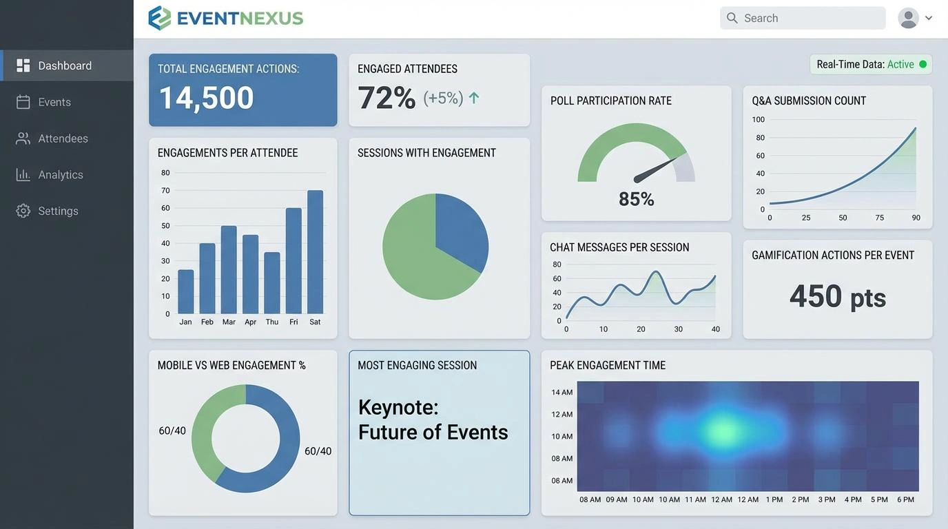
Engagement Across the Event Portfolio
Engagement is the most honest signal of event health. Registrations and attendance tell only part of the story, while engagement reveals whether attendees actually found value. A cross-event engagement view is especially important for organizations running multiple events, since it highlights patterns that are invisible when events are reviewed individually.
Total Engagement Actions
Total engagement actions aggregate every meaningful interaction across sessions, networking, content, and interactive features. This metric establishes a baseline for overall activity volume. Its real value comes from comparison across events, formats, or time periods. Sudden drops often signal content fatigue, platform friction, or poor session scheduling.
Engaged Attendees
Engaged attendees measure how many unique participants took at least one meaningful action. This metric is more revealing than total attendance because it filters out passive participants. A large gap between attendees and engaged attendees suggests the experience is not compelling enough or that engagement tools are difficult to discover.
Engagements per Attendee
Engagements per attendee normalize interaction levels and allow fair comparison between small and large events. High values indicate deeper participation, often driven by strong facilitation, relevant content, and well-timed interaction prompts.
Sessions with Engagement
This metric shows how widely engagement is distributed across the agenda. Events where most sessions generate engagement tend to feel cohesive and intentional. Concentrated engagement in only a few sessions may indicate uneven content quality.
Poll Participation Rate
Poll participation rate measures responsiveness and attention. Because polls require minimal effort, low participation often signals disengagement, poor timing, or unclear framing. High participation reflects trust in the moderator and relevance of the topic.
Q&A Submission Count
Q&A submissions represent a higher bar for engagement than polls. Asking questions requires confidence and interest. Tracking this metric by session and speaker highlights which topics inspire curiosity and which presenters invite dialogue.
Chat Messages per Session
Chat activity reflects social energy. Messages per session distinguish lively discussions from passive listening experiences. Persistent low chat activity may indicate unclear expectations or weak moderation.
Gamification Actions per Event
Gamification actions show whether attendees are motivated to explore beyond scheduled sessions. Trends over time reveal whether game mechanics remain engaging or quickly lose novelty.
Mobile vs Web Engagement Percentage
Understanding device usage informs experience design. High mobile engagement favors shorter interactions and simplified navigation, while web-dominant engagement supports longer sessions and detailed content.
Most Engaging Session
Identifying the most engaging session provides a concrete example of success. Dashboards should enable drill-down into session format, speaker style, and engagement breakdown to inform future planning.
Peak Engagement Time
Peak engagement time shows when attention is highest. This insight guides agenda structure, keynote placement, and sponsor activation timing.
Event Performance and Return on Investment
Performance and ROI metrics translate engagement into business outcomes. Dashboards that connect financial and operational metrics with engagement provide a realistic view of event effectiveness.
Total Registrations
Total registrations represent top-of-funnel interest. Viewed over time, this metric reveals marketing effectiveness and audience growth or saturation.
Checked-In Attendees
Checked-in attendees reflect actual participation. Comparing this number with registrations highlights how compelling the event was at the moment of attendance.
No-Show Rate
No-show rate is a diagnostic metric. High values often result from weak reminders, schedule conflicts, or unclear value propositions.

Registration to Attendance Conversion Percentage
This conversion metric bridges marketing and experience delivery. Strong conversion suggests accurate messaging, while weak conversion points to misaligned expectations.
Total Ticket Revenue
Total ticket revenue is the most direct financial outcome. When combined with engagement data, it reveals whether revenue growth is sustainable.
Average Ticket Value
Average ticket value highlights pricing effectiveness. Rising values often reflect successful premium positioning, while declines may indicate over-reliance on discounts.
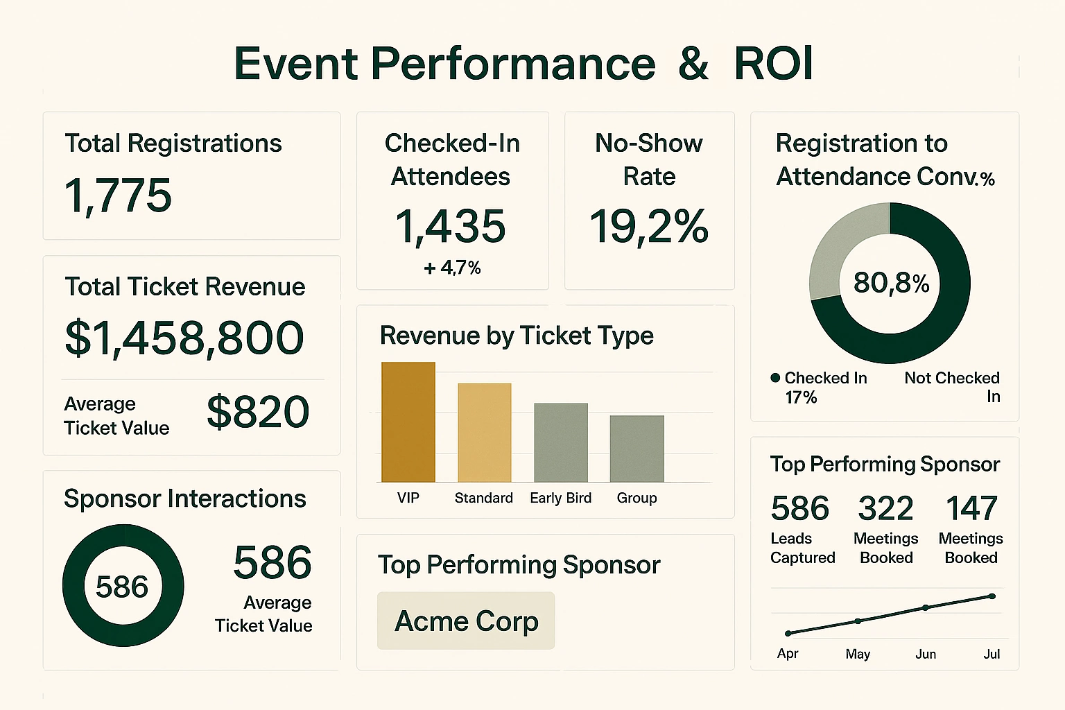
Revenue by Ticket Type
Breaking down revenue by ticket type shows which offerings resonate most. Visualizing this distribution helps refine pricing strategy.
Sponsor Interactions
Sponsor interactions demonstrate delivered partner value. Tracking these interactions supports stronger sponsor retention and renewal conversations.
Leads Captured
Leads captured connect event activity to future revenue opportunities. When aligned with engagement data, this metric highlights which experiences generate high-quality prospects.

Meetings Booked
Meetings booked signal serious intent, particularly in B2B contexts. Dashboards that segment this metric help optimize matchmaking features.
Top Performing Sponsor
Identifying the top performing sponsor creates a benchmark and learning opportunity. Dashboards should make sponsor success patterns easy to analyze.
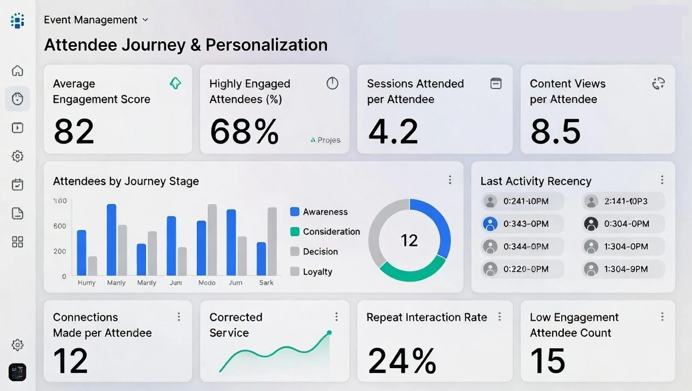
Attendee Journey and Personalization Signals
The attendee journey perspective shifts focus from aggregate outcomes to individual behavior. This view enables personalization, retention, and community building.
Average Engagement Score
An average engagement score condenses multiple behaviors into a single indicator. It offers a quick snapshot of attendee involvement across the event.
Highly Engaged Attendees Percentage
This metric shows how much of the audience is deeply involved. Growth here often correlates with stronger loyalty and repeat attendance.
Sessions Attended per Attendee
Sessions attended per attendee reveal how fully participants explore the agenda. Low values may signal scheduling friction or unclear session value.
Content Views per Attendee
Content views extend engagement beyond live participation. High values indicate effective on-demand and supplemental content strategies.
Attendees by Journey Stage
Segmenting attendees by journey stage clarifies where engagement strengthens or weakens, enabling targeted interventions.

Connections Made per Attendee
Connections per attendee measure networking success. Low numbers often reflect discovery issues or unclear networking incentives.
Repeat Interaction Rate
Repeat interaction rate shows whether engagement is sustained over time. High repeat rates indicate long-term value and community potential.
Low Engagement Attendee Count
This metric highlights attendees who may need additional support or targeted outreach. It represents opportunity rather than failure.

Last Activity Recency
Last activity recency shows how recently attendees interacted with the platform. This insight is essential for post-event follow-up and retention strategies.
An effective event management dashboard does not overwhelm users with data. It organizes metrics into meaningful sections, emphasizes trends, and enables exploration from summary to detail. When engagement, performance, and journey metrics are viewed together, dashboards evolve from reporting tools into strategic assets that shape better events over time.