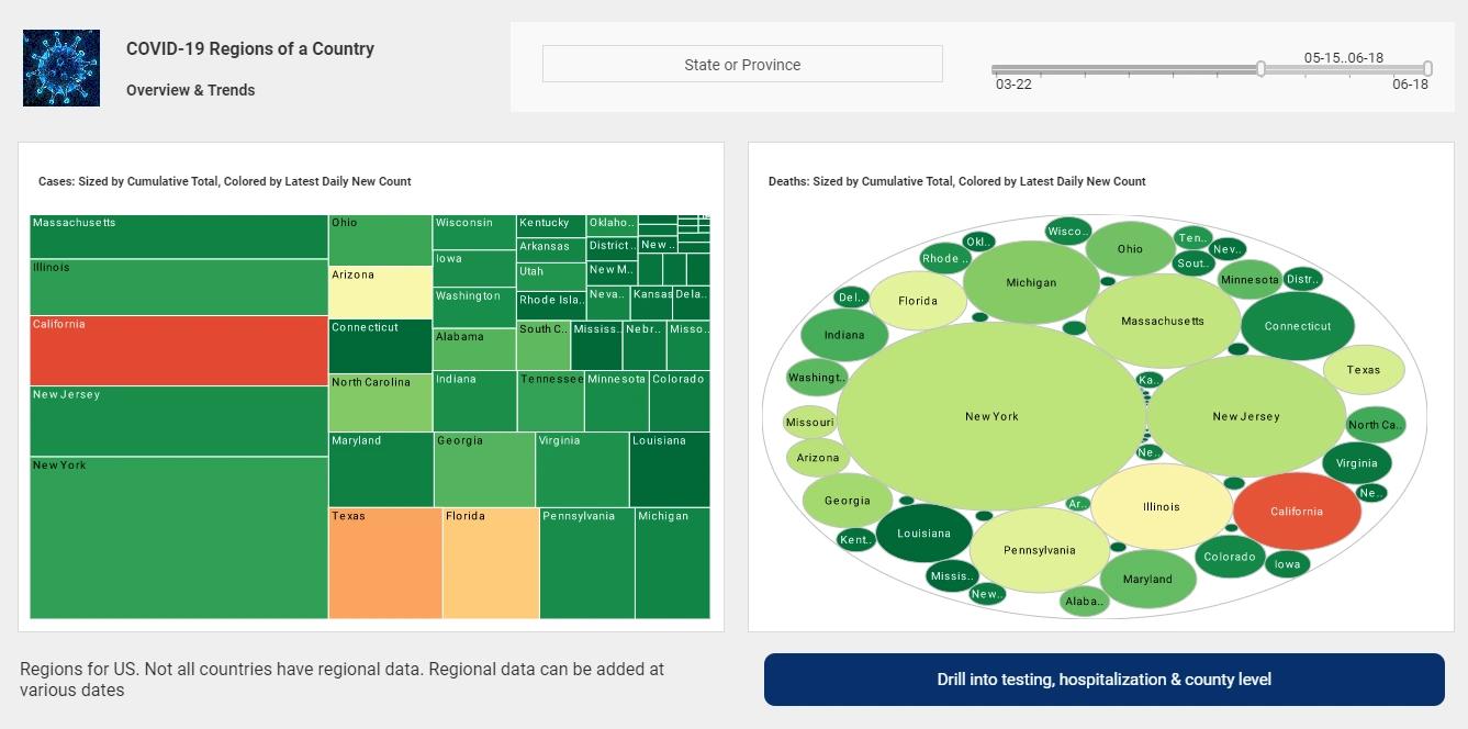
Data Discovery Tools | Reasons to Evaluate InetSoft
Are you searching for a good data discovery tool? InetSoft offers an easy to deploy, easy to use enterprise data visualization and dashboarding application.


Why Choose InetSoft
InetSoft's data visualization and dashboarding software is:
Easy enough to be:
- deployed in weeks, not months
- learned by new users with minimal training
Agile enough to:
- mashup disparate sources
- adapt to changing business needs
- deliver maximum self-service
And robust enough to:
- attract the attention of business executives
- satisfy the demands of power users
- scale up for organizations of all sizes

The Power of Multi-Dimensional Charting
Multi-dimensional charting means being able to depict more than just two dimensions on a graph. The standard simple graph charts just two dimension, on the x and y axes. In a two-dimensional chart you can identify basic trends, such as time-based one: is a measure like sales, increasing or decreasing, but you can’t see any other dimension that might help explain why.
With multi-dimensional charting you can add coloring and sizing options. Coloring means coloring different data points on that two-dimensional chart to denote more information. For example start with a graph of sales opportunities where closing probability is depicted on the y-axis and days until expected close date on the y-axis, with dots represented a single opportunity. You would already be able to identify imminently winnable opportunities in the upper left corner. Now color the dots by sales person, a different color for each person. Now a scan of the color patterns shows who has more open opportunities and where they are in the likelihood and timeliness to close.
Add another dimension by sizing those dots by dollar amount, such that the larger the revenue potential of the opportunity, the larger the circle is. Now, at a glance you can prioritize opportunities to focus on.
The Answer to Many Ad Hoc Reporting Needs: Drill-down and Filtering
Another aspect of visual analysis is the interactivity, pointing and clicking to explore the data and drill into more details. Drill-down simply means clicking on a data point to see more detail. That can be summarized data as seen by hovering the mouse over a data point, or detailed background information seen by drilling into a detail page of another application or another detailed report that can be accessed by double-clicking on a data point.
Filtering the data displayed on a graph is as easy as checking off selection boxes from criteria lists, as many lists as applicable. Date selection is another level of filtering, and date sliders or visual calendars are visual controls for picking the date ranges to include in the chart. Either of these methods allows sifting through large amounts of data, zooming into the areas of interest, noticing comparisons and trends along the way.
A very powerful innovation in visual analysis is the ability to change what is on the X or Y axis, or the “size by” or “color by” options. By using simple drop-down menus of available choices for any of these four settings, dozens of useful charts and analyses can be accessed in a single visual analytical view.

Using a Data Discovery Tool in Biotech Research: A Scenario
Dr. Maya Chen, a senior researcher at a biotech firm working on rare genetic disorders, manages several ongoing projects, including RNA sequencing analysis and biomarker identification for potential therapies. Traditionally, Maya had to rely on bioinformatics specialists to generate reports, which could take weeks to iterate as new experimental data arrived or hypotheses shifted. This process created bottlenecks and limited the agility of the research team.
With a data discovery tool, Maya now connects directly to the lab's SQL databases and CSV exports from sequencing instruments, blending them with public genomic datasets from repositories such as NCBI and Ensembl. She can easily visualize variant distributions across patient cohorts, filter datasets by specific genes of interest, and drill down to individual patient data when outliers are observed.
For example, while examining a cohort of patients with a specific rare disease, Maya uses scatter plots and heatmaps to identify clusters of gene expression that correlate with clinical outcomes. She applies filters to isolate age ranges and treatment conditions, quickly generating insights that inform which genes warrant further investigation. Previously, this process would have required multiple rounds of static report generation, but with a data discovery tool, Maya can interactively refine her analysis in real time during lab meetings with collaborators.
Benefits of Data Discovery Tools for Biotech Researchers
1. Accelerated Hypothesis Testing
Researchers can test hypotheses immediately upon obtaining new data, reducing the time between data collection and insight generation. Interactive dashboards allow for instant visualization of correlations and patterns that inform experimental decisions and resource prioritization.
2. Enhanced Collaboration
Data discovery tools allow sharing of interactive dashboards with colleagues, enabling cross-functional teams of scientists, data analysts, and clinicians to review and analyze the same datasets in real-time. This collaborative environment fosters discussion and hypothesis refinement while maintaining a single source of truth.
3. Intuitive Visualization of Complex Data
Biotech datasets can be high-dimensional and complex, making interpretation challenging. A data discovery tool offers heatmaps, scatter plots, box plots, radar charts, and custom visualizations that simplify the understanding of data distributions and relationships across multiple variables simultaneously.
4. Data Integration from Multiple Sources
Data discovery tools often provide connectors for various data sources, including SQL databases, cloud storage, APIs, and flat files. This enables researchers to blend lab-generated data with external datasets like public health repositories or clinical trial data without complex manual merges.
5. Empowering Researchers Without Heavy Coding
Not every researcher has advanced programming skills in Python or R, and relying on data science teams for every exploratory analysis can create bottlenecks. A data discovery tool empowers researchers to conduct their analyses independently, enabling quicker exploration while freeing data teams to focus on advanced modeling and pipeline development.
Example Use Cases in Biotech Research
- Identifying gene expression clusters in RNA-Seq data correlated with drug response.
- Visualizing CRISPR screening results to find high-impact gene targets.
- Tracking sample conditions and experiment metadata to identify variables affecting results.
- Analyzing patient biomarker data for predictive modeling in clinical trials.
- Combining internal lab data with public genomic databases to validate findings.