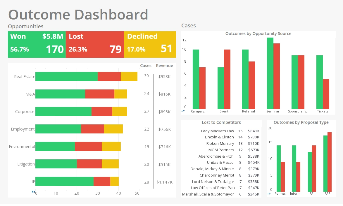
The Most Intuitive Dashboards
InetSoft is in the business of producing the most intuitive dashboards available for your business needs. Not only are they easy to navigate, but they're also easy to develop.
What sets InetSoft's StyleBI apart from the competition is the seamless drag-and-drop interface for data mashup, report formatting, and dashboard design.
The Drag-and-Drop Model
To facilitate usability for individuals of all skill levels, this drag-and-drop interface permeates all design stages of StyleBI. Standard business users with little to no IT training can feel comfortable creating intricate and intuitive displays by placing charts, sliders, gauges, selection lists, and a plethora of other elements directly on to the dashboard.What Makes StyleBI Intuitive to Use?
InetSoft’s StyleBI platform stands out as intuitive due to a combination of thoughtful user interface design, self-service capabilities, and data mashup flexibility—all structured around the principle of reducing the technical overhead required to explore and act on data. For IT professionals and business users alike, “intuitive” in a BI context means minimizing complexity while maximizing clarity, responsiveness, and interactivity. Here's a detailed breakdown of what makes StyleBI intuitive to use:
1. Self-Service Data Preparation and Mashups
One of the most intuitive features of StyleBI is its drag-and-drop data mashup layer. Instead of forcing users to rely on IT or write complex ETL pipelines, StyleBI allows users to:
- Combine data from multiple sources (SQL, REST APIs, Excel, etc.) in real-time
- Clean, join, and transform data visually using a flowchart-like interface
- Create reusable data blocks and filters with a point-and-click approach
This no-code/low-code approach drastically reduces the learning curve for both analysts and citizen developers.
2. Visual-First Dashboard Design
The dashboard builder in StyleBI is engineered for ease of use. It includes:
- WYSIWYG canvas: What you see is what you get. Users can build dashboards by dragging charts, grids, and filters directly onto the layout.
- Smart auto-alignment and layout grids: Objects snap into position, and mobile-responsive breakpoints are built-in.
- Live previews: Data and interactions are visible in real-time as users build dashboards, without requiring separate design and runtime modes.
This visual approach empowers users to focus on the story the data tells, rather than the mechanics of the design.
3. Natural Interactions for Exploration
StyleBI promotes intuitive data exploration through:
- Interactive filters and drill-downs: Users can click on elements to filter other components or launch detail views without needing to pre-define interactions.
- Auto-suggestions for filtering: Drop-downs and filters adapt based on user-selected fields and data types, reducing errors and confusion.
- Dynamic parameter controls: Users can quickly adjust time ranges, locations, and variables without reloading the dashboard.
These features support a "discover as you explore" model, where insight flows naturally from interaction.
4. Unified Data and Presentation Model
StyleBI unifies the underlying data logic with the presentation layer, so users aren’t forced to switch between different tools or workflows. All KPIs, calculations, and filters are defined in one environment—this reduces cognitive load and keeps the focus on analysis.
Moreover, the platform leverages in-memory processing and data streaming where possible, meaning that even large datasets feel responsive and fluid to navigate.
5. Prebuilt Templates and Reusable Components
To help users get started quickly and consistently, StyleBI includes:
- Dashboard templates for common use cases (e.g., sales, manufacturing, healthcare, emergency response)
- Reusable visual components like KPI blocks, gauges, sparklines, and mini-maps
- Theming tools to standardize branding across dashboards
New users can copy and adapt existing dashboards without starting from scratch—this improves onboarding and ensures consistency across teams.
6. Mobile-Optimized Without Extra Design Work
Creating mobile dashboards doesn’t require additional steps. StyleBI dashboards are automatically responsive, using HTML5 rendering that adapts layouts and interaction models based on screen size. The same dashboard designed for desktop can be opened on a tablet or phone, with touch-friendly controls and resizable elements built in.
This is especially intuitive for emergency responders, salespeople, or operations staff who need to monitor KPIs from the field.
7. Smart Alerting and Natural Language Integration
While more advanced, features like rule-based alerts (e.g., notify when a KPI exceeds a threshold) and optional natural language summaries make StyleBI feel more proactive and conversational. These features surface insights without users having to dig, further reinforcing the platform’s intuitiveness.
8. Minimal IT Dependencies
StyleBI was designed to empower users while reducing IT workload. It allows:
- Self-service publishing of dashboards and mashups
- Built-in governance via row-level security and user access roles
- Embed-ready dashboards for web portals and mobile apps
This means fewer tickets, less waiting, and more time spent on high-value analysis rather than data plumbing.

