Personalized Templates for Data Visualization
This is the continuation of the transcript of DM Radio’s program titled “What You See Is What You ‘Get’ – How Data Visualization Conveys Insight.”
Jim Ericson: There are a couple of things driving visualization templates are very interesting. One is that to make this real, as I was saying, some of the vendors are starting to personalize these visualizations for various roles.
So, for example, a company like GoodData, which is an analytic mashup service provider, launched a series of products a couple of weeks ago. The products are designed for marketing professionals, sales professionals, and campaign management professionals. The tools are intended to help them visualize things that would commonly be in the realm of their jobs.
Then, we had other folks on the list like Intensity, that very much focus on sediment analysis, or Clarabridge, who focus on Natural Language Processing and things like that.
Others were very focused on marketing analytics, which I think is really kind of the tip of the spear for a lot of businesses now. So they are thinking of visualization in terms of, “Okay, what am I seeing in terms of sediment? What does this segment represent?”
Quite frankly, all the vendors are creating these templates – even all the way up the food chain. SAP is doing this too. A lot of vendors are doing this. I just mentioned two.
These vendors are saying, “What do these representations mean? Let’s give our users sort of a semi organized approach with a template. We can’t give them exactly what they will use because every organization is different. But this way, they can build a role based on this simple power tool.”
And, by the way, I think this new development is very much supported by the idea of tablets, iPads, and other visualizations.
Some of our guests today will explain to us how these tablets have changed the game a little bit in terms of what we are doing with real estate and visualizations.But, I think, the role based stuff really shows how we are taking notions like Big Data and making them pay off, especially for those that really fit a specific role.
Eric Kavanagh: And that's very interesting. It does seem as though having some role based construct or mapping that you can apply to raw data would be extremely useful. Otherwise, where do you even begin?
With a lot of the stuff, that’s part of the challenge really. Certainly in data mining, when you are trying to visualize patterns and data, you know basically what you are doing – you’re identifying certain characteristics of the data and you plot them against each other using various algorithms to spread out different visualizations of stuff.
But if you don’t really know how to manage that process, you can spend a lot of time just kind of twisting in the wind out there and finding false positives – I would think, right?
Jim Ericson: Yeah. And our friends over at Enterprise Management Associates mentioned before putting out some research that a lot of the Big Data usage is now operational – how to respond to customers, how to respond to business needs, etc.
Ad-Hoc Exploration Type of Data Visualization
I think that's another thing that’s reflected here. If you think about sort of the ad-hoc exploration type of data visualization as it applies to Big Data, you can kind of imagine that pretty easily on the hands of a business analyst or someone who is taking kind of long looks and building models for algorithms and preferences and turns like that.
But, for example, the demo I saw was a visualization tool was being laid over some Hadoop cluster. This was actually formatted in a way that you could say, “Okay, Mr. Sales Manager, here are the buyers of my lowest margin products. And here is how they compare by how much it costs to ship this stuff to them.”
So if you think about outliers and say, “Well, these guys are buying low margin stuff from me. But there are also the most expensive people I have to ship stuff too, well, what can I do about that?”
And that's a very practical application of Big Data visualization with outliers. But it points to a very obvious business issue and a potential solution.
How Does StyleBI Enable Personalized Data Visualizations?
InetSoft’s StyleBI, a cloud-based business intelligence platform, is renowned for its ability to deliver highly personalized data visualizations that cater to diverse user needs within an organization. For a growing startup or established enterprise, personalized visualizations are critical for ensuring that stakeholders—from executives to operational teams—can access tailored insights in a format that aligns with their roles, preferences, and decision-making processes. StyleBI achieves this through a combination of intuitive design tools, flexible customization options, robust data integration, and interactive features. This article explores how StyleBI enables personalized data visualizations, highlighting its key capabilities and their impact on user experience.
1. Intuitive Drag-and-Drop Interface
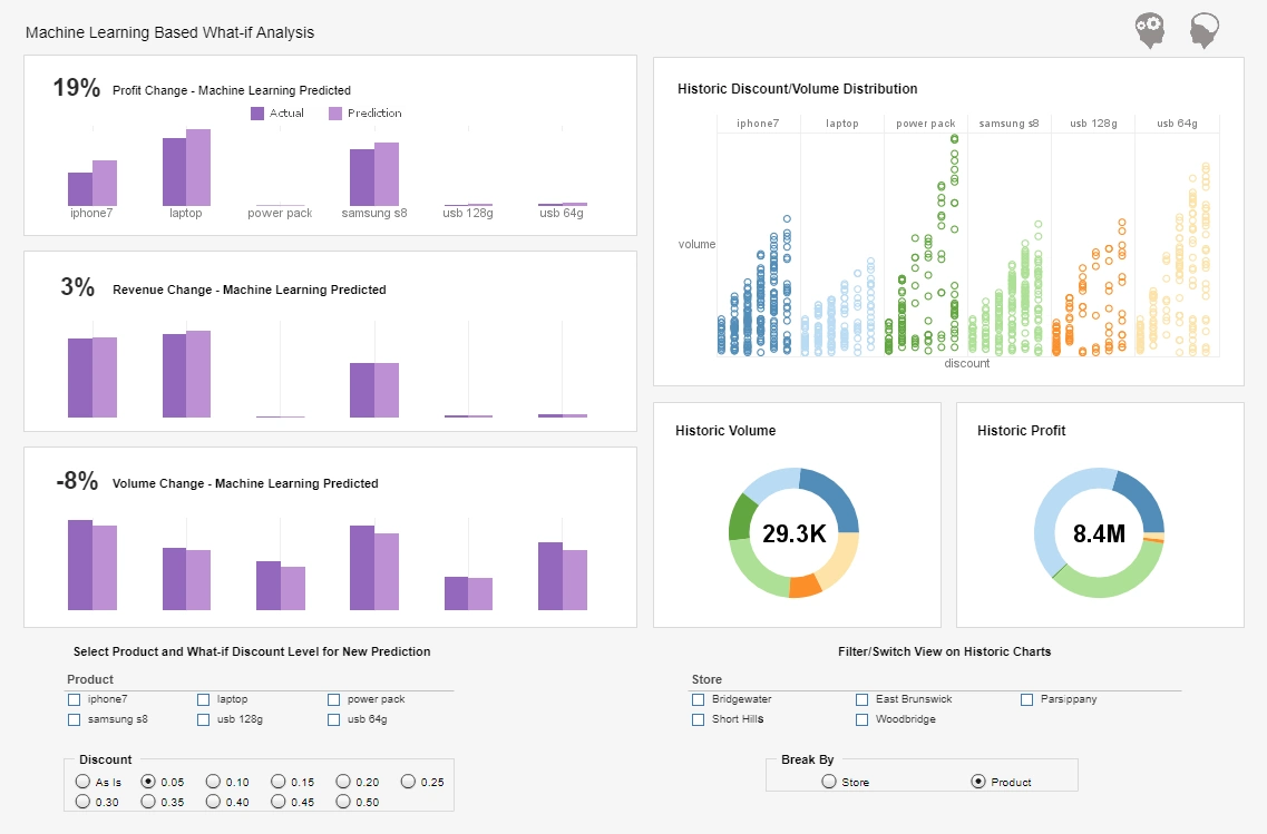
StyleBI’s WYSIWYG (What You See Is What You Get) drag-and-drop interface is a cornerstone of its personalization capabilities. This user-friendly design tool allows users, regardless of technical expertise, to create custom dashboards and reports by arranging visual elements like charts, tables, and gauges. Users can select from a library of pre-built components or design their own, tailoring layouts to reflect their specific needs. For example, a sales manager might prioritize a bar chart showing monthly revenue trends, while a marketing team member could focus on a pie chart displaying campaign performance metrics. This flexibility ensures that each user can craft visualizations that are relevant to their role without requiring coding skills.
2. Extensive Visualization Options
StyleBI offers over 30 chart styles, including bar, line, pie, radar, waterfall, speedometer, and bubble charts, enabling users to choose the most effective format for their data. Each chart type supports advanced customization, such as:
- Conditional Formatting: Users can apply color-coding to highlight specific thresholds or KPIs, such as red for underperforming metrics and green for targets met.
- Tooltips and Annotations: Interactive tooltips provide additional context on hover, while annotations allow users to add notes for clarity.
- Multi-Dimensional Analysis: Users can combine multiple data dimensions (e.g., time, region, and product) in a single chart, creating personalized views of complex datasets.
These options allow users to tailor visualizations to their preferences, ensuring that data is presented in a way that is both visually appealing and meaningful to their specific role or task.
3. Role-Based Dashboards and Permissions
StyleBI’s granular access controls enable personalized visualizations by allowing administrators to create role-based dashboards. Each user or group can access a customized view of the data relevant to their responsibilities. For instance, a CEO might see a high-level dashboard with company-wide KPIs, while a department head views metrics specific to their team. The platform’s role-based permissions ensure that sensitive data is only visible to authorized users, enhancing security while delivering tailored insights. This feature is particularly valuable for startups scaling from 50 to 150 employees, where diverse roles require distinct data perspectives.
4. Data Mashup and Integration Flexibility
StyleBI’s patent-pending Data Block technology allows users to combine data from disparate sources—such as CRM systems, spreadsheets, cloud applications, and databases—without predefined data models. This flexibility enables users to create highly personalized visualizations by selecting only the data points relevant to their needs. For example, a product manager can mash up sales data from a CRM with inventory data from an ERP system to create a custom dashboard tracking product performance. The platform supports over 40 data sources, including Salesforce, Google Analytics, and Microsoft Excel, ensuring users can personalize visualizations based on the specific datasets they rely on.
5. Interactive and Self-Service Features
StyleBI empowers users to interact with and personalize visualizations through self-service analytics tools. Key interactive features include:
- Drill-Downs: Users can click on a chart element to explore underlying data, tailoring their analysis to specific areas of interest.
- Dynamic Filters and Sliders: Point-and-click controls allow users to filter data by parameters like date ranges, regions, or product categories, creating personalized views on the fly.
- Wizards and Recommenders: Built-in wizards guide users through chart creation, suggesting visualization types based on selected data, which simplifies the process for non-technical users.
These features enable employees to adapt visualizations in real time, ensuring that insights remain relevant to their immediate tasks or strategic goals.
6. Real-Time Data Updates
StyleBI’s real-time data processing ensures that visualizations reflect the most current information, which is critical for personalized decision-making. Users can configure dashboards to update automatically based on live data feeds, such as sales transactions or customer interactions. For example, a customer support lead can create a dashboard that displays real-time ticket resolution rates, allowing them to monitor team performance dynamically. The platform’s data caching and streaming capabilities optimize performance, ensuring that personalized visualizations remain responsive even with large datasets.
7. Mobile-Responsive Design
StyleBI’s fully responsive interface allows users to access and customize visualizations on mobile devices, such as smartphones and tablets. This is particularly valuable for remote or hybrid teams in a scaling startup, where employees need access to tailored insights on the go. Users can adjust dashboards, apply filters, or drill into data from their mobile devices, ensuring that personalized visualizations are available anytime, anywhere. This mobility enhances productivity and supports a flexible work environment.
8. Collaboration and Sharing Capabilities
StyleBI facilitates personalized visualizations through collaboration features that allow users to share customized dashboards. Users can save specific views as bookmarks, add annotations for context, or share dashboards via direct web links, embedded HTML, or email. Integration with collaboration platforms like Slack and Microsoft Teams further enhances accessibility. For example, a team member can create a personalized sales performance dashboard and share it with their manager, who can then add comments or adjust the view to align with their priorities. This fosters a collaborative environment where personalized insights drive collective decision-making.
9. Embedded Analytics for Custom Applications
For startups developing their own applications, StyleBI’s embedding capabilities allow developers to integrate personalized visualizations into custom platforms. Using RESTful APIs and JavaScript, developers can embed dashboards that are tailored to specific users or workflows. For instance, a startup building a customer portal can embed StyleBI visualizations to show clients personalized performance metrics. The platform’s white-labeling options ensure that these embedded visualizations align with the startup’s branding, enhancing the user experience.
10. Support for Advanced Customization
For users with technical expertise, StyleBI’s Style Studio desktop application offers advanced customization options, such as pixel-perfect report design and scripting for complex visualizations. This allows developers to create highly tailored dashboards for specific use cases, such as financial forecasting or supply chain analytics. The platform’s open-source version further supports customization by providing access to source code, enabling startups to adapt visualizations to unique requirements.
Benefits for a Scaling Startup
For a startup growing from 50 to 150 employees, StyleBI’s personalized visualization capabilities offer several advantages:
- Empowered Teams: Role-based dashboards and self-service tools enable employees to create visualizations that align with their responsibilities, fostering engagement.
- Agility: Real-time updates and interactive features allow users to adapt visualizations quickly to changing business needs.
- Scalability: The platform’s cloud-native architecture supports increasing user numbers and data complexity as the startup grows.
- Cost-Effectiveness: By reducing reliance on IT for visualization creation, StyleBI minimizes operational costs.


