Catering Data Visualization for Your Users
This is the continuation of the transcript of DM Radio’s program titled “What You See Is What You ‘Get’ – How Data Visualization Conveys Insight,”
Eric Kavanagh: Well, let’s bring in our resident expert of the week on data visualization and dashboards. Wayne Eckerson, of the BI Leadership Forum, welcome back to DM Radio.
Wayne Eckerson: Thanks Eric, good to be here, as always.
Eric Kavanagh: Sure. So that’s a pretty compelling example that Jim just gave.
I know you just raffed up a new book. Can you tell us what the title is?
Does anything in that book resonate with what Jim just talked about? Such as these very specific examples of being able to use data visualization to find significant segments that you can then cater to or choose not to cater to?
Wayne Eckerson: Well, yeah, it’s probably this recent book called “The Secrets of Analytical Leaders” that goes into visualization more than my prior book on dashboards, which had only one chapter on it.
There are a couple of interesting examples of how something that was perceived to be easier to use and more visual led to greater adoption of the BI application.
In this case, one of the companies in Kansas City had built a Web-based report analytical application of its state warehouse. When they converted that to a tablet based interface, all of a sudden usage went through the roof. It was the same exact application drew over through a different medium.
Now, I don’t know if you consider the iPad a visualization technique but it certainly is in the minds of the users. It’s perceived to be an easier to use environment and obviously it has access to some of the gestures that are perhaps easier to use than maybe a mouse.
The key thing is that its users expect that something delivered on a high pad will be easier to use. Users made more of an effort to use it and found that the information was in fact very useful. It’s a bit out of the lines in what we normally refer to as visualization but certainly relevant.
Jim Ericson: I think that’s a good point. I like that expectation. Because it’s coming on an iPad, people think it’s some app. How interesting is it that there is a psychological barrier – that for some, it can be hard to find their way in using these tools.
Wayne Eckerson: You can see the same phenomenon when you switch from text based representations and visual based representations. Not always but in many cases, a picture is worth a thousand words and that eye candy helps to sell the tool or the app.
So in some cases, when you are trying to sell visualization to executives who have been brought up for years looking at spreadsheets with very detailed sets of numbers, they don’t want to view data visually. In some cases, absorbing information is a very personal thing dictated by habits.
I would think that going forward into the next generation of users; one can expect to see things delivered much more visually then the current generation of executives.
What Features of InetSoft's BI Microservice App Allow Users to Cater It to Their Needs?
InetSoft's BI Microservice App offers several features that allow users to tailor it to their specific needs:
-
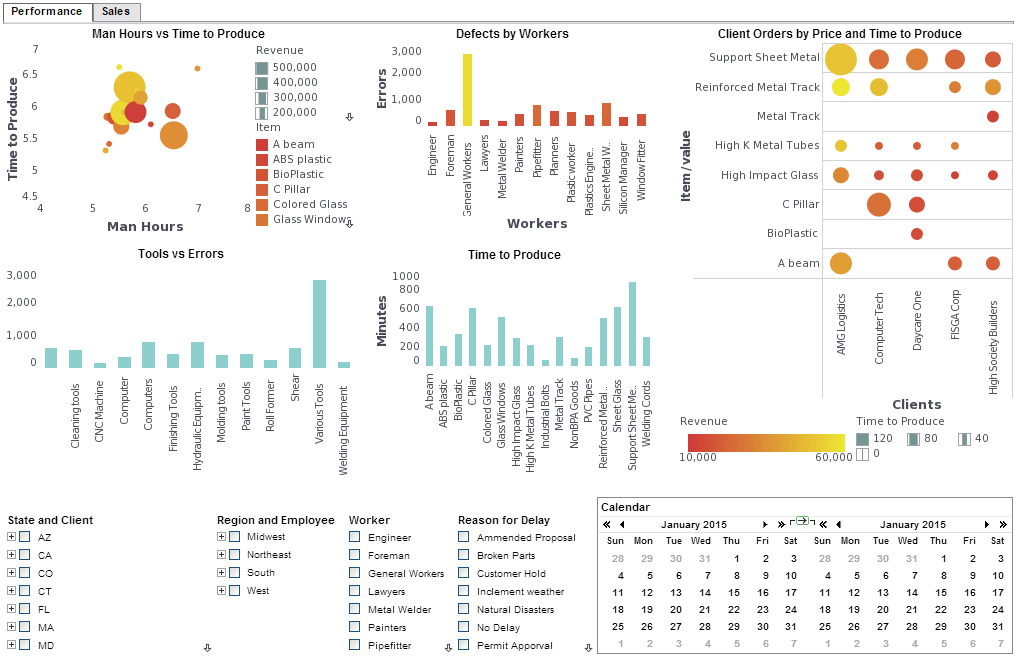
Customizable Dashboards: Users can design dashboards with drag-and-drop functionality, enabling them to create layouts that suit their workflows and preferences.
-
Data Mashup Capabilities: The app allows users to combine data from multiple sources in real time, providing a comprehensive view for analysis.
-
Interactive Filters: These enable users to dynamically filter data within dashboards, allowing for deeper exploration and analysis.
-
Embedding Options: Users can embed dashboards or visualizations into external applications or websites, ensuring seamless integration with existing systems.
-
Role-Based Access Control: Administrators can define user roles and permissions, ensuring that sensitive data is accessed only by authorized individuals.
-
Scalability: The app is designed to handle large volumes of data, making it suitable for organizations of all sizes.
These features make InetSoft's BI Microservice App a versatile tool for businesses looking to optimize their data analysis and reporting processes.
How Does InetSoft Cater to the Needs of Cloud Providers For Embedding BI Into Their Application?
Cloud providers looking to embed InetSoft's business intelligence (BI) solutions, such as Style Intelligence, into their applications have several options, leveraging InetSoft's cloud-flexible, small-footprint, and open standards-based architecture. Below is a summary of the key embedding approaches and considerations based on available information:
1. Embedding via IFrame
- Description: Dashboards, visualizations, and reports can be embedded into a cloud application using an IFrame. This method allows seamless presentation of InetSoft's interactive controls within the host application, even if the reporting engine runs in a separate container.
- Benefits:
- Eliminates the need for a proxy, simplifying integration.
- Supports transparent viewing and manipulation of reports and dashboards by end-users.
- Use Case: Ideal for quick integration where minimal coding is preferred, and the host application needs to display InetSoft's BI components without deep customization.
- Reference:,
2. JSP Tag Library for Web-Based Integration
- Description: InetSoft provides a custom JSP tag library for embedding reports and dashboards into Java Server Pages (JSP)-based web applications. Tags like create, header, and body allow developers to integrate dashboards with minimal configuration.
- Key Features:
- The cache tag optimizes performance by allowing selective refreshing of reports on a JSP page.
- Supports embedding charts or dashboards in specific locations within the application.
- Requires placing bisuite_pro.jar and etools.jar in the WEB-INF/lib directory and configuring the web.xml file.
- Benefits:
- Offers maximum flexibility for developers familiar with JSP technology.
- Ensures a unified user interface by embedding dashboards seamlessly.
- Use Case: Suitable for cloud providers building JSP-based web applications or portals requiring a single, cohesive user interface.
- Reference:,
3. Servlet or Web Services Integration
- Description: Cloud providers can embed InetSoft's reporting engine by calling its servlet or leveraging Web Services for seamless integration. This approach requires minimal coding and is suitable for rendering production reports or dashboards.
- Benefits:
- Leverages InetSoft's Service-Oriented Architecture (SOA) and Java-based design for easy integration.
- Supports embedding into web applications with existing APIs or service layers.
- Use Case: Ideal for cloud providers with API-driven applications or those needing to integrate BI components into microservices architectures.
- Reference:
4. Single Sign-On (SSO) and Security Integration
- Description: InetSoft supports SSO integration, allowing cloud providers to align its BI platform with their application's security model. Options include:
- Integration with LDAP systems (e.g., iPlanet/SunOne, Active Directory, Open LDAP) by importing user and role settings.
- Implementing a custom Security Provider interface for flexible authentication and authorization.
- Passing principal objects from the host application to enable SSO functionality.
- Benefits:
- Ensures a seamless user experience by aligning security protocols.
- Supports compliance with regulations like HIPAA by isolating client deployments.
- Use Case: Critical for cloud providers in regulated industries (e.g., healthcare, finance) or those requiring robust security for multi-tenant environments.
- Reference:,
5. Custom Branding and Theming
- Description: InetSoft allows cloud providers to rebrand and theme dashboards and reports to match the host application's look and feel. This includes customizing logos, colors, and interfaces.
- Benefits:
- Ensures a consistent user experience, making the BI components appear native to the host application.
- Supports multi-tenancy, allowing different branding for different clients.
- Use Case: Essential for SaaS providers or OEMs who want to white-label InetSoft's BI solution for their customers.
- Reference:,,
6. Embedding Charts and Graphs
- Description: InetSoft offers a charting and data access engine for embedding interactive charts into applications. This is particularly useful for providers needing lightweight visualization components.
- Benefits:
- Small footprint and 100% Java/HTML5 architecture make it ideal for cloud environments.
- Supports real-time data visualization for dynamic applications.
- Use Case: Suitable for cloud providers embedding specific visualizations (e.g., sales trends, KPIs) into CRM or financial applications.
- Reference:,
7. Cloud Deployment Flexibility
- Description: InetSoft's BI solution can be deployed in various cloud environments:
- Public Cloud: Hosted on providers like AWS, Azure, or Google Cloud.
- Private Cloud: Self-hosted for maximum control.
- Hybrid Cloud: Combining cloud and on-premises deployments.
- Multi-Client or Dedicated-Client: Supports multi-tenant SaaS or isolated client instances for compliance (e.g., HIPAA).
- Benefits:
- Small footprint (deployable on instances as small as two virtual cores) ensures cost-efficient scaling.
- Supports both scaling up (more powerful instances) and scaling out (more instances).
- Allows hosting on the provider's chosen cloud infrastructure or self-hosting for low latency.
- Use Case: Flexible for cloud providers needing to balance cost, performance, and regulatory requirements.
- Reference:,,
8. Ad Hoc Reporting and Self-Service
- Description: InetSoft's StyleBI enables embedded ad hoc reporting, allowing end-users to create custom reports via a drag-and-drop interface. This can be integrated into cloud applications to empower business users.
- Benefits:
- Reduces IT dependency by enabling self-service for non-technical users.
- Supports a wide range of data visualizations (charts, graphs, tables) with interactive features like drill-downs.
- Use Case: Ideal for cloud providers offering SaaS applications where users need to generate custom reports without leaving the application.
- Reference:,
9. Data Access and Mashup
- Description: InetSoft's Data Block™ technology allows embedding applications to connect to multiple cloud and on-premises data sources (e.g., Salesforce, Google Analytics, Amazon RDS) for real-time data mashup and visualization.
- Benefits:
- Simplifies data integration without requiring a full data warehouse.
- Supports high-performance caching and incremental updates for large datasets.
- Use Case: Useful for cloud providers needing to combine disparate data sources into unified dashboards or reports.
- Reference:,
Considerations for Cloud Providers
- Scalability: InetSoft's architecture supportsboth scaling up and scaling out, accommodating varying client needs and resource allocations.,
- Performance: For large datasets, InetSoft uses distributed technology based on map-reduce concepts, parallelizing calculations across clusters without requiring specialized hardware.
- Ease of Integration: The SOA, Java-based, and open standards (XML, JavaScript, HTML5) architecture minimizes integration effort and leverages existing developer skills.,
- Cost Efficiency: Flexible licensing and capacity pricing models based on cores avoid steep cost cliffs, making it affordable for cloud providers to scale.,
- OEM Partnership: InetSoft's history of collaborating with OEMs ensures responsive support and tailored solutions for embedding scenarios.,
Example Use Cases
- CRM Application: Embed a dashboard showing real-time lead generation metrics, integrated via IFrame or JSP tags, with SSO for secure access.
- Financial Management SaaS: Embed drill-through reports for financial analytics, using servlet integration and custom branding to align with the application's UI.
- Healthcare Compliance: Deploy isolated instances for each client in a private cloud, embedding ad hoc reporting with LDAP-based SSO to meet HIPAA requirements.
Getting Started
Cloud providers can explore these options by:
- Viewing demos or downloading free evaluation copies
- Contacting InetSoft for personalized demos or OEM partnership discussions.
- Testing integration with a pre-configured AWS instance for rapid deployment.


